The Creuse, Le Dorat & La Rochelle
For me, choosing a holiday destination will also mean choosing the right mediums and methods that are suitable for the venue and trip! I love having the choice to paint larger works, if I am inspired to do so, but this may not be possible if baggage and transport space are limited.
I have just returned from a two week trip to Provence where I drove my own vehicle 1,500 kilometres, during a direct 24 hours from here in North Lincolnshire, with only short stops to refuel or rest. Then staying with artist friends.
This enabled me to take many different sized canvases, including large ones, plus a full stock of acrylic paints.
See the video below for this whole trip and the paintings.
Yet a few weeks previously I had enjoyed a very different weeks break with friends in Le Dorat and then across to an air B&B for a week in La Rochelle, with my wife. The whole film…
In this case a very different break with only minimal space and time to paint. When travelling like this, or flying, I often resort to simply taking pastel papers, watercolours and my full 72 set of Unison Colour soft pastels that I can then use directly onto the pastel paper or with water onto the watercolour paper. Or in combination. ( I also have a chosen “travel set” of 18 colours for less space or time).
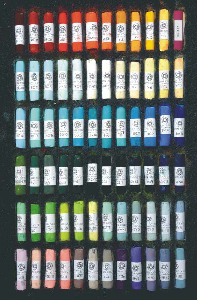
BE18 – RE11 – Red 6 – ADD15 – ADD14 – Orange 1 – Add 13 – Y2 – Y9 – ADD12 – Y11 – Red 15
BG10 – BG11 – BG5 – BG12 – BG6 – Light 1 – Grey 28 – Grey 26 – ADD7 – Y6 – Y5 – Y18
BG4 – OB7 – BG16 – BG15 – BG8 – BG14 – T2 (discontinued) – T3 (discontinued) – BG7 – BG2 – BV12 – BV18
GRN13 – GRN1 – ADD44 – Dark 8 – ADD43 – Grey 13 – CB2 – CB 1 – Grey 36 – ADD 49 – Dark 18 – ADD50
GRN22 – GRN26 – GRN27 – GRN29 – GRN28 – GRN36 – BGE7 – Grey 32 – Grey 3 – Grey 5 – Grey 11 – Grey 9
ADD5 – RE13 – RED12 – RED11 – ADD27 – ADD41 – ADD40 – ADD36 – BV5 – ADD34 – Grey 8 – Grey 33
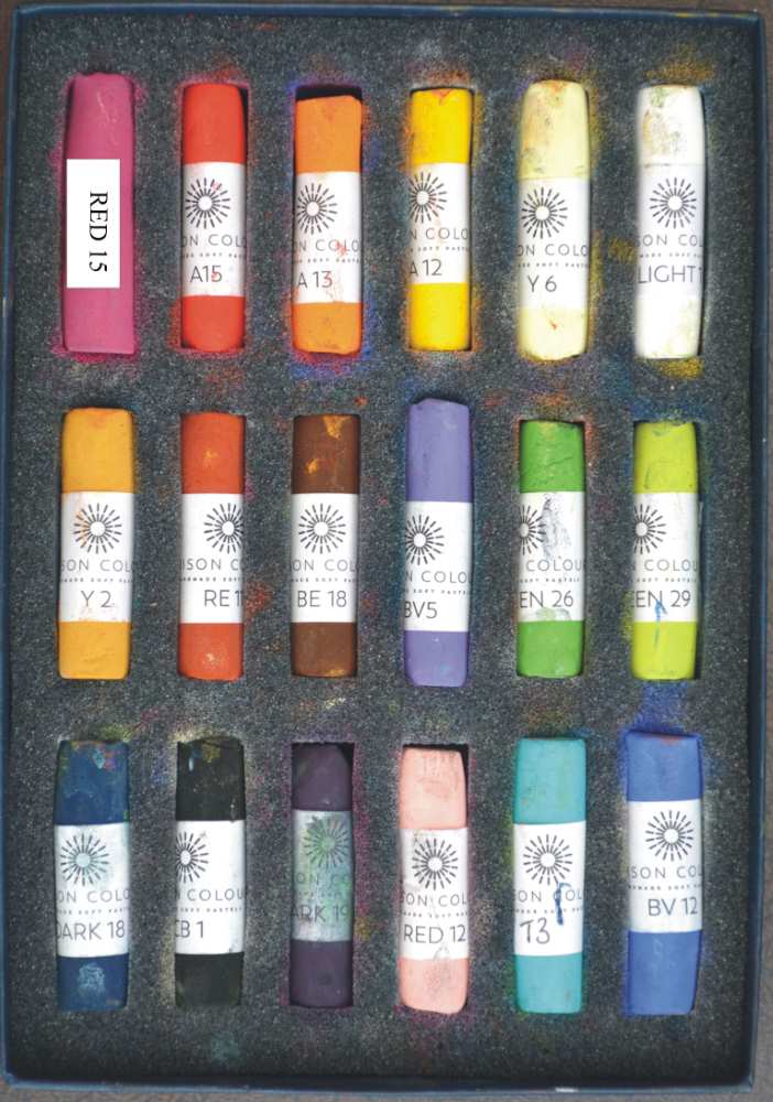
Red 15 – ADD15 – ADD13 – ADD12 – Y6 – Light 1
Y2 – RE11 – BE18 – BV5 – GRN26 – GRN29
Dark 18 – CB1 Dark 19 – Red 12 – T3 (discontinued) – BV12
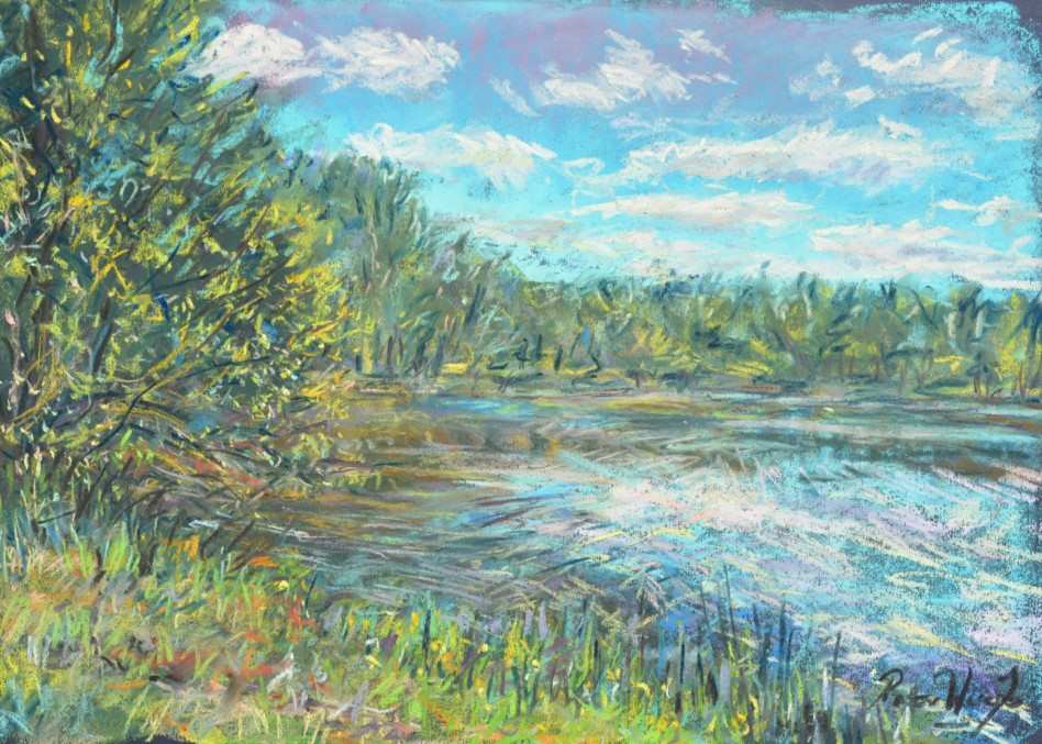
During this particular trip I painted two watercolours and four pastels during the trip, one directly afterwards. Many times I have painted whilst fishing and waiting for a bite. This was the case during the first week of this break, when visiting a lake near to Eguzon called Lac Pez Chauvet.
One hardly ever find these village commune lakes crowded and this one is a beautiful water surrounded by trees. Frogs croak coarsely in surrounding reeds, nightingales and golden oriels songs and calls can be heard echoing in the background. Carp are the main quarry and whilst waiting it is an ideal time to set up an easel and using Ingres paper, do a quick traditional block and blend painting of this tranquil scene.
This means doing a light loose outline composition and then blocking in all base colours, medium and dark tones and blending them well into the paper surface before working up the lighter colours into highlights, feathering and adding pure colour avoiding touching or making the colours “dirty” if at all possible.
Blending the colours or touching them stops the brilliance of light that reflects off pure colours, as can fixative, which I avoid using especially on my highlights.
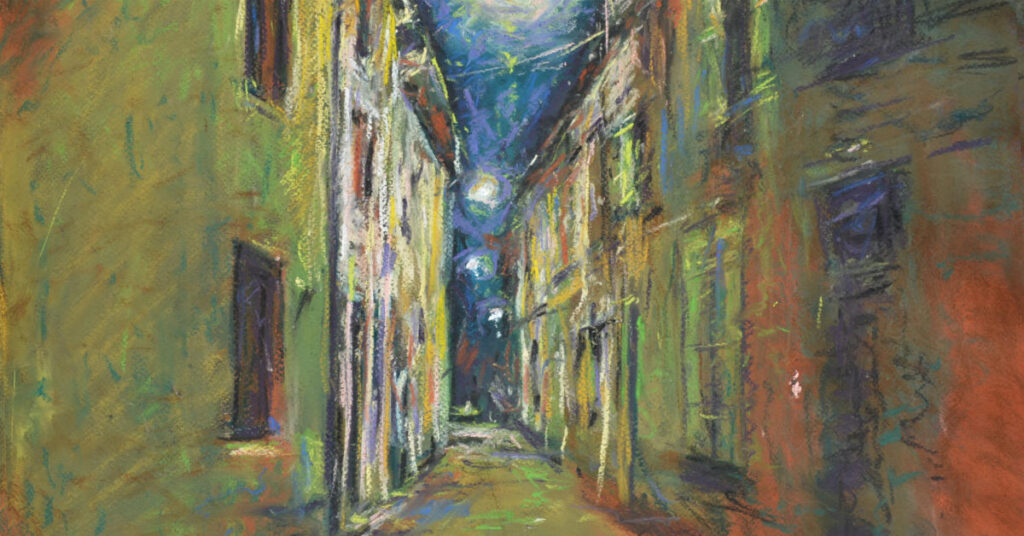
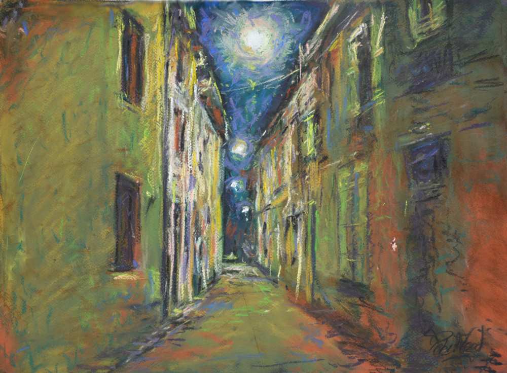
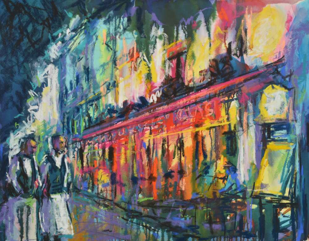
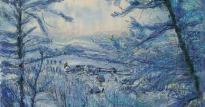
My next pastel in this article was, in fact, done just after the trip from a photo taken at night as we returned from a concert in Le Dorat. The light reflected down the narrow French streets reminding me of Van Goghs work! The whole process can be seen in detail on Night street Le Dorat…
I use black Canson paper and, again, the old English method of “blocking and blending”. My colours used are – BV5, Red 12 Y18, Light 1, Green 29, Y11, BV12, Y6, Y2, Green 13, RE11, Green 26, BG7, Dark 19, CB2, Dark 23, BE18
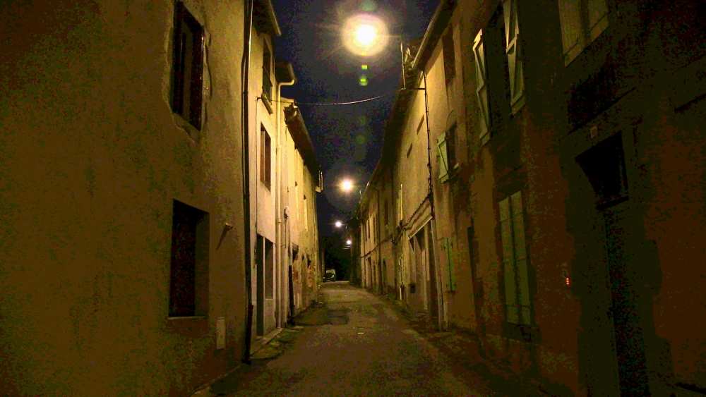
Note the single point perspective, yet due to the street being on a slight slope or hill, the windows and angles of each house will be different and not all go to a single point on the horizon. Check these with a ruler and you will see what I mean. The street and rooves go to one vanishing point but due to the buildings / floors being built on a level the doors and windows will not.
After lightly drawing out the composition with a light colour I start by using my mid tones and work from these down to my darks. Eventually returning to my mid tones and working up to my lighter tones and eventually highlights. It is a simple method I often use in my other mediums and subjects. Follow my film for a step by step demonstration.
The final painting…
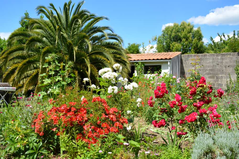
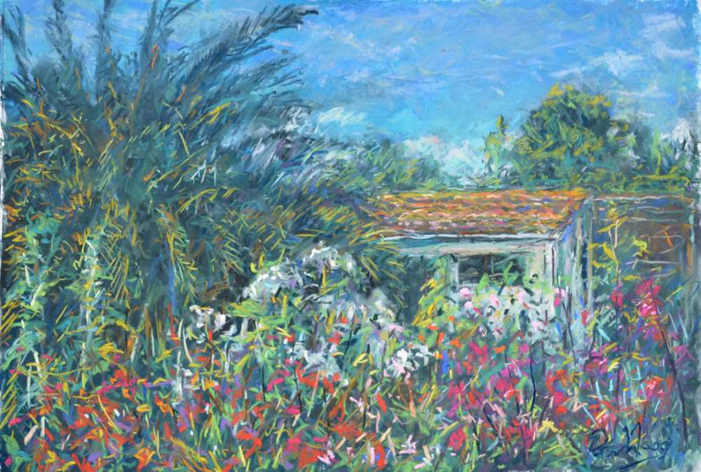
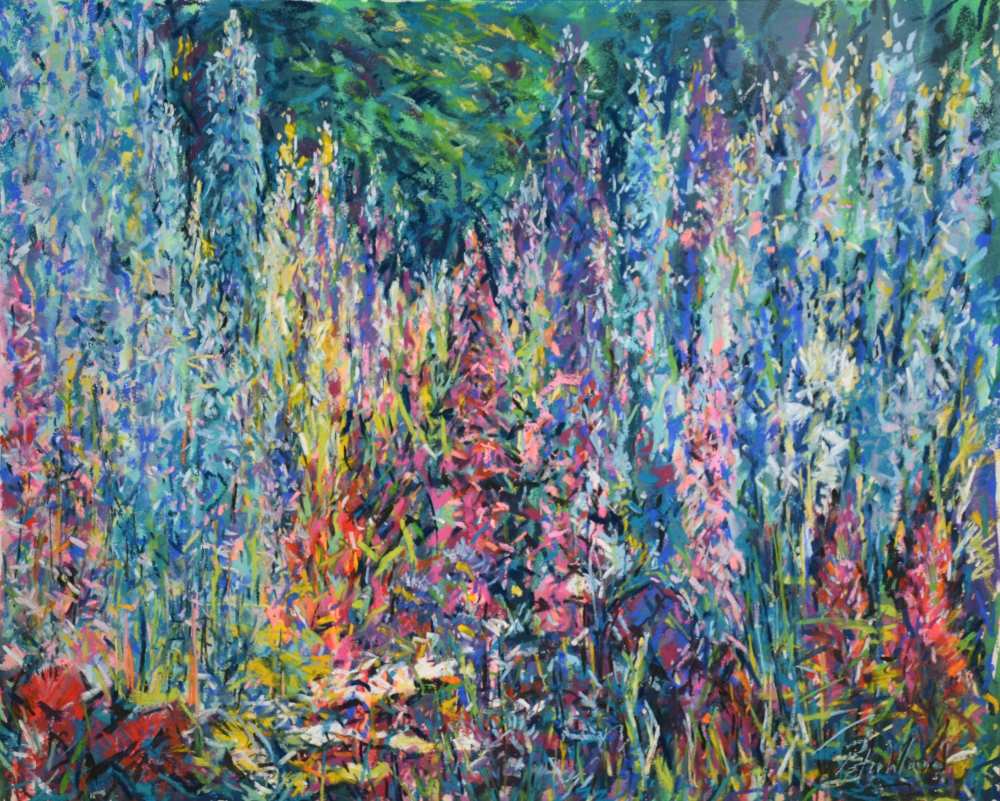
My next pastel painting in this trip is the delightful “potager” or kitchen garden of the Air B&B we were staying at. It was delightfully wild and random, with a lovely red tiled shed in the background. (By this time I had also painted two watercolours earlier).
The film will show you the painting of this picture en plein air. Pastel of a French flower garden in La Rochelle…
In this case I am using water and Unison Colour pastels onto 140 lb watercolour paper. I prefer a smooth or hot-pressed paper but this one is a “not” paper with a slight texture. Again, the film will discuss all of this and you will see the methods used.
One of the beauties of this way of working is that pastels mixed with or applied with water will dry “fixed” and so will take further coats of pastels without moving. As before, I work from my medium tones and underpainting, whilst blending with water, and then add my darks.
Once these are established, I continue outwards again from mid tones up to my highlights and details in both darks and then lightest colours. You may not believe that smooth watercolour paper will have enough “bite” to accept the pastels, but it certainly does, especially after the first coats of pastels using water.
It is a lovely fluid way to work and allows you to use some of the freedom of watercolour techniques with the primary coats and brushes with water. Even texturing these pastel coats using rake brushes, stippling, sponging etc…! Giving you a far more versatile start to your background, if wished?
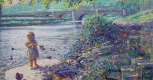
Finally in this series I came across a lovely view facing into the light as the sun set into the harbour entrance. It was also tucked away behind a building that offered me some privacy from both people and sea breeze. This time I decided to use watercolour paper again but 140 lb hot pressed, the smooth surface I was just writing about earlier.
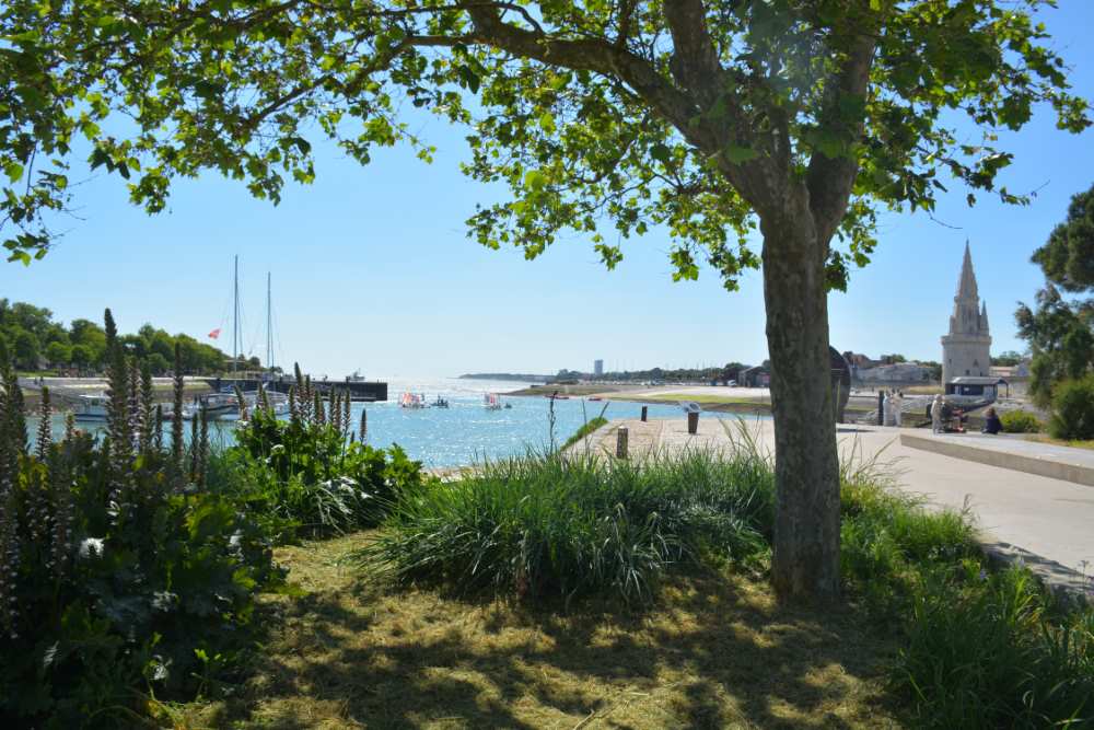
Once again, I was able to work very rapidly, firstly adding the pastel mid tones to the paper, mixing approximate colours before using a large oval mop with water to blend and fix these undercoats. Then working downward in tones towards my darks and then, as the water and pastels dried, able to add mid tones to lighter colours, details and highlights.
This method can only really be successful using quality soft pastels as cheaper harder ones will not mix well with water and also tend to tear the paper if at all damp! As the primary coats are fixed, using the water, it further negates the need for using fixative and less loose pastel dust may later drop onto mount edges etc.
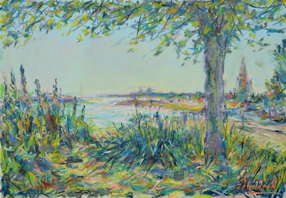
La Rochelle Harbour using water and Unison Colour soft pastels…
Further tips for working en plein air on holiday.
- You may cut foam board to the size you wish for a light drawing board, not only for paper size but a suitcase.
- If you have a stretched canvas that still has the collophane protection toughly across it, that can also act as a good lightweight board.
- Acrylic Inks can be a very good way to create a lovely loose but strong background for a final pastel. Allowing the inks to show through, just cutting into them works well. Examples below, both garden scene and street scene.
1 comment
Nigel Smith
Love Le Dorat painting. Literally just back from near Narbonne, French streets are just the best I find in terms of drawing inspiration from buildings. Nigel