
Now call me old fashioned, but with the radio on in the background, when I listened to a man boast about his ability to grab a woman by her genitalia on account of his celebrity status, going on to become the president of the United States, Orange 7 snapped into shards as my blood boiled.
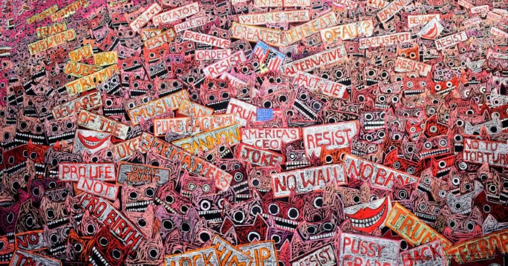
I wanted to communicate the revulsion I felt through the means I knew best. Women across the US were acting out their protests through mass knitting of wool pussy hats worn on protest marches, such innovation gave my own cardboard cutout cats emblematic of protest, ideas. They turned pink with rage!

The development of my ideas began the way I begin all projects…through intense research.
The press photo of our very own Nigel Farage, hailed by some as the “Father of Brexit”, lording it in the notoriously famous golden lift standing shoulder to shoulder with Trump, I considered dodgy. Months earlier the Vote Leave campaign had had a surprising win in the 2016 referendum – could there be a connection via the dark arts of cyber metrics using social media and voting manipulation? It was worth investigating.
Politically, both social and mainstream media were getting noisy. Summerhall, Edinburgh’s premier multi-arts venue with a reputation for catching the Zeitgeist and delivering often edgy, thought provoking work, offered me a vast wall space – more than 30 m2 – to turn black and pastel up.
My first port of call of course was Unison Colour. I imagined raised eyebrows and scorched fingers as they packed relentlessly hot colours, the temperature cooled only by a few disarming light reds for the pink wall. Words and slogans however were in a complementary electric blue Ocean Blue 2 with occasional blue green to calm areas with emphasis on the layers of crowds.
But there was one pastel from this order missing. My “punk pastel” Orange 7 that I had no idea had been discontinued. Disaster. I was not an Associate Artist back then and the deadline was too close to plead for its resurrection. But being the “shoutiest” pastel that made the most noise, it was the most needed – essential in fact. My long suffering husband Neville as always got on the case. He searched every art store across the UK for the last stocks of Orange 7 to be delivered with urgency to Summerhall.
For me it had the equivalent rarity value of lapis lazuli to a Renaissance artist.


By using the main thoroughfare that separated two massive wall areas I was able to use the space conceptually linking the one wall: “Pink Pussy Protest” (a satirical work paraphrasing Trump’s grotesque quote ) with the other “Protest Mask Project” representing the screaming mouths of protestors. Cascading down the walls throughout were carefully selected hashtag quotes and words relating to the not well understood but very controversial misuse of cybermetrics.

The walls were so successful with the public often using them for “selfie” backdrops that Robert McDowell, the founding director and owner of Summerhall, asked me to agree to leave the pastel installation as a permanent display and it has now become a dominant feature of the venue.

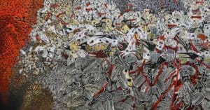
For or against Brexit, few can disagree that 2018/2019 was a year of chaos. (Has anything changed?) Once again the mood of the country disturbed me to the core and I felt compelled to act. This time Summerhall gave me an entire gallery to myself for their Edinburgh festival programme 2019, with a caveat, however, that no vast pastel painting could be left on walls this time. I believe Summerhall boss Robert, himself an artist, was feeling queasy at the idea that pastels of such quality would have to be washed away once my exhibition “Exit – 100 days of Khaos” was over.
As the pitch of media noise reached frenzied hysteria and emotions across the nation peaked, I imagined this ultimate EXIT, as a metaphorical fleeing of humanity in all of its guises, hurtling like lemmings towards a precipice.

Charting the first 100 day countdown to the supposed day of exit, December 19 2018 to March 29 2019, I created an exhibition that comprised works in various media, drawings, printmaking, maquettes, theatrical masks, sound and superb animations of my images by the talented Canadian animator Georges Eloi Thibault.
I found plywood to be the perfect support for the central piece. The grain of the wood provided the tooth I craved for. By piecing together 4 mm thick plywood panels each 180 x 60 cm, and painting in black gesso, the result filled an entire wall with an enormous pastel frieze 700 x 180 metres.
It was a relief to move away from the hot prismatic colours, this time through a range of chromatic greys mostly interspersed with striking red diagonals. I returned to the same hot colours of the earlier murals in the last two panels which happened to link the work on the other part of the building. Conceptually the screaming heads of 2017 meet and collide falling into the abyss with the fleeing crowd of 2019.


As I use no fixative, aiming always to maintain maximum pigment saturation and luminosity, transporting the work from my studio to Edinburgh was a delicate task. As well as being the Orange 7 huntsman, Neville created a tiered structure so each slim panel could be stacked and safely transported on wheels.
Once fixed on to the wall in situ using panel pins surprisingly little touching up was necessary.


Now that I am an Associate Artist with Unison Colour, and still in awe of some of the fine pastellists out there, I have decided to behave! I’m waiting with bated breath for the arrival of a full set of Unison Colour pastels and plan to dedicate some time for study and development, continuing to work in an experimental way focusing primarily on colour theory using my studio as a laboratory.
I hope to be able to share the results with anyone who might be interested.
Installing the pastel panel mural at Summerhall, July 2019
janefrere.info/video-links A short film about life in a Highland studio and the making of Exit- 100 Days of Khaos (17 minutes)


25 comments
Henrietta Paine
Dear Jane
Your work is hugely inspiring. The size speaks volumes and I notice that your mark making is in part gestural, but also quite emotional and staccato. Could you say more about this please?
I was also struck with what you said about breaking out of the mould of pastel artist. This work makes me want to buy some of these pastels and really play with them. I am primarily an oil painter and often draw with the paint. It is interesting how the oil tradition has broken out of the constraints of the realistic but less so the pastel. So it is wonderful snd very inspiring to see this happening with your work. I know that Paula Rego also used primarily pastel now for her work. I’m not sure if this is oil or chalk pastel.
Many thanks for sharing your journey.
Henrietta
http://www.henriettapainefineart.com
Jane Frere
Hi Henrietta,
Thank you, you raise some great points and perhaps you have really hit on something by mentioning gestural marks. Marks that reveal the emotion within a work.
There’s a great quote by De Kooning on gestural mark making
‘I paint this way because I can keep putting more and more things into it – drama, anger, pain, love – through your eyes it again becomes an emotion or an idea.’
I think an artwork is about that interaction he suggests, a dialogue of sorts between the work of art and the viewer.
There are pastel works that are so finely crafted, colours and tones synchronized and balanced to perfection. The image photographically reproduced, holds the attention of the viewer for its virtuosity alone, but personally I find is emotionally or spiritually flat. To paraphrase De Kooning while I recognize the craftsmanship behind the work, I feel little emotionally and so the ideas get lost.
Iv always been struck by the idea the heart “thinks” first then the brain! My aim in the larger works is touch emotion, even if it results in a negative response, its a response, hopefully followed by questioning and at best further thought.
I mostly work from sketches and my head. I worry that working from photographs will tighten my mark making, restrain my imagination, might prevent me from going Off-piste. Its nonsense of course because it depends how one uses the photographic reference, but I do have a tendency towards tight drawing .The sheer physicality of working on an expansive surface makes tight mark making almost impossible. Thus liberating.
Iv decided to “behave” now. No more walls anyway. Going far smaller for starters and yes! the greatest challenge of all is how to keep the drawing or painting loose.
I love the way you draw with paint, you use your “paint” brushes as you would a piece of charcoal or indeed a stick of pastel. On your landscapes you ensure the brush marks are there giving direction and energy, revealing the mood of place and of the day. What is great about pastels, they combine both drawing and painting, certainly more of a drawing medium when artists use pastel pencils which give detail and more control.
Maybe its about reliquishing control.
I think there seems to be a conservative element within the pastel genre, especially compared to those working in oils. Acrylics perhaps because they are so versatile, basically its a plastic glue with pigment in it, has expanded across all realms of art. Pastels have the impression of being delicate, do need to be glazed really, but prior to being captured behind glass can go everywhere, very ” off-piste” !
Sue Thurlow
Hi Jane
I was fascinated by your recent Part 1 of The Pastel is Mightier than the Sword – it came into my inbox with great serendipity as I was mulling over some ideas for my final OU assignment about ‘linguistic creativity’. As I am a (very amateur!) pastel artist myself I was really interested by your use of colour, images and text to produce a protest wall. So, decision made, can I have your permission to attach the blog reference to my final essay? I’m now very excited about writing it, where I was a bit lost before! Many thanks!
Sue
Jane Frere
Ammendment “what makes a painting successful”? @juliefreeman
Jane Frere
Hi Sue, what a wondeful response to my blog. It’s funny because I was just reading Unison Associate Artist @juliefreeman 4th May blog, what makes an artwork successful? Julie is very kind and gives artists plenty of options to give themselves a pat on the back, but I couldn’t decide on one of them. However, your request I think is a mark of success for me. Thank you. I would be delighted for you to use my blog re quotes, link or anything and if you want to take it further and ask questions I would be happy to answer here.
John Sutherland
Love the scale & impact of your work and am really inspired to ‘go large’. But for now, I only have a comparatively small collection of 43 Unison pastels – my first 27 of which, by the way, came from that very same presentation case when it was still at the art shop in Inverness! Look forward to hearing more from your colour theory explorations.
Jane Frere
Hi John,
That’s amazing! I love that, what a small world, I loved Artmedia, it was a little refuge on a Highland dreicht day, are you near by then ?
Actually although the works are big I didnt use that many colours and not that many pastels either. I think because I drew with the pastels instead of painting and blending. The lines take up less pastel than working in a painterly way on textured surfaces. Something Im learning and oddly I cant bare to waste a spec of dust any more.
Im forming a sketchbook with colour studies and from time to time I post up the odd image or observation on FB. I will see how it goes. It might work as an on line workshop. If one has the patience I think taking time to study colour theory is useful for all art / design pracitioners. Primarily it saves on muddy or dull paintings. Even pastels can sink, or get muddy.
I am starting to look at surface colours differently, they have abreviated letters and numbers attached!
Going big can be wonderfully liberating, even if its several pieces of paper pinned to a wall, and a few pastels, there’s something wondrous about scale.
John Sutherland
Yes Jane, I’m in Inverness, on the road leading out of town towards Loch Ness.
I’m also more inclined towards drawing, though with pencils (charcoal, watercolour, pastel, etc.); still learning & experimenting.
Love that final description you gave for scale: “something wondrous”!
Jane Frere
Great John,
I wonder when the weather permits, would you like to come out, see the old Art media box in the studio and have a cuppa in the garden Inverness side of Drum!!
John Sutherland
Oh Jane, that sounds lovely! Covid restrictions about to be lifted I believe … but maybe wait a bit yet for that spell of good weather as you said! Regards, John
Fiona Carvell
Such powerful and thought provoking work Jane. Thankyou so much for your detailed and fascinating blog posts.
Your energy is incredible and your work reflects such depth of emotion- Thankyou for visualising and sharing what so many feel but cannot express.
It was after reading your blog posts that I noticed you are in Drumnadrochit.
A very dear friend of mine lived there and sadly passed away last year. I visited a few times over the past 6 years. A magical place and I hope to return.
As a fellow Associate Artist I love seeing your approach to using pastel. Wonderfully liberating.
Best wishes
Jane Frere
Hi Fiona,
Thank you for your kind thoughts and comments. Its so reassuring coming from pastelists because I often feel out of my depth. As with all forms of art practise there are so many techniques to master with pastels which comes from years working with the medium. Going from a wall to small scale work I find particularly tricky. Im not sure of my style yet, what style or way of working to adopt.
To get serious I decided create a new project and obtain the full Unisoncolour set. I am studying the unison palette in relation to colour theory. Its actually fascinating and challenging. I am limited to the full 380 colours unless I blend, however by blending how much luminosity or inherent colour is lost? Years ago I used to teach colour theory to BA costume design students at the Arts institute Bournemouth, We used gouache ! Im sorry to hear about your friend, if ever you are up this way, please call in
Jackie Goodwin
That was so interesting and insightful. Thank you Jane for sharing your thought processes and your own way of working. I think your work is visually stunning and very thought-provoking – it’s obvious that you put your whole self into each work. (I am also very jealous of your studio.)
Jane Frere
Thanks Jackie, I do love my studio too! Its in the house and used to be “best room”, my parents bedroom! needless to say interiors change over time. There is one problem. South facing windows. I need to get blinds up to diffuse sunlight otherwise its the only time the sun becomes a nusance!
Henry Knowles
This is superb, the artwork and the background detail. I hope to get down to Summerhall soon, now that things are opening up again. You say that you have decided to behave but I trust this will only be a temporary state of affairs. I am rather fond of misbehaviour when it produces powerful messages and high quality art like this.
Jane Frere
Thank you Henry,
You may get to Summerhall before me! I hope you wont be too dissapointed by the smudging. Periodically I repair !
There are notices up warning people not to get too close i.e shoulder height, otherwise the “punk pastel” Orange 7, or some of the portrait pinks might end up on a Gautier jacket or whatever! During the riotous festival days, there was a bit of audience participation, purposeful smearing! I accepted that unless covered there would be damage but felt it added to the noise and anarchy. However its been suggested that I should “repair” again.
When I do repair Im inevitably tempted to update. The last time in 2019 I added “Boris Johnson \ Crowned King\ July 23rd !” Not sure what I might change next time. I quite like the idea that the walls remain in a state of flux. Thats the difference once glazed, no more meddling!
Henry Knowles
Last week I finally managed to get over to Summerhall to see your paintings “in the flesh” and can report that they’re still fresh and vibrant with only minor smudging. Standing next them in the space increases their impact and I loved the experience. Sadly the selfie protest masks had been placed out of reach but I will just have to go back again. I was tempted to add “The King Abdicates” but I might have been turfed out on my ear. (I left my Jean Paul Gaultier jacket at home.)
Jane Frere
Oh that’s wonderful news, so glad they are still looking fresh, well! @unisoncolour that just shows how steadfast and tough they are. Used on a wall and unless brushed against, secure . Yes! I have thought about the King has abdicated, could be he lied and thus The King abdicated. Iv not been down, but should visit and do a bit of repair soon. Thanku for that.
cory Goulet
I loved this, love the work, such interesting work / approach to this issue (understatement I know), the message and Bravo to you for putting it all out there. This video was great – putting it all together. Thank you for sharing. How are you preserving all of this?
While I am in US, we have our own issues…………………….. Hubs is from England, so we were following the Brexit crisis. Thanks again!
Jane Frere
Thank you Cory, some of your issues across the pond are relatively resolved I think for the moment anyway, and as for Brexit, its all become a blur mixed in with Covid restrictions. It will take years before we really understand the repercussions one way or another.
The works responded to a period in our history, I tried to capture the mood if nothing else, interesting how issues become history very quickly. The artist is useful perhaps acting as a chronicler, just in case we forget the source of evolving problems!
Ali Burns
Love your work Jane! I live on the edge of Edinburgh and love it when I can make time to visit Summerhall – great venue. I have a growing collection of Unison Pastels – so lush! And its really lovely to hear about and see other artists working with them.
Jane Frere
Oh wonderful Ali, and so you actually go there. I do miss Summerhall, hopefully now things are opening up, will get back soon. I’m working with all 380 unisoncolour pastels now on a serious and very disciplined colour theory exploration, I may turn it into a course one day. In truth I’m taking a reverential approach to the medium. No more ladders!!!!!😁
Roger Holmes
Wonderful work and a very unusual way of doing it.
Very brave to do something on this scale in pastels, transport it and install it without anything protecting it. All it needed was someone to walk past it too close and hey presto! your statement could have become a huge smear.
Bravo.
Jane Frere
Thank you, the panels were roped off but hanging was lethal! And actually when the panels were all ready to go, the cats thought it was just another box and so….. The walls do get smudged on the lower part, so are smudged, it’s a form of graffiti, a kind of audience interaction.
However I’m all for glass now, only I can’t do massive any more, I mean the cost of all that glass!!!
Белянская Наталья
Колоссальный труд Джейн! Я восхищаюсь прогрессивными взглядами, вернее сказать философской реакцией на современный мир, на глобальные события, происходящие в мире. Наша страна претерпела множество событий, революции, войны, гонения, трансформации Советского Союза. Объединение различных республик, затем их распад, когда закончилась власть одной партии, все это было, и непонятно, что лучше, что хуже, союз или самостоятельность. Главное, чтобы народ не бедствовал. Вот что важно на мой взгляд