I’m often asked how I create a mood in my landscape paintings. Sometimes it’s simply about leaning into the atmosphere of a place. Sometimes it happens with the way I utilize edges, soft vs. hard, to create different types of light and places where one can fall into a soft spot or bump up against a big contrast in the painting.
But one of the most creative and exciting things I consider in the making of every painting is my choice of color palette. It is all well and good and sometimes the perfect choice to work within the bounds of “local” color, that is, the color we see in front of us while working en plein air or in the photos we choose to use for reference in our studio practices. Perhaps the sky is grey, or the grass is green, or the leaves are gold and orange, against the crisp blue of a sunny autumn afternoon. But, if I really want to emphasize a certain mood or atmosphere, I can exaggerate to get my point across by pushing the boundaries of my color palette, whether in bold ways or subtle ways.
Color choices can be determined using their relationships on the color wheel, for example, one can choose to work with complimentary colors, analogous colors, monochromatic color, or even within a color temperature range. The key is understanding that certain color groupings can create a psychological effect of their own.
Analogous colors tend to be harmonious within their variations, monochromatic palettes are dramatic, complimentary colors can create vibration within shared values or can neutralize each other to create soft “colored” greys.
Color can also have symbolic or cultural meaning. Your choice of color palette plays a very important role in setting the stage for the way someone interprets your work. It is often what attracts a viewer immediately from across a room, and it can also be the initial introduction to the overall “feel” of a painting.
Composition can attract us by way of a carefully crafted path into and around the elements of a painting. But color is the emotional driver of a painting. It allows the viewer to “feel” the scene, even before one begins to explore its nuances. The artist can set out to create something bold or subtle, jarring or soft, familiar or uncomfortable, all by the color choices that are made.
Cultural clues and symbolic clues come into play, as well; for example, death can be represented by either black or white, depending on your cultural leaning. Violet is often thought to be regal. Red can be symbolic of anger or blood or fire, blue is often thought to be representative of something calm or cool.
When I paint, part of my initial process is to determine the mood or feeling I want to convey before I begin building the painting. By editing, rearranging, composing, even determining where to place the horizon line I can direct my viewer to have the experience of seeing this landscape the way I want them to see it.
Next, but certainly no less important, is choosing a color palette. To be effective, it must help to convey the overall feeling I wish to create. For example, if I wanted to create a painting that felt like a dry, hot day in the desert, I might not feel that the local color was enough to really make someone feel that heat. I may choose an analogous palette of warm, bold colors, keeping away from the blues of the daytime sky or the cool sage green of the saguaro cactuses. I may instead choose to use only bold, warm colors ranging from yellow to orange to red to red-violet. Pushing the envelope and creating something warmer than what I see might be exactly what allows the viewer to feel the heat of the place.
Now imagine that I want to create a scene that is calm and cool, perhaps a summer morning at the beach before the sun has gotten too hot, early enough for a walk with a breeze. If I want to create this feeling, it will be important to keep my palette in a range of cool colors that don’t lean too far toward the red-violets or warm tans of the sand or the oranges of the sunrise. Even if there is a red ball of sun coming up with yellow and violet clouds on the horizon, I will need to cool those colors down to get the effect I want. I will have to “weigh” the amounts of various colors and determine which should dominate and which should be subordinate, mindful of proportions and amounts of color.
I have to remind myself that sometimes, a bit of exaggeration and drama is exactly what I need to get my point across. Sometimes, it will be just the opposite.
Let’s look at some examples:
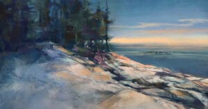
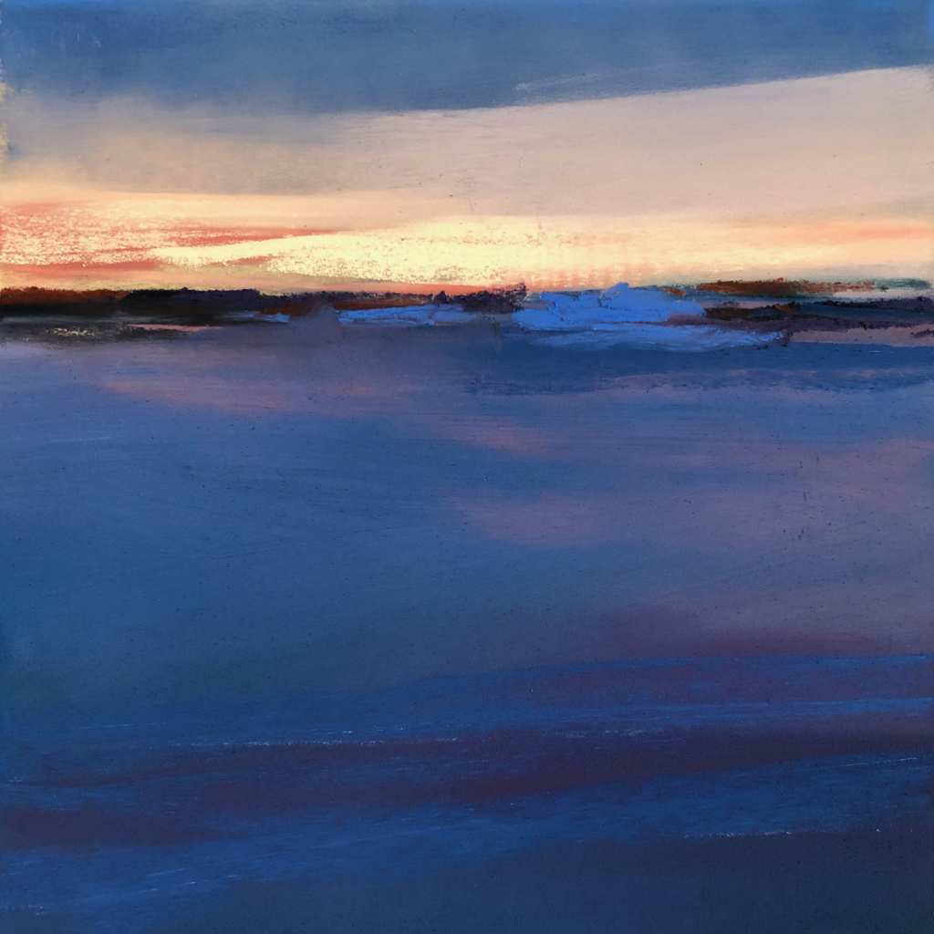
In this small painting called “Chill in the Air”, I wanted the feel of a cold winter night. There is a lot of blue, naturally, but what about orange? If you look closely, I’ve utilized cool versions of orange, and I’ve limited the amount of them so that the primary colors of the painting are deep, cool blues. In middle layer of the sky, I’ve pulled blue over orange to create a very light swath of “neutral” grey. In this case, the drama comes from the proportion of blue vs. the proportion of orange, as well as from the proportion of dark vs. light values.
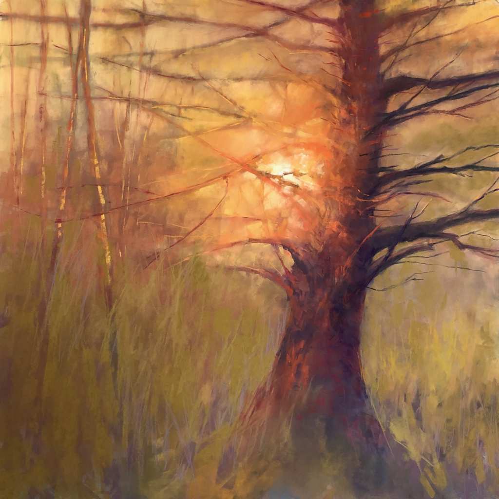
In “She Won’t Give Up Her Secrets”, I’ve done the opposite and warmed up the scene significantly by relying on a warm color palette and pushing the warmth till it felt significant to me. I wanted the glow of the sun to light up the tree, eclipsing the intricacy of the branches so that the warmth and light were of utmost importance. I wanted them to create a bit of mystery by blurring the edges of the branches, as if I was looking into the sun and I couldn’t really see exactly what I was looking at.
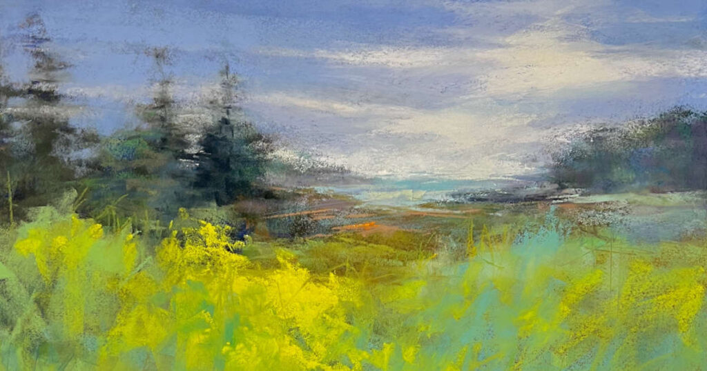
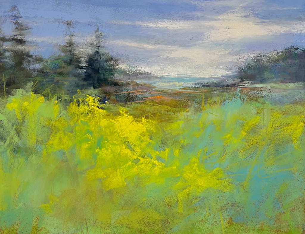
In “Summer”, I wanted the day to feel fresh, as if spring was ending and summer was just beginning, that time between new growth and the sort of crazy, bright growth that happens with rain and warm sun. So, I chose what is basically a local color palette, but emphasized the greens and yellows, creating more space for those than any other colors. By utilizing a blue sky and bits of turquoise, I kept the painting firmly within the range of an analogous palette, but with the range of colors stretching from a cooler orange, to yellow, to green, to blue to blue-green. It reads as somewhat cool but leans toward just a hint of warmth.
So often, our experiences with color are limited to what we see, or what we “like”, or what we know “works” in a scene. We tend not to consider the emotional currency of color and we don’t always give ourselves permission to experiment or play outside of the box.
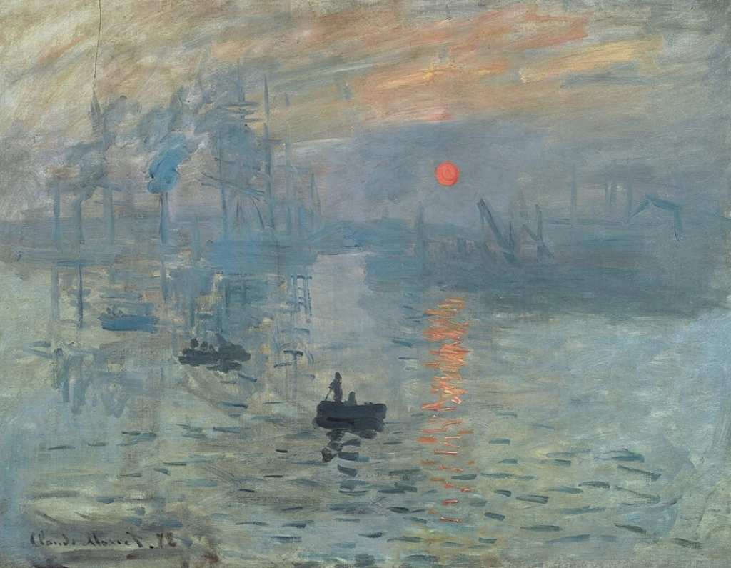
Explore some of the paintings you are drawn to, regardless of medium, and ask yourself how much the artist’s use of color pulls you into the experience? Look at artists like O’Keeffe, Van Gogh and Monet. Consider the atmospheric effectiveness of Monet’s Impression Sunrise and note the way he uses so many variations of cool blues, paired with a very limited amount of their complement, a cool, but intense, orange to pull your eye toward that early morning ball of sun but to also keep you feeling the relative temperature of the morning. Was this exactly what he saw? Not likely, but it effectively conveys what he might have felt in this place.
Look at Joan Eardly’s work and note the difference in mood between the paintings she created at Catterline, where she lived on the Scottish coast surrounded by the sea and open air, and the paintings she creates of the tenements in the gritty city of Glasgow. Color plays a big role in the mood of her paintings, especially when paired with her expressive mark-making.
Joan Eardley, A Glasgow Tenement, 1959-62 (View at link due to copyright)
Joan Eardley, Summer Grasses and Barley on the Clifftop, 1962 (View at link due to copyright)
Note the way O’Keefe uses neutrals in Storm Cloud, St. George, and the way she uses an intensely warm, dramatic analogous palette in Red Hills and Bones. She evokes equally strong emotions in both, but with different results due to her choices of color.
Georgia O’Keeffe, Storm Cloud, Lake George, 1923 (View at link due to copyright)
Georgia O’Keeffe, Red Hills and Bones, 1941 (View at link due to copyright)
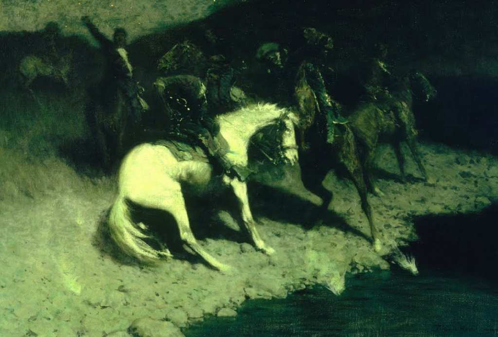
Look at Frederic Remington’s frequent use of an unearthly green in his nocturnes. We are brought into a mysterious night time world that holds us captive with chilling color under the moonlight.
We can make use of color in so many ways and, if used well, it can open up whole new emotional worlds for our subject matter. I hope you’ll experiment with varying your color palette and finding ways to emphasize mood or intent or temperature with color. It can make the difference between an average painting and one that stands out on a gallery wall. Your choice of color palette can be what allows you, as an artist, to make a deeper connection with the people who view and collect your work. Color can be a catalyst to truly extraordinary paintings.