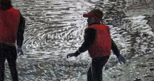
See finished image here;
www.henryfalzon.com/product-page/villa-frere-from-the-ashes (link now expired)
Few things in life are more innate than colour – from birth to death, colour is a tremendous driving force in mankind. As a person with dyslexic traits, I value colours even more I guess then, say, mathematically biased brains. In science, colour is a bunch of excited photon particles (or waves) travelling from a source (example the Sun), bouncing off an object (example a red pastel stick) and some of the light is reflected off into the viewer’s eye. The red pastel stick absorbs all the colours of the spectrum except for red which is not absorbed, thus bounces off. The spectrum of colour is basically the colours of the rainbow – naively grouped as seven colours.
That’s all there is – seven colours. Like music has seven notes, the artist has to compose and orchestrate with these seven colours to create a myriad for images and emotions.
Studying colour and its infinite implications is a vast life-long undertaking for some, and paradoxically, others do not really see more then Richard Of York Gave Battle In Vane.
A challenge for artists is grouping colours into aspects or parameters such as: tints and shades, hues, greys, saturation, temperature, earths… and the list goes on. Colour theory is a fascinating and useful subject and a good reference book that bridges theory with colour practical use could be, amongst others, Simon Jennings – Artist’s Colour Manual.

Colour Temperature
From my personal take, colour temperature is one of the most important and primordial aspects of colour. Even to anyone who never travelled, an image of the red rusty Australian soil gives you an instant impression of heat, and the turquoise of a Greenland iceberg screen saver picture, sends cold shivers down your spine. In simplified form red, oranges and yellows are warm while green, blue and purples are cold. This implies that warm colours should be used for sunlit areas and cold colours should be used for shadows. For advanced uses this notion is in fact a bit of a formulatic trap and in reality shadows can and often need to have warm nuances. Likewise lit areas too need a cooling element. If there is a master in this it has to be Spanish artist Sorolla.
On a personal level I am no master and do not claim to be anything close. I like to study about it, observe it, test and learn from things that I sense went off track. To the pastel artist who is offered with a range of say 200 colours, picking up the right stick is difficult. It is so easy to grab any shade only to be horrified with the colour deposited on the paper. I would like to think that every stick I pick up has to be a strategic and conscious decision (do not worry I often wreck drawings with my assumptions) – but it’s not always the case.
One more critical area in colour study is what I call ‘Colour Influence’ – how colours sitting side-by-side seems to alter each other’s appearance. This becomes very evident to the pastel artists when applying pastels onto coloured papers. The shade deposited looks rather different to the stick at hand. The surrounding coloured ground shifts the hue of the applied colour. I cannot offer more views of this as it is still a journey I’m making in colour. I hope to have given you a slightly different perspective on colour usage and that you’re inspired like me to keep learning on those precious seven colours.
Cheers and enjoy the medium.