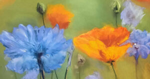
The Pastel Society Open Exhibition is one of the most eagerly anticipated events in the colourful world of pastels each year. Held in the grandest of locations (the Mall Galleries, London) in January, it showcases some of the best contemporary pastel artworks and artists in the world.
There is a real buzz of excitement close to the end of each year, when artists, across the pastel community, find out if their best submitted works have been chosen for the show. There are two ways to have pieces included in the show. Firstly, as a non-member, you can enter your work for juried selection. Competition for the limited number of spaces is fierce, the standard of work selected is very high and usually less than 10% of works put forward make it to the exhibition. Secondly, as a member, you are entitled to show up to 6 works at the exhibition. However, it needs to be added that the process to become a Pastel Society member takes a number of years of consistently having multiple works juried in to the non-member element of the show and then getting through a tough selection process.
The Pastel Society traces its origins to 1870 when the Société de Pastelists was founded in Paris. However, after this ended in 1891, the Pastel Society, as we know it, was formed in 1898. Annual exhibitions began in 1899 and, unlike many societies, continued through the Second World War. At the heart of the current Pastel Society’s ethos is: “Membership of The Society will be granted through a strict assessment of technical skill, originality, innovation, enthusiasm and a willingness to promote the objectives and activities of the Society”.
The theme of the 2026 exhibition, the 127th in the Pastel Society history, was “Direct Touch’, focussing on the immediate, tactile connection between the artist’s hand, the dry media (pastel, charcoal, crayon) and the paper.
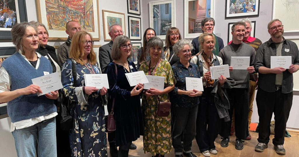
Unison Colour is proud to be a sponsor of the Pastel Society Open Exhibition and to be associated with such a joyous celebration of the medium of pastel. We sponsor 3 prizes – the Unison Colour Members Award, the Unison Colour Non-Members Award and the Unison Colour Young Artist Award. In addition, we are thrilled that a good number of our Associate Artists (both members and non-members) had works on display this year.
We asked our featured Associate Artists to tell us a little about their pieces that were included.
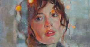
Michele Ashby PS
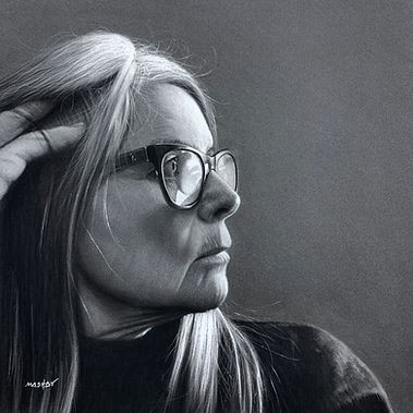
Multi-award winning Pastel Society member, Michele, started her art career as a graphic designer and is now particularly known for her stunning portraiture. Indeed, her recent work “Get a Dog They Said” was an award winner with the British Art Prize 2025. Michele said that she was stunned to see it displayed on the large London billboards. One of a number of her pieces displayed at the Pastel Society show – Michele has chosen to describe “Transfigure”.
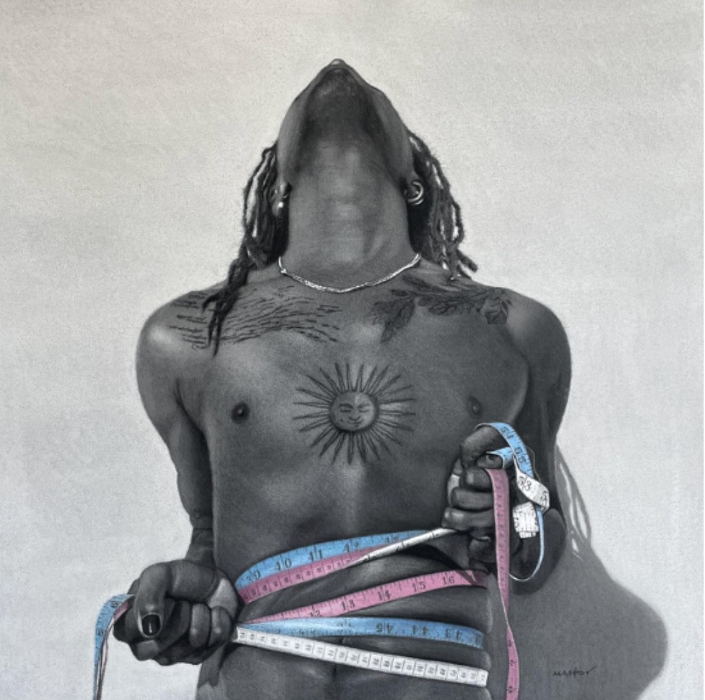
Michele – “In Transfigure, body dysmorphia sits at the very centre of the image. It’s in the tension of the pose, in the way the tape measures are pulled too tight, the grip clearly visible in the clenched hands. It is also evident in the despairing backward tilt of the head — a visceral physical response to an internal clash. Body dysmorphia isn’t simply about disliking one’s appearance; it’s about living in a body that feels foreign, untrustworthy, or painfully out of sync with the self.
For many trans people, this disconnect can be relentless. The body becoming something to negotiate with daily, something to monitor, assess, measure, and re-measure. Numbers take on an outsized power. They promise certainty, yet they can so often deepen distress. In Transfigure, the tape measures don’t offer clarity or resolution — instead, they amplify the suffocating feeling of being trapped, shackled by the results they reveal – failing to reflect the person within.
Tape measures are ordinary, familiar objects, especially in the context of clothing and fitting in. Here, though, they become something else entirely. They bind rather than measure, accuse rather than inform. They represent a world that insists on quantifying bodies, reducing complex human experience to numbers that feel cold, rigid, and unforgiving.
The repetition of the tape measures relates to obsession and compulsion, a circle that is hard to break. One measurement is never enough, because the hope is always that the next reading will somehow be different, kinder, more acceptable.
When dysmorphia takes hold the world can lose colour and nuance, becoming reduced to singular fixations and internal noise, I wanted the near monochrome palette to reinforce this emotional narrowing. Against these muted tones, the coloured tape measures stand out boldly, symbolic of the Trans flag. The focal point of the artwork showing how issues of gender, identity, and bodily expectation can dominate thought, even when everything else fades into the background.
Transfigure doesn’t offer answers or comfort in a conventional sense, it bears witness by making the struggle visible inviting empathy rather than judgement. I see you, I hear you – acknowledging the quiet often unseen and unheard suffering that comes with such a complex subject particularly within the Trans community. Instead, it bears witness and asks the viewer to consider how deeply identity and body are entwined — and how painful it can be when the two feel diametrically opposed to one another.”
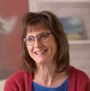
Fiona Jane Carvell PS
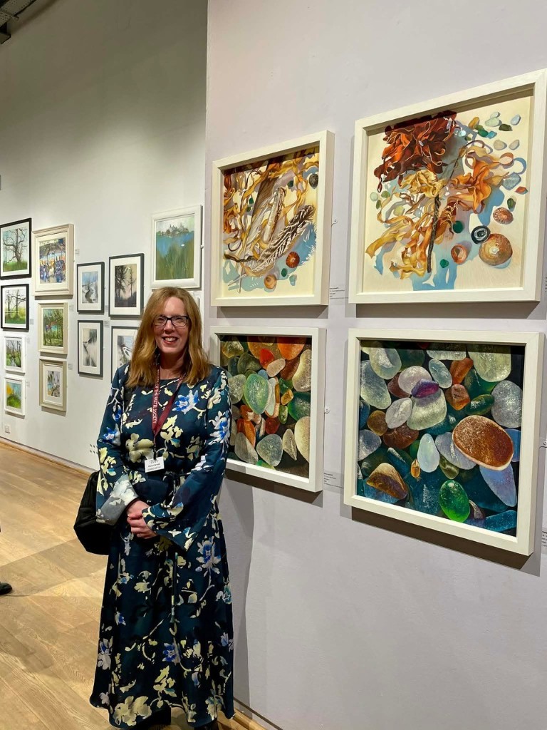
Fiona was elected to the Pastel Society last year. Accomplished in a range of subject matter she has recently attracted much attention for her still life work featuring both items found on the beach and sea glass. Indeed, at this year’s exhibition, her piece “Found Beachcombing 3” won the Unison Colour Member’s award (but more of that later).
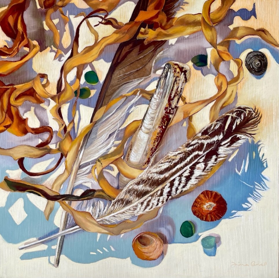
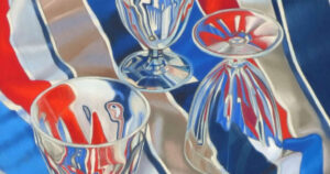
Fiona – “This piece is a continuation of my Found Beachcombing series, featuring objects I have found on the beaches of the North East UK. I collect all sorts of things, often without knowing why I am drawn to them other than a fascination with shape, pattern or colour. Feathers have been included here quite consciously however, to represent fellow ‘beachcombers’, whose pickings are somewhat more essential to survival than mine.
The numbers of many sea birds are in decline as a consequence of falling fish stocks and changes in sea temperature. They are in themselves, creatures to be treasured and just some of the many animals affected by our impact upon the planet.”
Katy Bailey
Katy is an accomplished and award-winning landscape painter who has exhibited regularly at the Pastel Society and also won the “West Design Award” in 2025. She reaching the final stages of the process for Pastel Society selection this year.
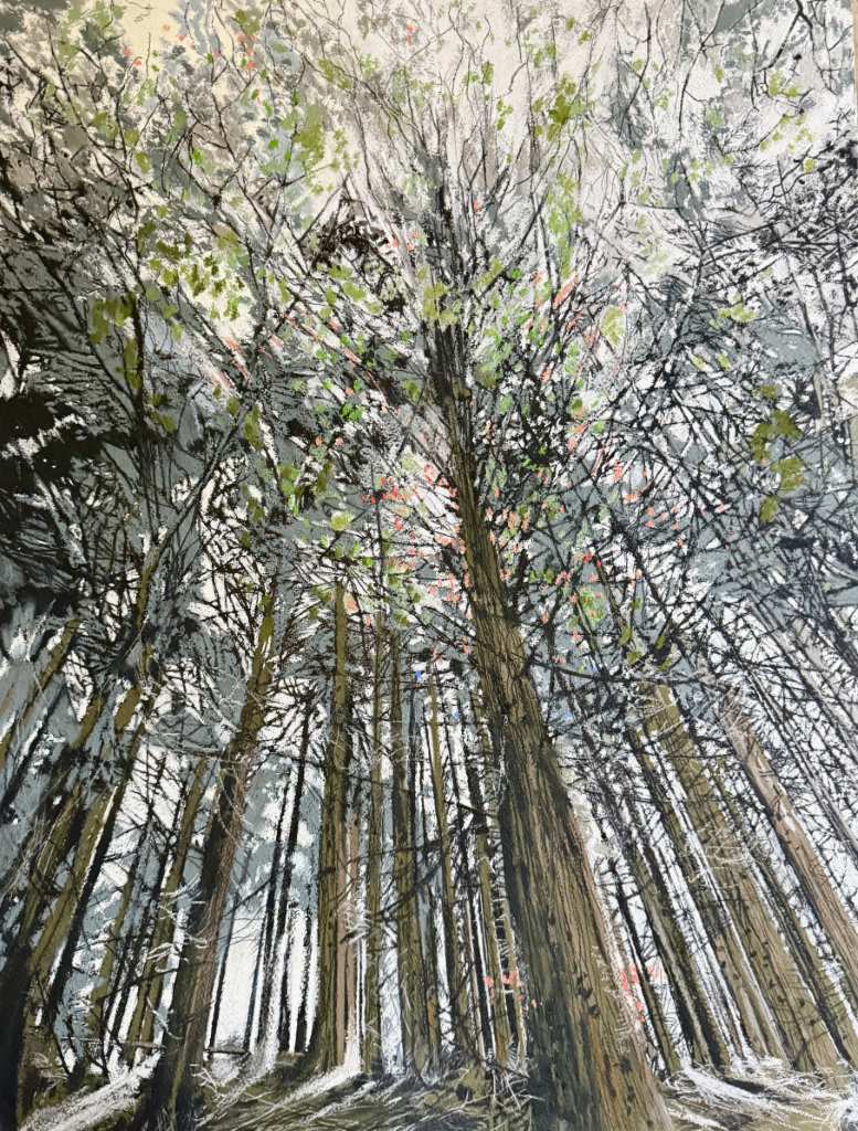
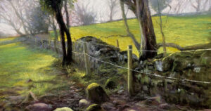
Katy – “In Fingle Woods, there was a quiet darkness, yet what stayed with me was the trees reaching for the light. Ivy twisted around their trunks, seeming to restrain them, yet they rose tall regardless. It felt symbolic of persistence and becoming.
My work is a diary in paint, shaped by memory and nature, and by a search for meaningful ways to share these experiences with the viewer. Alongside my work as a psychotherapist – where I look beyond the person in front of me to truly know them – I bring the same attention to the woodlands and landscapes I walk through.
Childhood woodland walks continue to echo through my practice – the sense of others having passed along these same paths, leaving traces of themselves behind. I am drawn to places that have remained unchanged for centuries, imagining the histories they hold: lovers meeting, farmers working, ancient gatherings unfolding. Capturing this sense of historical presence is a thread that runs throughout my work.
I walk daily, returning often to certain places that call me back. Standing in a familiar landscape is not only about seeing but about feeling and knowing.
A relationship with a landscape cannot be rushed. It asks for time, humility, and presence. In return, it offers a quiet understanding that I feel deepens my work and leaves a stillness that lingers. Every field, river, and stretch of woodland holds more stories than we can ever fully know. When I return with my hands full of colour, I become part of that story too. Perhaps that is why I keep going back – to listen for what has yet to be said.”
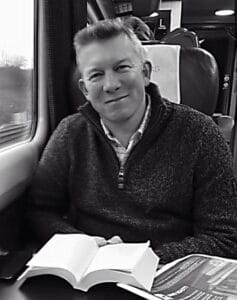
Stephen Fuller
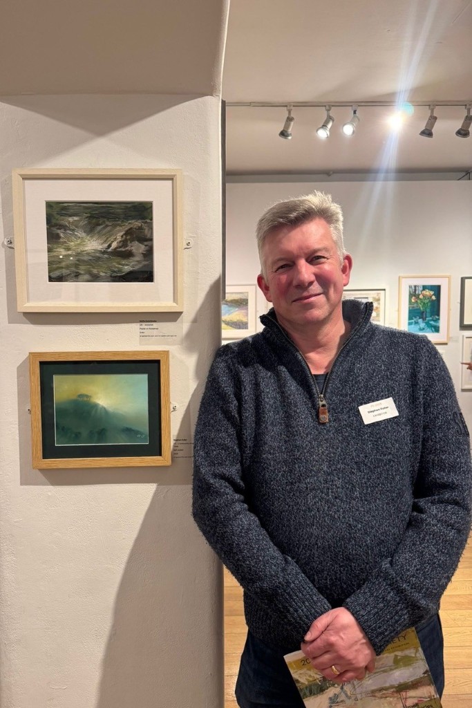
Stephen is a landscape and seascape pastel artist based in the West Country. His atmospheric work concentrates on light, tone and mood and draws from the magical ocean and moorland views in Cornwall. He has exhibited (and luckily sold) at the last 2 Pastel Society exhibitions.
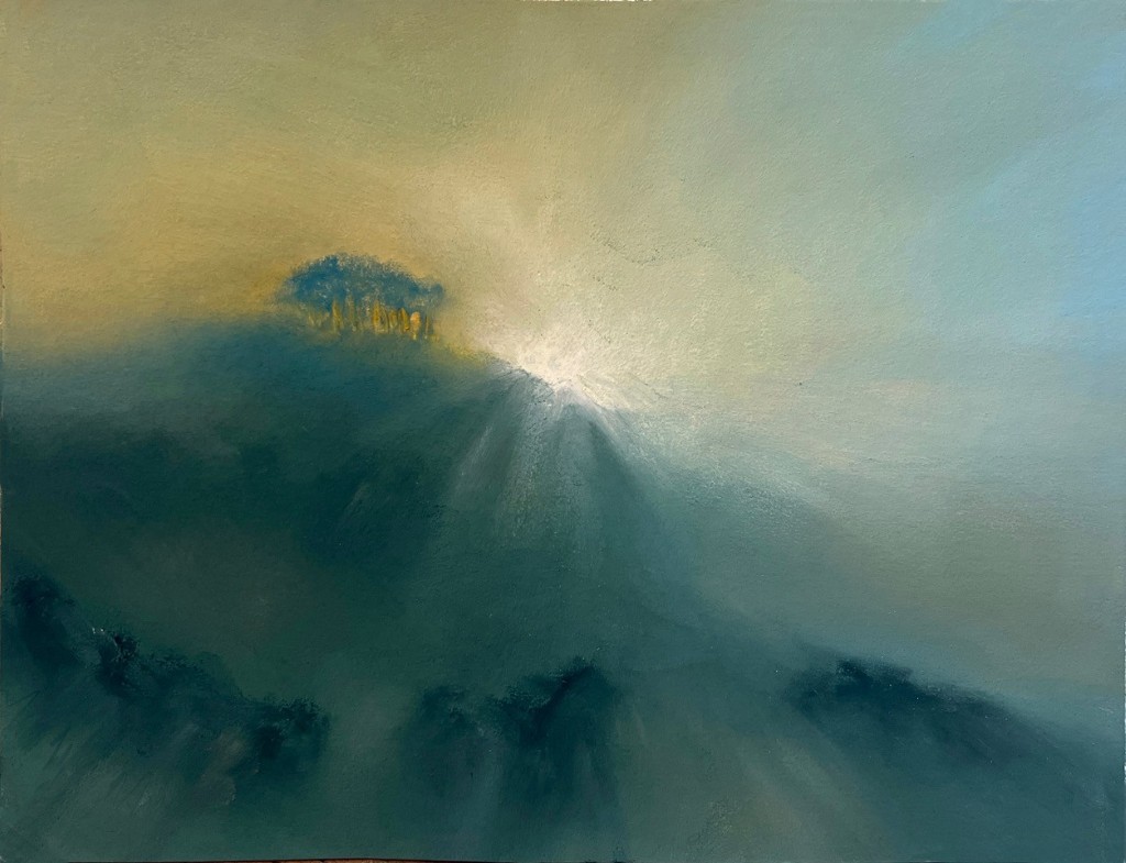
Stephen – “There are 2 main routes into Cornwall – the A30 to the North and A39 to the South. The A30 takes you over two of the three great West Country moors, Dartmoor and Bodmin. The moors are magical places, ageless and with ancient tales carried on the wind. Just before you cross the border between Devon and Cornwall (heading West), near Broadwoodwidger, is a distinctive copse of trees that looks down over the A30 known as Cookworthy Knapp. These are a much-loved landmark; those who live in Cornwall and many who visit know them as the “Nearly There Trees”.
Whether the old-granite bones of Cornwall are where your spiritual roots lie, or whether Cornwall is a place of fond childhood memories, these trees are a herald to the fact that you will be soon be crossing the river Tamar and entering a magical land. There are those who feel a fey or supernatural significance of Cookworthy Knapp.
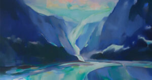
In this small tonal piece, I tried to capture the magic of a place existing between lands, floating somewhere between light and physical form. I tried to use indistinct ambiguous forms to add to the sense mystery. As with much of my work, I pared back most of the detail – leaving just the light and hopefully enough residual pointers for a viewer to find a little of the beauty of existence and also a little of themselves within it. I think that is where the real power of art hides – holding something of a mirror up to a viewer. I was thrilled that it was chosen for the Pastel Society Exhibition – it is a genuine honour to have work displayed alongside some of the gods and goddesses of the Pastel World.
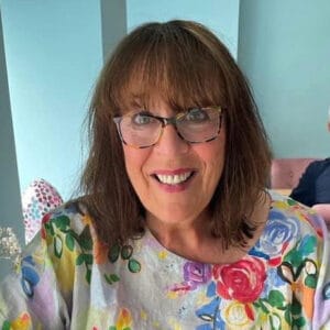
Lynn Howarth
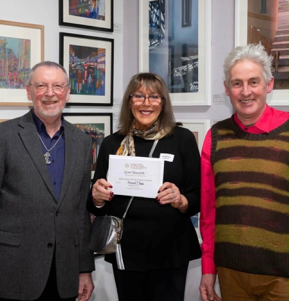
Lynn is a Glasgow based artist particularly known for her portraiture and figurative works. A household name within the pastel community she has exhibited widely and has been awarded Master Circle status with the International Association of Pastel Societies. This year her outstanding piece “Oh, what a Circus” won the Caran D’Ache Product Product Prize at the Pastel Society Exhibition.
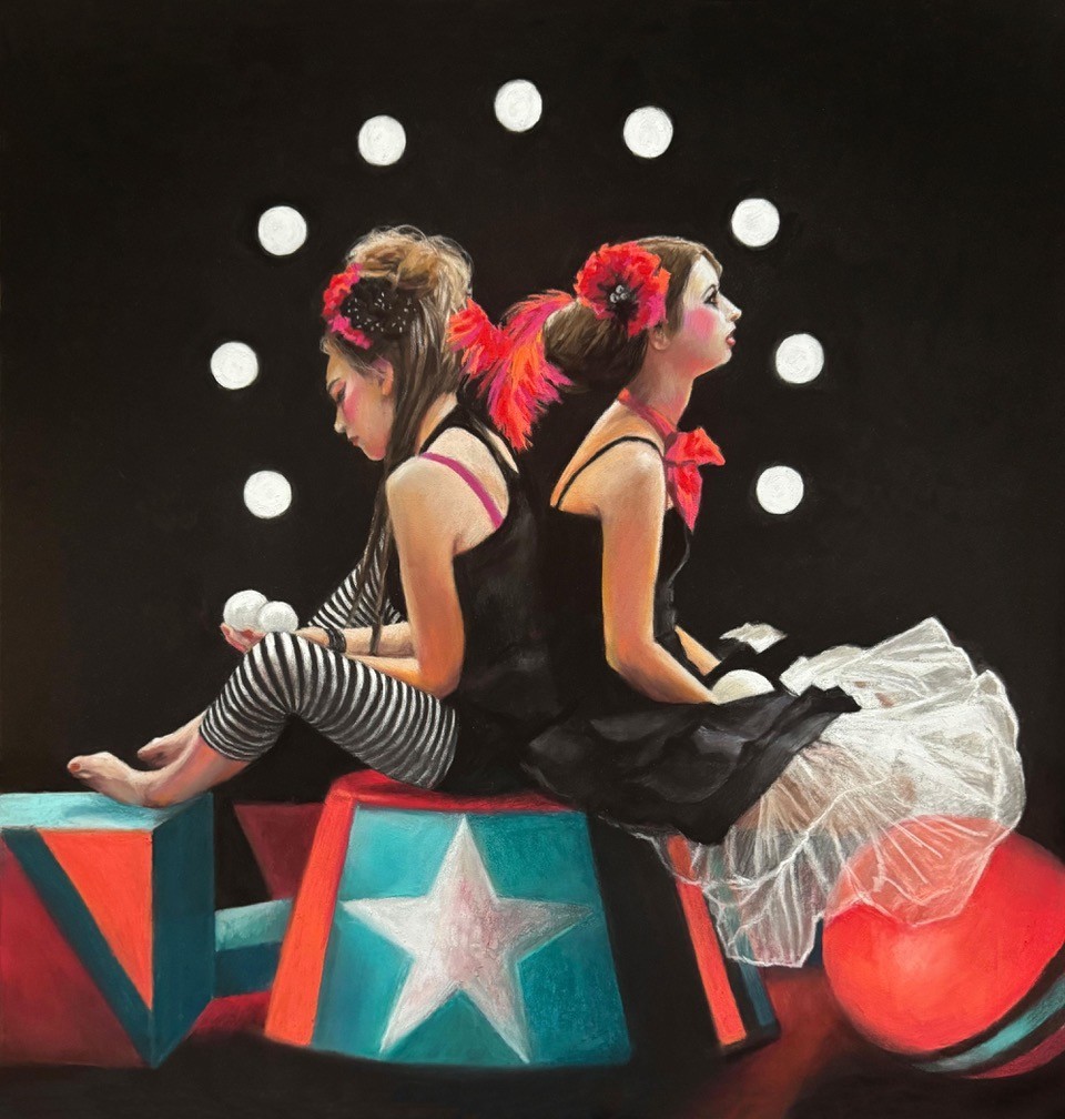
Lynn – “This was the first of my series of circus themed paintings from a series of life drawings done way back in 2016! I remember feeling very inspired at that session thinking about what I was going to do with them. It’s taken until now to realise them as paintings. A few months ago I found myself thinking about the state of the world at present and how we are subjected daily to the constant bombardment of media and social media peddling a cocktail of anxiety and fear. It’s all becoming like a mad, sad circus at times. The seed of an idea came to me when I found those sketches and “Oh what a Circus!” sprang to life! I had to create a foreground out of my imagination as the girls were sitting on very basic chairs at the life session so a lot of artistic licence was taken in rendering the foreground out of balls, cubes and fabrics etc. The painting was completed using Unison Colour pastels on Pastelmat board and it is 50x40cms. I decided to enter all three into the Pastel Society “Direct Touch” Exhibition and was delighted to hear one got chosen. As an open entrant you have much less chance of being picked, so I was thrilled to bits to get the lovely email saying congratulations! I was even more delighted to hear later that week that it won the Caran d’Ache Product Prize which I was presented with by the lovely Richard Rees President of the Pastel Society, and Mark Cazalet, Senior Member of Faculty at The Royal Drawing School at the Private View. Please do go check out this incredible exhibition of pastel and see how versatile my favourite medium is!”
Gareth Jones
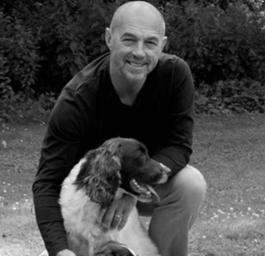
Gareth is a Welsh artist particularly known for his outstanding landscapes and seascapes. With works on display globally – in 2024, he achieved Master Circle Status with the International Association of Pastel Societies. He is a regular exhibitor at the Pastel Society Exhibition.
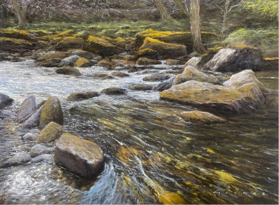
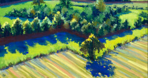
Gareth – “Being accepted into the PS Annual Exhibition is always a thrilling achievement. From three submissions, I felt the one selected was perhaps the least likely to be chosen. Two larger and more dynamic seascapes were overlooked in favour of this more simple river scene. ‘Running Clear’ however, is a painting I particularly enjoyed creating, as it typifies the terrain and character of my beloved North Wales. Water is a topic that I’m continually drawn to, and the crystal clear waters of the Afon Glaslyn near Beddgelert provided the perfect inspiration. The subtle shifts of colour in the rocks with their mossy highlights, blended with the early autumnal foliage to create a harmonious palette. I was particularly pleased with the impression of flowing water, both in the depth and direction. A hint of reflected blue sky, the sparkling highlights and the rush of foam added just enough interest and movement. To capture a scene that is not only aesthetically pleasing, but one that conveys my pride and love of the area, is immensely satisfying.”
Rebecca De Mendonca

Rebecca is a Devon based artist and author particularly known for her light filled equestrian work and beautiful Dartmoor based landscapes. She is a member of the Society of Equestrian Artists and regularly has work selected for the Pastel Society Exhibition.
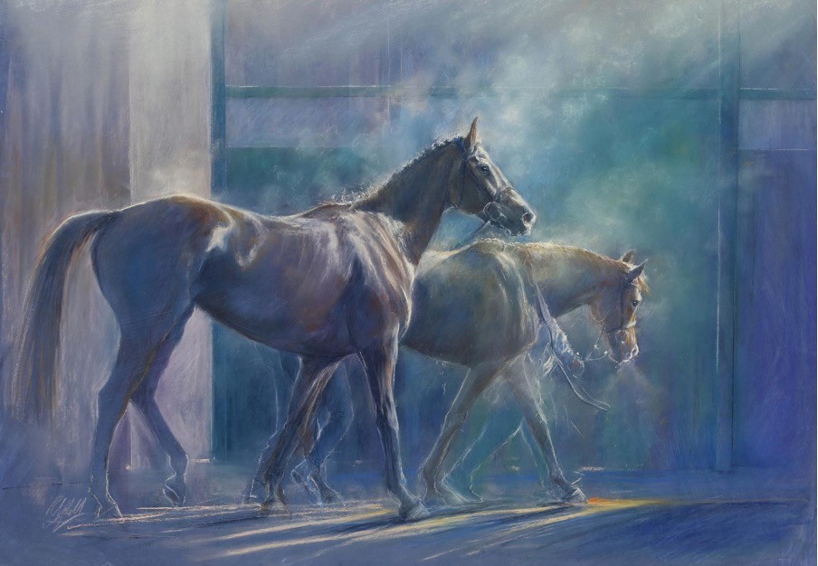
Rebecca – I am delighted to be part of this exciting Pastel Society exhibition, each year the quality and range of work on show seems to get better.
My pieces in the show are inspired by visits to my local horse races during winter, to watch beautiful thoroughbreds. After the race, the horses steam as they are cooling down, with the low winter light sunlight shining through the steam. This beautiful light describing the edges of the exquisite equine forms never fails to inspire me.
In my pastel pieces, I am exploring the negative space around the horses, as they move through the space and the air around them.
My aim is to capture the effect of light filtering through layers of air. Over the last few years, through learning more about photography, I have become fascinated with the thought of ‘painting with light’.
I paint a base of Colourfix primer onto mount-card, and then build up layers with a little bit of Pan pastels and charcoal. I then use Unison Colour Pastels, to build in depth and richness to these underlayers. I use a mixture of pastel pencils, Unison Colour pastels (breaking off little shards to get details), and Conte Sketching Crayons to draw the horses, figures and structures around them.
My pastels take hours of careful tweaking before they are finished!
Cathy Pearce
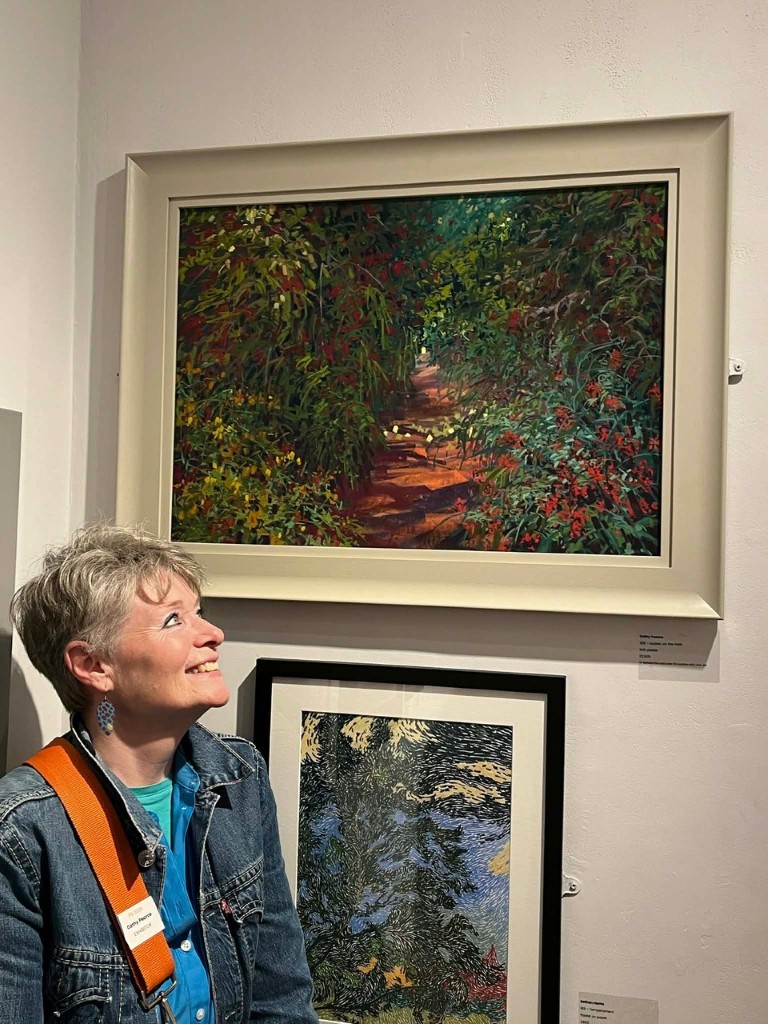
Cathy lives in Wiltshire with her sculptor husband and draws inspiration from her local landscape of chalk downland and meandering waterways. Her work is recognisable through her expressive mark making, extracting the best from the pastels she uses. She is a regular exhibitor with the Pastel Society and she was an award winner at the 2025 exhibition.
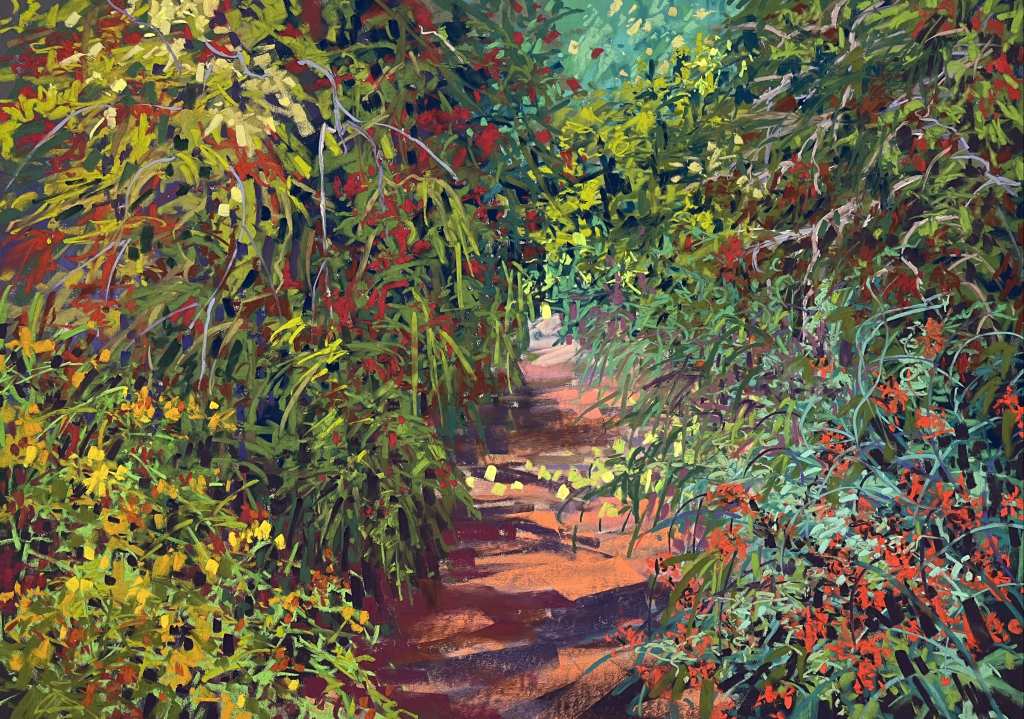
Cathy – “This large view is painted in the studio directly from my much smaller plein air sketch. It depicts a sunken lane with apples lying across wherever they’ve fallen in the breeze. The original sketch was painted in August and this larger version just a few days later. I have been absolutely mesmerised by the abundance of wild berries in all the hedgerows and this typifies the overgrown undergrowth, thickets and hedgerows around the Wiltshire countryside this Summer. In order to suggest the scale of wild growth, abundant berries and fruit and fervent foliage of a wide variety of plants, I knew I would be working in quite a maximalist mark making frenzy which I found extremely exhilarating during the process, in order to achieve the chaotic, complex and un-ordered nature of wild growth. The path with a few dots of apples provides a pause for the eye and an invitation to the viewer to take a step deeper into the ancient sunken lane.”
Teresa Seals
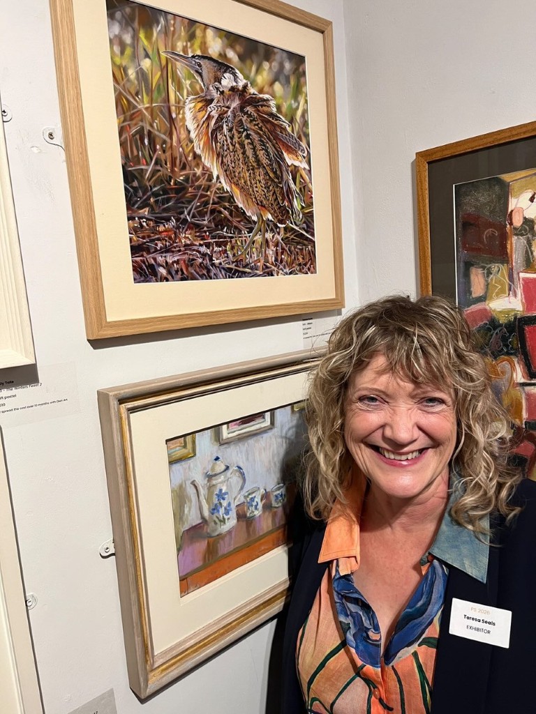
Teresa, an award-winning artist, is renowned for her realist portraiture in pastel and in particular pets and animals. She is also an educator at heart and regularly teaches workshops and art classes. She had 2 stunning pieces selected for this year’s Pastel Society exhibition.
Teresa – “Born in the rural county of Suffolk, I have always been drawn to the natural world. One of my first careers was fruit-farming and I now live close to the Heritage Suffolk coastline with a view of the sea from my garden studio. It is no surprise then that I am most drawn to wildlife and landscape subjects.
There is an inexplicable joy in using the natural pigments of soft pastel to bring an animal to life on the paper; it will never cease to create a sense of wonder in me that with a few pastel marks (or a lot!) I can almost stroke the creature into being. The hands-on nature of soft pastel where I blend with my fingers, each finger having a different pressure and shape, makes this a three-dimensional process – more like sculpture than painting! It is the feel of the pastel on the surface that informs my process.
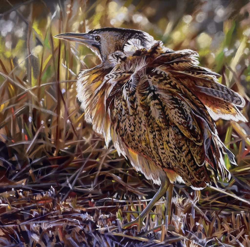
The Bittern is still on the red list for endangered species and known for its shy, secretive life in the reeds – its natural camouflage makes it elusive to even the most ardent birdwatchers. We are lucky here in Suffolk to have several at the Minsmere RSPB site and they can occasionally be heard with their famous ‘booming’ call, even if you can’t see them!
Pastelling this bittern was a challenge. I wanted to use a palette of colours which would focus the viewer on the marvellously camouflaged plumage so I ensured that my palette was the same for both background and bird. The dilemma of the bird disappearing into this background was solved by the wonderful backlighting here which acts as a bright silhouette.
What a joy to use the most natural mediums to create images of the beautiful natural world around us!”
Unison Colour Sponsored Prizes
As mentioned earlier, Unison Colour sponsor 3 prizes at the Pastel Society exhibition – the Unison Colour Members Award, the Unison Colour Non-Members Award and the Unison Colour Young Artist Award.
Unison Colour Member’s Award
For 2026 the Unison Colour Member’s Award went to Fiona Carvell for her piece “Found Beachcombing 3”. We chose this fabulous piece because we felt it showed so much texture both delicate and rough but with movement as if it has just washed ashore with a calming contrasting colour palette. Congratulations Fiona.
Unison Colour Non-Member’s Award
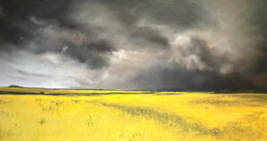
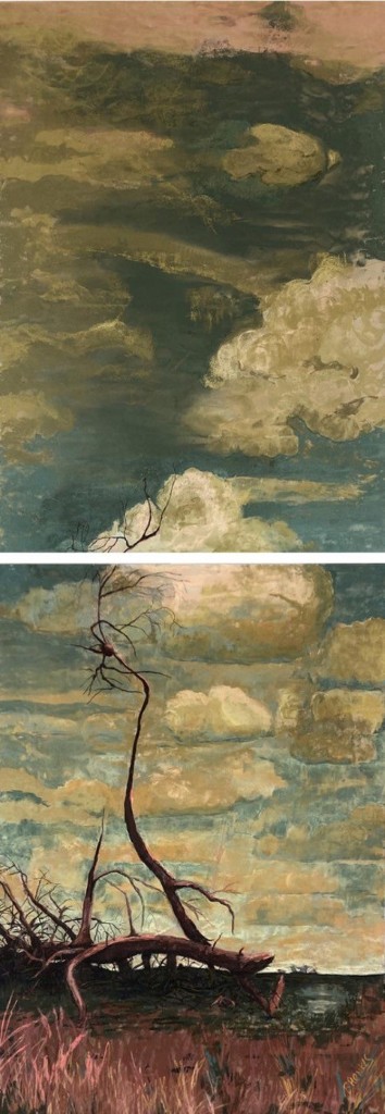
Our choice for the Non-Member’s Award for 2026 was Barbara Henkes for her innovative and captivating piece “The Tree in the Heather” This painting stopped us in our tracks, it is such an atmospheric, moody piece but with the split canvas this gives it an even more dramatic almost lonely feeling, the grey clouds giving the impression of a storm about to change the view completely. Congratulations Barbara.
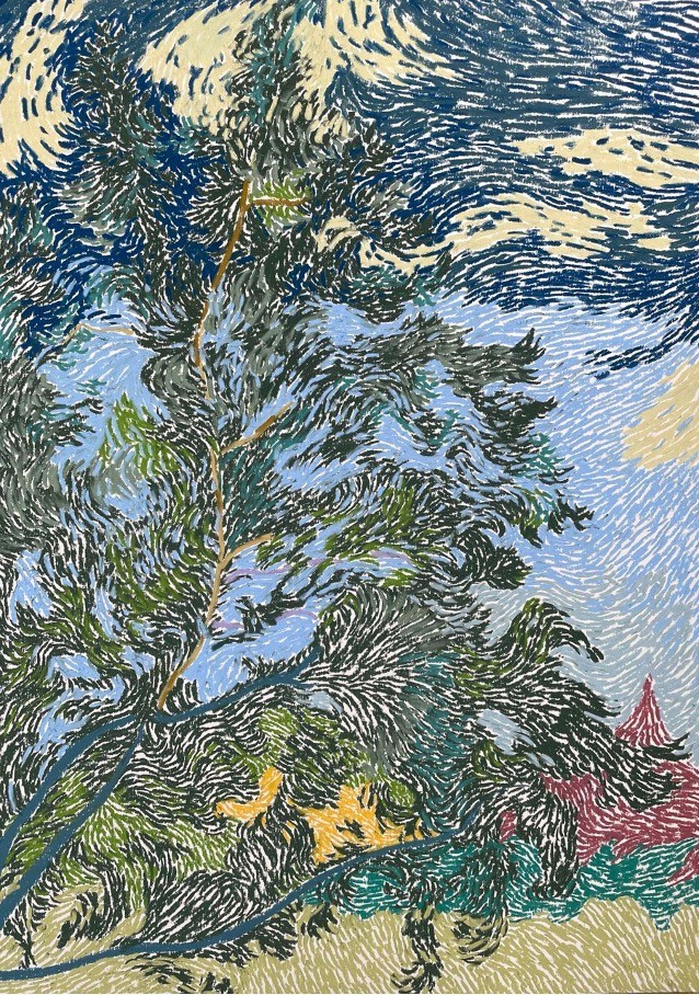
Unison Colour Young Artist Award
Unison Colour is particularly thrilled to recognise the best of emerging pastel talent and the opportunity to award a Young Artist Award is a real delight. This year we chose Bethan Harris for his piece “Temperament”. We chose this beautiful piece because we felt the mark making was so floaty as if the wind was making the tree move across the painting. Such a beautiful use colour to draw the eye in. Congratulations Bethan.