We have been following Pastel Artist Amy Webber on Instagram & watching her progress for a while now. We knew that Amy would be the perfect artist to join our Associate Artist scheme, an we were delighted when Amy accepted our invitation!
Amy sent us some information about her, her art & where she finds inspiration.

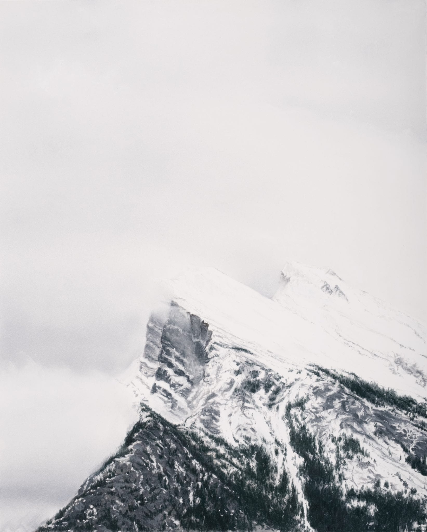
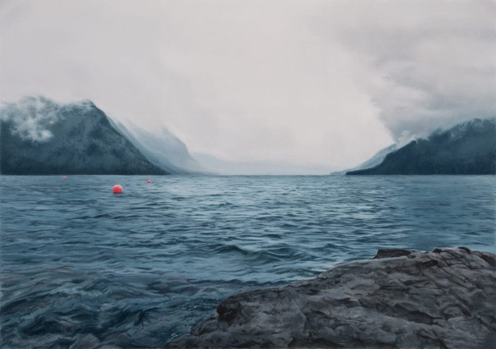
I am a self-taught artist based in Calgary, Alberta, Canada. I am particularly drawn to creating moody images with shades of grey and blue, as I find that these colours have the ability to evoke deep emotion but are also very calming, inviting us to slow down and breathe. My proximity to the Rocky Mountains and my love of the west coast of Canada have inspired me to paint landscapes and seascapes, based on photos from my own travels.

For me, the process begins with taking photos, as photography is an art in itself, and in my case, a means to bring my vision of a painting to life. When I am in just about any outdoor environment, I can’t help but frame it in my head as a composition for a painting. I automatically observe and deconstruct the colours and shapes in nature, thinking of them in terms of which colours of pastels or paints, and which strokes and techniques would best capture the scene.

My absolute love for fine detail gives my paintings a realistic quality; I strive to make the viewer feel almost as if they are really there, seeing what I saw, but with the soft, ethereal beauty that can only come from a painting. I like when the eye is tricked to wonder for a second whether it is looking at a photo, but upon closer viewing, one can see each individual stroke and mark that went into creating something from nothing.
Most of my work is done with pastel, as I appreciate the way it feels like simultaneously drawing and painting. I enjoy the immediacy and spontaneity of the medium, the direct contact of applying pastel with the stick and blending it with my hand, and the richness and luminosity of the colour. There is unparalleled softness of blending that can be achieved with pastels, which I find particularly appealing for painting cloudy skies.

When I revisit places that I have painted with pastel, I feel like I almost have a muscle memory of those places, as my fingers have recreated every line and shape and contour on paper. Being able to capture those places through painting makes me feel a deep familiarity and intimate connection with them, such that going back makes me feel like visiting an old friend.
Amy Webber