Summary:
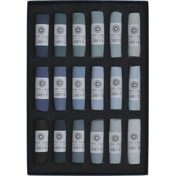
- The Grey 1- 18 is a subtle set of blue violet, green and neutral tones and hues.
- Very versatile. Enough range to be used alone, or with other colours or sets.
- Recommended for adding a classic look to your work, creating dimension, depth, and distance.
Why Greys?
Artists love colour. When I see the highly pigmented pastels laid out in a gorgeous curated set I am tempted by colour. Pure pigment and pure potential.
When you use highly saturated colours and a full palette to make a composition, you may find your design lacks focus, and has too many colours. Objects may look flat.
When I first studied classical drawing, students were limited to only black and white, later they were allowed to use a few earth tones. The idea is to learn to see in tone, not in colour. As a teacher, I have used this method of limiting students at the beginning, to black and white. You can see drawing skills improve immediately.
First Impressions
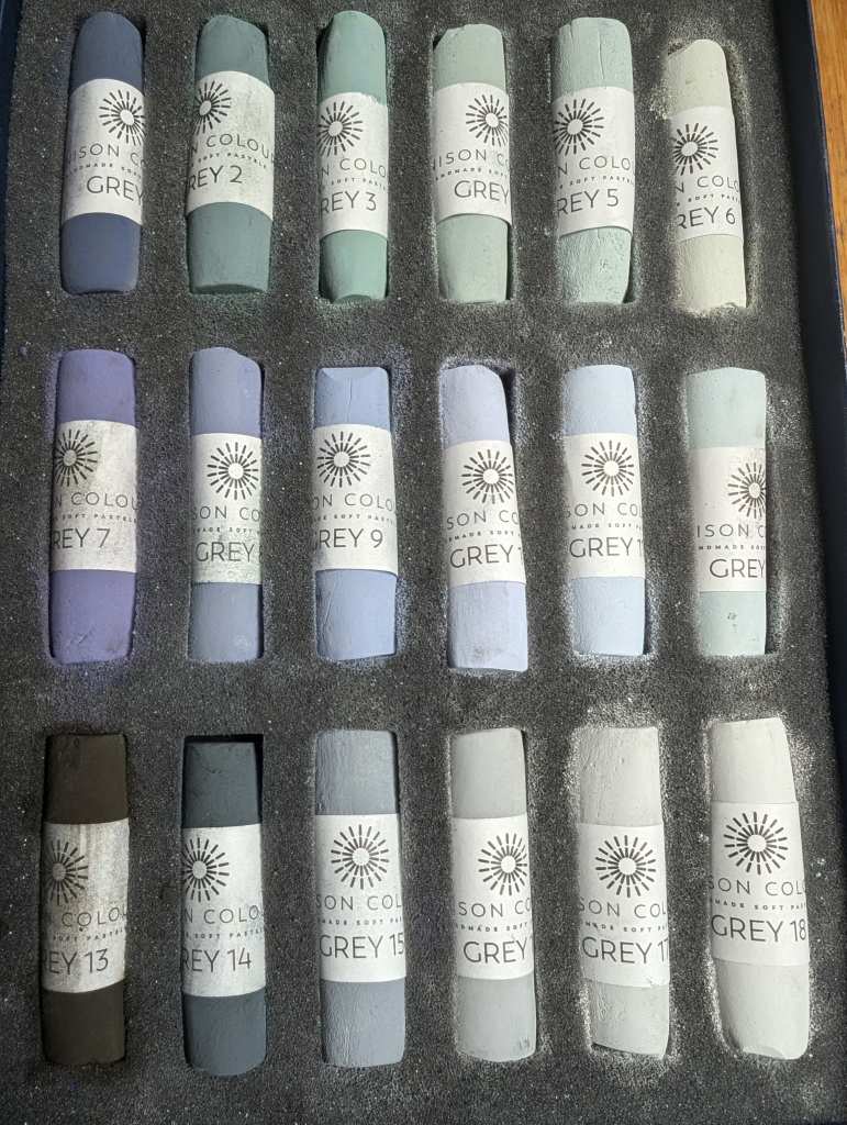
The Unison Colour Grey Set, is stunning and full of surprises. The first thing you notice about the Unison Colour Grey 1-18 is the colour! Subtle green greys, neutral cool greys, and beautiful violet greys (the violet greys were something that I was missing in my palette). Also, a velvety dark grey which appears black.
This set was a perfect addition to my collection. I work with the Starter 72 set, and the Landscape 36 set. Neither of these sets have these greys, so there were no duplicates.
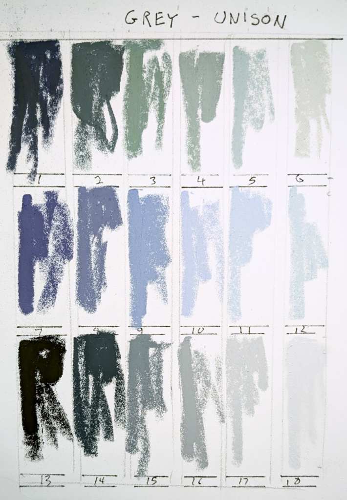
First thing I did was make a colour chart. Seeing the colours side by side helps to identify the tone and hue.
- #1 is a dark blue grey.
- #2-6 tend towards the green.
- #7 to 11 are cool violet hue.
- #13 to 18 are the most neutral greys in this set.
- #13 is the darkest, and 19 is the lightest.
My next step was to use this set for three different subjects.
Portrait
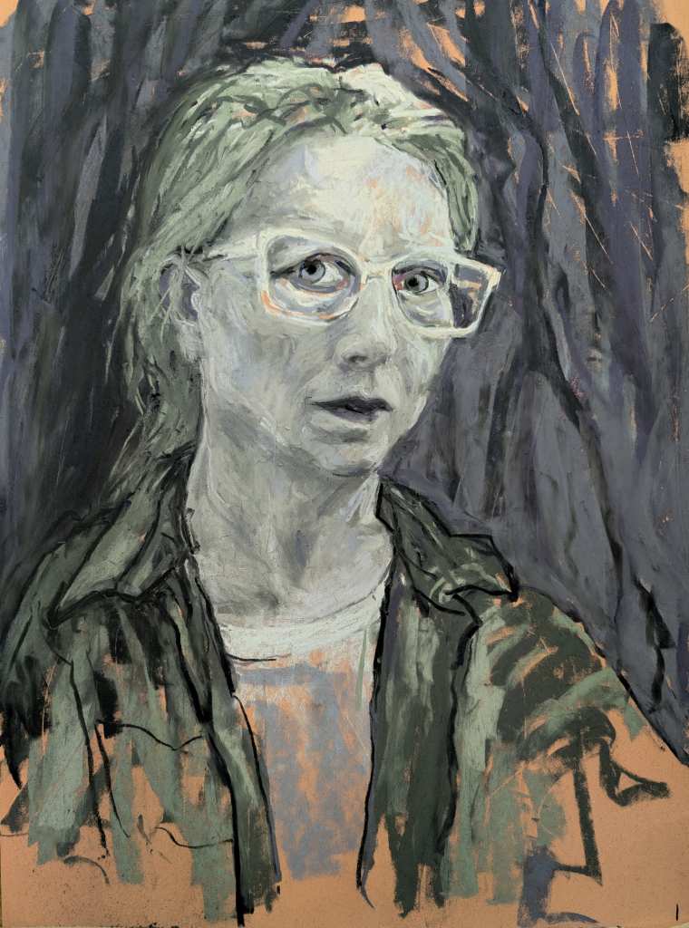
I used an earth toned paper to contrast the greys, and add a bit of warmth. Drawing grey skin tones is a bit of a mind game. It’s a matter of trying to see the subject as grey. This involves trying not to see colour, but to see the tones (darks and lights) in the subject.
There are some hues in this grey set, so even though you are trying to see in black and white, you still want to take advantage of these subtle colours. In this self portrait I used the green greys for the hair and skin. To me this made sense, since the skin has both yellow and blue in it, I used the blue violets in the background and lips. I used the darker green greys for the jacket.
After it was complete I added a touch of red pastel pencil on the eyelids.
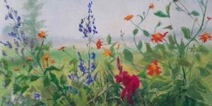
Still life
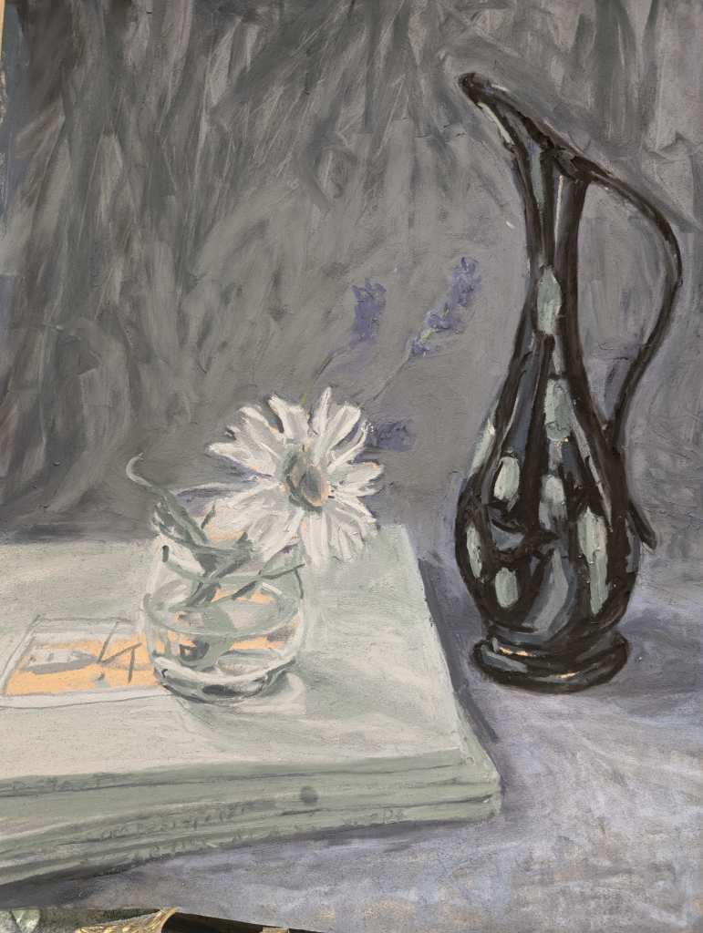
I set up a still a still life with mostly greys and greens objects, but also included lavender flower, and daisy.
I used a warm yellow paper, and the grey set of pastels.
I wanted to be as literal as possible in my colour choices. I left the paper colour for the yellow illustration on the book. The cool blue, almost mauve greys, had enough colour to give the impression of the lavender flower and to stand out against the neutral grey background. The greenish greys were green enough for the stem and leaves.
I found that the limited pallet gives a cohesive feel to the drawing. For some reason this still life feels a bit nostalgic, it could be the objects from the 1950’s or it could be the effect of the muted grey palette.
The center of the daisy is grey, and since we expect it to be yellow, it might be a bit disturbing. I could have let the paper colour show through here to get warm tones. In a case like this, it may be powerful to add just a touch of yellow pastel to the daisy.
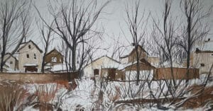
En Plein Air Landscape
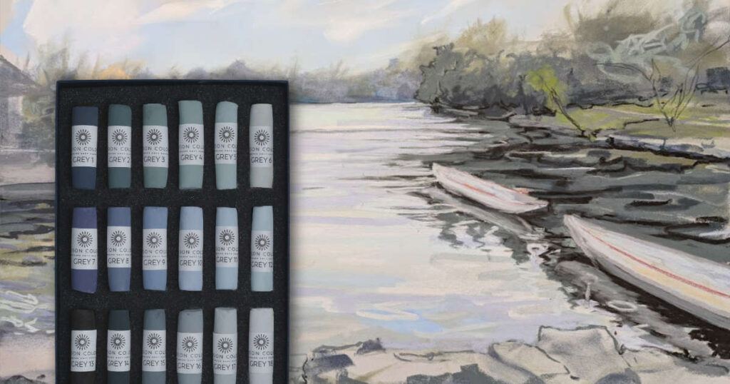
The beautiful thing about this set for en plein air is its simplicity. One small box is very convenient. When trying to paint on the spot, too many colours to choose from can slow you down. I added a base with pan pastels, and some lines with pastel pencil. I relied mainly on this box of greys which helped me focus on tone.
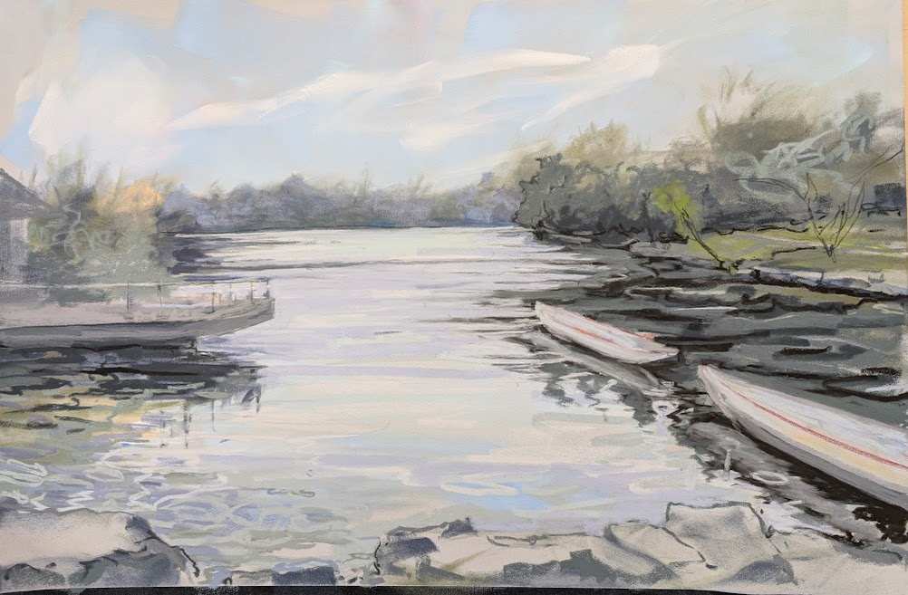
The result is a landscape impression that is less acidy or colourful then some of my other en plein air landscapes. I like the way the greys all pull together to create a softness and atmosphere.
After this experiment. I decided to simplify my en plein air palette. Now I only bring the grey set with me to all painting excursions, along with the small landscape set, and a few pastel pencils.
Recommended
Although grey doesn’t sound exciting, it really is. I recommend this set to my students. It will round out your collection and add a classic look to your work.