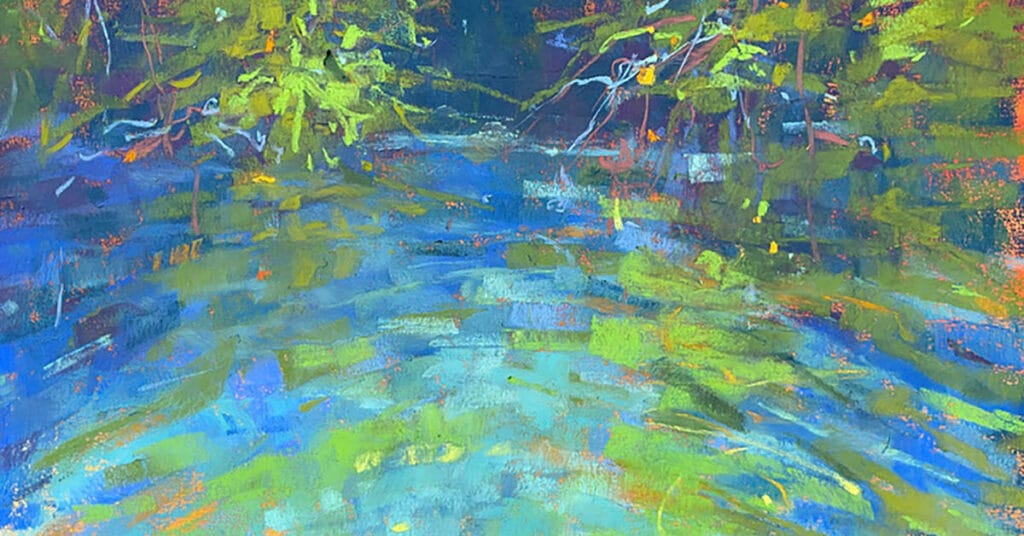
One of the most common questions I get about painting is “How can I loosen up?”. A technique that I use quite often, especially in my mangrove series, is to use an older painting as the photo reference. It’s a great way to take yet another step away from your original photo. Often there are times when working on a studio painting, I rely too heavily on the information I get from my photo. My colour choices may be brighter or softer but my emotional response and energy may be lacking. I have found that using a painting as the reference is a great way to focus more on mark making, texture, colour palette and, as a result, create a more energetic and exciting painting.
I am a big fan of the Unison Colour half stick collections. The half stick size is perfect for making marks using the broad edge of the stick. I work primarily dark to light and large shapes to smaller shapes. I have attached a short video demonstrating this process. It isn’t until the very end of the painting that I will use an edge of the pastel stick for intricate line work and detail.
For any comments or questions, email me at info@julieskodafineart.com
Enjoy!
Julie


3 comments
Christy
The video is so helpful and Julie’s paintings are brilliant!
Jackie Boggeln
Thanks for sharing your technic with us . Really enjoyed watching your tutorial. The vibrancy of your painting is lovely.
Pamela Lang
Thanks Julie for your blog. The colours are lovely when you layer them. I am going to try putting an under painting in on my next painting. I must admit that I do paint to tight it’s a bit hard to change as I did a year at a drawing class. Having good pastels and paper is the way to go.