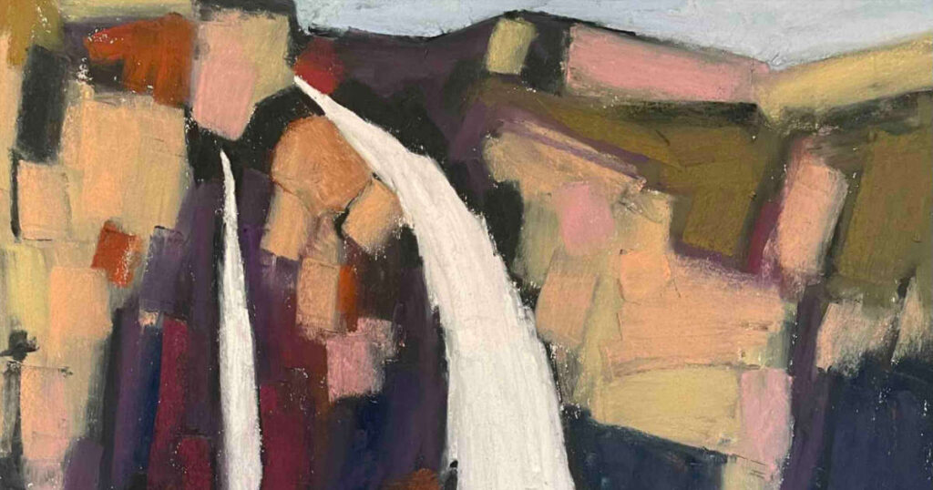
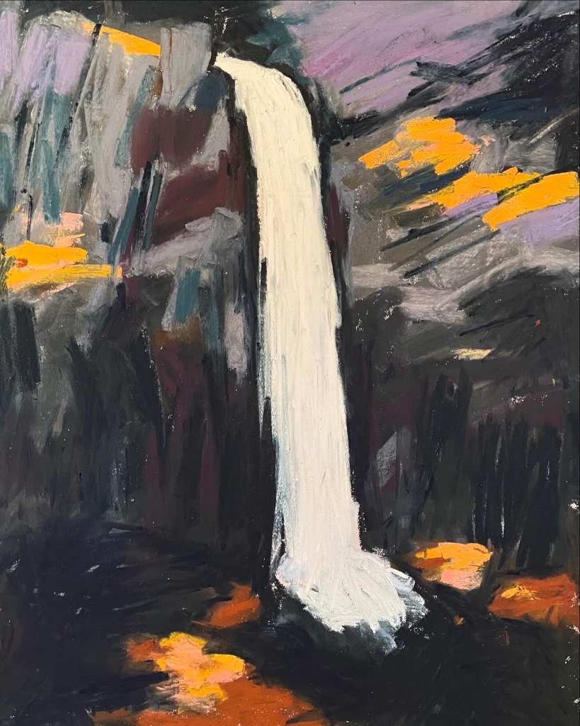
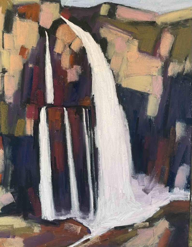
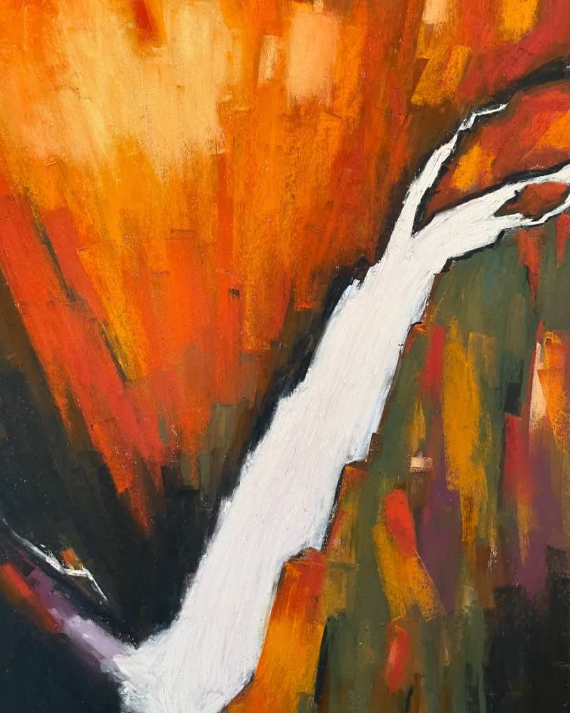
Someone recently told me they thought my soft pastel paintings of Norwegian waterfalls looked a little dangerous. That they looked punk. I’m not sure they realised how right they were. The way I capture the energy of Manafossen, Odnesfossen, Kjelfossen and all of the other fossen is to lock myself in the studio and turn up the music.
I think the vikings would be proud of me. I’m an artist marauder charging into small villages, raiding their natural wonders and disappearing into the night. My face bloodied with Unison Colour Red One and Blue-Violet Eighteen.
I suppose all art is a response to your environment but capturing and infusing it with energy and emotion can at times require a little assistance. A little Amyl and the Sniffers or Cosmic Psychos.
So, for your listening pleasure I’ve attached a link to my Spotify waterfall painting playlist. It’s nasty and grubby and you’ll probably hate it but I couldn’t paint the fossen without it.

2 comments
Nigel Smith
I flipping love these Peter, plus am dead jealous. The way you’ve been able to make the water move is more impactful than photo realistic paintings for me. The left hand one in particular, plus theres loads to look at, love the shadows and the highlights.
and yes very punk. One of my unison blogs is on pastels being punk. I feel sometimes the word pastel does UNISONs ‘noise sticks’ a disservice and whilst they can create lovely traditional landscapes etc. that they also have a valid place in making louder art.
pete
Thanks Nigel. I enjoyed your blog post and I agree, pastels can be controlled and traditional or you can let them off the leash and go a little nuts. I love Unison when the marks and colours convey life and energy. I hope you like the playlist. It’s raucous!