A written guide exploring ways to use your pastels both wet and dry or combine with other media to create loose and lively work.
Unison Colour pastels have the wonderful quality of lending themselves to working in combination with water for a looser, more painterly effect in your pastel drawings. Working on a robust paper such as a watercolour paper or heavy cartridge we can build up layers of loose and lively marks, colour and pattern to create work that is full of variety and interest.
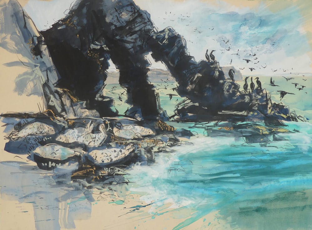
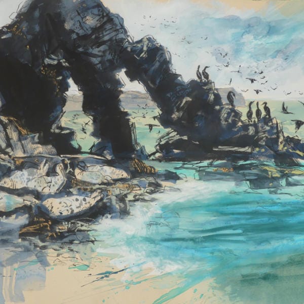
In this example, “Late Afternoon at the Arches” the pastels were used in combination with water to make an initial drawing setting out the main areas of tone and colour. Once this base layer had dried I was then able to work back over the image with dry pastel to define areas of interest before finishing off with a few details added in pastel pencil or conte crayon.
I was particularly keen to capture the translucent aqua-marine sea in contrast with the strong, deeply shadowed form of the rocks. Several washes of water allowed the turquoise and green colours to run together creating the impression of fluidity while the rocks were handled in a more controlled manner with less water.
Step-by-step
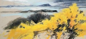
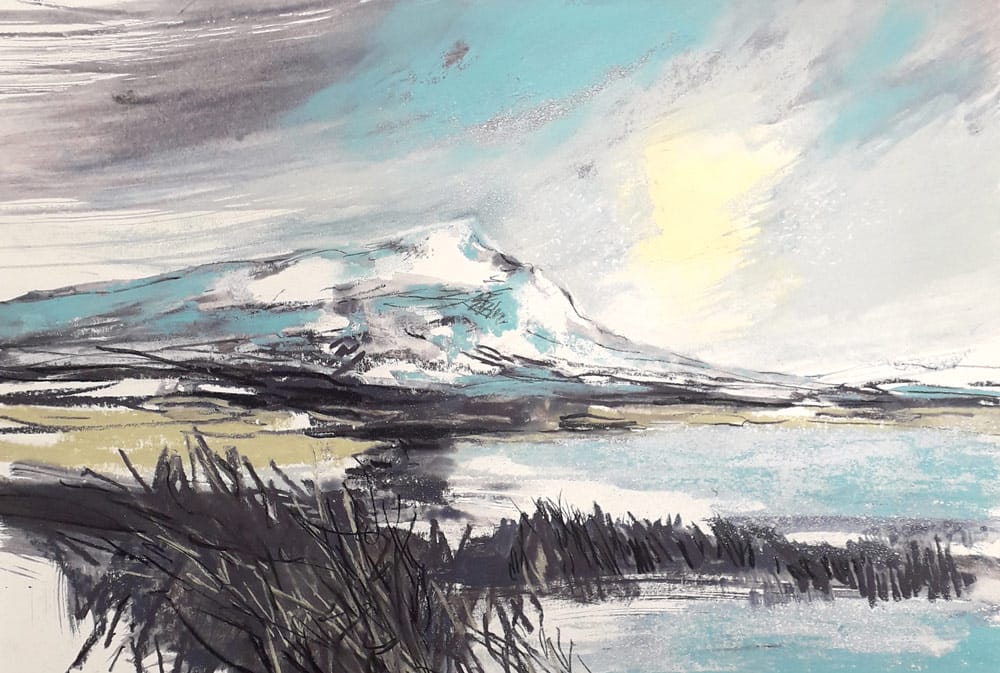
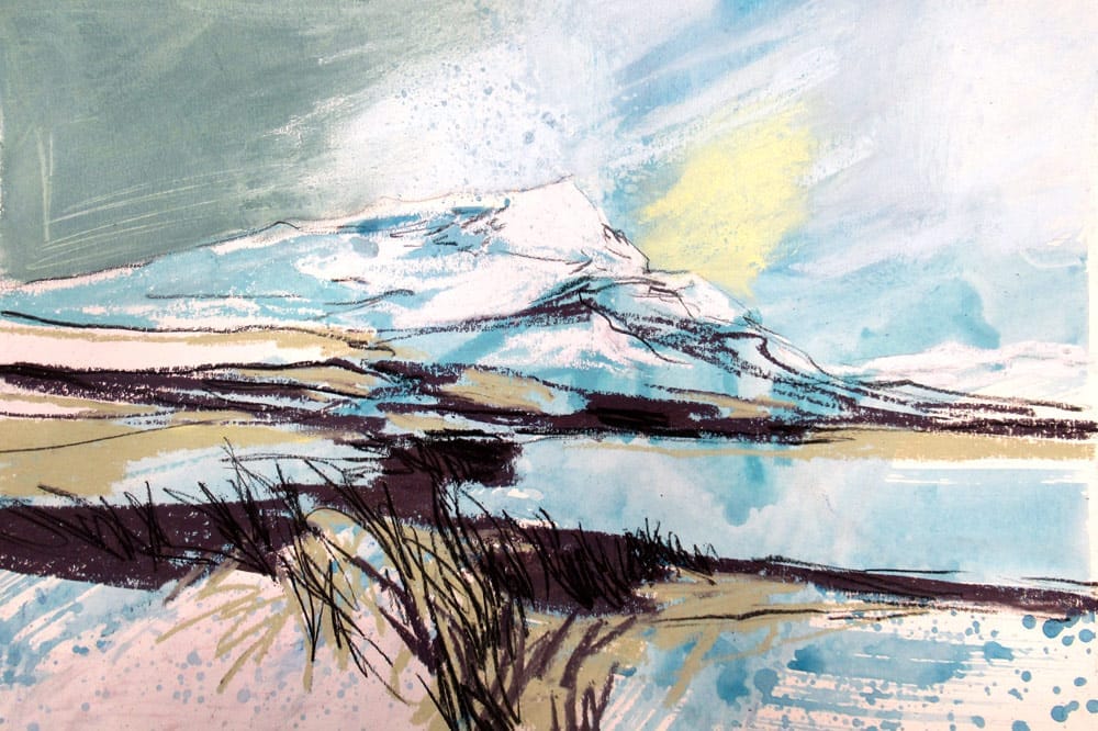
I’ve chosen to work with a limited palette to tackle a mountain scene in winter. The colours in this type of landscape lend themselves naturally to being pared back to enhance the stark nature of the environment but it also helps to keep a sense of focus and harmony within the work. By using a limited palette in the base layers of a piece of work it will lend harmony and cohesion to the finished piece through continuity of colour.
You could then choose to use a more varied range of colours on top, safe in the knowledge that they will be anchored together by the underlying layers.
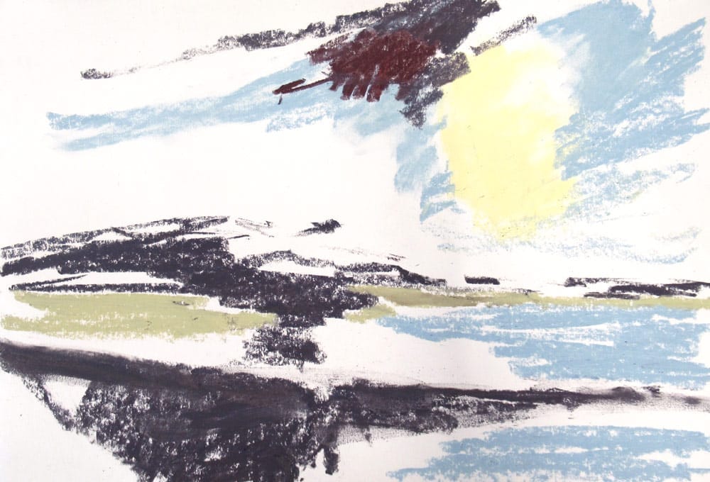
I like to work without an underdrawing but you could begin by making a light sketch to guide you. Here I have taken the most dominant features of the scene and blocked them in with colour – sunshine beneath heavy cloud, water in the foreground and hills which are a patchwork of white snow and dark heather.
The colours used so far are: Additional 53, Yellow 12, Dark 14 and Yellow Green Earth 14
My paper is Heritage Woodfree which is much like a heavy quality cartridge paper with a smooth surface that will accept a limited quantity of water.
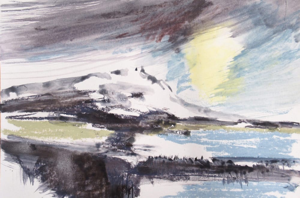
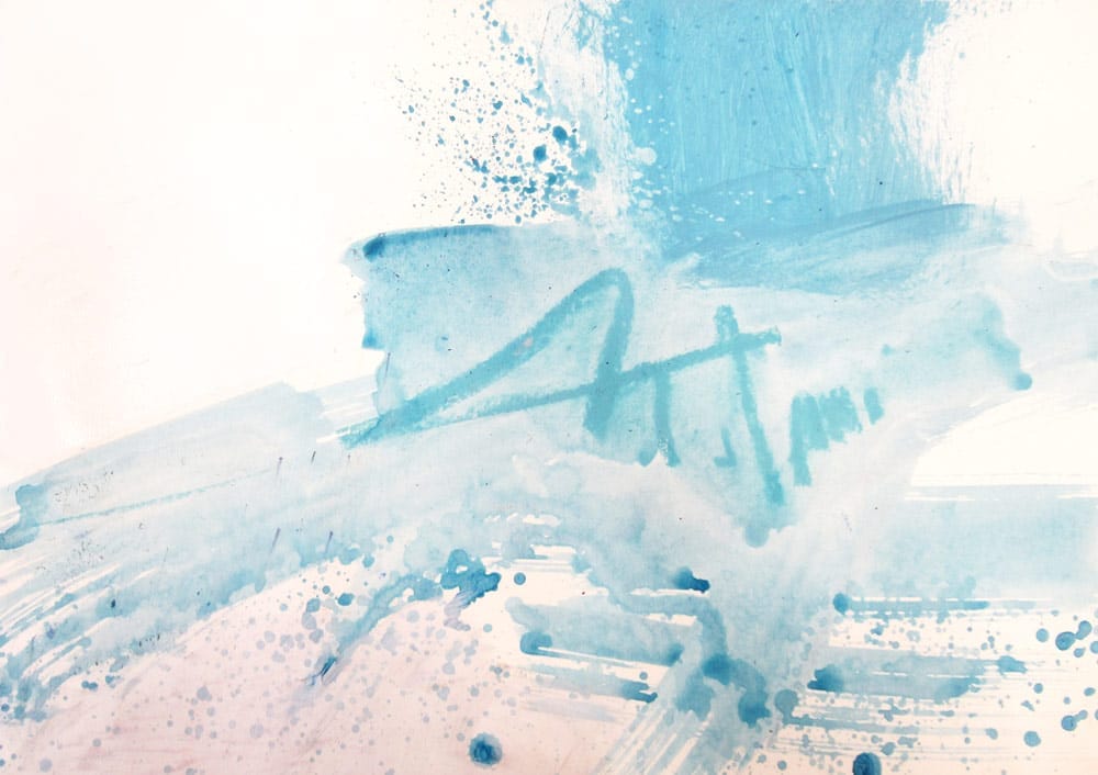
For the second stage of the pastel painting I’ve used a large brush to sweep water across the sky blending the colours and creating a sense of movement. The residual colour on the brush is used to add some areas of shadow on the mountain and help define its form. I’ve allowed plenty of white paper to remain visible to bring the brightness of freshly fallen snow to the picture.
Try a bit of variety
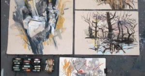
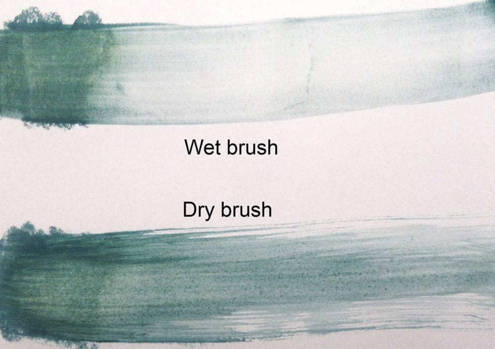
You could try using different quantities of water to create either subtle washes or a more controlled dry-brush approach. Think about contrasts – light and dark, big marks and small ones. Things can be very loose at this stage as you’ll be working back into the picture with dry pastels to define things so don’t worry if it looks a little messy – that’s all part of the fun!
Experiment and find out what suits you
You might like to try using watercolours, acrylics or mixing mediums in combination with the pastel. It is all about building up a history in the surface textures which can then guide your decisions on how much or how little of this base layer should remain visible when the work is finished.
Working back into the underpainting
While completing the final layers of the work with dry pastel I begin by considering which areas of the underpainting definitely need to be worked on and which I would like to try to retain as they are.
Look for elements that are already working well in their own right:
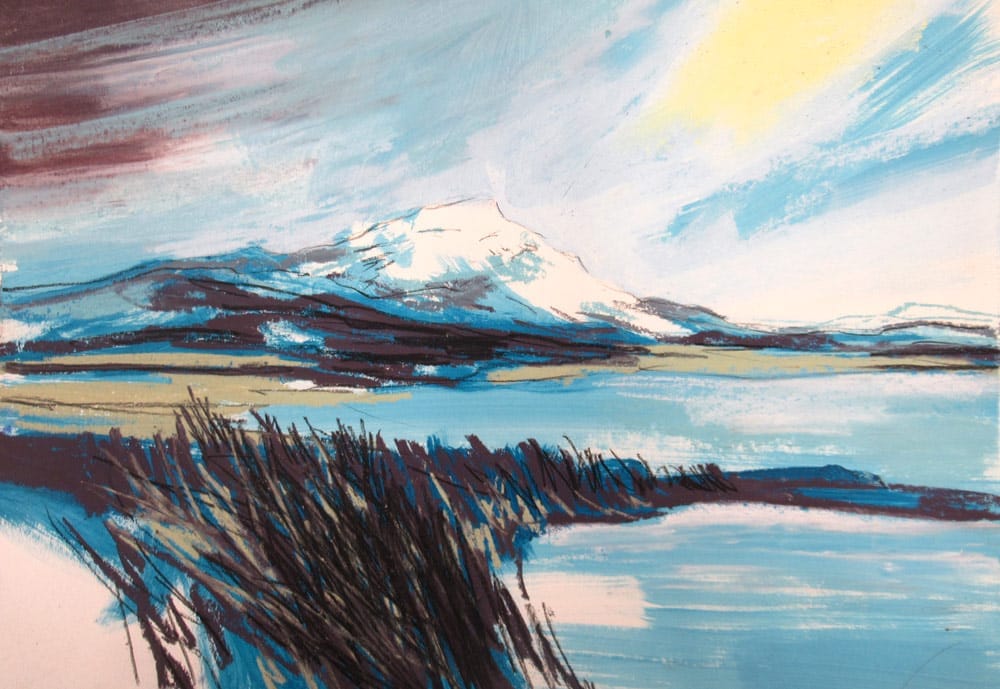
In this case I liked the dark, broken texture of the foreground. Just a few extra lines with the pastels and a conte pencil seemed to give enough definition to transform it from an area of dark tone to being a mass of tangled, waterlogged reeds.
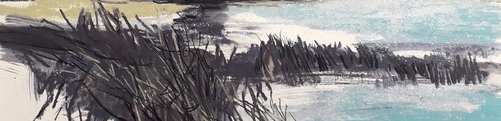
I also liked the brushstrokes in the left-hand edge of the sky which give a good sense of movement.
And areas that need attention:
The sky had some hard edges, particularly around the area where sunshine was breaking through the cloud. I softened this by using white to blend the edges and add some speckling suggestive of snow showers.
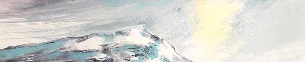
I decided to add some lighter blue in the sky, landscape shadows and water to brighten the whole picture.
Finishing off
Sometimes the saying “it’s not what you put in, it’s what you leave out” is very true. If we over-resolve a piece of work it can lose the vibrancy and liveliness of earlier stages.
By being clear about the focal point of our work we can concentrate on where to give it detail and clarity in contrast to looser areas elsewhere. This helps to focus the viewers attention where you want it to be and we automatically interpret what else is happening in the picture even if it hasn’t been drawn in detail.
I might use the sharp edge of a pastel, a pastel pencil or conte crayon to add in a few detailed marks and give some elements a nice crisp edge here and there.
Tips
Look for contrasts, busy against calm, bright against neutral, big marks against small ones. All of these will help make your work lively and exciting to make as well as to look at.
Other things to try…
Create an underpainting in acrylic or gouache to work over the top of. Both of these mediums will give you a very solid flat colour in contrast to the softer effect that watercolour and water with pastel creates.
Make an abstract background unrelated to your subject to work on top of.
Or recycle old work you no longer want by painting back into the surface to give yourself a fresh starting point for new drawings.
I hope this has given you a few ideas of how to introduce some more painterly mixed media elements to you pastel drawings. Enjoy experimenting and don’t worry if at first things look a bit messy, it’s all part of the learning process. And just have fun – even if things don’t go as planned you will have learnt how to adapt what you do next time.
A few key tips to help keep you on track:
- Keep a focus on what you’re trying to achieve in each layer of the picture
- Allow paint to fully dry before working on top of it (it can get a bit sludgy otherwise!)
- Reflect on the progress of your work every now and then by stepping back