Sometimes I just don’t want to use what nature gives. Sometimes I just don’t want to use local color. Don’t get me wrong. The world is filled with infinite beauty and inspiration. But sometimes I just don’t want to paint a blue sky and green leaves.
But where to find inspiration?
As an avid learner, I commonly seek inspiration from those who have come before. Given my preferences for scenes that evoke a sense of serenity, I am drawn to the Tonalists and to the works of J.M.W. Turner. So when I decided I didn’t want to use local color in a recent painting, I went searching for some inspiration.
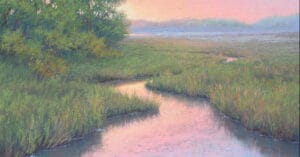
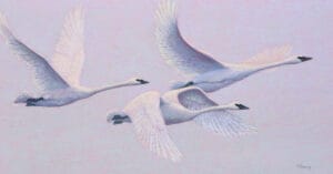
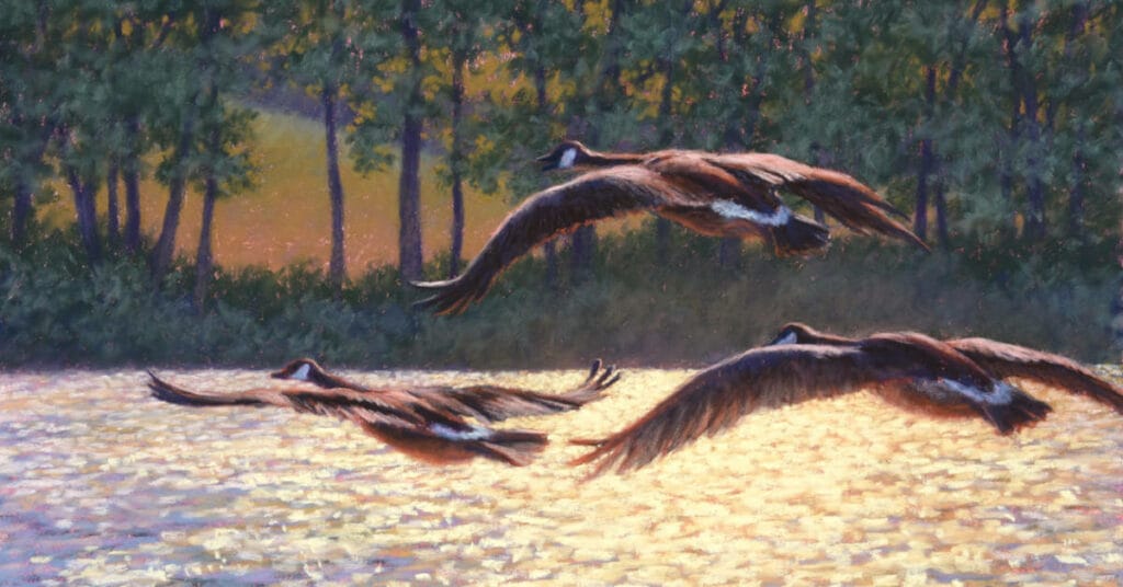
The painting I had planned was 3 geese in flight over a lake backlit by the morning sun. The camera exaggerated the values and the colors resulting in a discordant image and almost unusable image. Therefore, the reference photo would be used to inspire the composition only, which would also need some changes.

I began flipping through several books filled with images of paintings, looking for some sense of colors that I felt would work for this scene. The paintings in the books had absolutely no relationship to the scene that I was going to be painting. But I was seeking that moment that would jump out and say, “that’s it!”
And I found it with J.M.W. Turner’s “Le Chateau de Pembroke” (Pembroke Castle) painting of a stormy ocean scene with shipwrecks, a castle, and sun breaking through the clouds. Again, nothing to do with my geese flying over a lake. But the colors clicked.
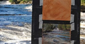
Analyzing his painting, I initially selected a sampling of about 20 colors that were used by Turner. These would serve as the foundation of my painting. But not in a literal sense. His sky colors became my water colors. His shoreline and castle colors became my tree colors. His wrecked ships served as the basis for my geese.

As my painting progressed, I incorporated additional colors for the geese, adding darker values of blue and mars violet, and lighter warmer orange colors. In the end, “Heralding the Morning” bore little resemblance to the local colors evident in the reference photo and no real resemblance to the story of J.M.W. Turner’s painting.

But I am always grateful to those who came before, the artists’ and their vision, in providing inspiration to those of us who continue our journey to learn and grow.