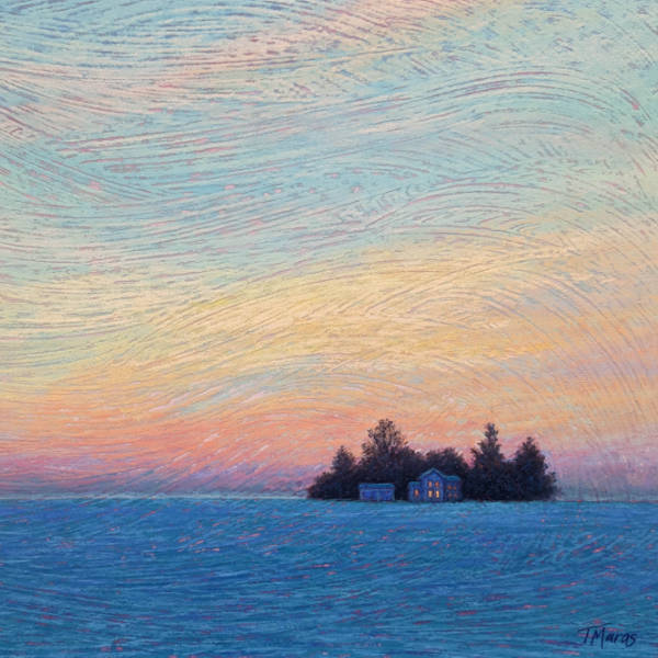
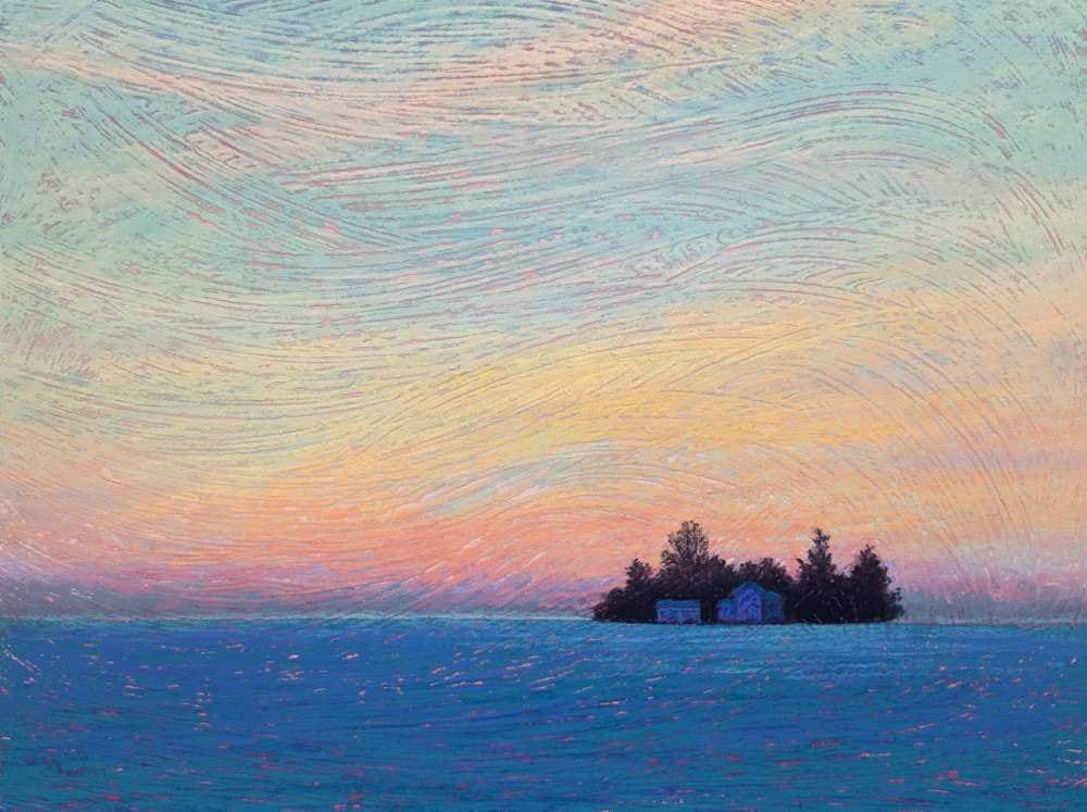
Introduction
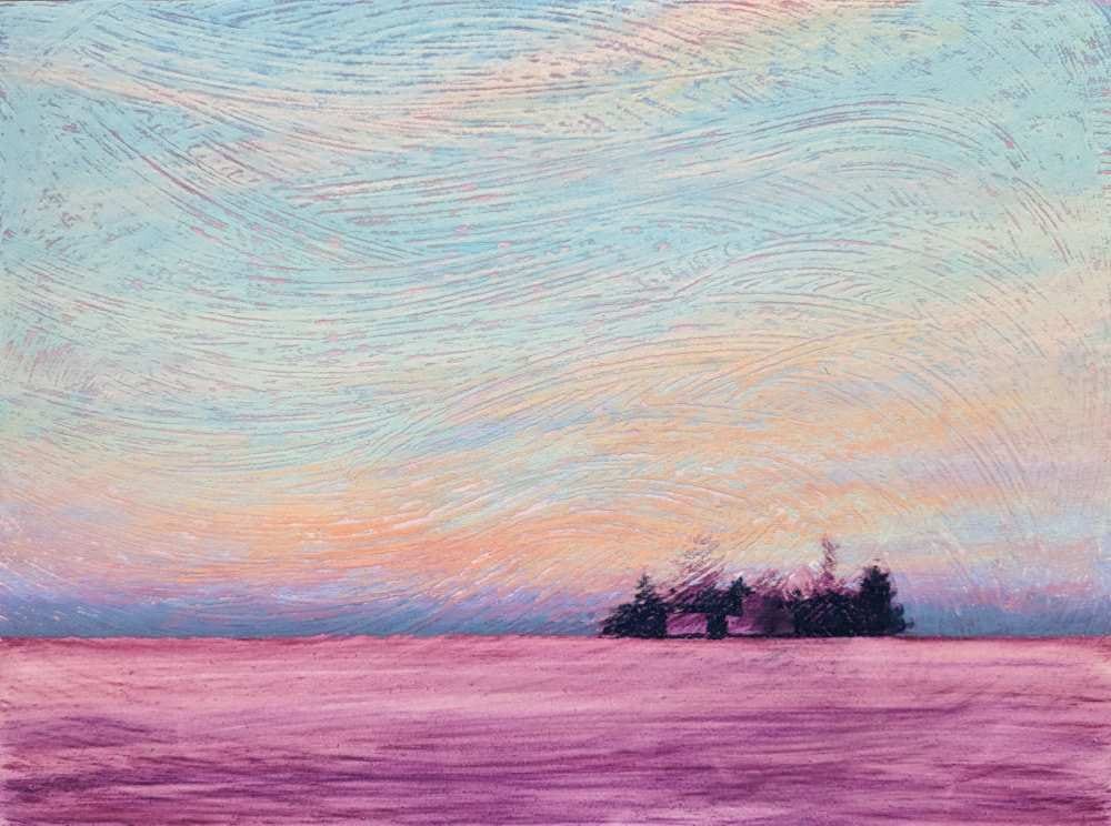
When imagining a winter scene, we usually visualize a scene filled with white. But in the low-light hours of twilight, snow can become a blanket of rich indigo and turquoise blue. Pairing that with the warm highlights of the setting sun reflected on clouds or the warm light emanating from the windows of a house can create a scene that is colorful and expressive.
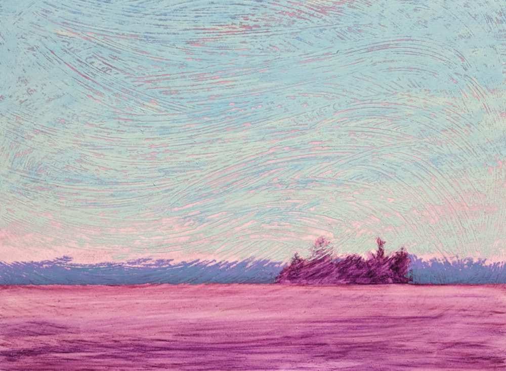
While this scene could have been painted on any pastel paper, textured ground was used to impart subtle drama to an overall simplified scene of an isolated homestead silhouetted against a twilight sky of winter.
Materials
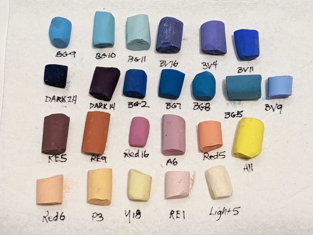
Unison Colour pastels
- Blue Green 2
- Blue Green 5
- Blue Green 7
- Blue Green 8
- Blue Green 9
- Blue Green 10
- Blue Green 11
- Blue Violet 4
- Blue Violet 9
- Blue Violet 11
- Blue Violet 16
- Dark 14
- Dark 24
- Red Earth 1
- Red Earth 5
- Red Earth 9
- Red 5
- Red 6
- Red 16
- Yellow 18
- Additional 6
- Additional 11
- Portrait 3
- Light 5
Other materials
- 1/8” Gatorboard
- Golden Fine Pumice Gel (Pastel Ground or Acrylic Gesso can be substituted.)
- An inexpensive paintbrush
- Cup
- Isopropyl alcohol for underpainting
- 1” to 2” wide brush for the underpainting
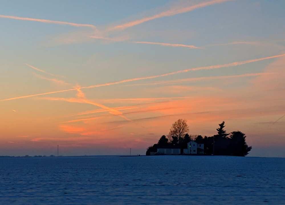
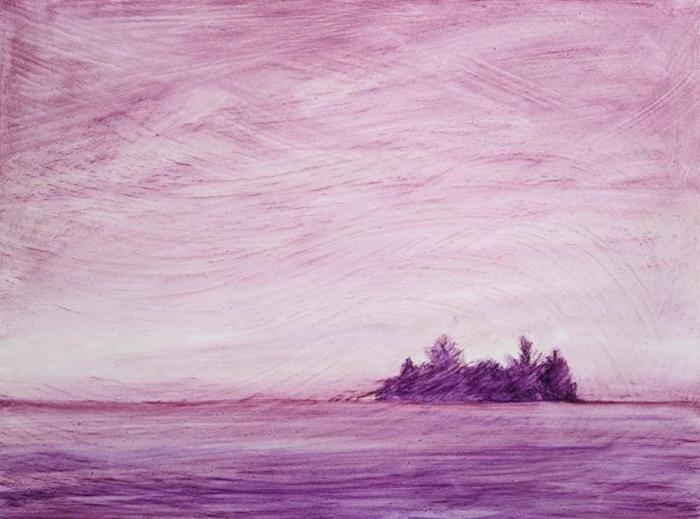
Reference photo
Stage 1: Design & Composition
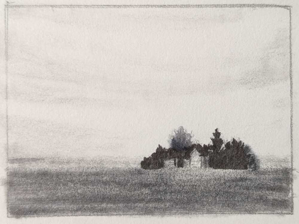
Creating a few thumbnail sketches can be beneficial in the design on your composition. They can help in the telling of your story, can identify potential compositional problems, and can help you separate from simply copying a reference photo.
Rather than copying the reference photo literally, I created several small thumbnail sketches (2×3”) to consider various compositions and to determine which design I preferred. When creating thumbnail sketches, I loosely sketch the large shapes using a pencil. I then use value markers (generally in 3 different values including black, medium grey, and light grey) to establish the value relationships in the scene. The lightest light is retained as the white of the paper.
The original reference photo depicted a sky filled with condensation trails from jets. I was initially drawn to these, not only for the dramatic color, but also for the story it told, of travellers and their destinations.
But as I worked through possible designs, I was drawn more towards the concept of creating welcoming light emanating from the windows of the homestead, which was not evident in the photo. In this case, the graphic lines of the con trails would have competed with the windows for attention. I decided on a simplified sky, still colorful, but fewer linear elements.
When selecting the color palette, I recognized that the camera had shifted the scene darker in the photo. In attempting to capture the colors in the sky, the camera shifted the silhouette of the homestead to near black and the foreground snowscape to an overly dark blue. Remembering what I experienced at that moment guided me to select a color palette that was slightly lighter than what was indicated in the photo. The lighter palette also imparted a more welcoming and hopeful feeling to the painting.
Stage 2: Preparing the Painting Surface
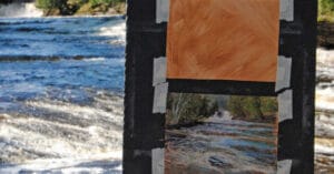
Because of the simplified composition, I felt that the addition of a specialized textured painting surface would add visual interest to the scene. Fine pumice gel applied to a board would create that texture.
I used Gatorboard because of its rigidity and ability to accept liquid medium.
Using Golden Fine Pumice Gel, I thinned the gel with water in a cup, to the consistency of thick cream.
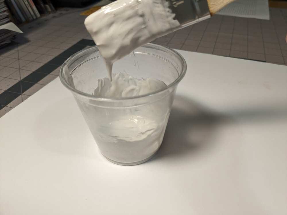
With the Gatorboard lying flat on a table, and using an inexpensive paintbrush, I covered the Gatorboard with a layer of the gel.
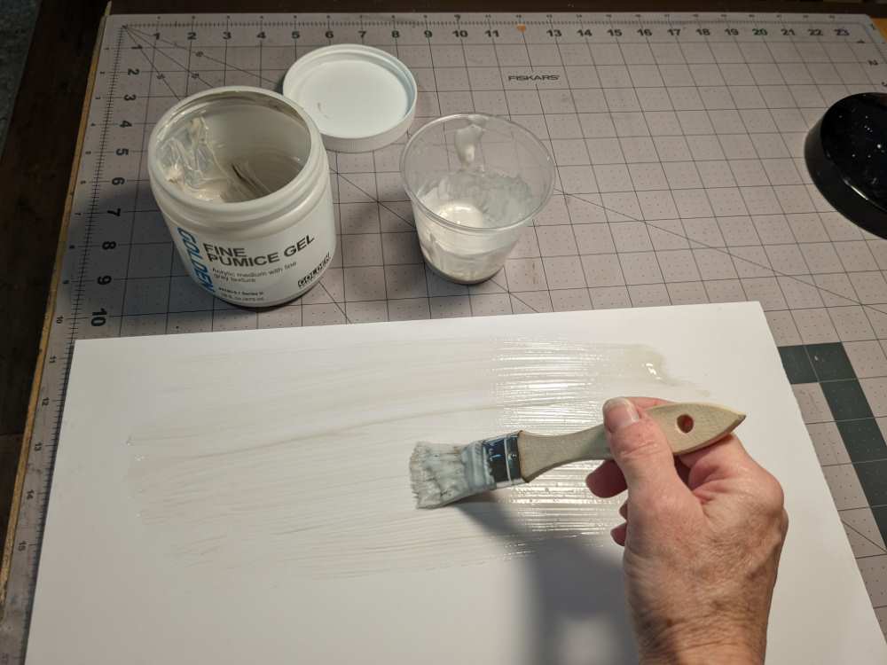
I then dragged the brush across the surface to create sweeping motions throughout the gel medium.
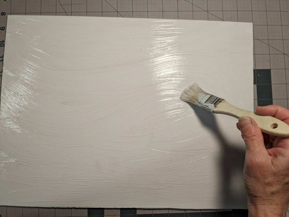
I allowed the board to dry at least 24 hours before proceeding.
Stage 3: Sketch & Underpainting
Since the composition is very simple in this scene, I decided to free-hand draw the sketch onto the prepared board. Using the thumbnail design I selected, I loosely sketched the horizon line and the general shape and placement of the homestead trees onto the board. As I sketched the homestead, I decided to make it slightly smaller than what I had originally planned in the thumbnail sketch, strengthening the concept of the isolation of the home.
For this sketch, I selected a color of pastel that would be incorporated into the overall color scheme. I used A6 to lightly and loosely sketch the horizon line and placement of the homestead.
Applying an underpainting to the paper adds another layer of color that will peak through and add interest and dimension to the painting. For this scene, I planned for the underpainting to be an integral component of the final painting, strengthening a value structure of the scene.
Using the side of the pastel, I LIGHTLY dragged it across the board, leaving some of the board surface showing. I used only one pastel RE5, varying the amount of pastel to establish a Value Map of light and dark shapes. I applied slightly more pastel for the darkest value of the homestead shape, slightly less for the foreground and the least for the sky. The lower 1/3 of the sky I left untouched since this would be the lightest light value.
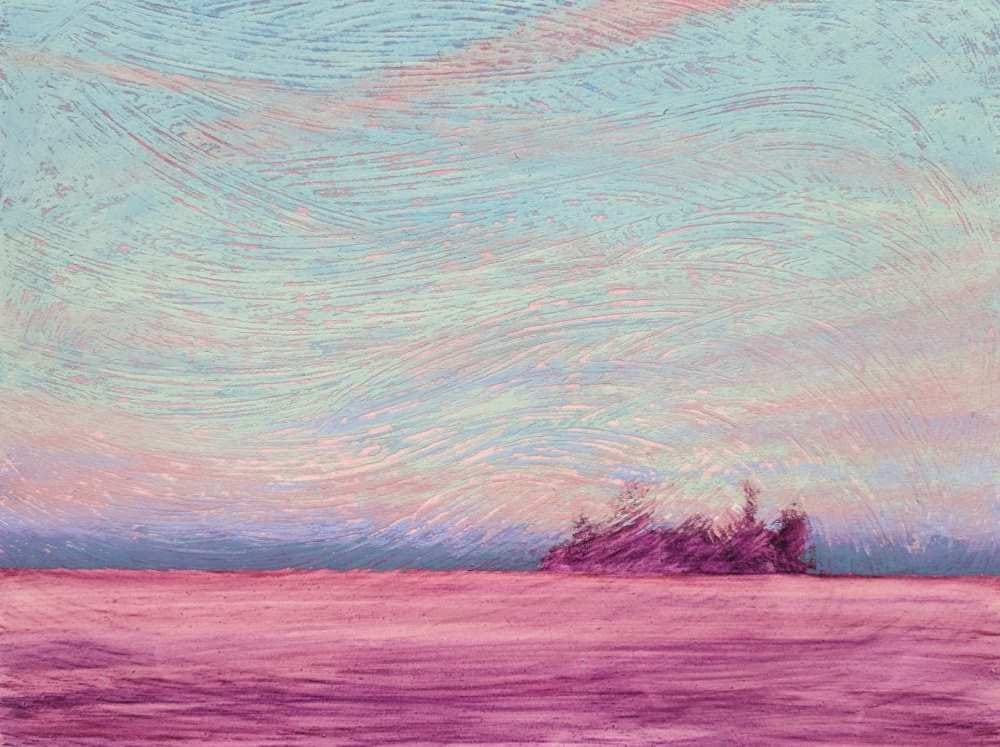
The pastel can be liquefied with Isopropyl alcohol, water, or Turpenoid to tint the textured board. For this painting, I used 70% Isopropyl alcohol and a wide brush.
I began with the rough shape of the homestead. I then began liquefying the pastel at the top of the sky, working down to the horizon. Residual color in the brush imparted a slight tint of color onto the board where no pastel had been applied in the lower part of the sky. I used gentle sweeping brush marks to imply the movement of the clouds. I then moved to the foreground, using horizontal marks to indicate the field surrounding the homestead.
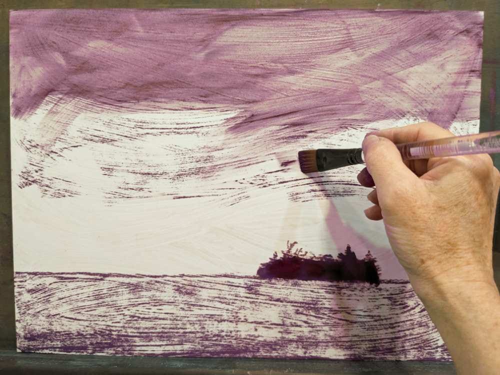
I let the underpainting dry fully before proceeding.
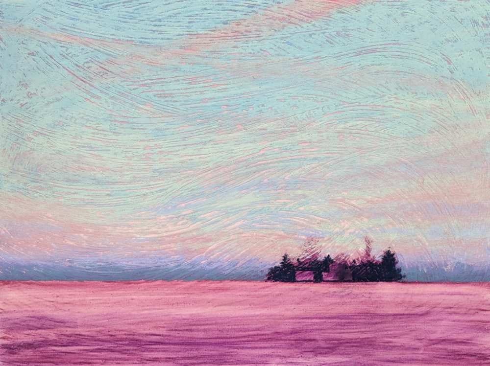
Stage 4: Beginning with the Sky
In any scene with clouds in the sky, I consider whether I will paint the sky and then layer the clouds over it or if I will paint the clouds and sky somewhat separately. In this scene, since the clouds form a thin veil of color over the sky, I decided to paint the majority of the sky colors first.
The blue of the sky was created by layering 3 different blues. When we are outdoors looking at the sky, the most saturated blue is directly overhead, shifting warmer and lighter as it approaches the horizon. That color shift relationship is evident in this scene as well.
Beginning with BG9 and using the side of the pastel, I dragged it across the sky, creating broken color over the warm underpainting. My goal was to not fill in the tooth of the texture as I applied pastel. In the design plan, the texture and the underpainting would serve to add interest and dimension to the painting.
As I moved farther down toward the horizon, I diminished the amount of BG9 that was applied, using a progressively lighter touch.
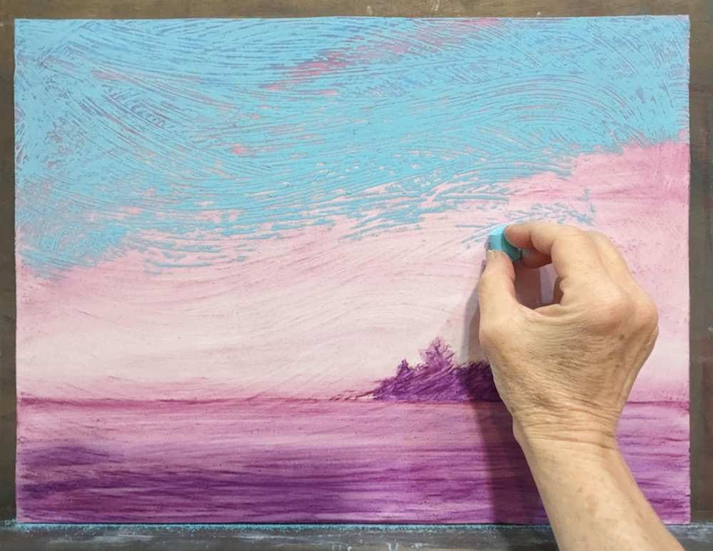
I then repeated the process using BG10, beginning at the top and bringing it slightly lower than BG9. Approximately half-way down the sky, I began adding BG11 and bringing it nearly to the horizon line. Each layer of pastel was applied lightly to avoid filling the tooth of the texture and covering up the initial underpainting. I applied the colors in sweeping marks for drama and to accentuate the eventual clouds that would be added.
It is very important to avoid blending the pastels with your fingers or a blending tool. Blending the pastels will greatly diminish the impact of the textured surface and the underpainting. It will also dull the colors of the pastels.
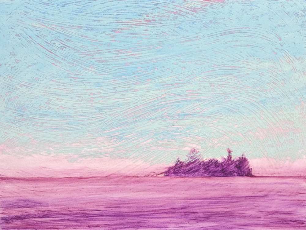
Because of the mid-value band of distant clouds along the horizon line, I turned the painting upside down to make establishing the horizon line a little easier. I have found that it is easier for me to see where I am placing the pastel mark if I rotate the painting. If my hand or the pastel are blocking my vision, I will rotate the painting.
Beginning with BV16, I loosely sketched the horizon line. Overlaying BV4 expanded the thickness of the shape, but I made sure that I did not allow it to get taller than the homestead. Keeping this mid-value band narrow pushed it well into the distance. I then layered BG5 to link this shape with the blue hues in the sky.
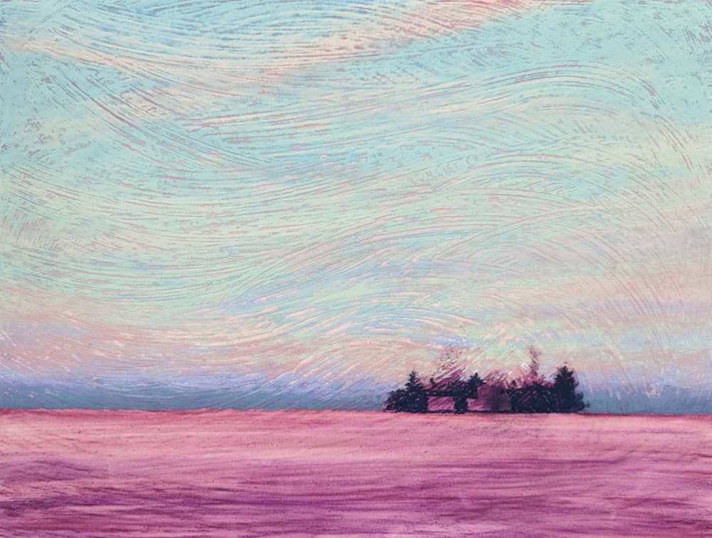
Stage 5: The Clouds and Blocking in the Homestead
Focusing on the wisping shapes of the clouds, I used Red16 and A6 to place subtle sweeping zig-zagging patterns across the sky. The pastel continued to be applied lightly to retain a sense of broken color and to allow the underneath layers of the underpainting and blue sky to show through. Remember, clouds are simply water vapor. And in this scene, the water vapor created a thin veil of color.
Nearing the horizon, I added Red 16 and then overlayed the tops of the distant mid value clouds as a bridge between the lighter portions of the sky and the mid value distant clouds. This also softened the contrast of the distant clouds, pushing them farther back into the distance.
The darkest value in the scene was the vertical shape of the trees of the homestead. They were loosely indicated with Dark 24. This allowed me to be able to compare all subsequent values, recognizing that nothing else in the scene would be darker than those trees.
Using negative space painting, I carved out the shapes of the garage and house when blocking in the dark of the trees. I chose to not block in the tops of the 2 tallest trees as cloud colors needed to be further developed behind the homestead.
Stage 6: Building the Clouds
I began slowly lightening the veil of clouds with RE1. Using the side of the pastel, I lightly glazed in clouds, placing the lighter color slightly above the previous cloud colors. This imparted a sense of dimension in the clouds with subtle shadowing along the lower edges of the clouds and lighter along the tops.
Now it was time to start warming up the clouds.
Continuing to use gentle sweeping motions, the clouds in the lower half of the sky were warmed using Red5, Red6, P3, and Y18. To bridge the sky into the mid-value cool clouds at the horizon line, Red16 was layered over the top edge of the horizon clouds.
The clouds floating above the homestead were warmed further with A11 and additional hints of Red5 and Red 16. The pastel marks continued to be applied with a light touch to allow underlaying colors to show through.
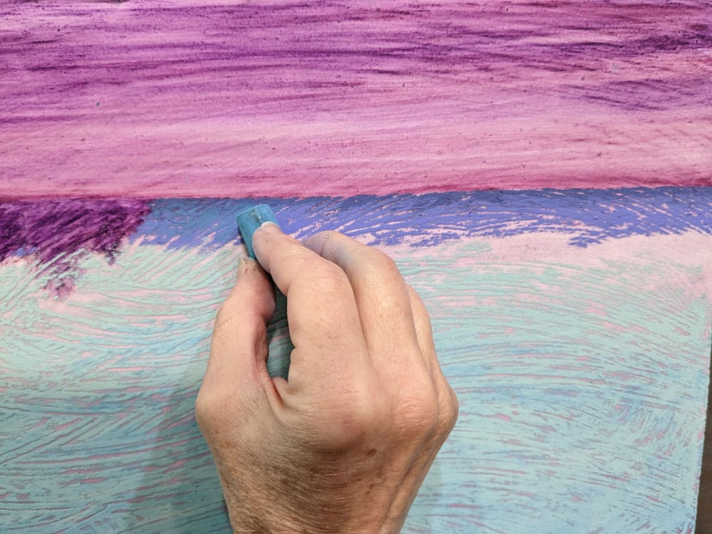
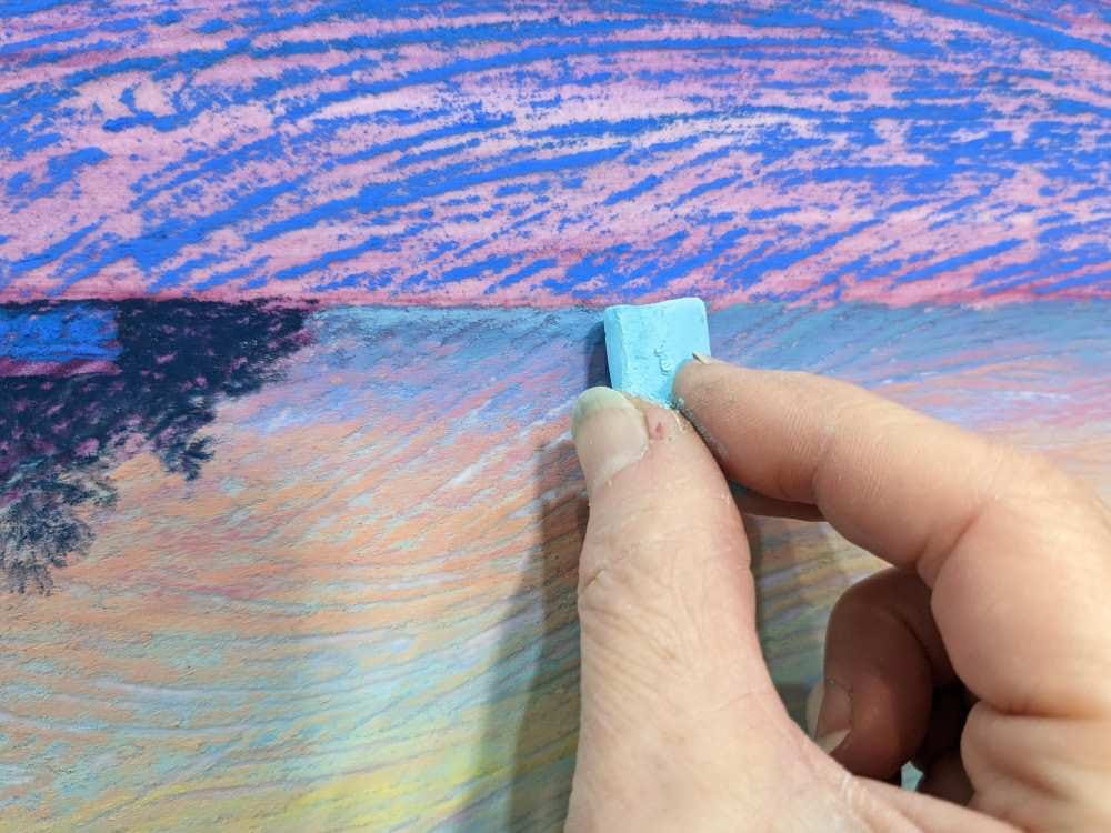
I chose to turn the painting upside down again when preparing to put in the fine line of turquoise just above the horizon line. It was easier for me to see where the pastel was going when attempting to establish a horizontal line that was butting up against another edge. In this case, the thin line of turquoise light butting up against the distant ground of the horizon. BG11 was used along either side of the homestead along the sky horizon. However, slightly less BG11 was applied to the right of the homestead (when the painting is upright).
Stage 7: Establishing the Foreground
The painting was returned to upright.
The garage and the center and left sides of the house were indicated with BV11. Since the right side of the house sat slightly back and in deeper shadow, I used BG7. I also returned to the trees and very lightly added Dark 24 for the two tallest trees.
To help keep the horizon in the distance, BV11 was lightly dragged along the upper third of the foreground land. The remainder of the foreground land was layered with BG2, BG7, and BG8. A significant portion of the underpainting was allowed to show through during this initial block-in of color. This would accentuate the texture and dimension of the snow-covered field. In addition, the warmer underpainting would help keep the foreground from receding too much with the use of the cooler hues.
Moving slightly lighter in value and warmer in hue, BG5 and BG10 were layered across the foreground land.
The thin lines of the garage roof and the house were indicated using BG5.
Subtle marks of Dark 14 were used to warm the trees of the homestead.
To further lighten the foreground land and to add textural interest, BG10 was lightly glazed over the previous cooler and darker colors. Slightly more BG10 was placed in front of the house for contrast and to also hint of additional light emanating from the house, lightening the ground.
Welcoming warm light from the windows was added to the house using RE9 and Red5. The roof lines were also lightened with a hint of “snow” using BG10.
The tops of the trees were lightened and warmed with RE5.
Stage 8: Time to Assess
Whenever painting a scene with a prominent horizon line, I double check to make sure that the line is level and straight. Pulling out a ruler and measuring from the bottom of the board verifies that the horizon line is level.
Throughout the painting process, I frequently step back from the painting to see it in its entirety. I assess the accuracy of the drawing, the flow of the composition, the value relationships, making sure that the darks, mid-values, and lights are accurate. I’m looking for anything that looks incorrect or awkward. And I am also assessing if the painting has captured my initial intent and vision.
If corrections were needed when working on this type of textured surface, I could easily take a stiff-bristle brush and brush off pastel. Afterwards, if I needed to take it back to the underpainting itself, I could use a Mr. Clean Magic Eraser to gently wipe off the pastel layers. Or I could apply the original underpainting color onto the base surface and gently rub it in.
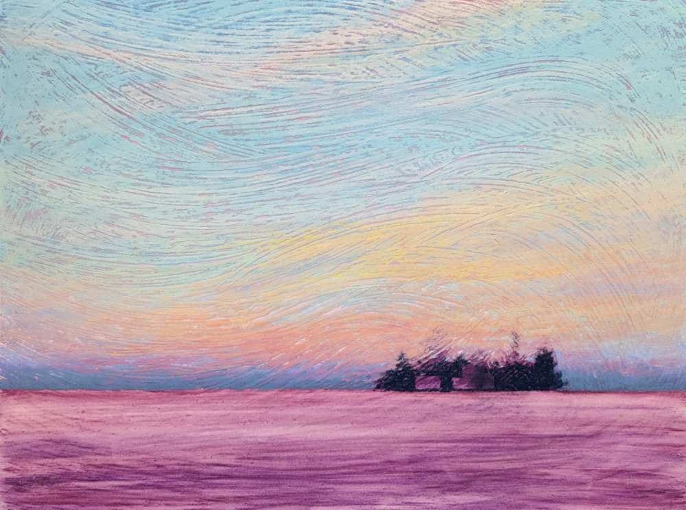
For this painting, I didn’t identify any corrections that I felt were needed, so on to the final highlights.
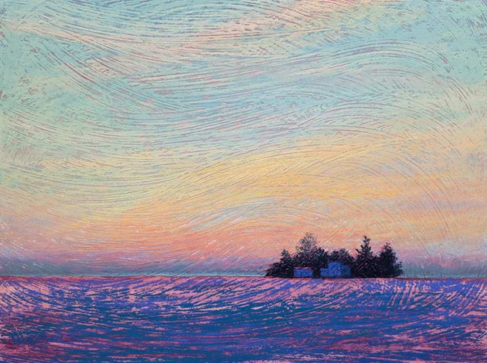
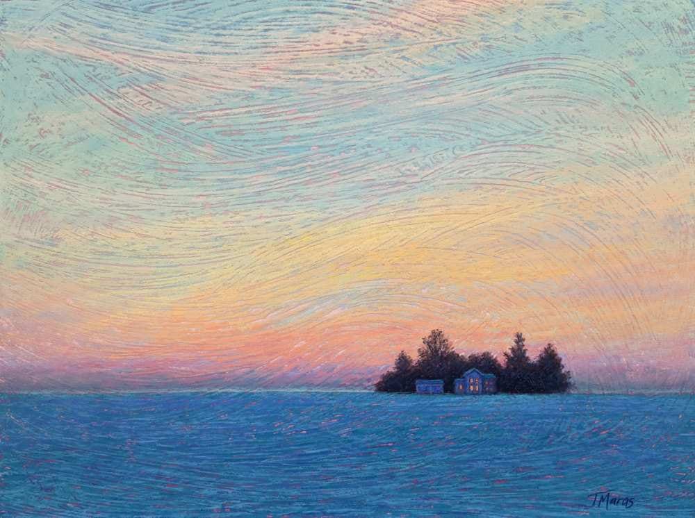
Stage 9: The Highlights
A few final highlights on the clouds in the middle of the sky were added using LIGHT5. And I brightened the lower 2 central windows of the house using A11 to give the feeling of welcoming light in the main living room of the house.
