Introduction
Limiting our palette may seem counter-intuitive when there is such a huge range of pastel colours available, all in beautiful and enticing colours. But have you ever found yourself stuck in a moment of indecision because there are just too many colours to choose from and you don’t know where to begin? Or working with a wide variety of colours then finding that your drawings have become too busy?
By practicing a bit of restraint and focussing on the colours that are going to be the most meaningful in depicting our subject we can make sure our choices work for and not against us. And as we gain confidence in our understanding of colour relationships it will help us to make bolder work in which all those luscious colours are given the best possible opportunity to shine.
Colour Theory
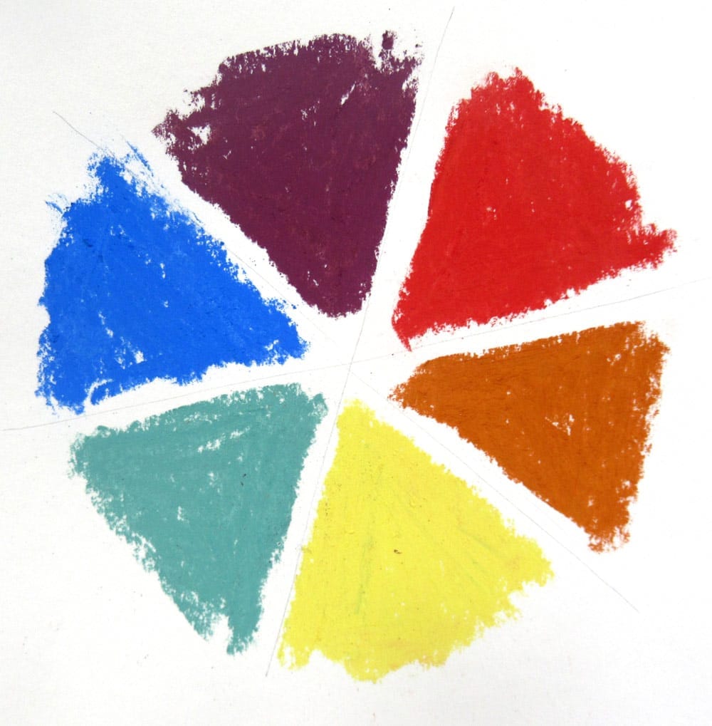
Colour theory is a set of well-known and ancient practical guidance that can be traced back through the centuries. We’re probably all aware of the colour wheel that demonstrates primary colours (blue, red, yellow), which mix to produce secondary colours (green, orange, purple) and how they relate to each other as complimentary colours (yellow & purple, blue & orange, red & green).
But what colour theory can really help with is to remember some of its principles when we’re selecting colours for our artwork. And by increasing our understanding of colour we can use it to imbue work with a great deal of character and atmosphere that may not be achievable if we were to approach it in a more photo-realistic manner.
A few useful points to consider when selecting colours can be broken down into three main subjects:
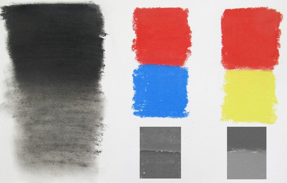
Tonal values – if you were working in black and white how dark should the tone be?
For example red is a very bright colour but tonally it might be similar to blue so will lack tonal contrast if they are side by side. Note the tonal contrasts in the colour swatches as illustrated in black and white beneath each colour combination.
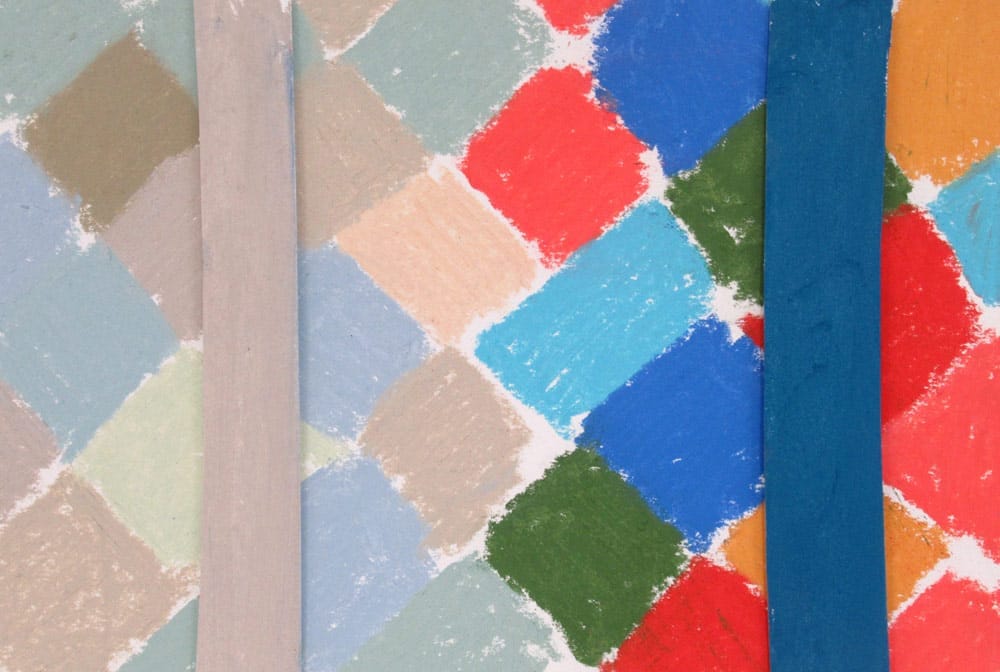
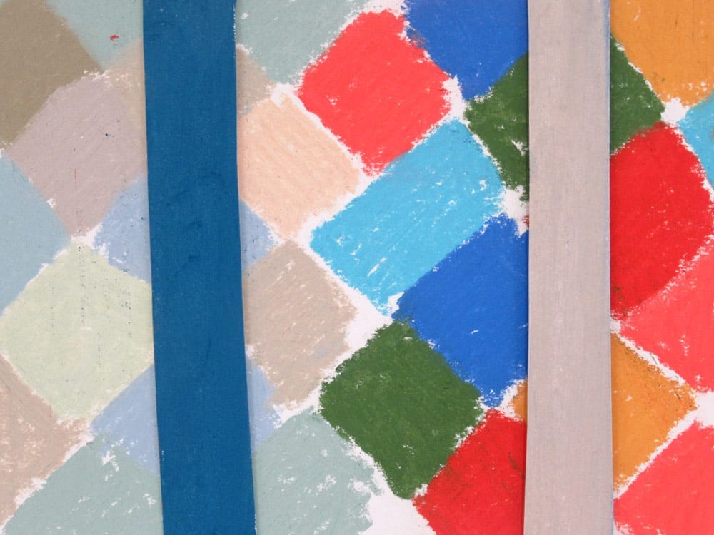
Saturation or vibrancy – how intense is the colour?
Lots of very bright colours together will compete for attention while neutral colours side by side will begin to blend into each other as shown in the first example. But if we use bright and neutral to compliment each other they will work together harmoniously as illustrated in the second image.
Once again it is a way to introduce contrasts within our work which can make it more impactful and easier for the eye to understand.
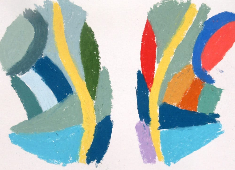
Hue – the families of colours such as reds, yellows, blues. Are you working with one or several colour families?
Our choices when using colours in combination can feel discordant or harmonious depending on how many different hues we use and the quantity in which we do so.
We may wish to decide upon a dominant colour for a piece of work then add smaller accents of other colours. This will have the effect of bringing focus to the contrasting colours while maintaining a harmonious balance overall. In the examples below the eye is instantly drawn to the yellow line on the left as it contrasts with the softer palette of blues and greens. While on the right it is difficult to find focus due to so many competing colours.
Putting a limited palette into practice
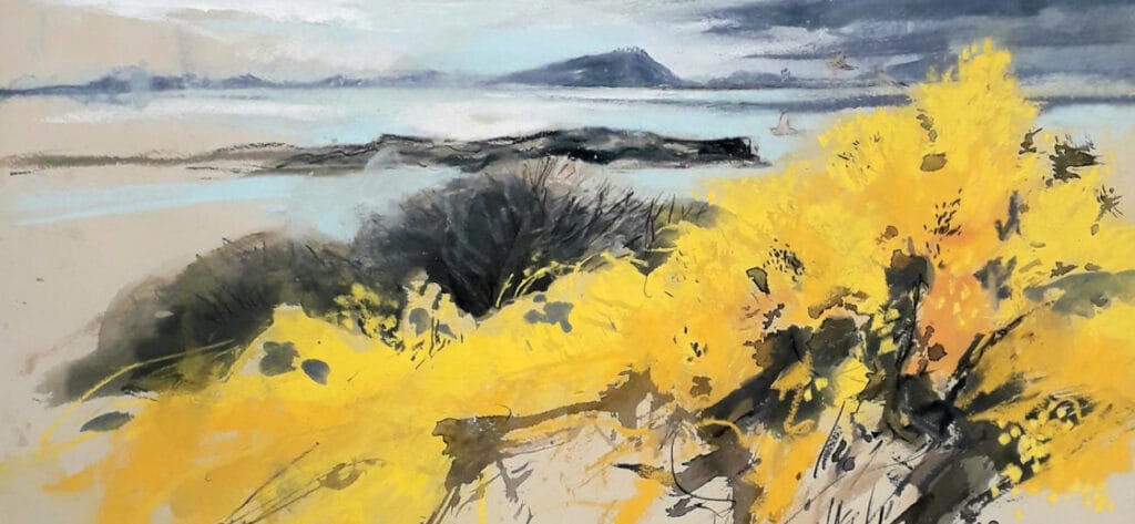
In this example I had spent some time drawing on the Isle of Skye, working entirely outdoors to make drawings which I hoped would capture the exuberance of springtime.
The things that most appealed to me about the subject were beautiful bright yellow gorse bushes in the foreground, in contrast with a sky that was still bringing regular wintery showers and gales in across the sea. With a few quick pencil sketches I decided on the composition and key elements for my drawing so am now ready to consider colour…
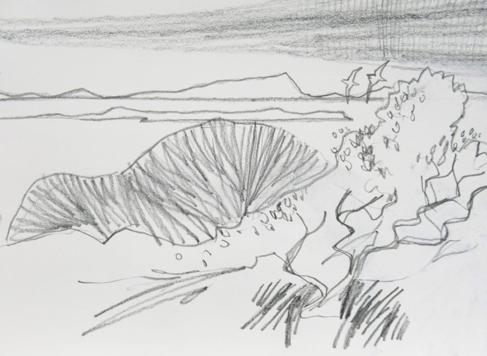
There were many different hues apparent in the view such as grasses in a variety of greens and occasional patches of clear bright blue sky. However I decided early on that it was yellow gorse bushes in the foreground, heavy purple/blue clouds and strong tonal contrast in areas of shadow were what interested me the most.
Try this…
Why not make some tonal studies with soft pencil or charcoal before beginning your colour work? By understanding tone it will help you choose colours with the correct saturation or vibrancy for your subject.
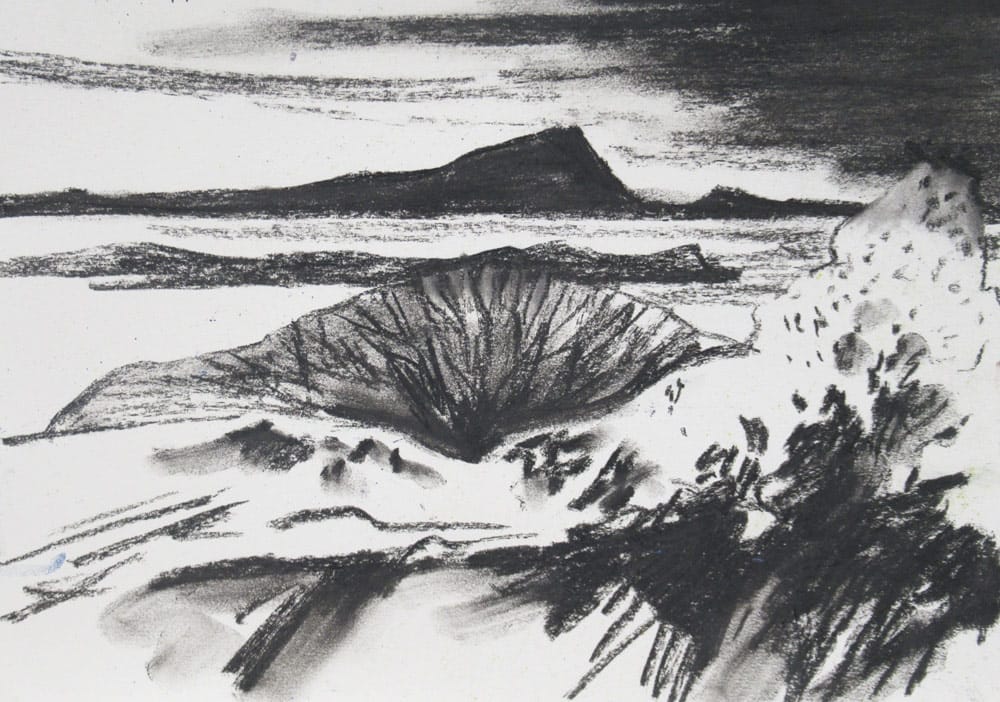
It can be easy to forget about the tonal values of work when we use colour but tone is extremely important in helping the colours to work effectively. Creating good tonal contrasts can help make your work more impactful as well as give your subject a greater sense of form and mass. You can also experiment with tonal values to affect the atmosphere of your work. For example; high contrast for drama, low contrast for calm, dark tones can feel oppressive while light tones suggest space and expansiveness.
Going back to basics with a tonal study helps us understand one aspect of the balance to be achieved with colour in the next stage.
Try this…
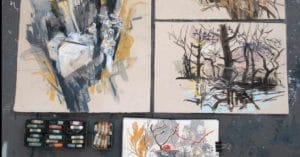
You might like to try making a series of small colour studies. Try to break the image down into as few colours as possible. You can always add more in the final artwork but beginning with a reduced palette will help achieve focus and balance in the foundations of the picture.
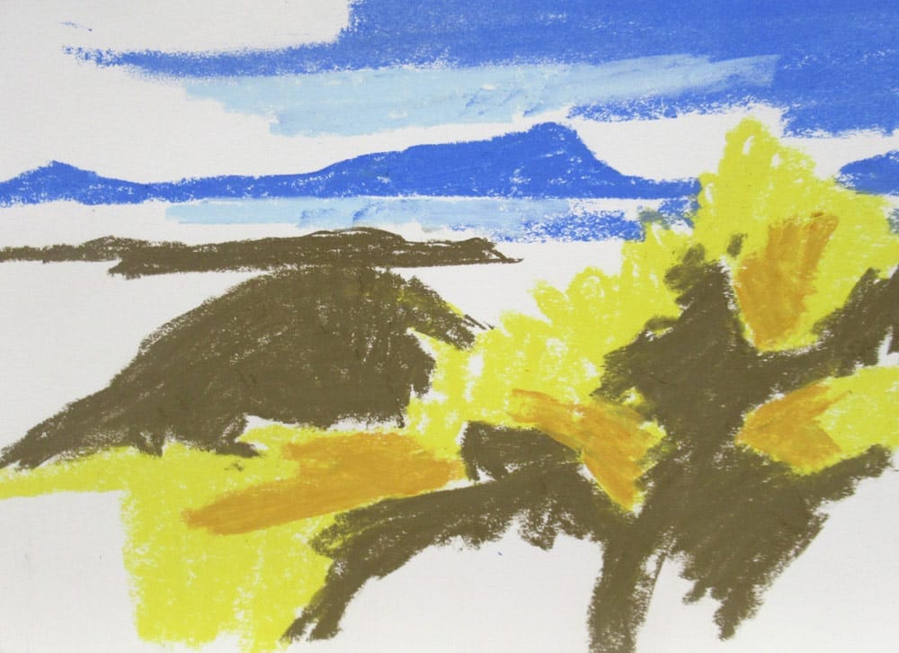
Begin by identifying the main shapes and tones then think about the colour that would best represent that area. Some great examples of using a limited colour palette are in early publishing when it was too expensive to print in full colour and artists had to think very carefully about which colours were most important to their images. A few quick colour studies of a subject before starting a larger work or even just pausing to think carefully about which are the most important colours can help you make more considered choices.
I knew yellow and purple/blue would work well together as they are complimentary colours and also have a good tonal contrast. They would be my two key colours, supplemented by some neutrals.
Experimenting with using different hues can take work in new directions and allow you to move away from direct representation of a subject to a more personal interpretation.
Colour has a huge effect on our mood and sense of surroundings, warm or cool, calm or energetic. For example “cool” colours such as blue and green are often seen as calming and relaxing while “hot” colours such as red or orange might appear more energising.
It could be an interesting exercise to tackle the same subject with different colour choices and see how this affects the mood of the work. Exploring subjects in this way can lead to new insights how to convey our feelings or a sense of atmosphere surrounding a subject.
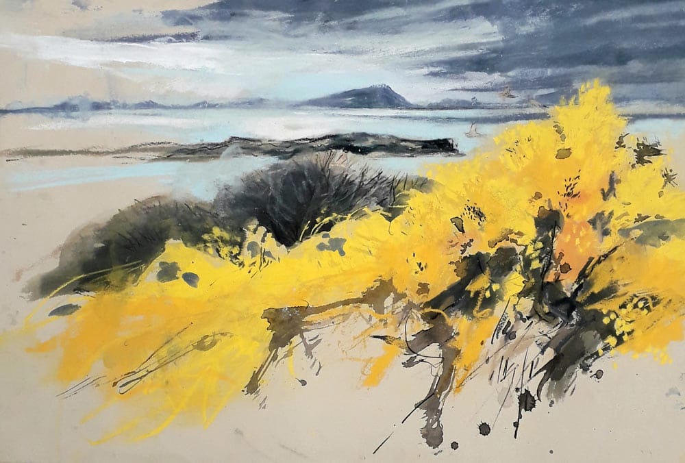
In this case I used a few tones within the two main colour families of yellow and purple so that there would be some variety. Bushes in the background were handled with a neutral grey/brown as were other details such as the islands so as not to detract from the focal points. A little extra tone was applied to the foreground in ink wash to add definition and extra depth. The use of complimentary colours which are high contrast lend the drawing a sense of energy and vibrancy – perfect for the mood of a fresh spring day.
Tip
I find it very helpful to keep a colour chart of colours I use regularly. This only takes a few minutes to make and is something I can refer back to when I’m working in the studio or selecting a limited number of pastels to take out drawing in the field. While I’m working I can just glance at it to see how the colour I intend to use actually looks on paper and in relation to other colours. (It’s also really handy for when I’ve torn the paper covering off my pastel and want to re-order more of the same colour but don’t know the code!).
Alternatively you could keep a scrap piece of paper next to you while working to try colours on before committing them to your drawing.