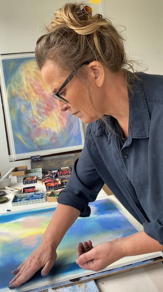
As a tactile person, soft pastels are the obvious choice.
A way with Colour
I have been fascinated by colour for as long as I can remember. Beautiful colours, vibrant ones or soothing are surprising and fun. All of them wherever they appear, they captivate and inspire me to use them, mix them and to create my own art by colour. Colours speak the language of my soul and it is invigorating and rejuvenating to explore the unending possibilities they offer.
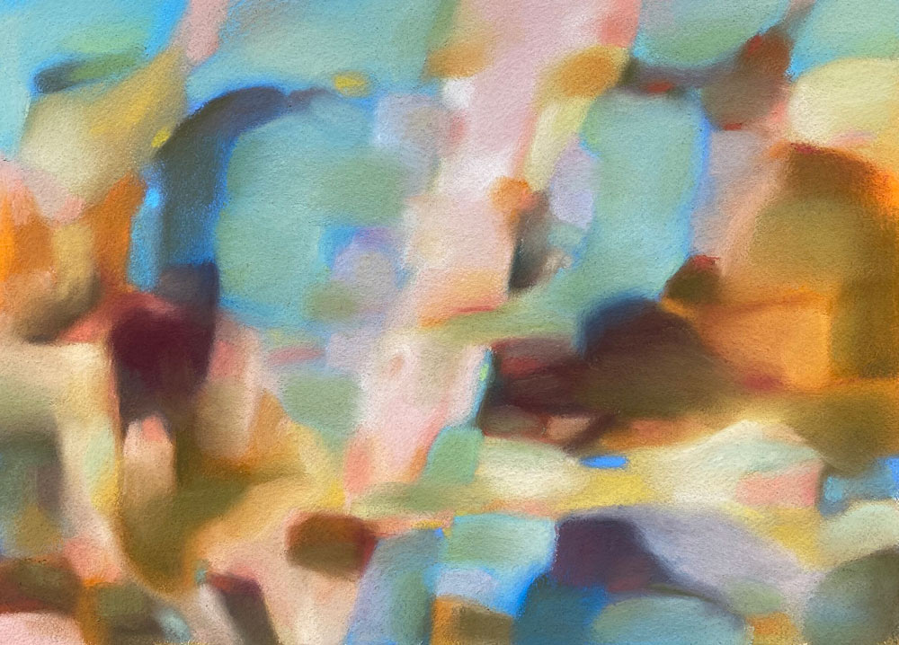
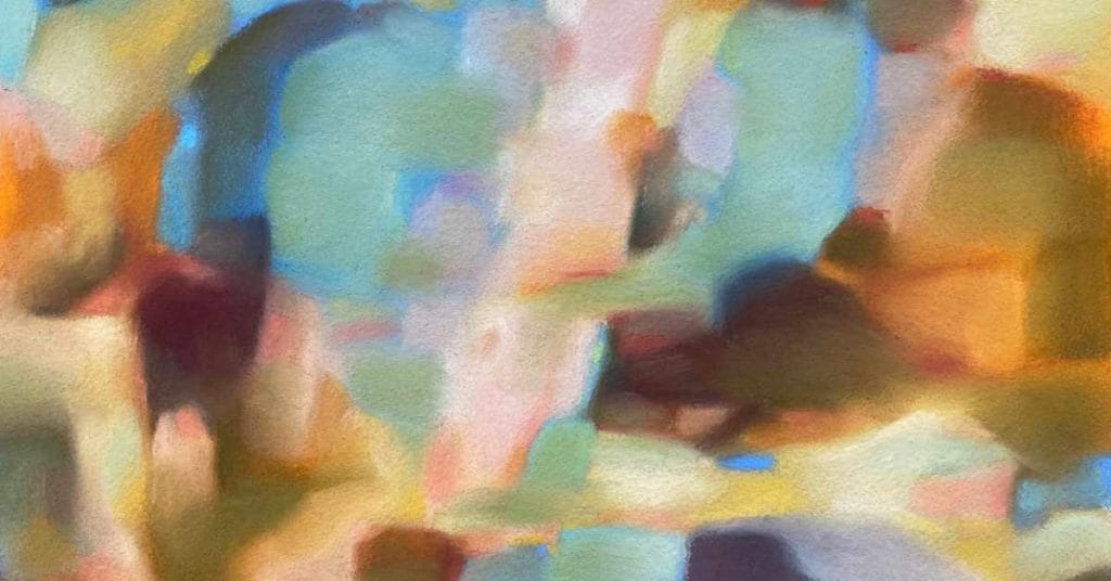
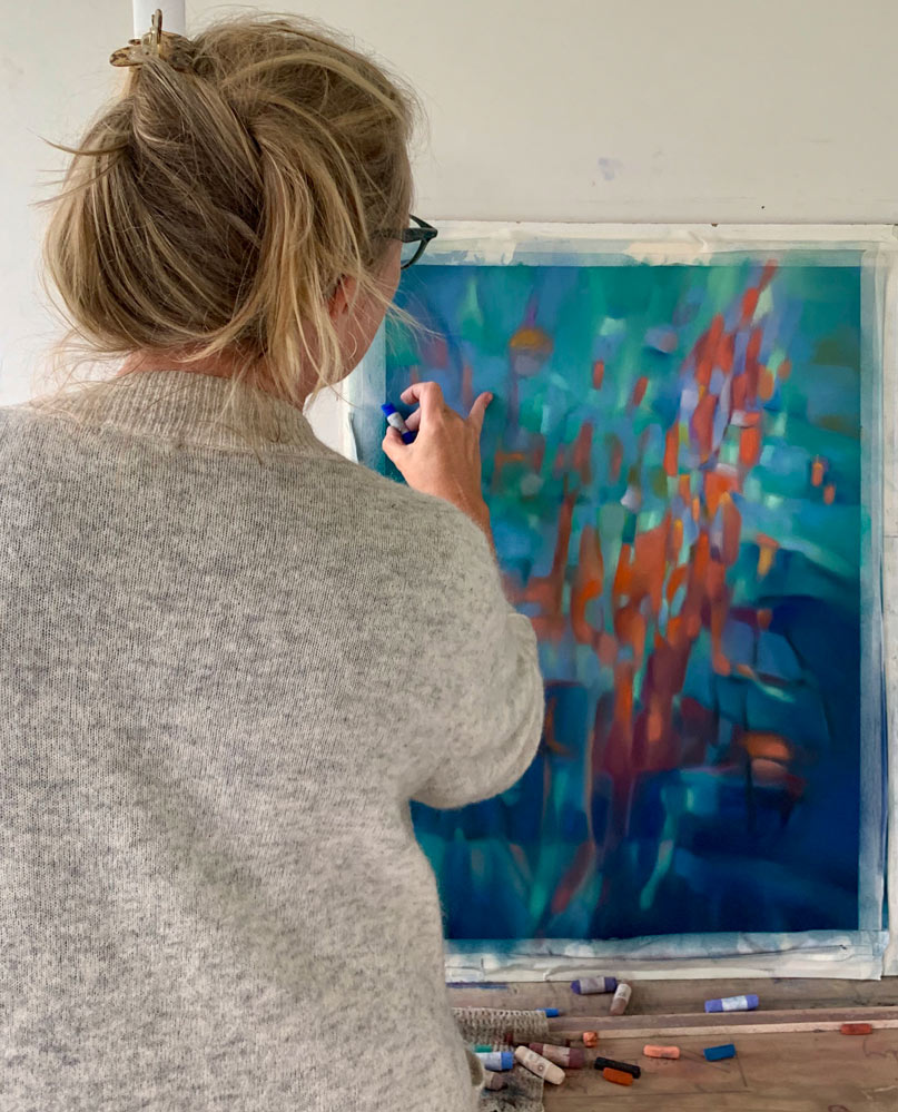
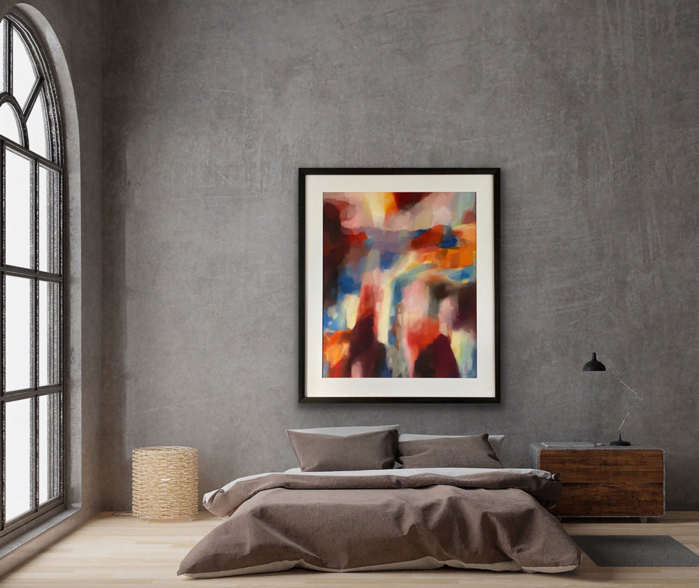
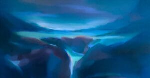
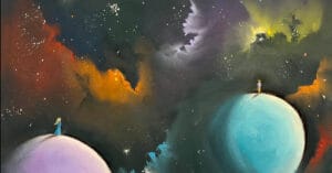
I have used turquoise GN 23, Dark red is P8 and the orange is Y7 in Unison Soft pastels.
“It’s in the language of colours I feel most at home and it is in this non-verbal language I find the strongest and most powerful way to communicate”
Insipration
For as long back as I remember I have colour memories. Memories like this from my childhood of my grandma standing white-haired in her summer garden between pink roses and greenery with her light blue apron gently waving in the breeze are imprinted as colourful images in my imaginary image album of memories. I work intuitively and from memories and often a series of pastel drawings from the same inception.
I find inspiration in my surroundings, I live on the West Coast of Norway close to fjords and mountains, on the edge of the North Sea. These old landscapes have endured dramatic weather changes for ages, the deep fjords and majestic mountains kindle my imagination and curiosity with its intrusiveness and persistence, its volatile colour moods. They encourage a broader perspective, remind me of the passing of time, the ungraspable past, undetermined present and unpredictable future for me and the generations before me. I perceive much of my surroundings through colours and I experience the landscapes as abstract imagery. I see surfaces and structures, colours and sculptural elements. I look at landscapes much the same way I observe a work of art. I like to go for walks but I’m not an ideal companion, I’m stopping ever so often, taking detours every-time something captivates me or look interesting, which is often. I love it anyway and use all my senses to take it all in.
You can find traces nature in my artwork, sometimes it is quite obvious other times you have to look closer and use your imagination to see it, but it’s always there. Translating my experiences and memories into my own artwork is a joyful process, I try to imbue my art with my impressions of the landscape, how it feels standing here, as I let my eyes gaze over the hills and into the horizon, looking at the light blue mountains in the far distance knowing they are days away in walking distance even if I can be there in a blink of my eye. Standing there breathing it all in, I feel alive and enjoy the smell and how the wind feels on my skin, resting on the granite that is warm from the sun and enjoying the sweet taste of a handful of berries. Back home I fill the paper with my feelings, experiences and thoughts, working from memories and freeing it from the actual place, and time using the colours that resonates most forcefully within me giving me such a powerful language to express myself. I want to give you the essence of the experience through my art.
I find it more and more important to communicate respect and love for nature and the significance of the landscape. It is pure joy to gaze farther and farther away and only see untouched nature until heaven and mountains meet in the far distance. It reminds me of our responsibility to protect it, because its value is immense, beyond money and shortsighted developments. We can enjoy it while we are here, then it is our daughters and the new and coming generations who are given this gift. I hope that they can stand at the same place I did and experience the beauty and serenity of it as so many generations before us has done.
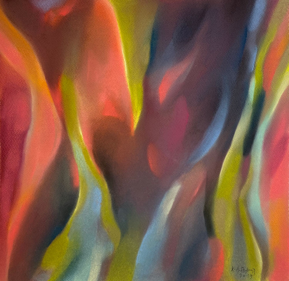
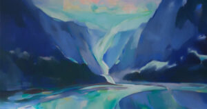
Here you see rich reds with a kiss of R9, the dark brown is DK3. The deepest blue is Dark 24, and the middle blue is A52, the fabulous green is GN15 in Unison Soft Pastels.
My first love affair
The first time I used soft pastels was when I was at art school in England, one of my classmates had a brand new set of Rembrandt pastels and it looked glorious. Later on, when I worked as an Art Therapist I found that Soft pastels provided me with an easy way to practice my skills, I could even do nice work in-between consultations. The children also loved to try it and bit by bit it became more important. Then, when I decided to dedicate all my time to develop my own artwork, it became my main medium, taking over completely from painting.
Every time I visit London I take a trip to my favourite shop Cornelissen & Son, a few years back I found the Unison Pastel drawers and fell head over heels in love. I almost used my whole holiday budget on these wonderful soft pastels. I brought home with me the most incredible soft pastels I have ever tried. From that moment on, I have used these as my main pastels. Everything about them appeals to me such as that they are handmade by dedicated and skilled people, they are made by a small company, the overall aesthetics are beautiful and completely implemented but most of all I love and rely on their fantastic quality.
WHY Unison Colour Soft pastels
In my artwork I explore the inherent luminosity and depth of the colour, the dynamics of the dialogues, movements and flow, how the character of the colours are affected and change and how they appear in gestures, shapes, and lines. My tools have to have first class pigments to deliver the highest quality I need to get the results that I am looking for. After using Unison Colour soft pastels daily for several years I’m still happy with them, perhaps more so than before and now it’s founded on my experience with the high performance and quality of these Soft pastels deliver, it has become a serious love affair, I will try to explain why.
Tactile
Then there is this about touching. I’m a tactile person, using my hands as tools are just right for me, I love the feel of the pigments in my hands, I enjoy to use my fingers and hands directly to create movements and flow. I like to add the pigments to the paper and then use my hands and fingers to move them around, to mix them and to create the shapes, edges or shadows I want. I seldom use the pastels as a drawing tool. I guess I am still a painter by way of thinking and applying colour, not in form of lines but areas of colour and building them layer by layer.
The colours
Since my way in to the art world is through colour, I find the vibrancy and clarity of the soft pastel colours really appealing, the way they carry the luminosity and saturation of the different colours are fantastic and as close to my imagination and perception of colour as I have found in any medium. Soft pastel is my preferred medium, the colours offer fluidity and give my artwork an ethereal quality that is hard to come by in other mediums.
To be able to get the character of the colour right, I have to use first class products with high intensity and pigments as pure and evenly distributed as possible. Since the pigments are pure they have a long longevity and age well. Unison Colour Soft pastels come in a huge variety of colours and nuances, they are appealing to look at and are awesome to use. All this combined with the silky soft surface they create makes it an interesting and satisfying medium to work with, leaving me with a beautiful artwork that I am proud of and enjoy.
Translucency
Soft pastels offer fabulous translucency. This quality opens up the artwork and creates a sense of space and depth to the colours. I have received comments on how much like stain glass windows my colour work appears, the luminosity in the colours are this powerful;
“Your paintings ventilate light, transparency and depth at the same time – so it is perfect.”
Sabine Kaiser
The pigments
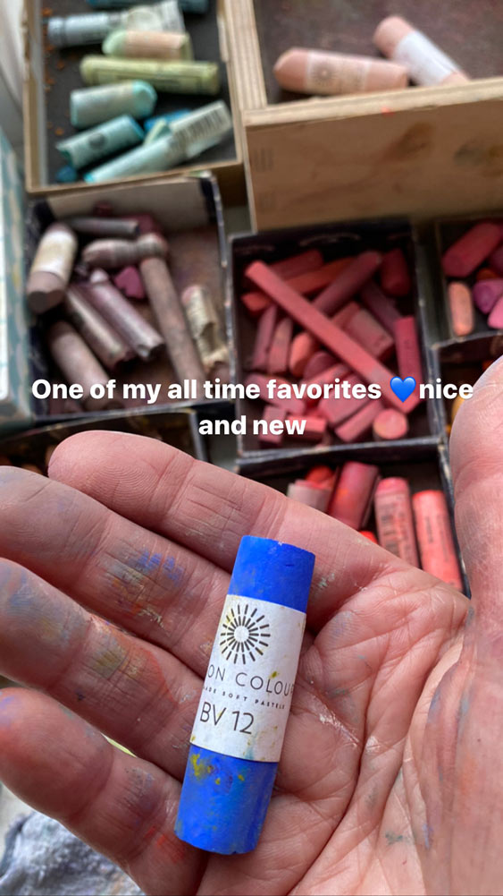
I like the purity and fine grain of the pigments, I love the consistency and that they are so evenly pigmented. The colours are magnificent and expressive, and the colour range is very good. I love to work with the push and pull of the colours, and often use colour perspective to bring something into the foreground or to push something further back. The Soft pastels does this in a superb way, like the Unison Colour BV 12 that will give you endless depths to dive into and the brilliant Unison Colour red 2 will pop right out at you as a sweet kiss.
The pastels are easy to use, they have a great size which make them easy to hold and they last. Unison Colour Soft pastels are made of the purest pigments which means that my artworks will last longer than me, and I know that I can trust the pastels to keep their colours vivid and beautiful with the intended intensity and hue beyond my years.
The surface
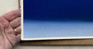
The surface of pastel paintings are awesome. The matte velvety smooth surface enhances the colours beautifully, showing of the luminosity of the colours and making them the main focus, but also giving the colours a subdued and graceful appearance. I always use quality paper and I prefer to use 300 g cotton paper, mainly fine grain but sometimes it is nice to use a more structured surface, which give a very different look. I like to vary the structure of the paper to change the character and expression of the artwork, a rougher surface can give extra life to large colour areas. I like to choose from many different types of paper, depending on what expression I want to achieve. The paper I use range from fine grain to medium rough, but I mainly use the silky smooth paper, because it is the easiest to work on and not as hard on my fingers. The roughest paper is also a bit more difficult to photograph because of the shadows, it has to get its main light from above, and I have to wait for a cloudy day to get a good result.
Stay Healthy
Being creative and create works of art are a great benefactor to my mental health and keep me in a positive place. It makes it easier to tackle all the different aspects of life, bumps in all the different varieties and colours that life offers seem simpler and more manageable. Lately I have taken another safety measure seriously, making a better physical environment in my studio and make t even more enjoyable.
I work every day and there can be a lot of dust in the air, so Im thinking of getting me a sanding table that will suck the dust down and out, its a smart to use the gravity to clean the air, my Studio isn’t so large so this will also give me a nice ventilation.
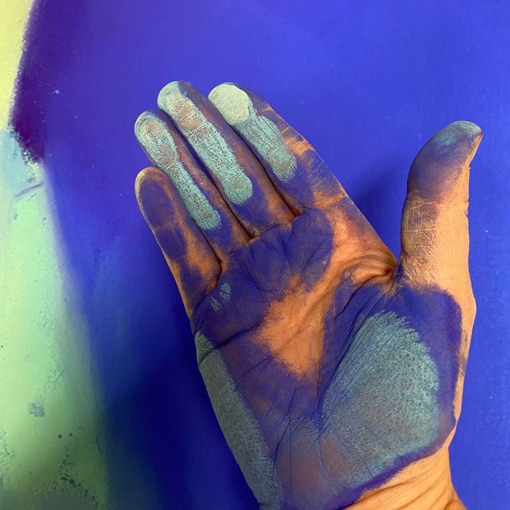
Breathing in fixative isn’t a good idea either, but I like to use a fine layer to seal the drawing when it’s finished. I do it outside as often as possible or use a mask made for this purpose, finding the right mask can be a challenge, it need to be able to filter aerosols but I think the down drouth table will help a little with this too. The last thing I want to mention is using surgical gloves, this was a change I didn’t want to do, but I can recommend it warmly, it is possible to get used to the different feel. As the daily exposure increased it was the only smart thing to do. I want to stay healthy and work for many more years so this is what I do. The gloves I use are soft and fits tightly, the best thing is—that I have a clean hand just by removing it, that is actually a surprising advantage and a practical benefit from this change and it saves me a lot of scrubbing.
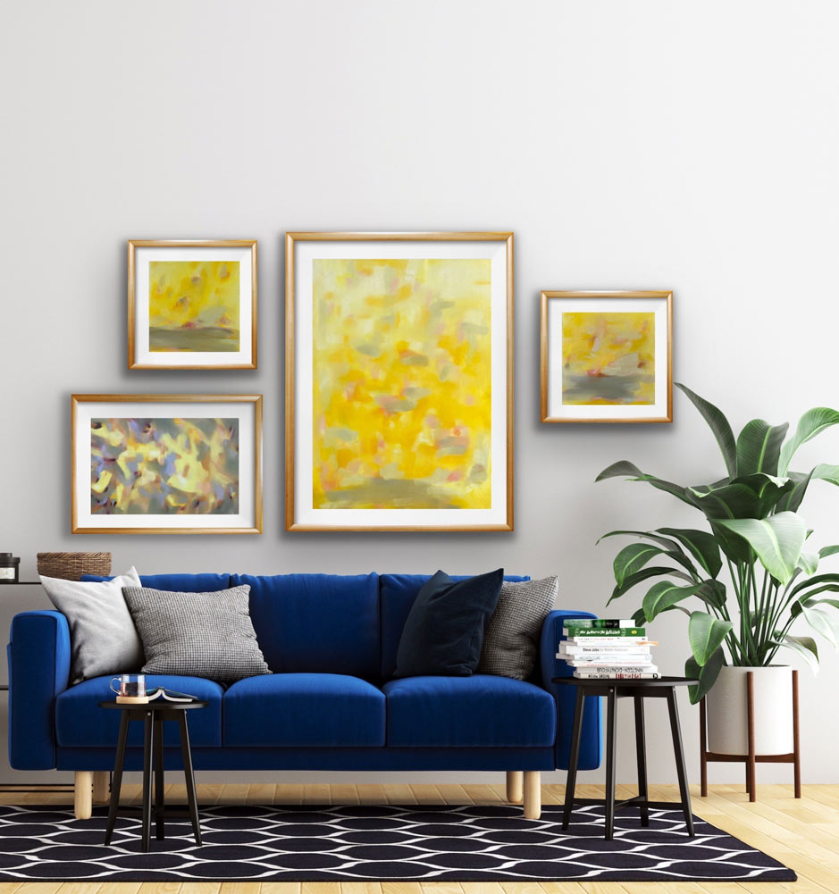
Hanging it
Soft pastels need the protection of a frame, I like to use non-reflective glass, keeping the colours as vivid and real as possible and to see it better and undisturbed by reflections. It doesn’t have a blue green taint as ordinary glass has, an extra plus is that it filters most of the harmful UV-light and make the colours even more durable. The museum quality glass has to wait a little longer because it is so expensive but it is the best.
I like to use a double mat that will create a place for the dust to settle that cannot be seen because the mat closest to the pastel is made with a larger hole than the one closest to the glass. This also put the glass a few mm away from the glass preventing the access dust to settle on the glass disturbing the artwork. The frame will also keep the pastel safe and show it off beautifully.
My lifelong passion with colour has finally unfolded itself in my artwork and became my full-time job. Sometimes it can be difficult to get the colours a 100 % right in the photos, but I try to get them as close as possible. I prefer to use daylight when I photograph my artwork, and preferably on a cloudy day, this give me the best result. Enjoy the images and examples!
The September Song Series
I love the spectacular cloud formations this season bring us, these ever changing and the gorgeous colour displays. I take hundreds of photographs of the sky, way too many, but I can’t seem to help myself, they change so rapidly that and I want to keep the mood of the moment, to hold on to it and to and take a second look at the beauty before me. I have always been fascinated by weather signs, to read the sky, looking for signs to predict the weather. I love it when people share their knowledge about this, standing outside their front door speaking into the air and to whoever want to listen about their observations and predictions with nonchalance and in an haphazardly sort of way. This fascination lead me to read about clouds and what they tell us about the weather and the changes that is underway. This series are born from this curiosity.
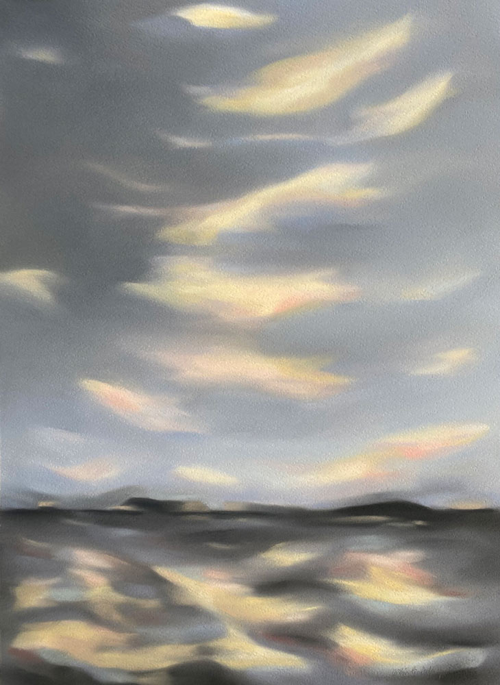
Grey 8 and 9 is the main colours here with black to darken and to deepen the sky. The Wisps of clouds are Light 2 and LT6 in Unison Colour Soft Pastels.
You can find more about me and my artwork at my website www.kristinholmdybvig.com.

5 comments
Ren
I absolutely love your use of pastels! Like you, I adore colour combinations and luminosity. Your paintings have inspired me to try some myself along the same lines – thank you! 🙂
Mark Johnson
beautiful use of color and you tell us which exact color you choose. Lovely red flecks in the blue background painting. Can you use the surgical gloves more than once.?
Thanks for sharing your experiences and process.
Trish McSweeney
Thank you for sharing so much – i think your work is wonderful, the colours and inspiration from Nature rings very true to my own Inspiriations… I’m starting out with pastels and love them – so thanks for being so open…
Ninoscka
(Translated)Hello
I’m Ninoscka, I live in Santiago, Chile.
. I’m sorry I don’t write in English.
I’d like to congratulate you on your beautiful work. A very original proposal!
(Original)From Chile my congratulations!Hola,
Soy Ninoscka, vivo en Santiago de Chile.
.Siento no escribir en inglés.
Quisiera felicitarla por su hermoso trabajo. Una propuesta muy original!
Desde Chile mis felicitaciones!
Белянская Наталья
(Translated)It’s a beautiful article! Reminded me of my childhood, visits to my grandmother at sea. I was born on the island of Sakhalin, for me the sea is not an empty sound. In art school we were taught drawing, painting, sculptures, but for me the main color. Unfortunately, my education is technical, but fate against all odds led to creativity, drawing was the first step after a long break. Then sample the pastel, it’s a lovely material, both tactile and color. I learn about the quality of materials bit by bit, thanks to the Internet and kind artists, comments and advice. Thank you!
(Original)Прекрасная статья! Напомнила мне моё детство, визиты к бабушке на море. Я родилась на острове Сахалин, для меня море это не пустой звук. В художественной школе нас обучали рисунку, живописи, скульптур, но для меня главное цвет. К сожалению образование у меня техническое, но судьба вопреки всему привела к творчеству, рисунок был первым шагом после долгого перерыва. Затем проба пастелью, это прекрасный материал, и тактильный, и цветовой. О качестве материалов узнаю по крупицам, благодаря интернету и добрым художникам, комментариям и советам. Спасибо!