I had been dreaming of this set since I first tried a Unison pastel, 4 years ago.
As a professional artist I shouldn’t feel bad about buying art materials, but in this case I did. I am not used to such an abundance of soft pastels in my art studio, not used to spending that amount of money in a single purchase, and certainly not used to the thought that such a treasure was travelling from England to France and taking all… its… time… While I was checking the parcel tracking every hour of every day.
Did I make the right decision? Did I really need so many pastels? Do I deserve them? Am I good enough for this range?
All those questions and the feeling of guilt simply vanished when, eyes wide open, I unpacked the boxes and took a good look at my new pastels. All I could think was “Wow.” They were so beautiful I could not take my eyes off those velvety, deep and vibrant colours.
I am very happy to share my pictures, thoughts and observations about the different boxes, hoping they could answer the questions you might have, inspire you, or simply satisfy your curiosity.
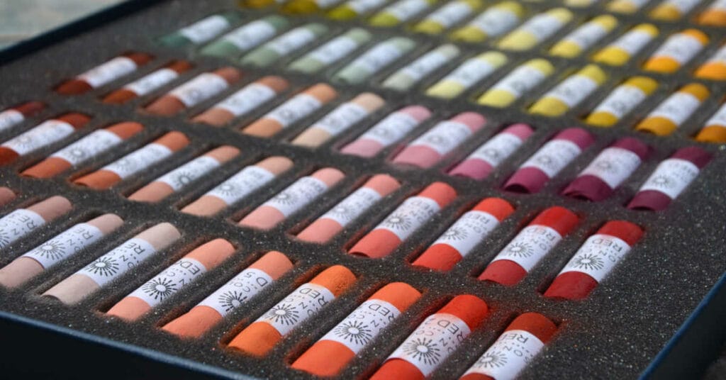
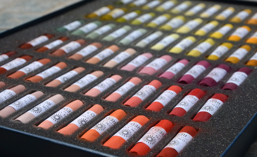
Box 1 : Red Earth / Red / Yellow / Yellow Green Earth
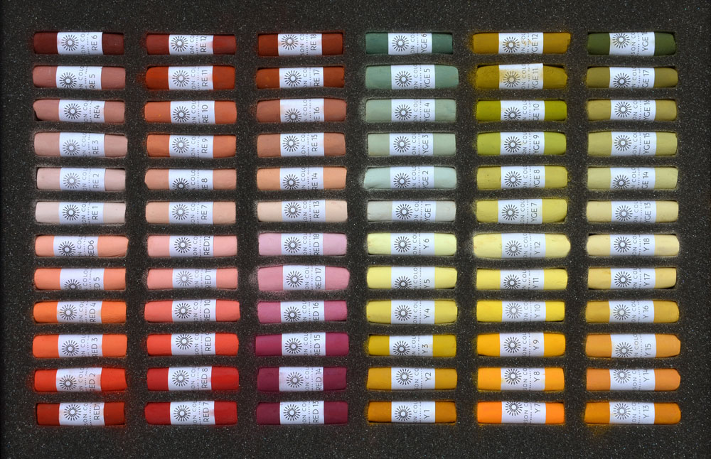
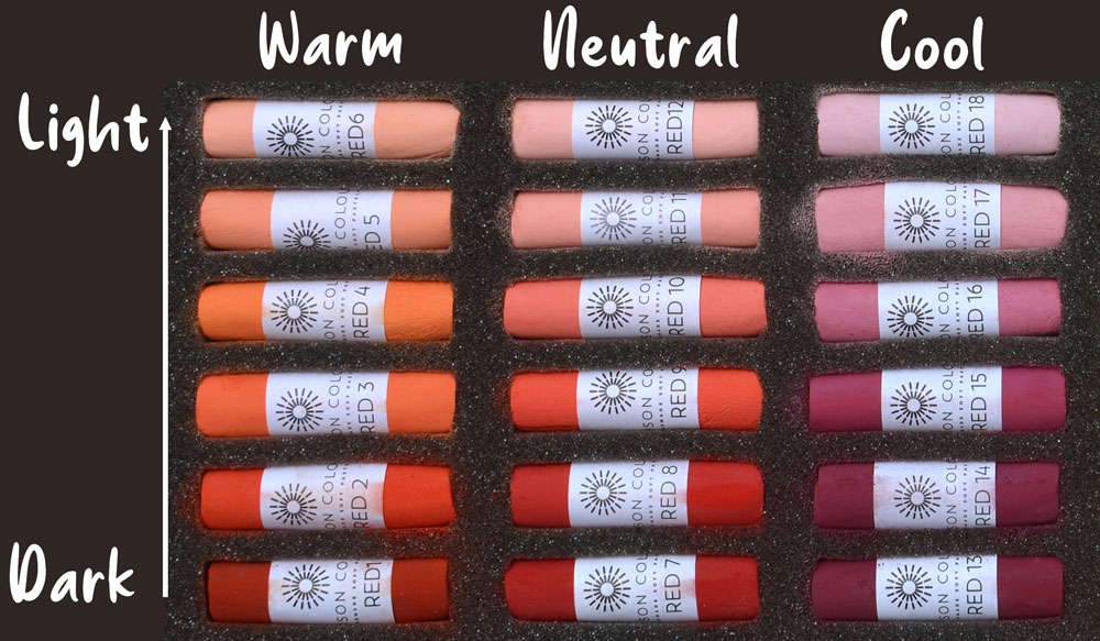
This box is divided into four parts. If we look closely, we can see that the pastels are carefully arranged : Each quarter of the box is divided into 3 rows. Each row represents a hue with its own temperature, that goes either from light to dark or from dark to light.
For example if we take the Reds from 1 to 18 (Bottom left corner), we can see that the first row is the warmest (the reds look more orange) ; the third is the coolest (the reds look more purple) and the second row, in the middle, is the most neutral.
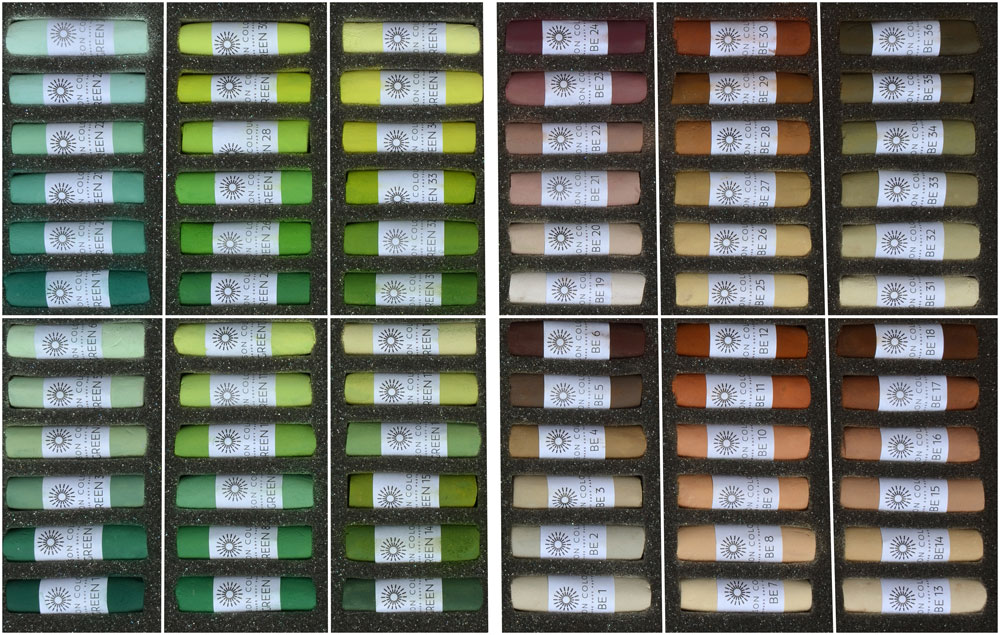
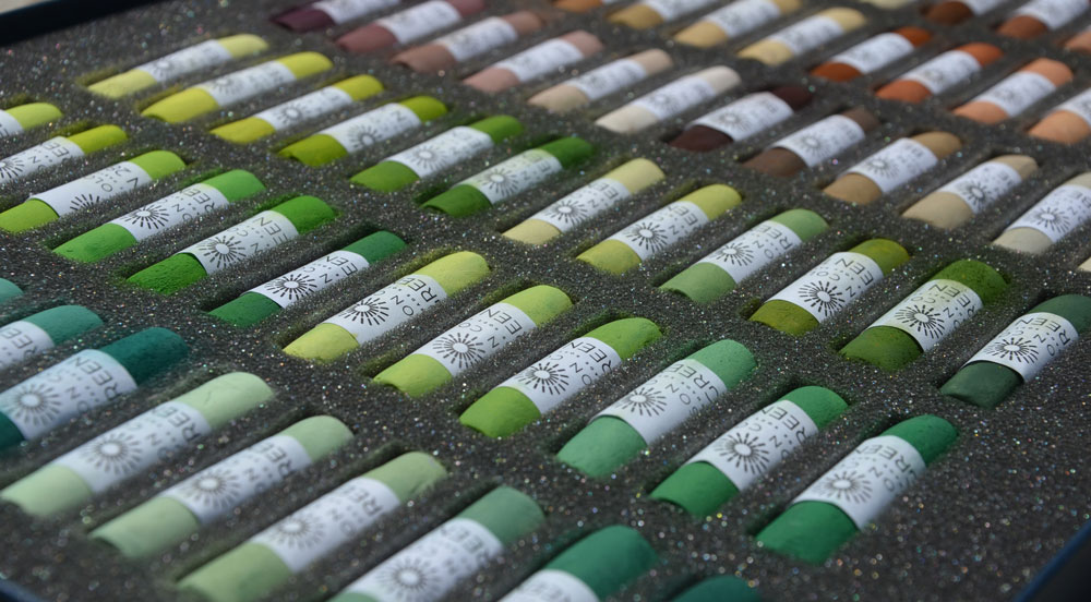
Box 2 : Green / Brown Earth
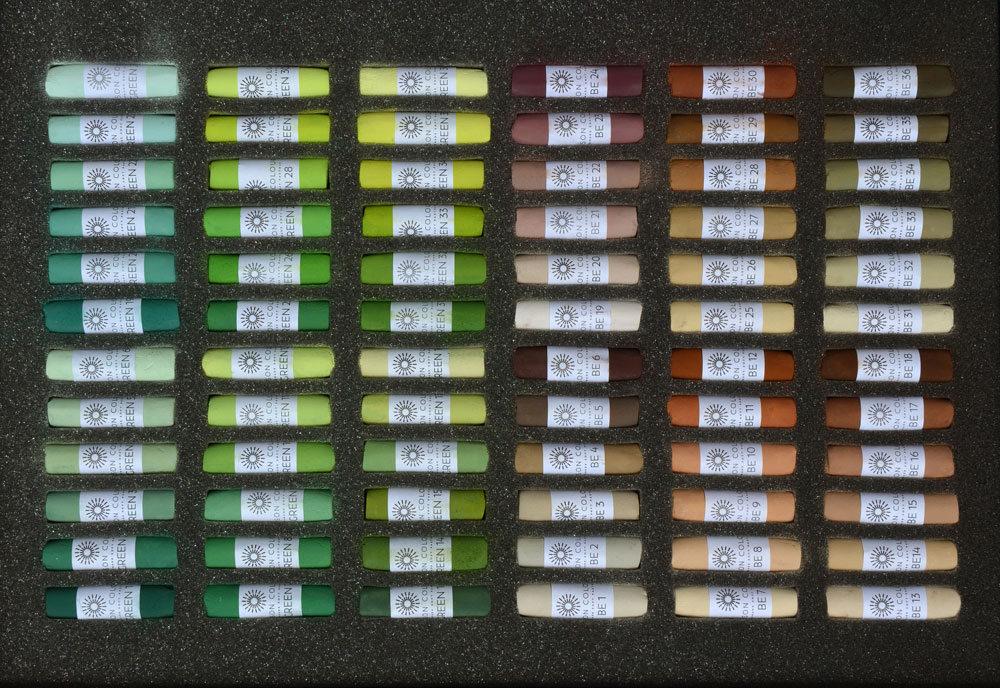
This box is divided into two equal parts. The first half is the complete range of Greens (from 1 to 36) and the second half is the complete range of Brown Earth (from 1 to 36).
Each half is divided into six rows of six pastels of the same hue, represented with different tonal values. Landscape artists often need a lot of greens and browns to replicate the numerous shades they observe in nature, and here they can easily find the appropriate temperature and tone they are looking for.
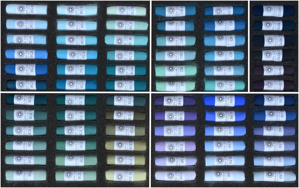
Box 3 : Blue Green / Blue Green Earth /Blue Violet / Ocean Blue / Darks
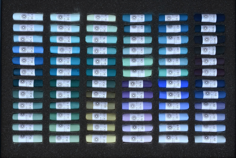
This box contains 5 different families of colours.
The top left corner is the range of Blue Green from 1 to 36, organized into 3 rows from the warmest to the coolest, and always from dark to light for each row (it will be the case for the rest of the box).
The bottom left corner shows the complete range of Blue Green Earth from 1 to 36, those ones are less intense in their chroma. The three rows are organised from the coolest to the warmest.
On the top middle right part of the box, we can see the wonderful range of Ocean Blue from 1 to 12, created in collaboration with artist Zaria Forman who was looking for very specific blues to paint her fabulous icebergs.
The bottom right corner is the Blue Violet range from 1 to 36, echoing the Blue Green of the left corner top and allowing us to have both warm and cool blues in the same box.
The last row represents a little part of the Dark range, from 19 to 24. They complete this box with beautiful dark blues and purples.
Box 4 : Grey and Additional
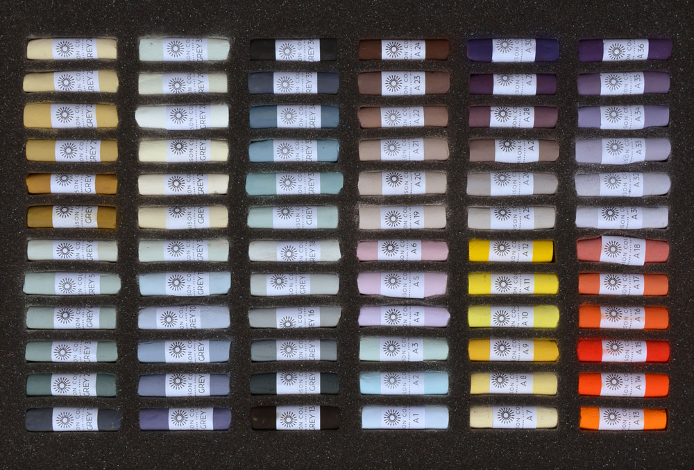
Divided into 2 halves, this box contains the complete range of Unison Grey from 1 to 36 and some of the Additional pastels from 1 to 36.
We can see that the greys are very varied in their temperatures and tonal values. The Additional pastels of the second half complete this box with other greys as well as very vivid reds and yellows.
Box 5 : Light, Additional, Dark, Natural Earth
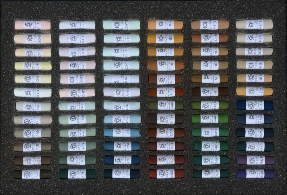
Here we have another box divided into four equal parts.
The top left corner is the range of Light pastel, a useful selection of coloured whites from the warmests to the coolests.
The bottom left is the rest of the Additional range from 37 to 54, a greyish selection of browns, greens and blues.
The top right corner is the beautiful range of Natural Earth from 1 to 24, made from genuine Italian earth, extremely useful for realistic animal painting.
And the bottom right corner ends the Dark (1 to 24) Dark 24 was created in collaboration with artist Robert Dutton. Irresistible velvety browns, greens and blues allow us for the deepest contrasts in any subject.
Box 6 : Portrait and Orange
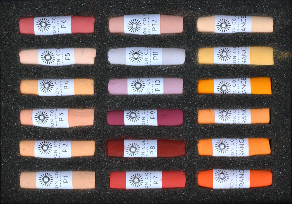
The last box is a set of 18 pastels : the Portrait range from 1 to 12 and the Orange range from 1 to 6. A selection of peachy and purple pinks gathered in this handy little box.
How to store them now ?
The storage of soft pastels is always a big subject to discuss.
A few years ago, I got rid of all my storage boxes and I gathered all my pastels by hue and temperature in mini-containers. I found that it was easier for me to mix all the different brands I had, allowing me to focus on the colour I needed rather than the texture.
But that was before I put my hands on this wonderful collection, so cleverly organised.
Now I just lay all my boxes on my table (Working on an easel saves so much space on the desk) and I can pick them as I need, or I can select them at the beginning of my painting and put them in an extra box (ready to replace them on the right spot when the painting is finished).
I love the fact that I just have to look at the sticks that are placed next to the one I have selected to find the same hue in a lighter or in a darker tone. This is so convenient and it saves me precious painting time.
Well, we will see if I manage to keep them that way or if my tendency to art chaos finally comes into play. Anyways I feel that the organisation of the workspace remains a work in progress for a lot of artists, don’t you think ?

12 comments
Bernie
This is fantastic and its making me think about the entire set. I searched for the packaging set up to see about values and warmth/coolness but couldn’t find anything till your post. Thank you so much.
Cindy
I am glad this post helped you ! Happy pastel !
Karen Donovan
So fortunate for you, Cindy! I can only imagine how ecstatic you must be. I just ordered a couple color sets and I can relate to tracking the order-DAILY. I started with the half stick set as I am a newbie at this. I just love these pastels! I am currently doing the 5 day challenge and finding it to be lots of fun! So many talented artists and great opportunity to paint along with others as well as adding new colors. Can’t wait to receive my boxes!
Cindy
Hi Karen, haha I know that feeling ! I am sure you have received your order by now, I hope you are enjoying your new pastels !
Alan Morris
Thank you Cindy, this is really useful. I have been gradually collecting the Unison pastels in the colour boxes and have been wondering how to organise them. I can feel an order for some empty 72 unit boxes coming on!
Cindy
I am very happy if this post can be useful to you ! Happy pastel organization !
Jane Frere
Hi Cindy
Thank you for sharing your joy and delight ( noooo no guilt, simply celebration!!) in owning the whole @unisoncolour set. I do as well! I received a #VACMA bursary (Highlands of Scotland) to purchase them specifically to explore aspects of colour theory. My only guilt, not using them,they are packed away for a bit as Im currently print making!
I laid out all of the boxes on a bench and charted each colour on large sheets of paper pinned on to my black studio wall. I turned my studio into a colour laboratory. I found that was the easiest way to guage and feel the temperatures. I still find it quite tricky determining what is cool and warm often the tonal range is so close.
I didnt realise although it does make perfect sense that Unison place the pastels in the box “theoretically” cool to warm, with high and low key etc. Cindy Is this your observation or has Unison confirmed this? Iv been trying to work out the theoretical logic of the packing !
I can see the order clearly as you have pointed out on the reds but not necessarily in all of them. Unfortunately I have not managed to get down to the Unison factory /studio yet, Id love to be a fly on the wall and watch the intricate process of adding fractional portions of a pigment heating up or cooling down a hue. (Dan @Unison a blog from you describing the process would be exceptional for us, although I know you hold on to all secrets)
Im actually particularly grateful for this blog, During the height of my “laboratory” observations some of the blocks of pastel hues got a bit muddled. I can now use your blog to get them back into exact order!
As for studio order versus chaos If anyone knows my work Im an anarchist, I draw on walls and chuck paint around and chaos is so often the order. However not when it comes to this precious set. After a session or two on a work, pastels everywhere and gaping slots in their boxes, I take the time and methodically replace them, when the paper comes off or they break up I try to stick it back on again. As long as I have been doing colour theory exercises in my “colour lab” this meticulous approach is fine but I do ask myself am I being too precious? is this about product care or maintaining a process recognising the characteristics of each hue. Spontaneity and organised chaos I believe a necessity to maintain energy and pathos in a work.
None the less, I do feel at peace knowing the pastels are snug in their exquisite boxes ! There is indeed something special owning the full set!
Cindy
Hi Jane ! Yes it is from my observation only and I have found, like you, that some rows did not seem to have the same organization.
Of course I can only understand why you try to keep them well stored after your pastel session, I don’t think this is too precious if it makes you as happy as I am when I look at my beautiful boxes 😃
Наталья
Хорошая коллекция! Сколько художников, столько же мнений об организации творческого пространства. Мне, как начинающему художнику, трудно выбрать и организовать место, пока я только накапливаю потенциал))). Когда захватывает процесс рисования, то все схемы просто не рассматриваются. Как говорится, художественный беспорядок. Отобранные пастели перемешиваются, о теплохолодности забываю. Это очень важный аспект творчества, Синди! Спасибо команде Юнисон!
Cindy
I am sure it is an important aspect of creativity, you are right ! But for me, seeing them so well organized, it just sparkles so much joy. I want to be able to admire them in their boxes because it makes me happy 😀
Eileen Faulkner
Chaos! I’m so familiar with that word. It describes me to a t! I try to be organised, really I do, but, somehow, my natural inclination always defeats me. Wherever I am chaos reigns. New project, new resolution – to keep things in order and make things easier. But once the project is started – within the shortest time, everything reverts to normal – for me -and chaos reigns again.
Cindy
Haha I can relate ! Thanks for sharing, it makes me feel better 😄