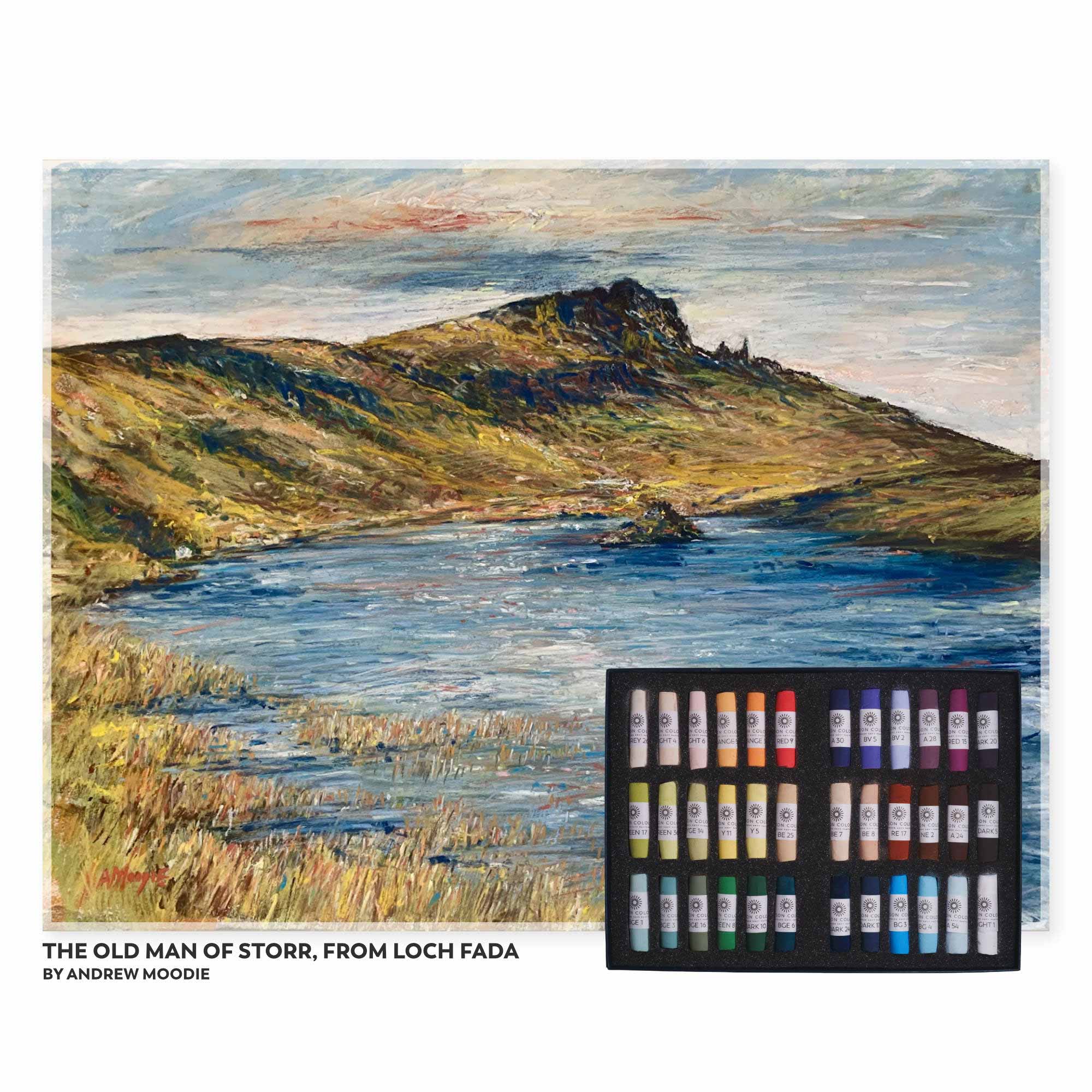
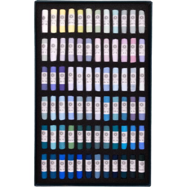
My favourite scene is ‘contre jour’, looking directly towards the light source, and so for me, the starting place for any range of pastels is lights and darks, all the way from LIGHT 1 through to DARK 24. I well remember the introduction and then development of the Unison Colour DARK range; this was so important for me! Up to then, I used predominantly Unison Colour pastels, but found myself turning to other brands for my darks. I no longer needed to do this, and my Unison Colour Darks have become my favourites, with the clear winner being the wonderful DARK 24!
A range of greens are of course vital for any landscape set. I think that one of the most challenging views to convert into a successful painting is a summer landscape full of green! But success can be achieved with a range of tonal values, from the intensity of DARK 10 to the bright summery value of GREEN 36 and not forgetting the importance of my favourite BLUE GREENS and BLUE GREEN EARTHS, so useful for greens in shadow or in a low winter light.
I’ve restricted my blues to some BLUE GREENS and BLUE GREEN EARTHS as I find that these are sufficient to deal with most skies and water scenes, particularly when other colours are layered over these to create a distinct colouration or tone.
My tendency is to veer towards brighter colours, so I’m quite pleased (and surprised!) that my picks have included various of the EARTH colours, so important for creating a landscape in any season.
Yellows, such as YELLOW 11, will always help to lift a scene and bring a smile to the viewer, and a light yellow and pinks (YELLOW 5, LIGHT 4 and LIGHT 6) work well to represent an early morning or late afternoon sky as the sun rises or sets, and are also great for popping highlights against darks.
A red, such as RED 9 and 15, and variations of red, together with some oranges, work well to bring impact to a painting. In particular, I will always look to bring some hints of red into a green landscape to act as a lifting complimentary.
And finally, my favourite colour is purple, in all its tones, from a light BLUE VIOLET 2, a mid range BLUE VIOLET 5, through to DARKS 17, 20 and 24. I don’t use black in a landscape (I only ever use black in a portrait) and instead will turn to the purples, and in particular, the indigos that the Darks provide.







Reviews
There are no reviews yet.