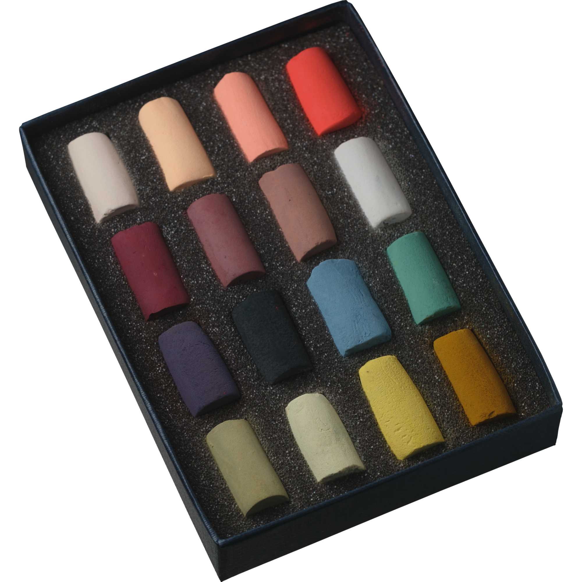
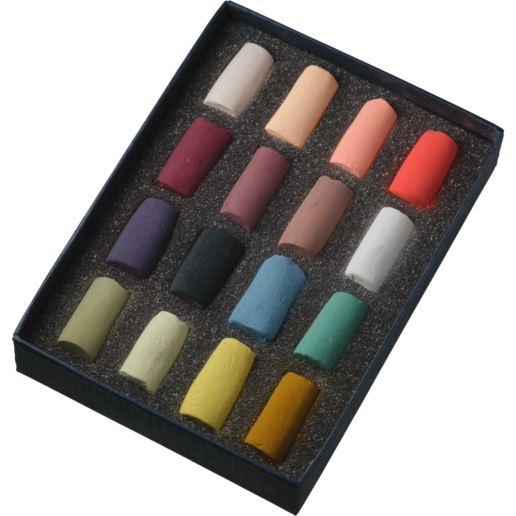
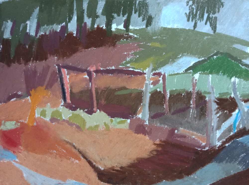
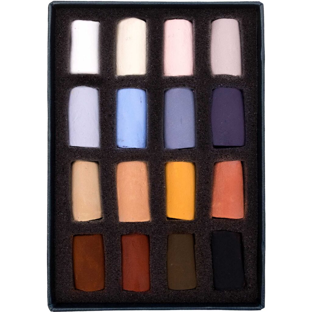
‘It’s been my aim to create a selection that is versatile and adaptable for any chosen subject matter. With the range of colours and tones in this box, it is possible to mix virtually any desired colour. This means that people buying the set can explore working with colour across any given subject and make exciting discoveries in moving between the local colour of the things they see out in the world and relative colour, a more subjective, intuitive and relational sense of colour within their drawings or paintings.’
Read Ginny’s blog below, and found out how she created the set.
Picking and unpicking ‘The Versatility Set’
How to choose? Which to choose, from which sets of colours? Coming up with a system to make a final selection of only 16 or 18 colours out of the full Unison Colour range was surely an impossible task. An enjoyable one of course, but also a tricky one. I had a few notions of how to begin though.
After having won a prize in 2023 for a drawing entered in the Royal Pastel Society Open Call, I was given the opportunity to select a set of pastels, to add to Unison Colour’s ‘Artist Sets’. These are individually crafted and hand-picked ranges of colours made by a wide range of artists working with soft pastel, in very diverse subject matters. I wanted to make a set that resonated with a recent body of landscape drawings I had made, but also wanted the set to be practical and enjoyable for others who were considering buying a set for themselves.
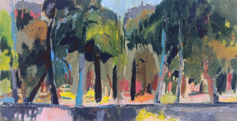
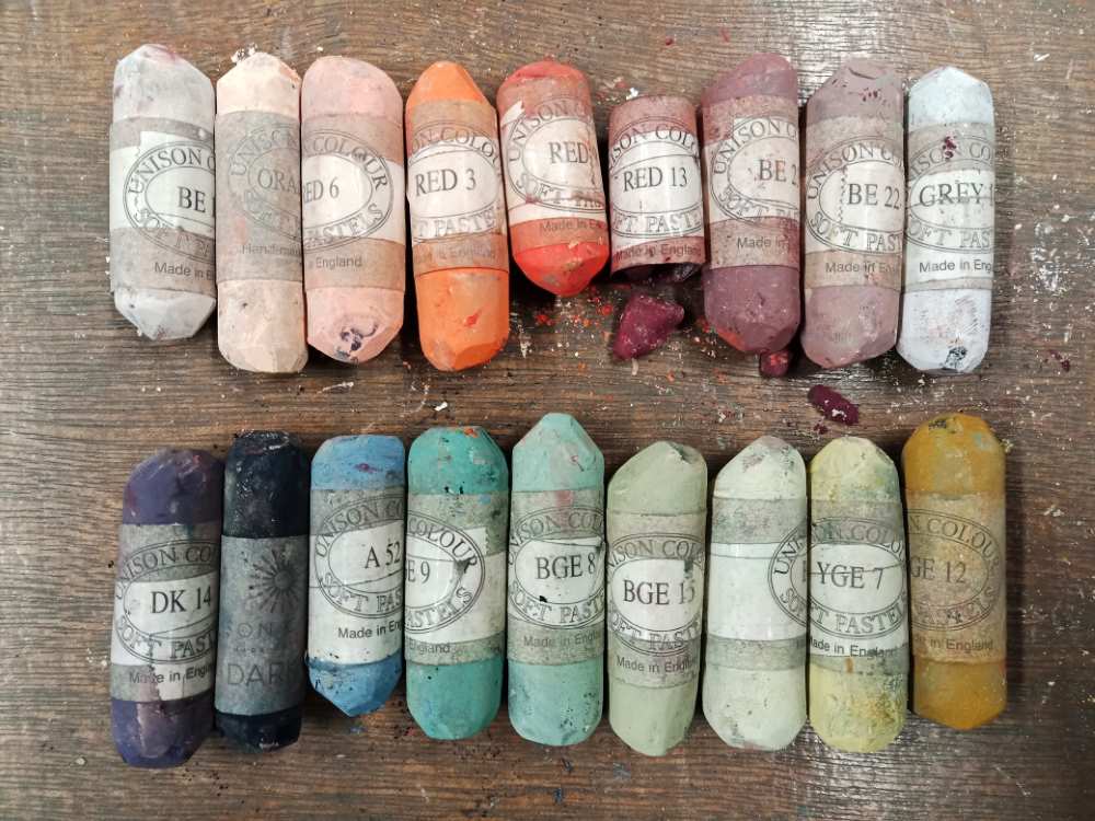
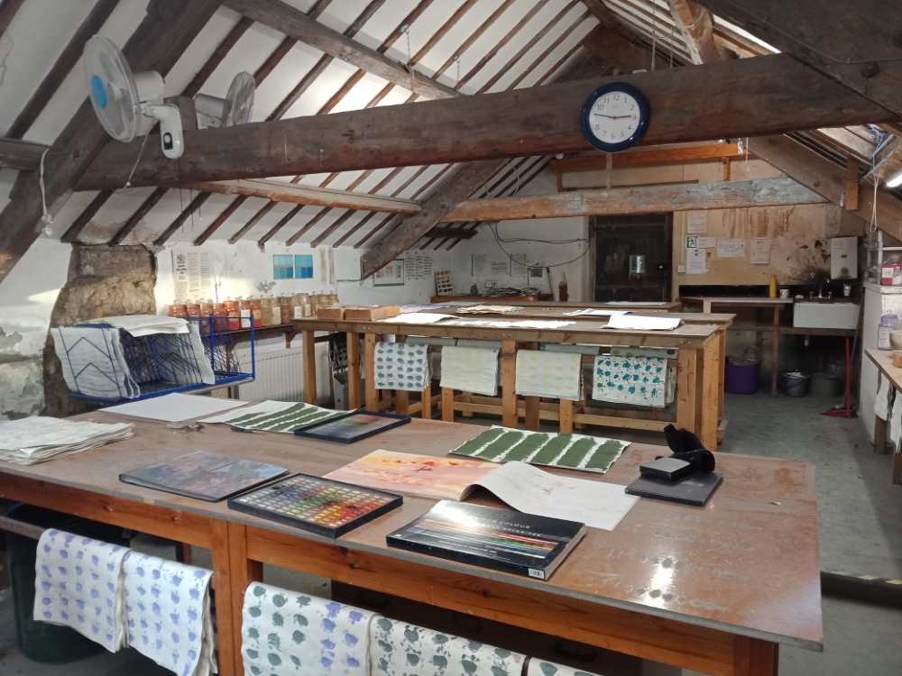
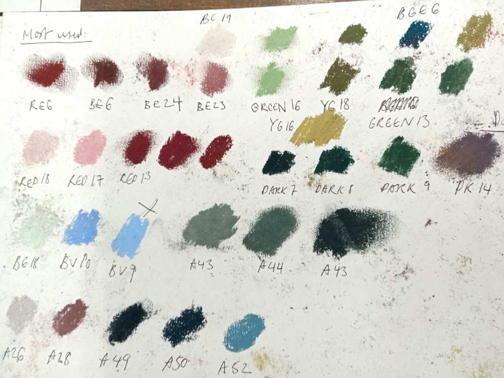
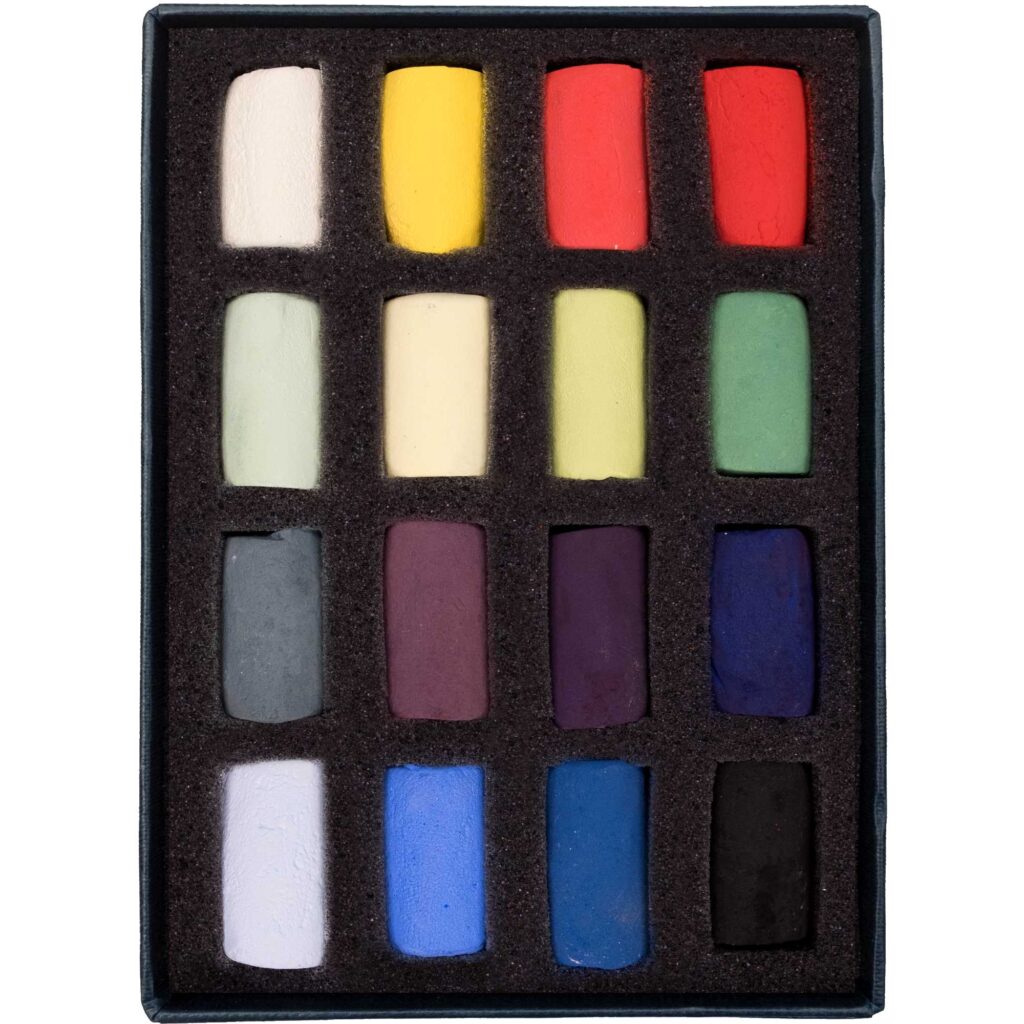
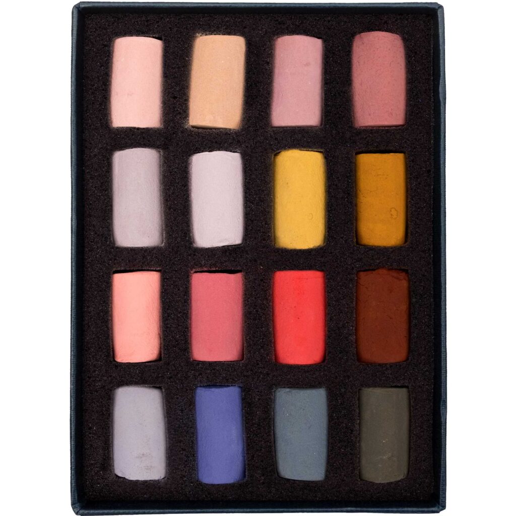
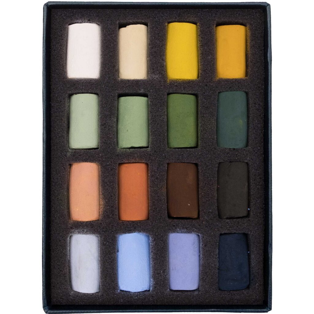
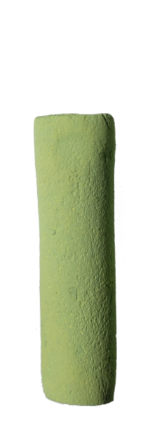
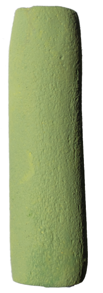
I began compiling a list of the colours most used in my sets that I brought down to Unison Colour HQ, at Thorneyburn. In any set of artist’s materials, it’s intriguing to note which colours wear down the quickest. It’s a way of assessing an artist’s approach to colour, indicating the innate natural tendencies to veer towards certain hues, and to stay away from others. Which colours are used in combination with others? Which are used little, but often, and which are used strategically in large amounts, almost as a ground to a painting? I noticed I had some recurring themes. I tended to reach a lot for the soft and muted Greens, those with golden-olive notes and not too acidic, notably Green 13, 14 and 15, and the warm Yellow Green Earths, especially YGE16, YGE17 and YGE18. Cool Blue Green Earths such as BGE 5 and 6 made lovely darker and cooler complements to these greenish hues. To encompass a richer palette, I also tended to veer towards several of the Brown Earths, BE23 and BE24 which have deep terracotta hues. Some lighter warms in the hues of Orange 6, Red 6 and Red 9 were also invaluable colours to add to the selection. They provided temperature contrasts to the bluish greens, whilst also not being over-powering in their reddish hues. This provided a clear guide to picking out the colours for my set.
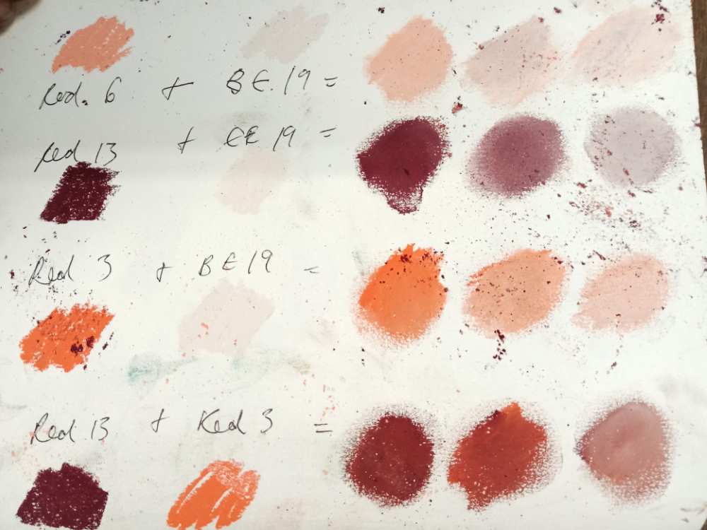
Once I had a core selection of around 9 -10 pastels which tended to be more mid-tones, I began to incorporate a few more necessary dark and lights to create tonal contrasts. The lights consisted of pale neutrals, such as BE19, and Grey 18 which made soft but resonant sky colours, meanwhile the Darks 14, 21 and RED13 provided deep, juicy warms with accents of maroon, violet and petrol blue. Narrowing down my selection, I experimented with which pastels could mix and layer over one another to create the hue I was after, allowing a more diverse selection of colours. It became important to think about which primaries were critical, and which secondaries or tertiaries I could achieve with mixing what I had already chosen. Additional 52 became a necessary greyish-blue, to bring a primary back into the palette after drifting off into quite neutral browns and greens.
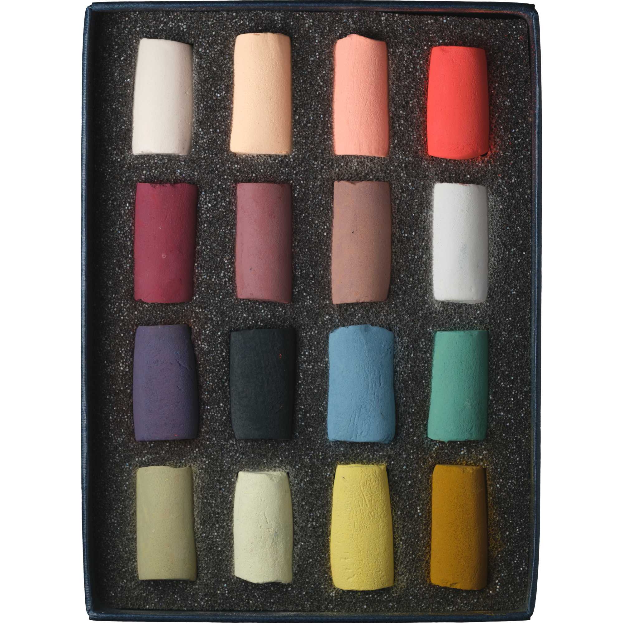
The final selection of colours came together in the end quite naturally, with a range of slightly muted primaries, and an even spread across warms and cools, with the reds leaning more towards more earthy, cool browns. Strong accents of a yellow ochre, deep violet, and orange played important parts in a selection otherwise connected through their gentleness in hue. It’s been my aim to create a selection that is versatile and adaptable for any chosen subject matter. With the range of colours and tones in this box, it is possible to mix virtually any desired colour. This means that people buying the set can explore working with colour across any given subject and make exciting discoveries in moving between the local colour of the things they see out in the world and relative colour, a more subjective, intuitive and relational sense of colour within their drawings or paintings. Enjoy!


Linda Rowles (verified owner) –
I am new to using pastels and this set is a great addition to the starter set. A good mix of vibrant and subtle colours which can be used to create a wide range of tones. Very good quality pastels which blend well and have a high degree of adherence.