5 day challenge explore an evocative sky feat

5 Day Pastel Challenge: Explore An Evocative Evening Sky

Current Status

Not Enrolled

Price

Free

Get Started

NOTE: This challenge has already run, but you can still take part and learn!

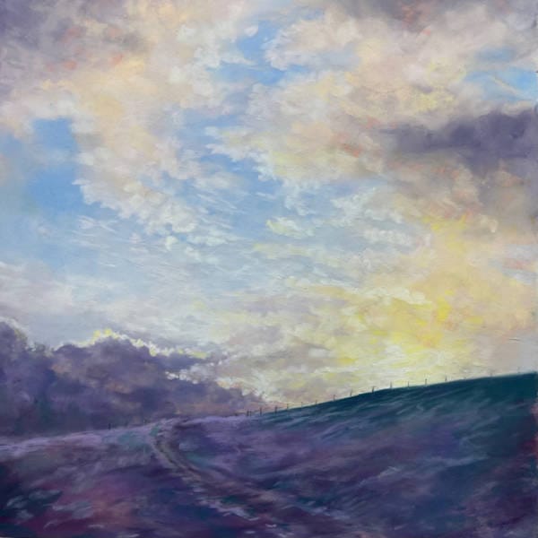
This 5 day pastel challenge, with award winning pastel artist Sandra Orme, will take you through creating beautiful clouds in an evening sky using Unison Colour Pastels ‘Sky’ set on Pastel Mat paper. You will learn how to use layers of pastel and a colour shaper tool to build stunning cloud effects,  Explore delicate wispy edges, dramatic tints and shades, as well as building sharp and defined cloud shapes. Learn about controlling and managing colours in this technique with ‘the rule of three’ and ‘bridging colours’. This is an exciting and fun challenge suitable for all.

Each morning there will be a new pre-recorded video ready for you to watch, where Sandra will go over the day’s steps.

The videos are around 10 minutes long (although the first is 20) and you can fit your painting around work or other daily routines. The only element that is fixed is the Live Q&As.

You can share your progress in the dedicated community group for feedback from Sandra and other participants.

There will be people taking part from all over the world so don’t worry about timings. It’s a very relaxed approach with no time restrictions.

Unison Colour

  • Light 1
  • Light 5
  • Additional 4
  • Blue Violet 1
  • Blue Violet 3
  • Blue Violet 5
  • Blue Violet 8
  • Blue Violet 9
  • Blue Violet 10
  • Red 18
  • Dark 23

Clairefontaine Pastel Mat paper (or equivalent with soft but firm tooth) at approx 35x35cm.

Colour shaper tool, size 10, soft, flat chisel (or equivalent)

Framers Tape 

Average Review Score:
★★★★★

You must log in and have started this tutorial to submit a review.

Tutorial Content

Day 0: Introduction
About the artist
Required Materials
DISCOUNTED PASTELS: Sandra Orme Sky 30 Half Stick Soft Pastel Set
Reference Photo
Day 1: Pressure
Day 1: Live Q&A Recording
Day 2: Depth and Texture
Day 2: Live Q&A Recording
Day 3: Building Layers, Depth of Tone and Contrast
Day 3: Live Q&A Recording
Day 4: Shaper Tool and Building Detail
Day 4: Live Q&A Recording
Day 5: Bringing everything together
Day 5: Live Q&A Recording
Red Sky At Night Workshop

Colour Chart Guidance

We believe the colours in our web based colour chart are a faithful representation of our pastel range. But with any colours portrayed on the internet, there’s a whole heap of variables which mean that what you see, may not be what we see. That said, there’s some things that can be done to mitigate some of the variance.

Mobile phone and tablet screens tend to be pretty good for colour, so they’re always worth using, when viewing our colour chart.

We hate to say it, but cheaper computer displays, including laptops, can be rather hit and miss, in both colour and contrast, so they might not reveal the depth of the colour, as well as the true tone.

If you’re really keen on getting your computer up to speed on colour representation, you can use a calibration device to reach your display's fullest potential.

With all that said, if you think we’re way off the mark with any of the colours then, by all means let us know, and we’ll give it another shot.