Botanical still life workshop course feat

Botanical Still Life Workshop

Current Status

Not Enrolled

Price

£19.99

Get Started

Introduction and Setup video available to watch now!

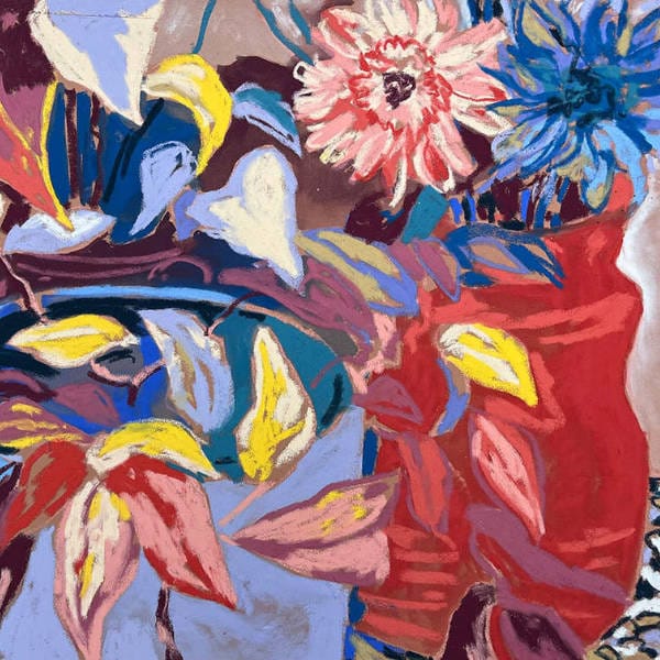
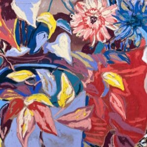
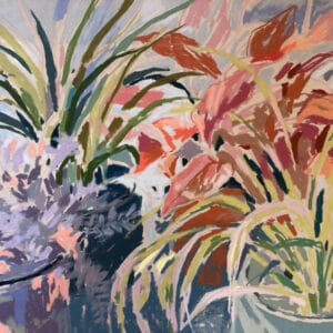
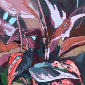
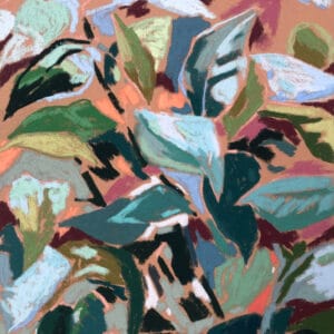
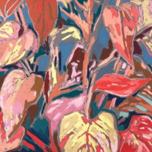
Caitlin will talk you through the process of creating your botanical set up, choosing your colour palette, through to the finishing touches on your artwork.

Caitlin has a unique approach to using pastels, weaving colours together like a tapestry and this workshop will show clear demonstrations of how she creates this effect and how you can weave it into your own artwork.

Pastel paper - I recommend Claire Fontaine Pastelmat paper 

Unison Colour Pastels - You can purchase the challenge pack of 16 half sticks, or select 16 colours from your own collection.

Botanical set up - Caitlin will make suggestions for how to go about this in the workshop, though she also provides resource images if you aren’t able to create your own set up. She recommends gathering together a collection of plants and/or flowers.

Pastel fixative - this is to prevent smudging once your piece is finished. Caitlin uses Unison Colour’s fixative. 

CHALLENGE SET COLOURS:

  • LIGHT 5
  • RED9, RED10, RED12, RED16, RED14
  • BG 1
  • OB 5
  • BV2, BV4, BV 9, BV12
  • A 50
  • GREY 28
  • YELLOW10
  • BE25
Average Review Score:
★★★★★

You must log in and have started this tutorial to submit a review.

Tutorial Content

Reference Image
Abstract 16 Half Stick Set
Part 2: Compositional studies
Part 3: Moving on to our artwork!
Part 4: Mapping out our artwork
Part 5: Beginning to lay down colours
Part 6: Reflecting on the process so far
Part 7: Developing your work
Part 8: Paintbrush technique
Part 9: Vibrancy and depth
Part 10: Finishing touches
Part 11: Summary

Colour Chart Guidance

We believe the colours in our web based colour chart are a faithful representation of our pastel range. But with any colours portrayed on the internet, there’s a whole heap of variables which mean that what you see, may not be what we see. That said, there’s some things that can be done to mitigate some of the variance.

Mobile phone and tablet screens tend to be pretty good for colour, so they’re always worth using, when viewing our colour chart.

We hate to say it, but cheaper computer displays, including laptops, can be rather hit and miss, in both colour and contrast, so they might not reveal the depth of the colour, as well as the true tone.

If you’re really keen on getting your computer up to speed on colour representation, you can use a calibration device to reach your display's fullest potential.

With all that said, if you think we’re way off the mark with any of the colours then, by all means let us know, and we’ll give it another shot.