The sky is blue and clouds are fluffy balls of cotton.
This notion follows us from our childhood and unfortunately, can inform our paintings, if we let it. To successfully take on a “skyscape” requires observation, a little science, and a bit of unlearning.
This tutorial includes an overview of the “anatomy” of sky and clouds. Knowing what to look for can make all the difference when you are gathering reference materials, whether plein air sketches, photographs, or just taking a walk. Observation becomes critical, especially when working from a reference photo. What the camera gives to us is rarely ideal composition and almost never correct in terms of values and colors.
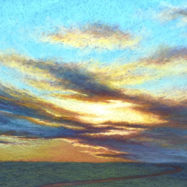
In “Braided Light”, pastels are layered using a light touch to create gradations of color through the sky, sweeping veils of colorful clouds, a glowing intensity of the sun, and a simplified, yet intriguing landscape. Blending is rarely used and only strategically.
This tutorial also offers two alternatives for an underpainting. The traditional approach of liquefied pastel is reviewed. However, the process of re-purposing paper from a previous painting is also demonstrated, allowing you to experiment with the effects of each.
Most importantly, this tutorial demonstrates the process for assessing and correcting a compositional error, even well into the painting process.
The goal of this tutorial may be to paint a dramatic skyscape. Yet it provides much more information that can lead to other successful skyscape paintings. All we need is observation, a little science, and unlearning what our brain thinks we know.

Unison Colour pastels...
- Blue Violet 6
- Blue Violet 5
- Additional 35
- Brown Earth 23
- Blue Green 9
- Blue Green 10
- Additional 3
- Additional 51
- Additional 52
- Grey 21
- Blue Violet 5
- Blue Violet 15
- Grey 27
- Red Earth 5
- Additional 25
- Yellow 3
- Grey 22
- Grey 26
- Red Earth 3
- Yellow 5
- Red 3
- Blue Green 15
- Blue Violet 14
- Blue Green Earth 5
- Additional 45
- Green 4
- Light 1
Other materials...
- Hard pastel - Umber
- Backer board (foamcore, gatorboard, Masonite, etc.)
- UArt pastel paper
- Masking Tape (white, beige or black)
- Cup
- Isopropyl alcohol for underpainting
- 1” to 2” wide brush for the underpainting
You must log in and have started this tutorial to submit a review.