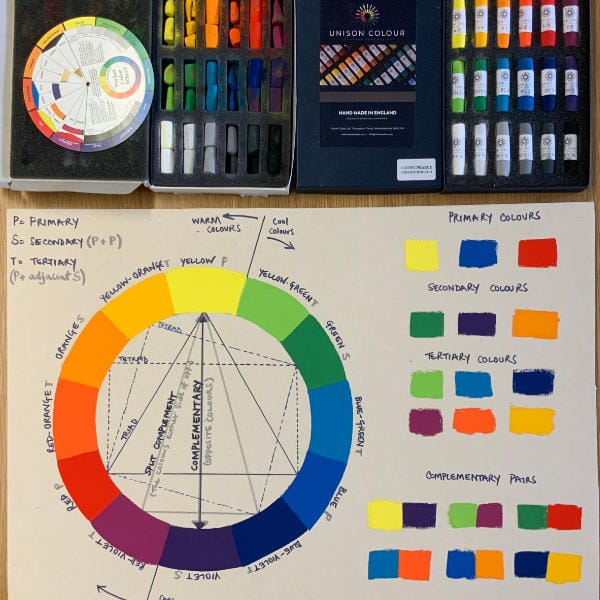
A series of tutorials (almost 3 hours of video) solely looking at colour theory for pastel artists. We will look at;
- Making your own pastel colour wheel reference
- Greyscale and colour value
- Colour temperature
- Choosing a colour palette
- Defining, describing and changing colours
- Colour relativity
These are all essential elements required for making successful and balanced paintings.
When you have watched each of my videos you will gain much more experience and knowledge if you actually try these experiments for yourself as there is no better way to learn than to actually do it in practice. These experiments will then become good reference material for you to keep together in a sketchbook or on your studio wall. You won’t remember every detail so keep these results at hand then gradually over time you will realise that you’re putting this information into practice automatically, it just requires practice.
Cathy’s Colour Wheel 18 Set
While the set is no longer available, the pastels can be purchased individually.
The aim of the colour wheel set is actually to help you learn the basics of colour theory.
The course content is excellent! There’s a lot of invaluable information that I learned. The color wheel made sense to me. Also learning the color schemes finally made sense. Now to put it into practice!!!!
The reason I gave this a 3 is because the sound quality is very poor. The sound kept flickering in and out and left my computer “thinking “
This is a really comprehensive, challenging and thought provoking tutorial – one to work slowly through and keep as a resource to refer back to. I thoroughly recommend it.
Wow! What a fabulous tutorial from Cathy! It’s was clearly delivered covering all aspects of the Colour Wheel and how to use it! I spent the whole Bank Holiday weekend looking and learning from each lesson.
I have a colour wheel that I purchased a couple of years ago but had no idea what all those black lines, geometric shapes and terminology meant! It is great spinning the layers around but if you are unaware of its purpose it just gathers dust. Now it ALL MAKES SENSE to me!
Now inspired to have a physical go at creating my colour learning experience, I’ve purchased the pastel stick set. I’m going to get a spiral paper pad and do it myself. My learning style is ‘Pragmatist’, like to see and understand before putting things into action. Cathy is right you need to do your own colour wheel and it will help you to remember HOW to make colour work for you. Thank you so much Cathy and Unison Colour Pastels. HIGHLY RECOMMEND.
You must log in and have started this tutorial to submit a review.
As someone learning about art later in life I was introduced to some basic concepts of the colour wheel on a short oil painting course and wanted to know more, but reading articles or sections of art books it hadn’t sunk in. As I want to develop my pastel art, finding pastels more accessible as an art medium for regular use at home, when I saw this course I jumped on it. Cathy does a great job of introducing the concepts of the colour wheel in a progressive way which makes sense and of delivering a good understanding of hue, value and intensity. Her exercises bring the intellectual neatly together with the practical and I feel confident enough now to delve deeper into colour combinations in my own time. Purchasing the suggested colour wheel pastel set from Unison to accompany the course was a good investment to make sure I was on the same page as Cathy with regard to colour throughout.