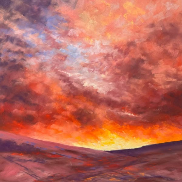
Join Sandra for a dramatic pastel sky workshop exploring a wonderfully vibrant evening sunset.
Although I usually work from photos as the colours and shapes in the sky change so rapidly, I use this photo as a ‘starting point’ and let the work evolve and develop away from a ‘copy’ of the photo.
Sandra Orme
This workshop day took place in 2023, but the tutorial videos were pre-recorded. Also included is the recording of the live Q&A session that Sandra hosted online – lots more advice to be had from it!
The workshop was a follow-up to Sandra’s ‘Explore an Evocative Evening Sky’ 5 Day Challenge, referenced in Sandra’s Intro video above, and can be accessed here…
Average Review Score:
★★★★★
You must log in and have started this tutorial to submit a review.
Tutorial Content
Preparation
Techniques you’ll learn
You don't currently have access to this content
Materials
You don't currently have access to this content
Reference Photo
You don't currently have access to this content
Videos
Stage 1
You don't currently have access to this content
Stage 2
You don't currently have access to this content
Stage 3
You don't currently have access to this content
Stage 4
You don't currently have access to this content
Stage 5
You don't currently have access to this content
Live Q&A Recording
You don't currently have access to this content
Thank you Sandra for a wonderful workshop. It has impressed upon me the need not to rush and to build up colour layers slowly. I am wont to rush to cover as much of the paper as possible as quickly as possible. I look forward to experimenting further with some of my own sunset photographs.
Thanks again