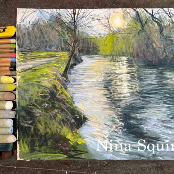
Nina inspires you to capture moments from local walks and bring them to your paintings.
Take a moment to read Nina’s blog written in association with this pastelling tutorial.


Unison Colour
Yellow 11, YGE 9, Dark 13/12, A27, Grey 28, 8, 9, Blue Violet 8, 9
Additional 19, 49, BE6, A37 White is grey 28 and my darkest is Grey 13
Faber Castell Pitt Pastel
101, 103, 140, 157, 170, 187, 181, 270, 233, 179, 199 or similar range
Paper - I’m using Fisher 400 - you can use Uart 400 or Art Spectrum Colourfix - A4 size
Brushes - 1inch hog haired Flat or similar
Prepare your workstation – have several clean brushes, clean pots, kitchen roll and liquid.
I use vodka to liquify pastels as it evaporates quickly. Try your pastels to see how they behave with different liquids. They all respond differently.
It is not necessary to have the same colours as me but using different brands and paper will produce different results. Good quality pastels on a good quality surface will create less dust and more vibrant colours.
I’m excited to take a walk on my river with my pastels! Thank you Unison for offering such a wonderful demonstration and thank you Nina Squire for a fantastic demonstration and a peak at your river!
You must log in and have started this tutorial to submit a review.

Great demonstration from Nina never attempted water before but. have loved following & completing the river walk.