Learn how to create a richly saturated, colourful atmospheric landscape of cornfields in afternoon light with Unison Colour Associate Artist Robert Dutton.
Here’s what you will need before you get started Fixative - an aid to pastel painting Fixative will be used to extend the depth of colours, deliberately darken them, build and enhance surface textures and much more! As a reminder your colours and art materials needed for the challenge Art materials highly recommended.
Paper
Full sheet of Clairefontaine 350gsm ‘Pastelmat’ Anthracite Grey (50 x70cm)
Fixative
Unison Colour fixative
Pastels
The colours used in Robert’s painting are…
- Green 13, 14, 21, 23, 33, 34
- Dark 8, 24
- Yellow Green Earth 8, 10
- Blue Green 9
- Natural Earth 7
- Brown Earth 11, 21, 23
- Yellow 9
Extra pastels needed…
Grey 28 (white)
Light mauve harder pastel (any brand) to initially ‘draw out’ your pastel composition
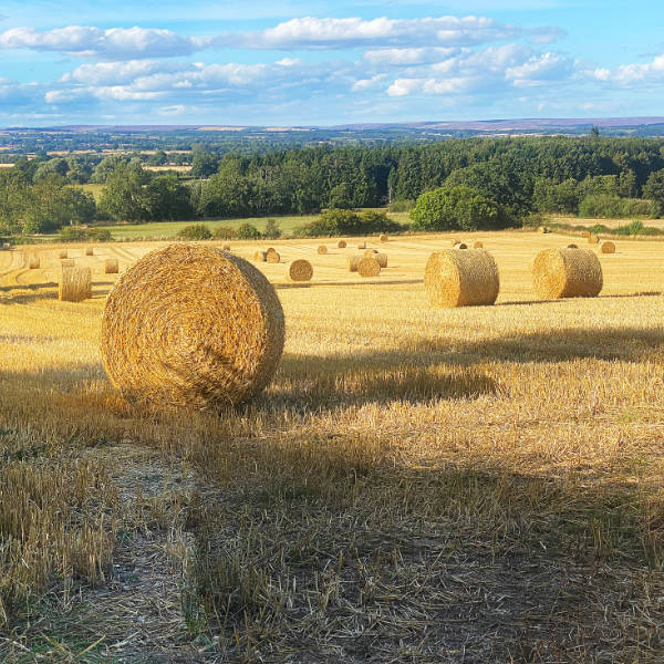
The photographic images to work from.
There is nothing fancy about the photograph - I simply took it with my mobile iPhone and stitched two shots taken side by side together in Photoshop. This gives a choice to you as an artist - you can create a longer composition or crop a little section off either or one side to create a more ‘landscape’ format. My suggestion is that you print your reference photograph out onto gloss photographic paper. Gloss paper will keep the colours ‘sharp’, richly saturated and bright. Printing onto ordinary photocopy paper and colours dull and sink in. You’ll not be able to ‘match them’ accurately. If in doubt, download the image, add to a memory card and take to a professional photo printer and ask them to print the image A4 or A3 for you. An alternative is to use a devise such as a laptop or iPad and use that to display your reference to paint from. These devises act like a lightbox with colours becoming richly saturated as light passes through the displayed image. So, you have a number of choices. Don’t leave it to the last minute - plan ahead.
Pastel support
My usual format is 50 x 60cm and its what I will be using for this masterclass. This is a standard size I use and usually stick to and follow ever since I began to use Canson Mi-Tientes ‘Touch’ 350gsm pastel paper several years ago.
However, I will be working on a full sheet of Clairefontaine 350gsm ‘pastelmat’ (MAIZE) cut to the size mentioned. It just standardises everything in my framed final pieces on a ‘large scale’. If you’ve not ever worked this ‘big’ before, now’s your chance to let go and do it! Believe me, its liberating and exciting to work at a larger format and I hope you take up the challenge!
The suggested pastel support (Clairefontaine pastel mat ‘MAIZE’) will provide a lovely ‘key colour’ of glowing ‘yellow’ on with to work.
Unison Colour pastels and Pastelmat are FANTASTIC in combination - a match made in heaven! The lightly velour surface holds lots of pastel without dusting, allowing lots of sumptuous pastel marks to build and build in lots of exciting and rewarding ways. Clouds remain bright, clean and fresh with every stroke.
However, you may have your own favourite pastel support and that’s OK - the Masterclass is not a prescriptive dictate. If you want to use a different pastel support than suggested - go right ahead! It will be interesting for us all when we share our exploits with one another on the Unison Colour Facebook page afterwards to compare, contrast and learn from one another in our Unison colour Pastel Community.
I’m looking forward to teaching you some really great pastel techniques so you to can create a wonderful landscape you’ll be really proud of and enjoy the rewarding experience in creating with me.
You must log in and have started this tutorial to submit a review.