One pleasure of the Unison Colour Soft Pastelling Community is never quite knowing what will appear next. A quiet landscape may sit beside a bright floral, a first pastel beside an established artist’s work, and a technical question may become a conversation between people across the world.
When I was invited to choose ten July posts that caught my eye, I wanted to capture that variety. As others have said, it’s surprisingly hard to choose just 10. I have enjoyed an opportunity to enjoy all that you’ve shared in July. You’ve been very busy! I deliberately included some names I don’t see as often, alongside artists whose work I have long admired. Some posts attracted me through colour or composition; others through the story behind them. Together, they celebrate what soft pastel can do and the warmth of our Unison Colour community where people feel able to experiment, ask questions and share at every stage of their journey.
Marz Doerflinger
Marz’s small desert painting immediately drew me in. Softened shapes, broken marks and flashes of unexpected pink and blue created a beautiful glow. Painted quickly before the desert grew too warm, it has the freshness of responding directly to a place.
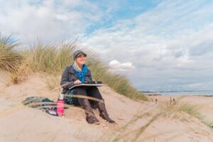
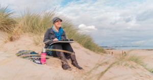
Plein-air work makes us pause and look again, make decisions and capture what matters before the light changes. The changing conditions create an urgency, bringing an energy that is difficult to recreate in the studio. I always admire fellow Associate Artist Cathy Pearce’s en plein air work for that reason, her work simply glows. I enjoy my own practice of painting outside and recommend it as a way of slowing down your process to my students.
Peter Hogarth
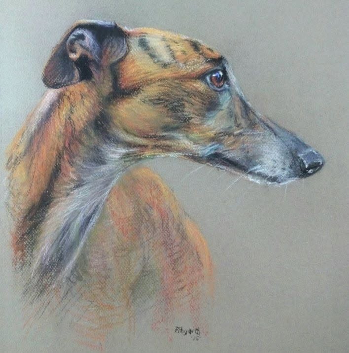
Having painted many dogs, I know how difficult it is to capture not only a likeness but character. Peter’s portrait of a stunning lurcher does both. That alert eye and turn of the head are so familiar, while the loose finish across the chest keeps our attention exactly where it belongs.
Brindle coats are so challenging: their markings are so subtle and individual to the animal, just like a fingerprint, so each detail must be perfect but loose enough to feel its movement. Peter’s portrait’s always capture a character rather than just a portrait.
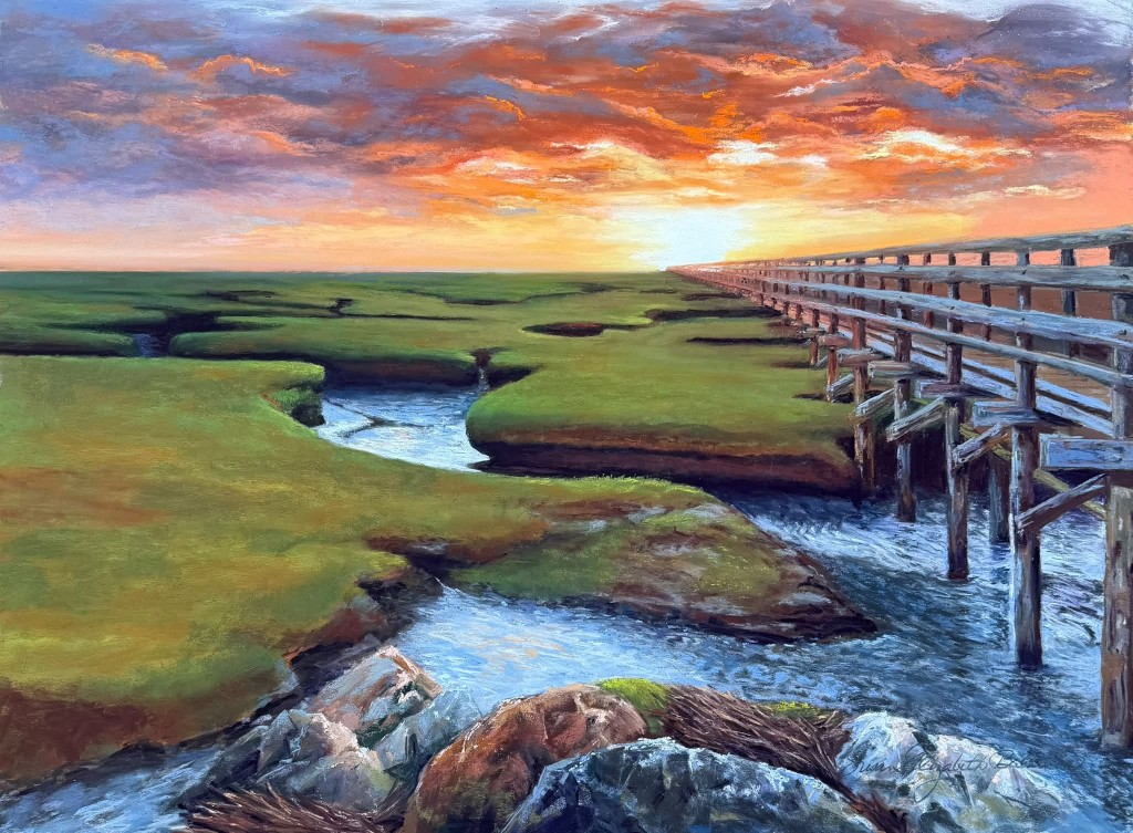
Susan Baldwin – Sunset Pier
I never tire of sunsets. Susan’s pier carries us towards the glowing horizon, while the winding channels bring us back through the marsh. That strong composition gives structure to a scene filled with colour and light. I loved the contrast between the vivid sky and broad areas of green.
Susan wrote that it was one of those moments she knew she would paint. Most artists will recognise that feeling, I know it myself, the sudden need to stop, look and store a scene away for later. My mind’s eye has an ability to store so much more than a photo, even if I use one for reference at a later point.
Jocelyn Pryor
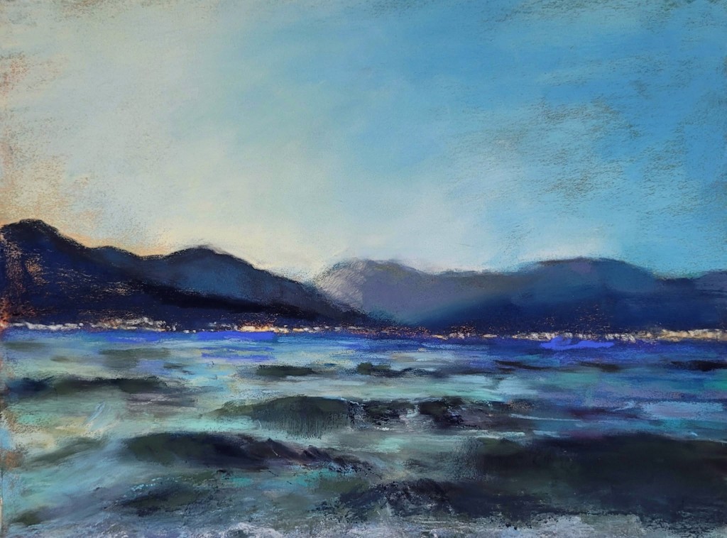
There is something encouraging about Jocelyn returning to a painting after putting it aside for a year. Sometimes time and distance allow us to see the solution more clearly. I love that she is encouraging us to explore a mixed media approach, that’s not cheating, that’s a creative solution! A great tip!
Texture layered blues and broken marks evoke shifting water, I love that movement. The dark foreground anchors the painting, while the distant land is handled softly. It is a useful reminder that an unfinished painting is not necessarily a failed one; occasionally it is simply waiting for us to catch up with it.
Alain Voinot – The Forest of Merlin
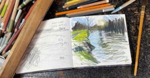
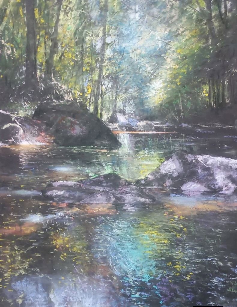
Alain’s woodland scene feels almost illuminated from within. Working on black paper has allowed the light pastel marks to sing, especially in the water and the opening between the trees. The dark surface remains an active part of the painting, giving immediate depth and atmosphere.
Woodlands can easily become a tangle of trunks, leaves and competing detail, but Alain has created a clear journey from the shadowed foreground towards that mysterious cool light. We have some wonderful tree painters in the group. Trees make the most wonderful subjects for sketchbook studies.
Mena Levit – Under the Dreaming Tree
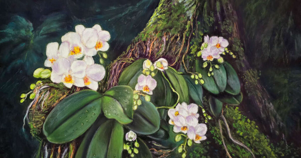
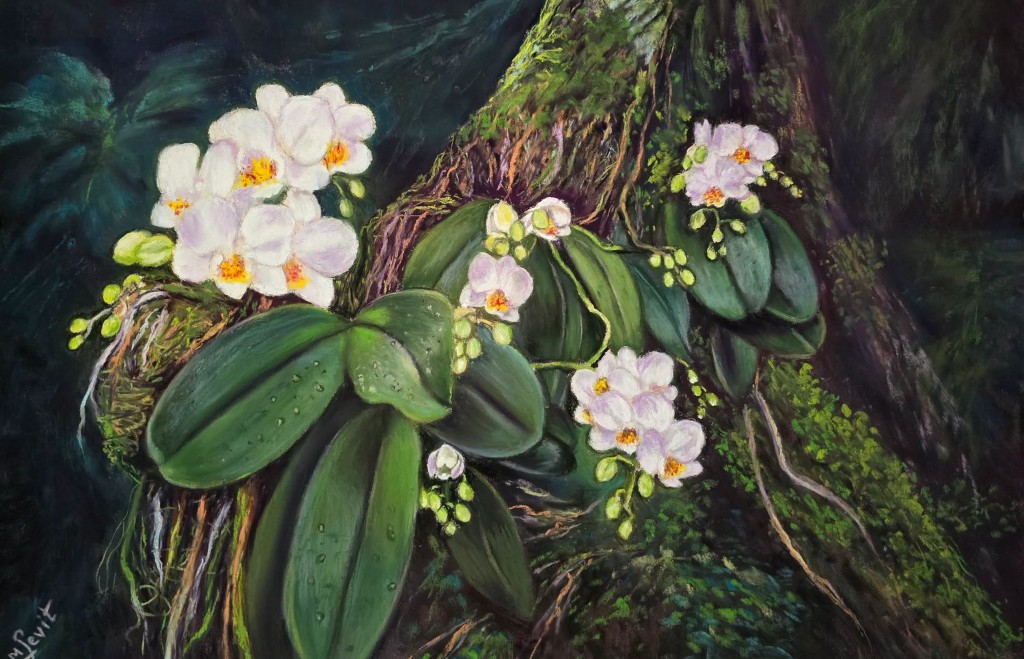
Mena’s painting made me stop because it focuses on a much smaller scene. I love that reminder to focus on what’s around us. The orchids glow against the deep greens, while the twisting, moss-covered branches give them a gorgeous setting.
I loved the contrast between the softness of the petals and the rougher textures surrounding them, pastel is so good at describing both. Mena wrote about beauty not needing to shout, and I think that is a lovely thought. As artists, it is easy to search for a dramatic view but sometimes slowing down and just looking more closely gives us everything we need.
Romana Svatoňová
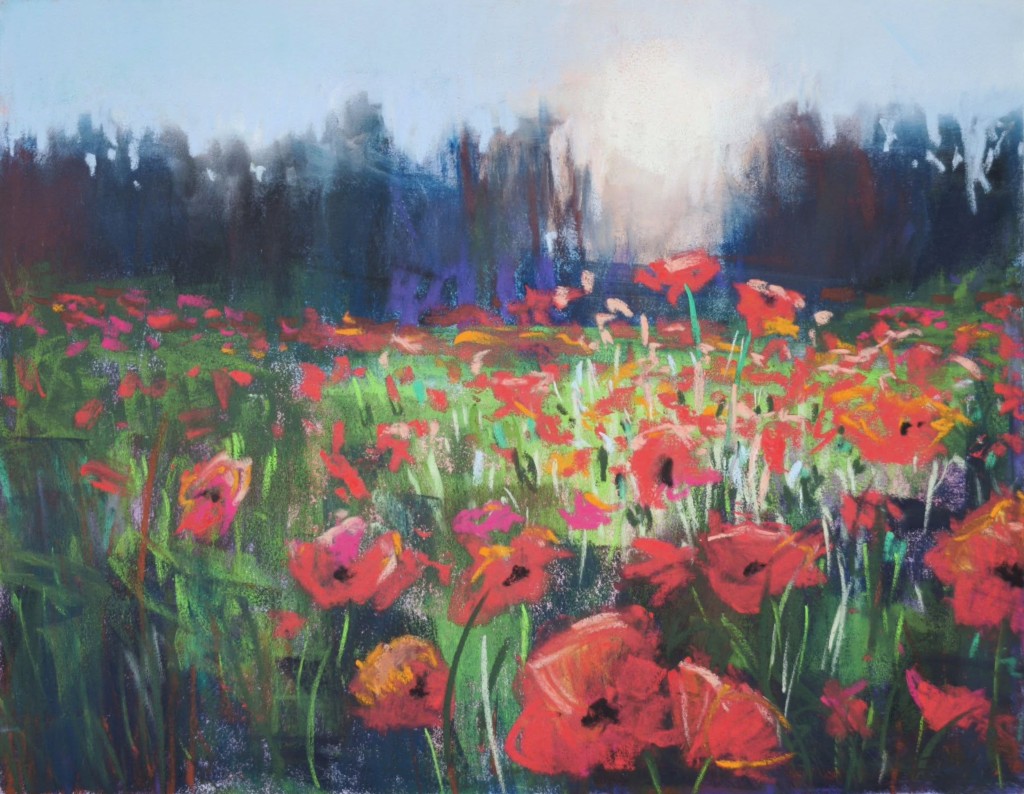
Romana’s poppy field is full of movement and confidence. Bright reds leap forward against the deep blue-green trees, while the quieter sky gives the eye somewhere to rest.
I like the variety of marks: some flowers are suggested with a quick stroke, while those in the foreground are given more character. Romana’s willingness to explore different media comes through in the freedom of the piece. Experimenting often brings something unexpected back into our pastel work; we are artists firstly and then across any media we choose.
Jade Eberl
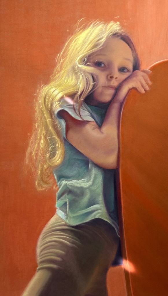
Jade’s portrait brings a different kind of artwork to my selection. A child’s pose, leaning against the warm orange surface, feels like a brief moment in time, while the turquoise clothing provides a beautiful colour contrast.
Backlit hair is notoriously difficult to paint, but Jade has captured its luminosity without losing the weight and shape of the hair itself. I liked her comment about trying to be less pedantic and giving herself permission to make mistakes. Portraiture requires careful observation, but likeness and character are not always found by tightening every edge. Sometimes allowing a little freedom is what enables a painting to breathe.
Bren Henderson
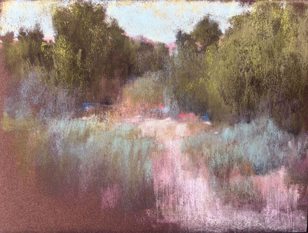
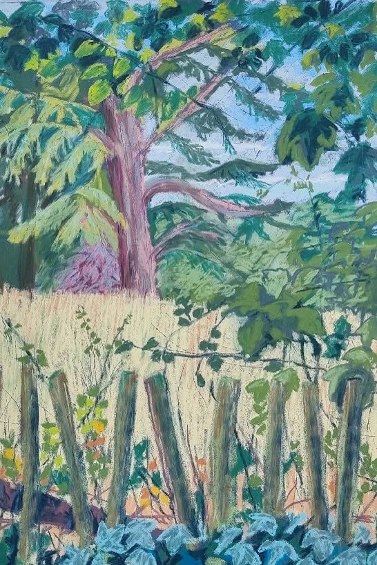
Bren’s first plein-air pastel, and the commendation she received for it, made me smile. Taking pastels outdoors can feel daunting, with the equipment, changing light and possibility of someone looking over your shoulder. Yet working from life makes us slow down and notice details a photograph may flatten.
Bren’s picture has an engaging immediacy, particularly in the lively greens, mauve-pink tree trunk and rhythm of the fence. Best of all, she says she is now hooked. We love that, Bren!
Dawn Taylor
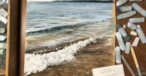
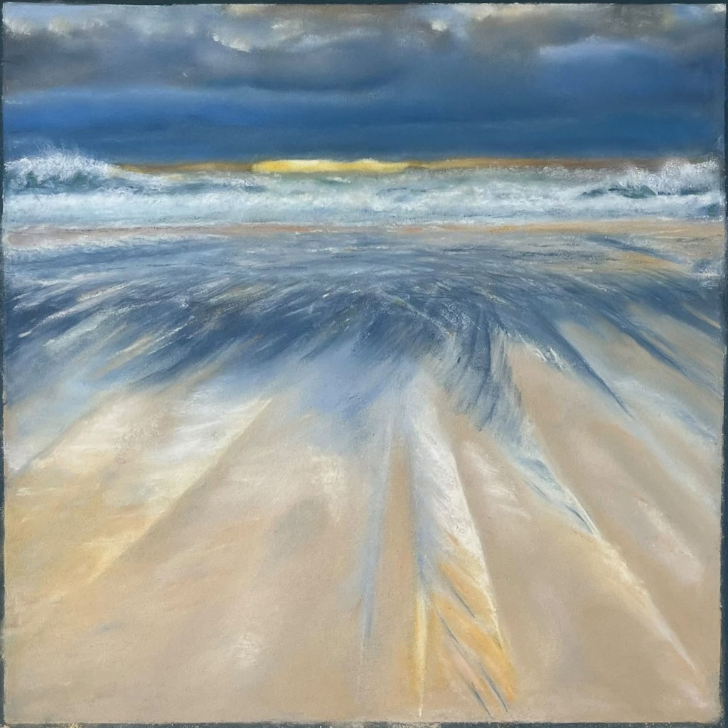
Dawn introduced herself as someone only a couple of months into soft pastel, then bravely shared her favourite painting so far. A stunner! Her seascape has a strong sense of weather, with narrow yellow light beneath heavy blue clouds and water rushing towards us across the sand.
I loved the enthusiasm of her post, overspending and I think we have all searched for that perfect purple, grey. (You’ll never have enough pastels! But mine, Grey 9 – I love it!) A friendly group should make it safe to ask, try and learn, and posts like Dawn’s show this community at its best.
The Unison Colour Pastelling Community
Looking across my July choices, what strikes me most is not one style or subject, but the act of paying attention. Whether someone is painting in the desert, beside a fence, from a phone snap or after returning to a piece placed on the shelf, pastel allows us the freedom to be flexible and work in a way that suits you.
It is something I often explore in my own work and when working with other artists: deciding what matters, simplifying what does not, and using colour and marks to share how a subject felt. Taking a break, returning to an artwork and reworking it from my sketches. To coin a phrase, the journey is the destination, which I love to enjoy.
Thank you to everyone who posts, comments and encourages others in the Unison Colour community. Its mixture of experience and openness, from brand-new pastellists to internationally recognised artists, it makes it such an inspiring place.
I could easily have chosen another ten. That is the lovely thing about this community: you never quite know what someone will share next. These were the ten posts that caught my eye in July; I hope they encourage you to look again, try something new and perhaps share what you have been creating too.