How lovely to be asked to take some time to look at peoples’ fabulous pieces of art and talk about why they grab your attention. As the two people who’ve read my blogs know, I probably sit on the edges of the Unison Colour Facebook Community as an outsider artist, with a style and taste that is probably a bit more leftfield than most. So, for this blog, I suspended ‘nearly’ all that style, taste (or lack of) and judgement to pick out which pieces spoke to me.
Big shout out to everyone who submitted a piece of art in June. It’s not an easy thing to do (I haven’t done it yet as I’m not on Facebook) to bare your creative soul to the world, let alone a bunch of artists!
The following are in no particular order and where they sit in this blog is absolutely no reflection of any ranking as there shouldn’t be ranking in art.
All the best you lovely people
Nigel
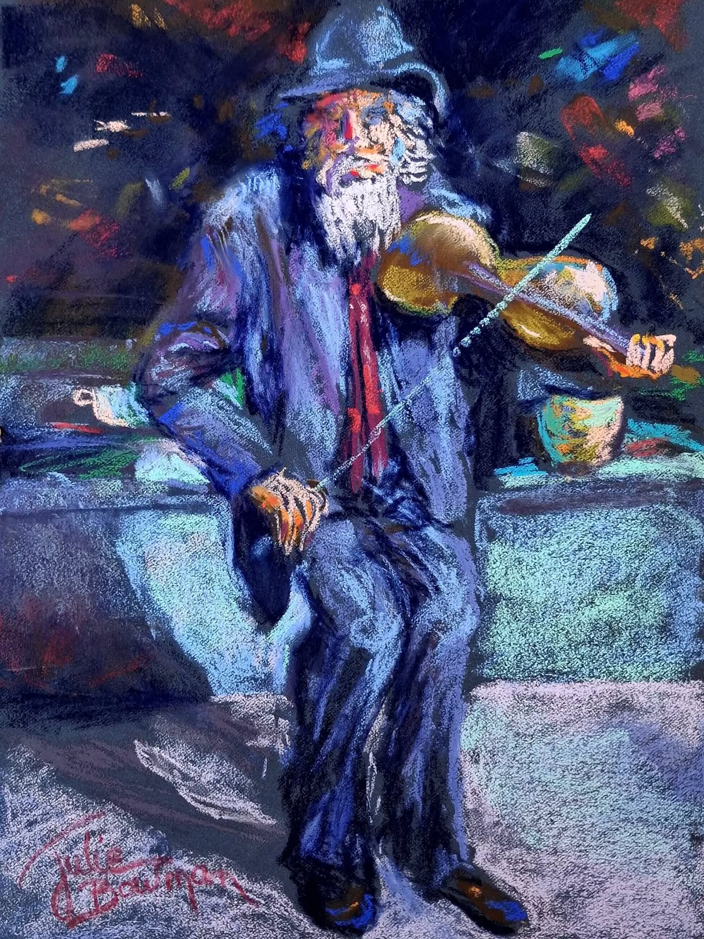
‘Fiddler on Market Day’ by Julie Bowman Williams
As a failed musician, I’m a sucker for any painting of musicians doing their thing. Although I am still a bit traumatised from the print of Picasso’s ‘The Old Guitarist’ that used to hang in the dismal doctor’s surgery I used to have to go to in the 70’s*.
The streaking blues and purples of this chap’s clothes against the rough grey blues of the lower background are really cool. I feel like striking a match off the stone and the subject’s body is animated with the pastel strokes but still has a stiffness that you would expect from an elderly gent. Flipping A as we used to say.
*Fun fact, one of the other GPs in that surgery was the Dad of the keyboard player from the band Keane.
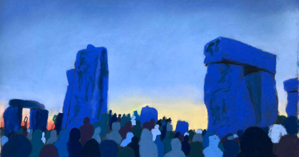
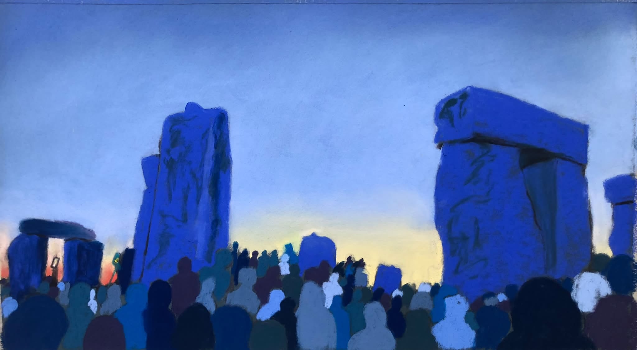
‘The Great Dance’ by Angela Bell
I just really like the vibe of this one.
Once again, some beautiful blues of the stones especially the trilithon (I had to look that up) on the right which has an interdimensional gateway quality to it. I also really like Angela’s use of shapes in different colours and shades for the revellers.
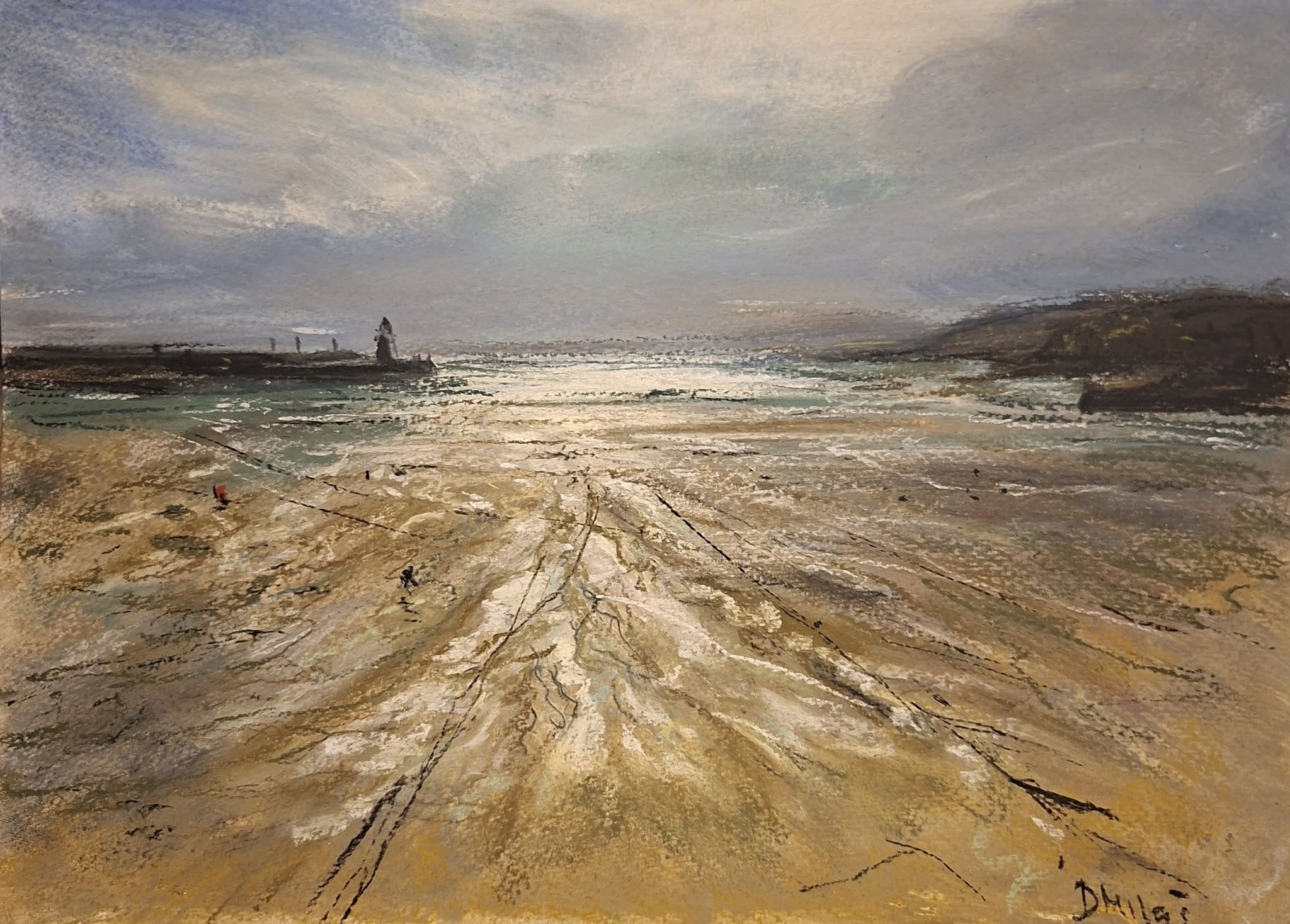
‘St Ives Light’ by Dragana Milas
An awesome painting from Dragana. One of my favourite places to be is on a beach at dusk (apologies if this was in the morning) in the summertime. Everyone’s gone home; there’s a warm breeze circumnavigating your body and you may or may not be about to go for a swim, or just paddling with a loved one through the tips of the water’s edge as it lollops round your toes. It takes me back to wonderful memories of body boarding on the Cornish coast with my daughters when they were young in the early evening, before going for a well-earned meal in a local pub.
Dragana’s colour pallet for the wet sand takes me there instantly and the random cuts and scratches give it such a realistic feel of a beach that’s been used for work and pleasure. Excellent stuff.
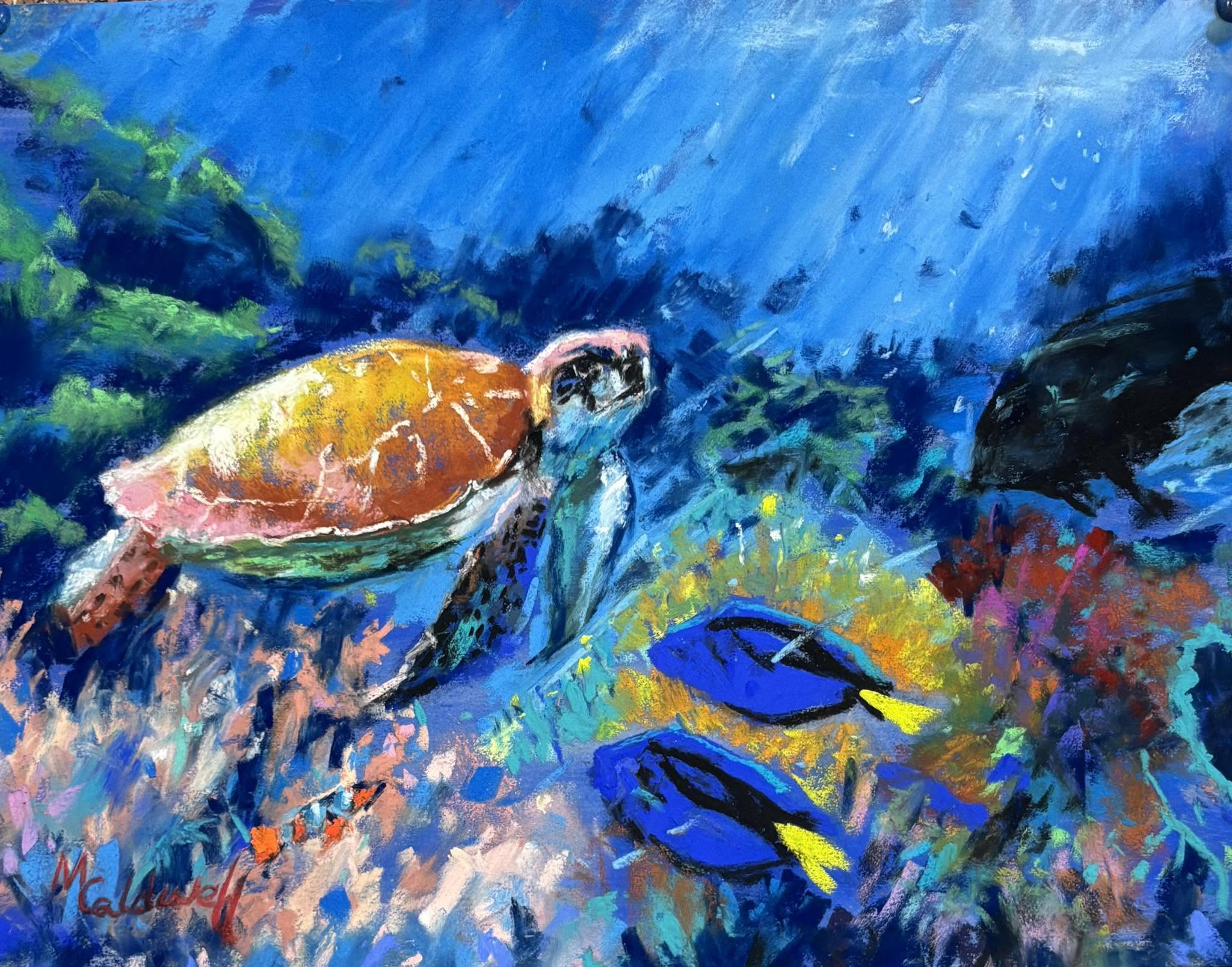
‘Under the Sea’ by Mary Smith Caldwell
This painting is so bright and happy it just makes me smile. I got to swim close to sea turtles off Isabela Island in the Galapagos years ago, one of my loveliest memories and this painting takes me right back there, bar the extreme sunburn and being bitten by angry insects when I got back to the surface.
Mary has captured the turtle’s laid back look perfectly. Technically I love the strokes on the sea turtle and the light pouring in. I’ve also realised I’ve picked a lot of paintings with fabulous blues in them!
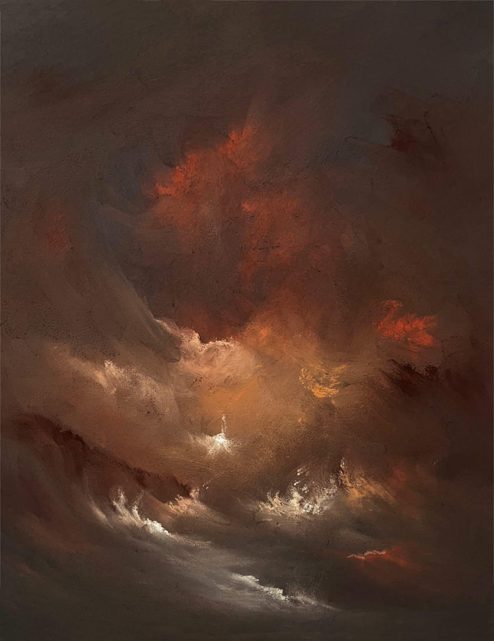
‘Storm’ by Stephen Fuller
Really hard to pick a favourite from Steve’s work but this one’s right up my overly dramatic alley. It’s the sort of thing I’d stand and stare at for ages in the National gallery. Real wrath of the gods, nature at its most brutal excellence and I’d like to get hold of a print of this for my wall.
Bloke’s a genius, nuff said.
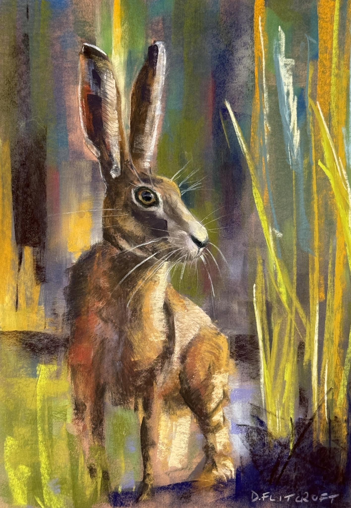
‘A Hare’ by Dave Filcroft
Animal paintings have never been my personal favourite genre I must admit but this one’s a cracker and a half. The detail and the strokes are brilliant, but what really stands out for me is how Dave has painted the grass/wheat/earth etc. The strokes are magnificent and I love the colours he’s used. The sense of danger you get from the alertness of the hare’s eye and stiff posture is further enhanced by whatever’s going on in the right-hand bottom corner, it might just be earth or roots but to my overly warped mind its emerging like a phantom (I was taken to see Watership Down as a child in the 70’s and have never recovered).
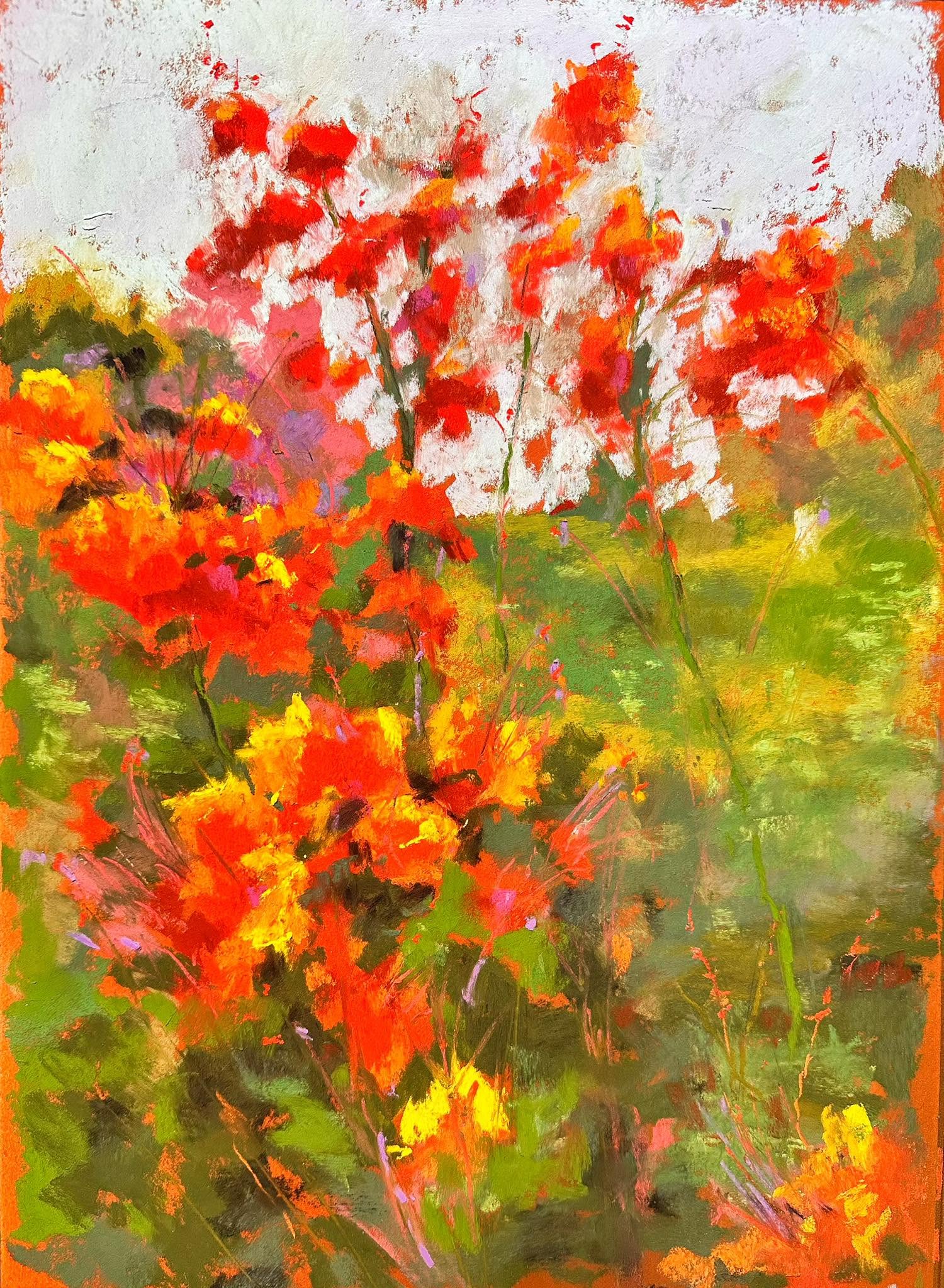
‘Pride of Barbados’ by Neva Rossi
I would be very proud if I’d produced this. Its blurry and messy and gnarly and bright and wonderful. My favourite bit is the white’ish background, I can just feel the texture on the tips of my fingers. One of those paintings you can keep seeing new stuff in every time you revisit it. One minute I see the flowers in the foreground and the next they’re merged into a chaotic background. Lovely stuff.
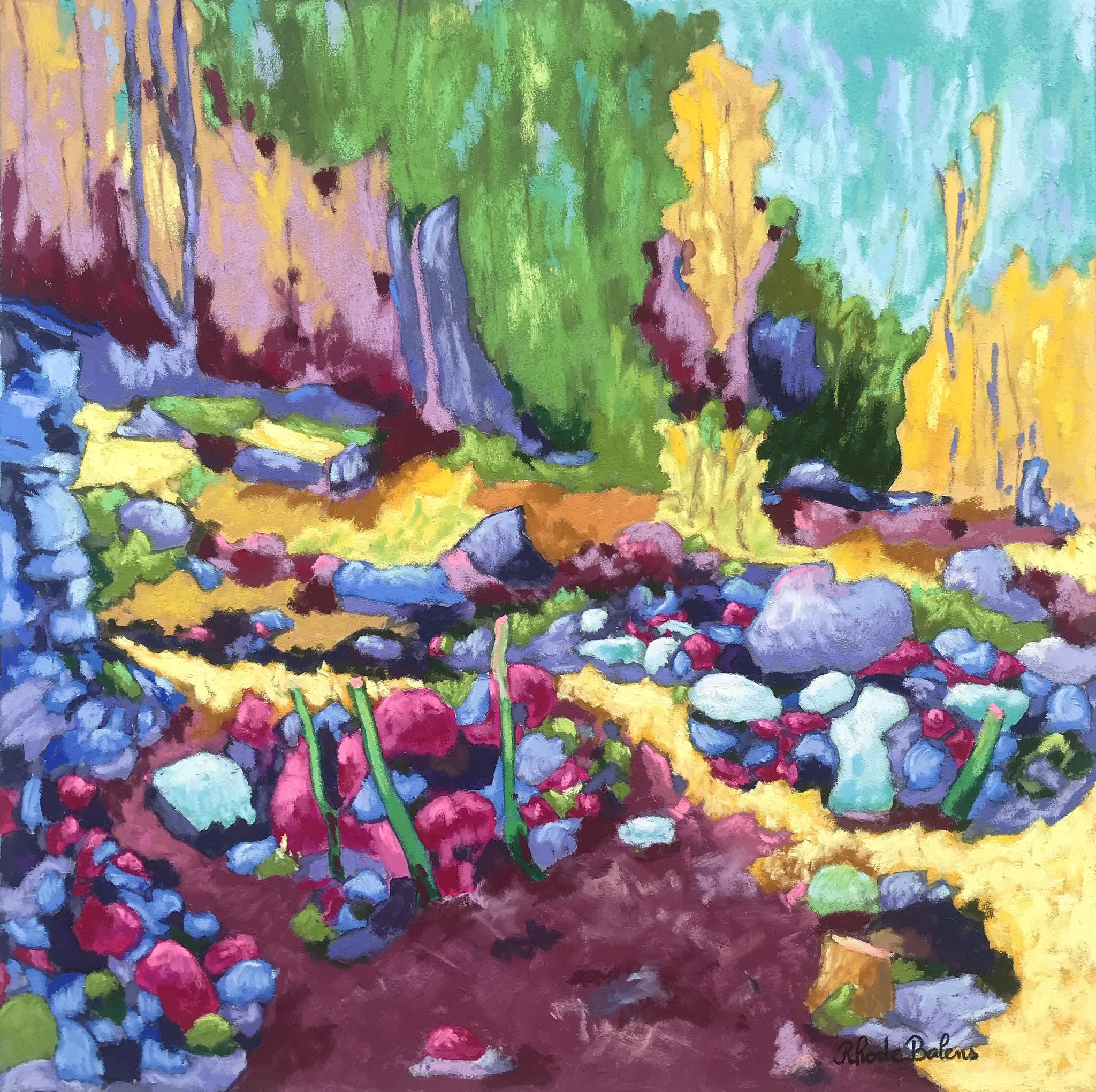
‘Untitled’ by RH Balens
I just love the totally bonkers colour pallet used in this painting. It’s like a treasure chest of sweets from my childhood sitting on top of a lake of sorbets!
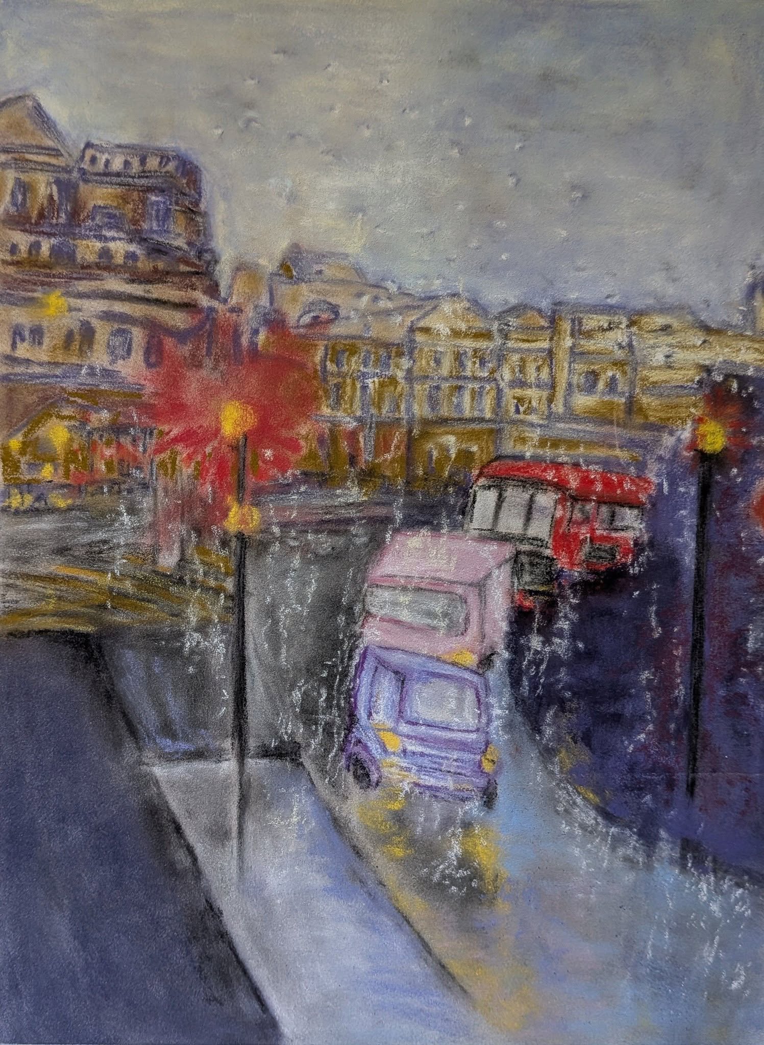
‘Untitled’ by Chris Siciliano
Another painting that invokes in me wonderful memories of getting lost in a city on a rainy day. London with my family in the Portobello Road area years ago and more recently amidst the heaviest downpour I’ve ever been caught in, in Tirana with a mate.
I love the outsider art style Chris is using, ignoring realism and technicalities and creating a piece that just puts you in that place. I can feel the volume of the rain (even if it isn’t intended to be rain); the challenge of trying to keep dry when your trousers, shoes and socks have already given up and are sopping wet. The chaos of the traffic and feeling a small part of, but a happy part of a bustling city.
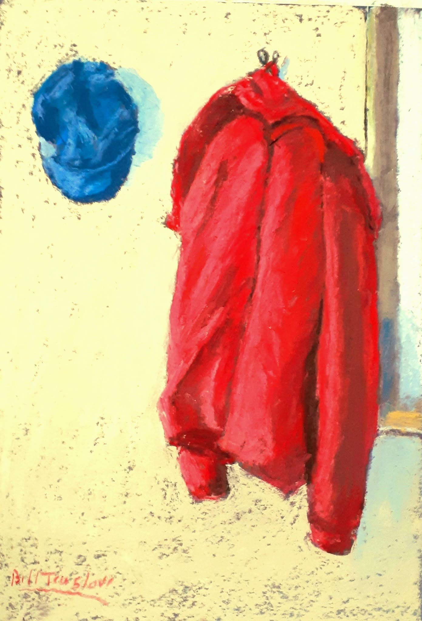
‘Robert’s Red Jacket’ by Bill Truslove
I love this painting so much. What a gorgeous pallet. The yellow of the wall and the blues of the hat combined again with that rough aged texture of the wall are so pleasing to the eye.
The red coat reminds me so vividly of my daughter’s primary school jackets and how adorable they all looked going to school (smart) and returning from school, often with the coat crushed into a bag or tied precariously around their waists.