What a privilege to be asked by Stephen Fuller to choose the Eyecatchers for March 2026 from the Unison Colour Soft Pastelling Community page! It was tricky to limit it to just a few but here are some that caught my eye:
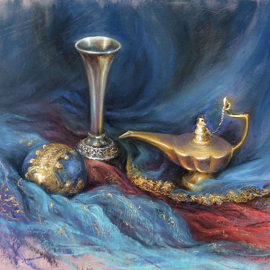
‘Still Life’ by Rebecca de Mendonca
I am always excited at the way soft pastel can be used to convey hard and shiny textures and Rebecca has achieved this very convincingly here. The warmth of the gold lamp contrasts beautifully with the cooler blue tones of the fabric. We have such a wonderful range of surfaces; I can perceive shiny, smooth, knobbly, soft, scratchy and wispy! How many can you see?
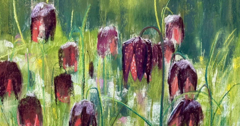
‘Sunlit Snakehead Fritillaries’ by Dave Flitcroft
I chose Dave’s flowers because, with just a few strokes of the pastel, he has clearly delivered the backlit delicacy of these petals. There is a really perceptive use of tonal values here to convey the volume of the flower heads and just the right amount of vibrant red to show the way the light is interacting with the shapes. The complementary green of the background heightens the warmth of the flowers brilliantly. As someone who revels in the details, I am always impressed by pieces that seem to deliver the details without actually having to pastel them! This is deceptively simple and yet says so much about the natural subjects and their context.
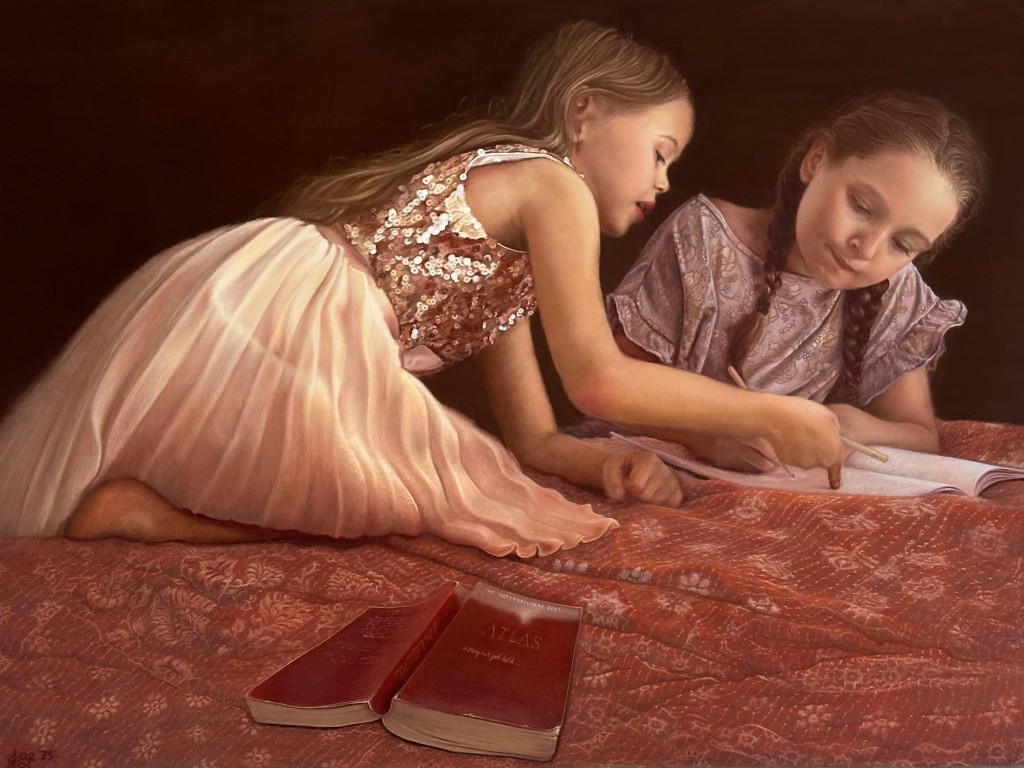
‘Stolen Moments’ by Jade Eberl
What a sublime piece of pastelwork here! I love the composition… how the foreground book pulls our eyes up the painting via the diagonals of the first girl’s skirt and then her arms take us across to the focal point of their faces. The simple dark background frames the subjects beautifully and allows us to delight in the negative shapes their figures create, allowing their warm skin tones to show how connected the girls are. The successful tackling of a range of textures is again seen here in the silk, sequins, hair and skin. What masterful handling of the medium!
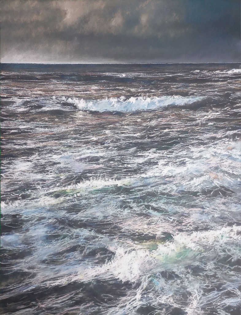
‘Auror’ by Alain Voinot
There was no shortage of waterscapes this month to choose from! It is clearly a popular subject but, being an ever-shifting element, water is a challenging subject to convey convincingly. Alain has certainly managed that here! Notice the very subtle but effective change of values as the planes of the water move in relation to the light from above. Notice too how there is very little pure white pastel used to create the surf; by using a wide range of blue-greys and green-greys in the ‘white’ surf areas, Alain shows he has full control of his values and this adds three dimensions to the lighter areas of water. The perspective is also used really well to show that the water goes ‘back’ towards the horizon in thinner and narrower planes. The diagonals keep this a dynamic composition – so fitting for the turbulent subject!
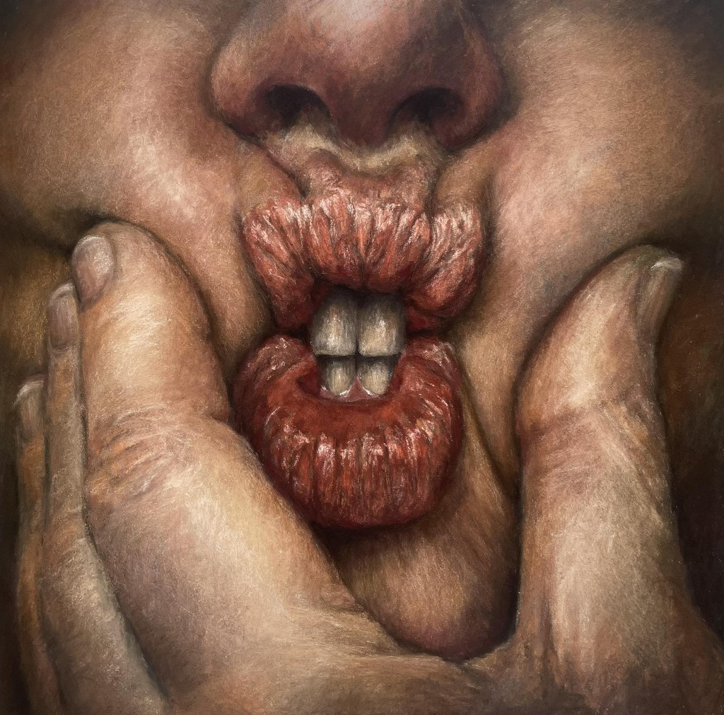
‘Clamp’ by Janina Meulendijks
Composition has also been used well in this piece where Janina has cropped so closely to the clamped mouth that the claustrophobic, squeezed expression is emphasised. We are made to feel uncomfortably ‘clamped’ into the picture with no escape. The handling of the skin texture is so effective because you can see, if you look closely, that her markmaking is very layered with not too much blending. This allows the pastel structure to mimic how skin itself is made up of many layers and tones. The teeth are perfectly toned and Janina has avoided the trap of making them too light in value, placing her lightest value as tiny marks to convey the moisture at the gum. The creases are also dark enough which adds form to this face and hand. What a lovely exploration of values!
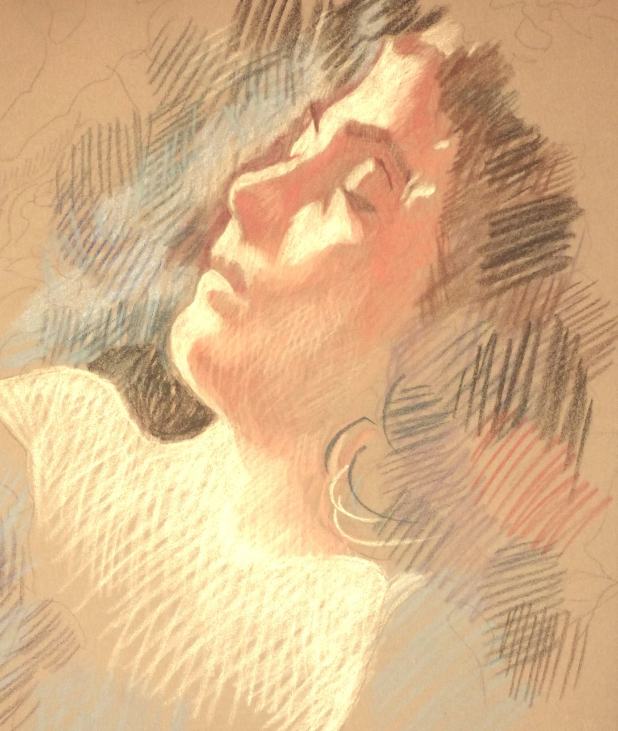
‘Quiet Night’ by Francois Malnati
This caught my eye because of its brevity! What a lovely little sketch showing the way crosshatching can be simply used to convey shape and form! I know that Francois’ work is usually brightly coloured, detailed work but this shows how even the simplest marks can be so effective. Look at those five single curled marks to portray her hair! There is a lovely unfinished quality to this piece… I like how the further away from the face we go, the fewer marks we see until we arrive at the raw unpastelled edges. This allows the light on the face to be the most important part so we can wonder what the subject is dreaming about.
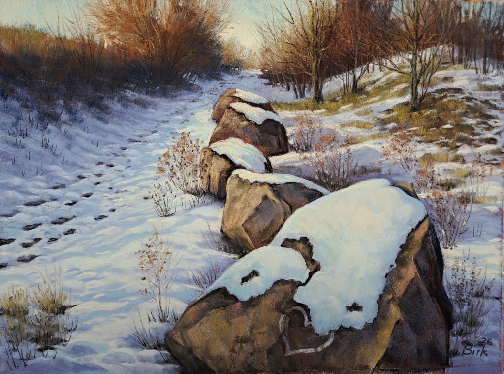
‘Snowy Heart’ by Kerstin Birk
I love Kerstin’s subtle control of values here with mauves and blues depicting the undulations of the bright snow. I love the warm pinks which have been used to add rims of warmth to the snow shadows. Notice how the dark hedge moves from mauve to dark purple to dark brown and then up to warm reds and orange as it reaches the light! Kerstin worked from her own reference photo of the scene and her cropping skills have really made this composition work well to lead us through the picture. The diagonal line of the footprints (see how they get lighter in value and closer in distance as they recede!) is balanced by the radiating lines of the two treelines and the boulders themselves.
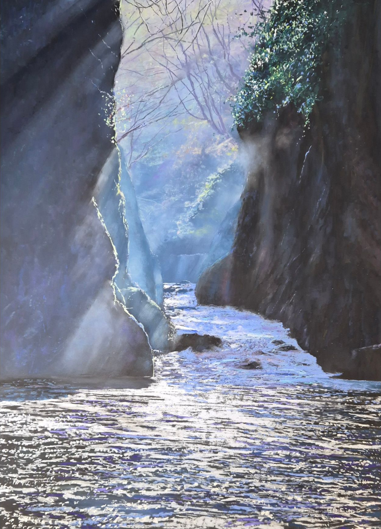
‘A Quiet Moment at Fairy Glen’ by Dave Roberts
The interplay of light and dark is what attracted me to this piece by Dave. There is no light without darkness and here the light has been captured between the two rock faces on each side. One of the joys of soft pastel is its ability to be ‘glazed’ as a transparent layer to show mist, smoke, dust or light and Dave has played with this here. Those shafts of light blues and lilacs cut across the hard surfaces of rock and add depth and luminosity to this lovely scene.
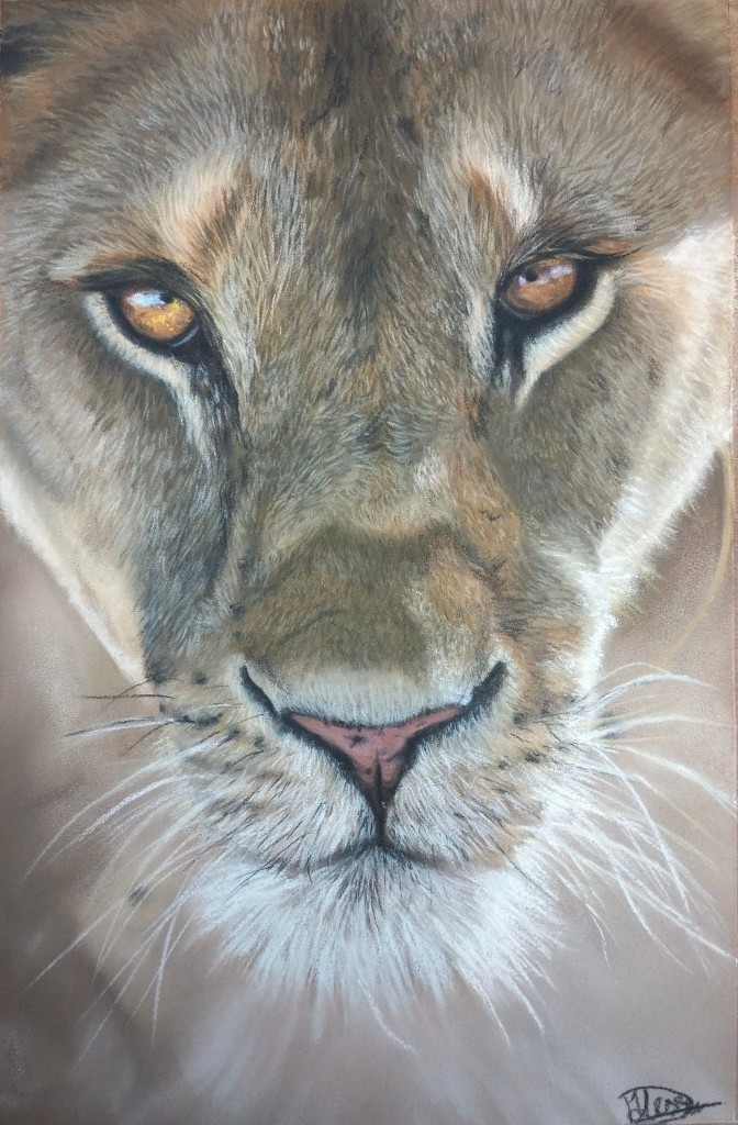
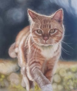
‘Lioness’ by Alessia Donato
Being predominantly a wildlife artist, I couldn’t resist this lovely feline by Alessia. I like the way she has used a blurred background to give the lioness a depth of field which emphasises the piercing amber eyes of this predator. She has managed a super level of softness on the Canson Velvet paper and used an effective pale blue for the eye highlight (rather than white) which adds to sense of the animal being under an open sky.

2 comments
Leone Madden
Thank for showing this stunning artwork..As an never-ending learner in art, I also really appreciate the comments and descriptions of each piece.. Thank you 🙏 cheers Leone…
Teresa Seals
Thanks Leone! It was hard to choose from such a lot of talented artists! 🙂