I’m grateful to be asked again by Unison Colour, to be the guest selector for the ten paintings that have caught my eye in the Unison Colour Facebook Community during the month of May.
Never an easy task, as it’s such a diverse range of subjects and styles, but it’s also an enjoyable opportunity to slow down and observe the posts a little more carefully.
That said, the rule of thumb I applied this time, was to look back over the month’s submissions at speed, and to register where my scrolling paused or stopped instinctively.
This still left me with a list of over twenty ‘eyecatchers’ that unfortunately I couldn’t include, so apologies to those whose excellent work I haven’t been able to feature this time.
I have attempted to choose a range of paintings that reflect the diversity and brilliance of our wonderful shared medium, hope you agree!
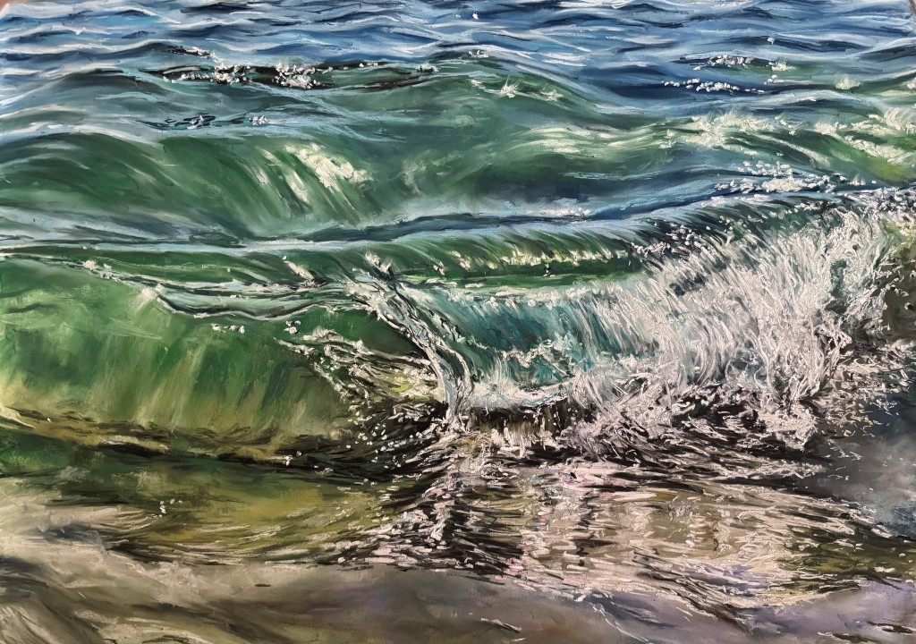
‘Transparencies II’ by Sandra Frey
The sea and waves are a very popular subject, yet a difficult one to master.
It’s a subject close to my own heart and having had reasonable success in portraying it myself, I do recognise when others capture it convincingly.
Sandra does so here with a realistic painting that sparkles and invites the viewer in.
The translucency and highlights are beautifully handled, and the glass like leading edges are superbly done. I could walk straight into this!
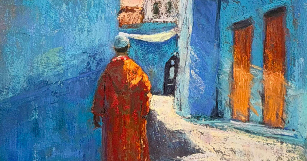
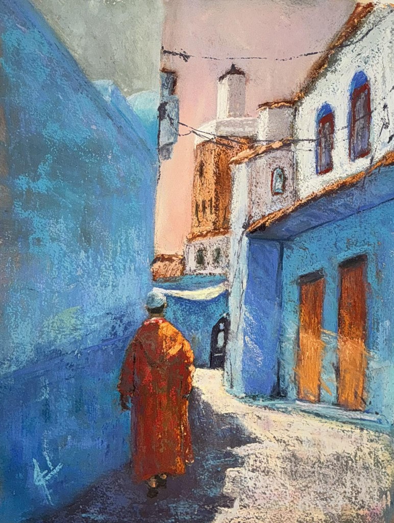
‘Along the Shadows’ by Adelaide Luedje
This immediately transported me to a distant land, presumably North Africa, where I can feel the heat and dust, and hear exotic sounds.
In contrast to the first selection, the sparsity of pastel employed here, utilising the background colour and texture, works greatly to its advantage. I was equally attracted to the complimentary colour palette of blue and orange, and the loose, yet effective, mark making.
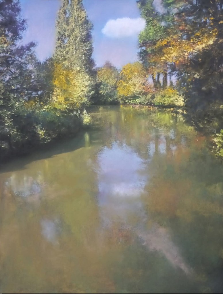
‘Souvenir Of This Day’ by Alain Voinot
I make no secret of being a great admirer of Alain’s work, he is consistently brilliant and unsurprisingly, his work features in Eyecatchers more than most!
Of his several posts in May, this piece stood out for me. The composition and treatment of the foliage are excellent, but it’s the beautifully handled reflections in the still water, which takes this work to another level.
So typical of many French waterways that initially appear flat and opaque, yet Alain elevates this scene with beautifully subtle shifts of colour, and masterful skill.
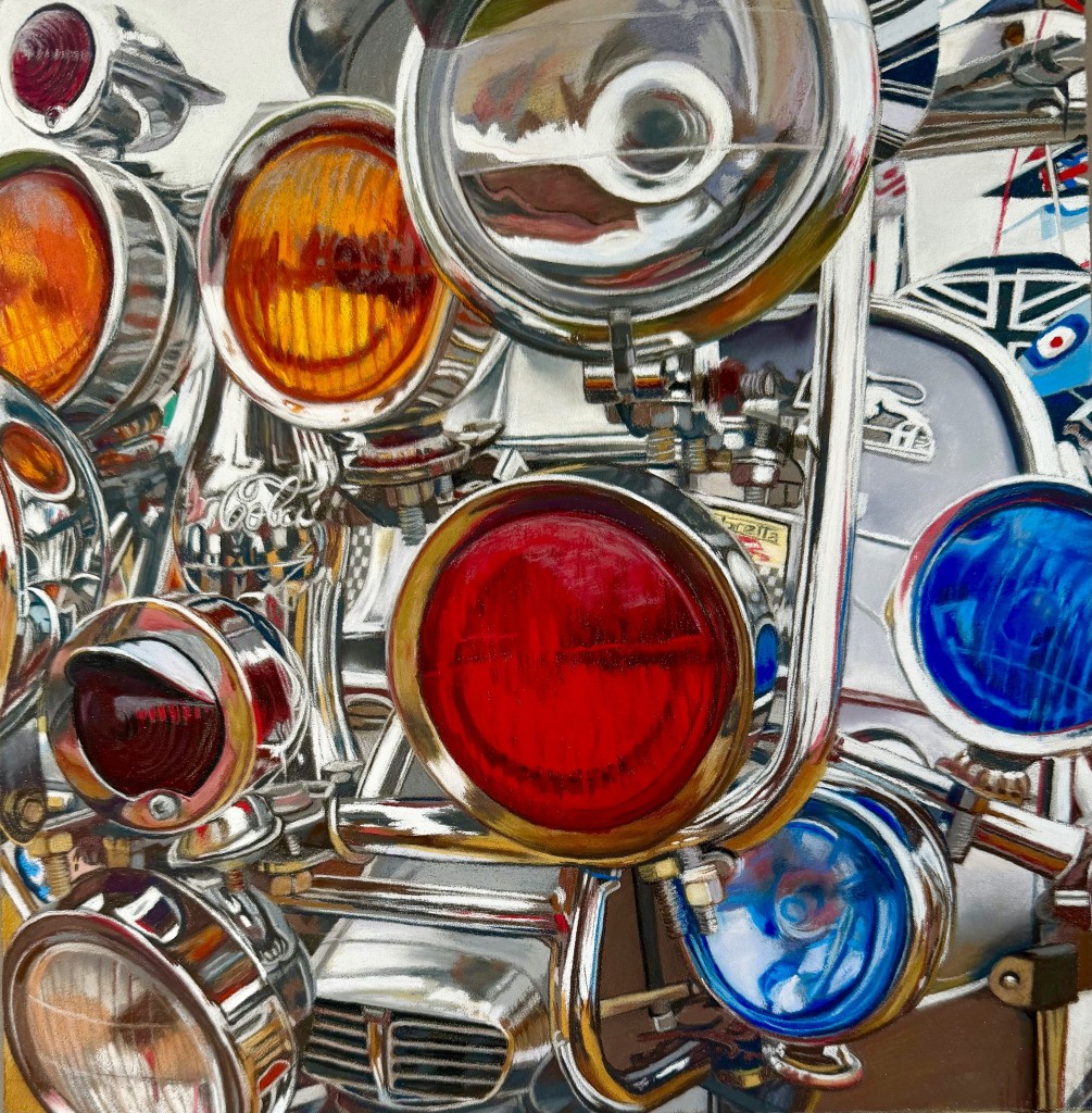
‘Untitled’ by Teresa Seals
An attention grabber for many reasons!
Not only is it a successful painting in its own right, but it’s also a technical tour de force.
Teresa’s departure from her natural subjects, adds to the impressive feat in creating this striking work.
The viewer is challenged in an exciting way, to decipher the content, and left applauding the accuracy of all those ellipses and reflections. I can only imagine the many hours involved, but each one was definitely worth it.
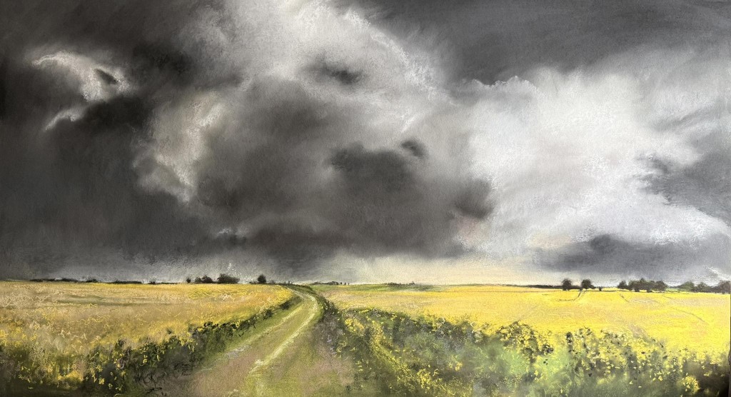
‘Finding A Way Through’ by Katie Bailey
A painting of scale and drama which needs to be imagined at its full impressive width of 125cms. The tempestuous clouds in their almost monochrome tones, contrast sharply with the bright, colourful fields below, creating a compelling atmosphere.
The viewer is led into the depth of the storm, along an inviting path that curves towards the foreboding sky.
Is the storm approaching or retreating? Whichever, this has great drama and almost a sense of mystery.
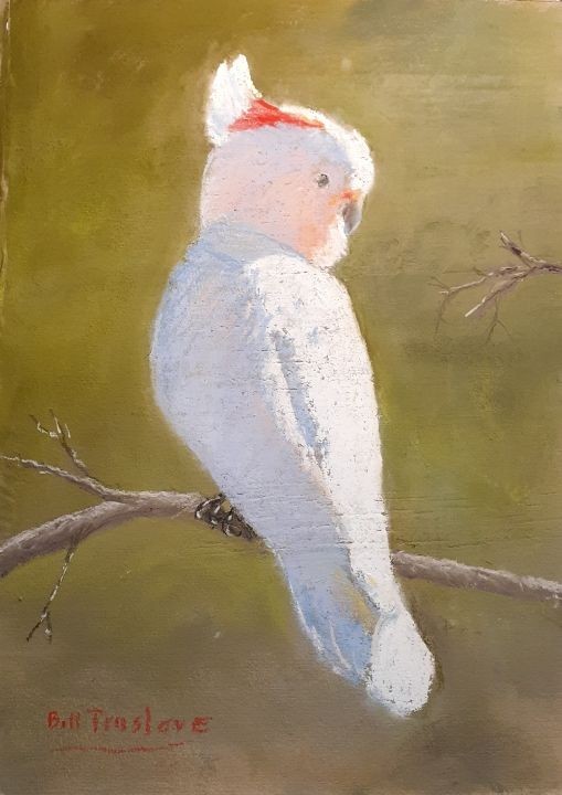
‘Major Mitchell Cockatoo’ by Bill Truslove
There was a warmth and immediate charm to this simple study, that caught my eye and captured my heart.
Being a bit of a birder in my day, I recall seeing cockatoos when I visited Australia, and I feel this encapsulates their character completely, without over reliance on ornithological detail.
The harmonious palette is exceptional, with the flat khaki backdrop that pushes the bird forward, and the blush pinks and peaches sit perfectly with the cool blue plumage shadows that make the white highlights sing.
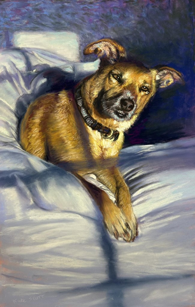
‘Sunlit Sweetheart’ by Kate Scott
There were several outstanding canine paintings posted during May, but this one prevailed.
The light and the pose stood out, together with great contrasting use of colour, the golden hues of her coat against luscious blues and purples.
It’s a painting that is clearly created with affection and suggests a story, where a beloved pet, on her believably rendered bedding, is awakened suddenly by a visitor?
The inquisitive gaze and the anticipation expressed, are caught with admirable sensitivity and skill.
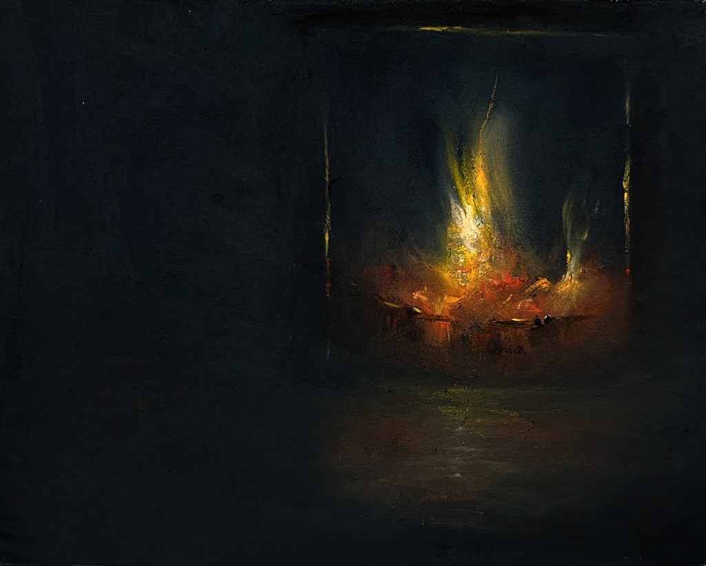
‘Embers’ by Stephen Fuller
Stephen’s works are often produced at a surprisingly small size. His sweeping fantastical vistas impart a feeling of great scale and majesty, yet his style is minimalist and economical in detail. His works often invite the viewer to use their imagination to complete the narrative in their own minds.
This is no exception, even though, here, we are in an enclosed and intimate space.
The painting convincingly captures that primeval connection with fire, and the comforting crackle and flickering warmth of home.
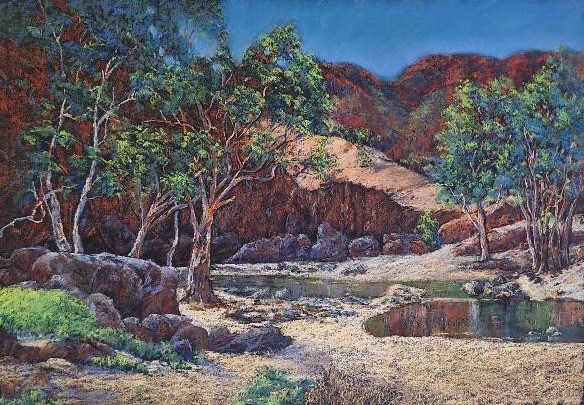
‘Life in the Centre’ by Helen Miles
Helen has created a landscape here that has a wonderful air of solitude and serenity.
The chosen palette and the beautifully balanced composition work very well, but it was the light in this landscape that also caught my eye. Building from a dark surface, the mid tones of mauves and rusts sit comfortably with the cooler greens, and the highlights are used intelligently. The mark making is accurate yet has a refreshing freedom that adds to the overall ambience… making this is a place I would like to visit!
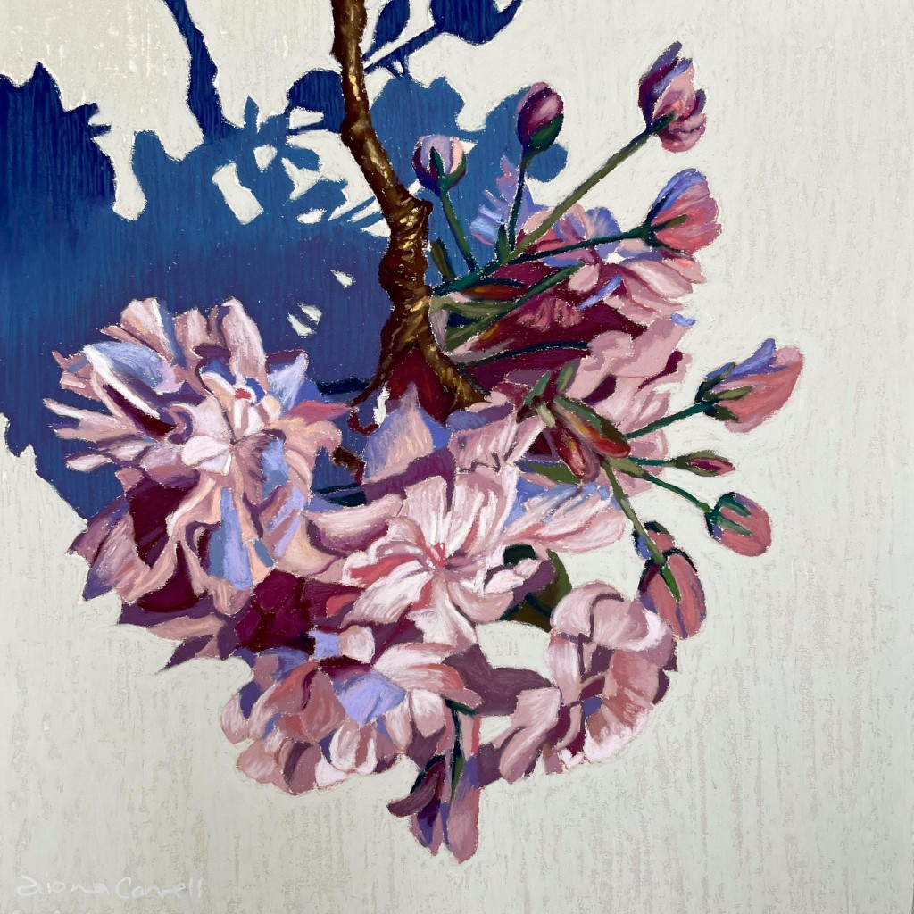
‘Bloom’ by Fiona Carvell
The strong design and layout of this painting, with its dramatic blue shadows, are almost at odds with the delicacy of the subject… but it’s this that makes it compelling and eye catching. The colours are perfectly chosen, the variety of pinks are intertwined with deeper reds and lilacs, and there are just enough greens and browns for balance.
The blossoms are beautifully rendered, but it’s that blue shadow that steals their thunder.
Fiona is known for producing series of works on one subject, so I hope that there are more of these to come!


1 comment
shirley tyack
I loved these choices! Also, the way Gareth has given an in depth critique of each one! Brilliant! Thank you! So much to learn from these things!