I was asked to choose 10 eye catchers from the pastel paintings and drawings posted in the Unison Colour Soft Pastelling Community Facebook Group during the month of August and write about them. The task was as delightful as it was difficult. I kept looking through the works and picked those that simply caught my eye. I ended up with roughly 30 pieces. The majority of works had moved me emotionally, others had a different approach to the handling of the medium of pastel. I had to narrow down to 10 though! So, these are my 10 eye catchers and the reasons why I chose them.
(Unfortunately, we didn’t hear back from one artist, so we’ve only been able to use 9 of Elena’s selected images).
‘Sentiment de calme’ by Jean Claude Baumier
I love everything about this pastel! Especially the way the juxtaposition of complimentary colours creates a tension. Look at the skies – can you feel their materiality? However, the colours are rich and warm and somehow the entire scene looks very comforting. I sense that even before reading the title Sentiment de calme – A sense of calm. Indeed.
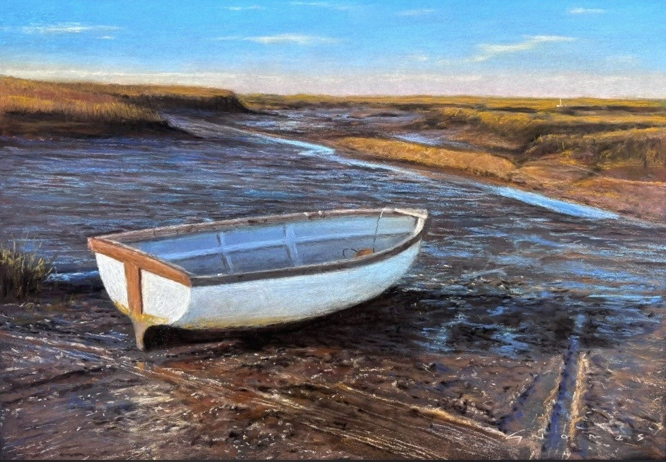
‘Your Tide Will Return’ by Gareth Jones
I’ve been always drawn to objects in art that are meant to contain people but they don’t: an empty chair in a room, a bench in a park or, like here, an empty boat stranded in the sea mud during low tide. This image evokes in me some sort of yearning. For places I had left. For people I had not seen in years. There’s some melancholy in there and yet the bright sunlight on the white boat and specks of blue here and there in the little pools left by the sea create a sense of peace.
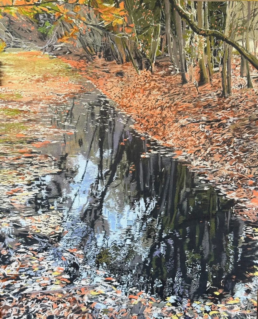
Katy Bailey’s latest drawing in the series of three of the old carp pond in Anglesey Abbey
When I first saw this pastel, I thought I was looking at the reduction linocut! The artist’s application of pastels is rather unusual. Thousands of short, thin lines, with the texture of the paper still visible here and there, create an illusion of tiny vibrations going through the waters and the fallen leaves. This, together with the restricted colour palette, makes for the special atmosphere of the place that holds memory and – maybe – some hidden stories of the past.
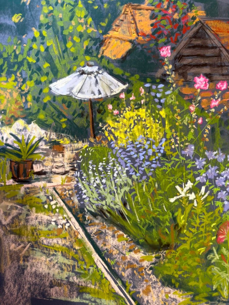
‘Nicks Garden on Monday’ by Laura Kyffin
This piece catches my eye immediately: it resembles a colourful tapestry. Something about this scene also moves me. Then I realise that the way the artist painted the garden path, a pot with a plant, parasol and houses in the background fills me with nostalgia for the school summer holidays spent in my grandmother’s house and in her colourful garden. The title suggests a personal story and makes this piece feel even more human.
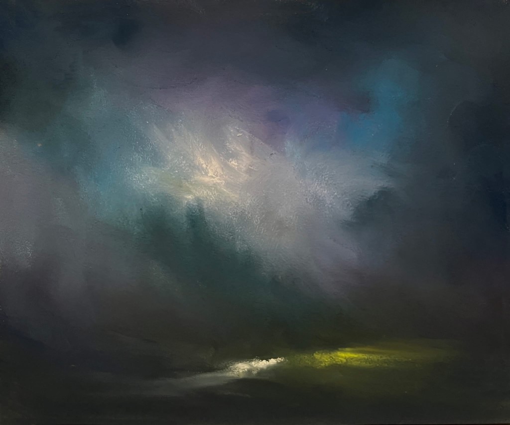
‘Mountain Stream’ by Stephen Fuller
The intense drama of this abstracted landscape, achieved through striking colours, sweeping marks and beautiful light, makes me stop and look at it closer. The title suggests something idyllic but the atmosphere feels charged. Is there a storm approaching? Or is it over and the light suddenly breaks through the heavy clouds? The earth and skies seem to fuse together in a dance. The colour palette evokes beautiful memories of my recent hiking trip to the Highlands, Scotland.
‘Little Morning’ by Alain Voinot
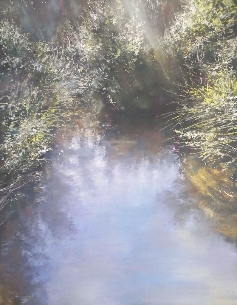
The light, bright and soft at the same time, catches my attention first. Then I look deeper. The enclosed composition of the piece suggests that the scene might be a depiction of a little bay on a lake where someone goes to for their morning swim. The composition and the inclusion of the word “little” in the title – Little Morning – create an intimate atmosphere. Like Laura Kyffin’s and Gareth Jones’ works, this piece shows an uninhabited landscape where human absence tells human stories.
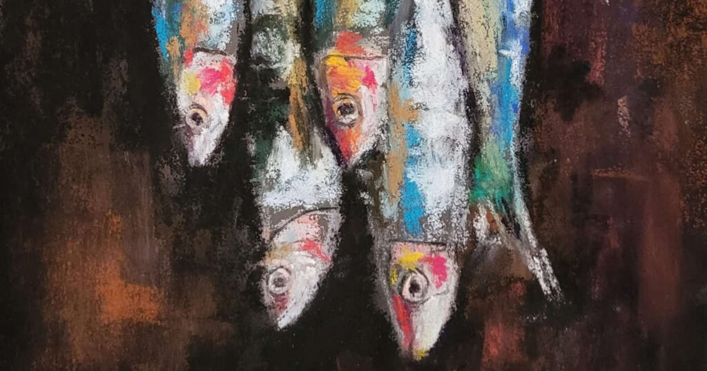
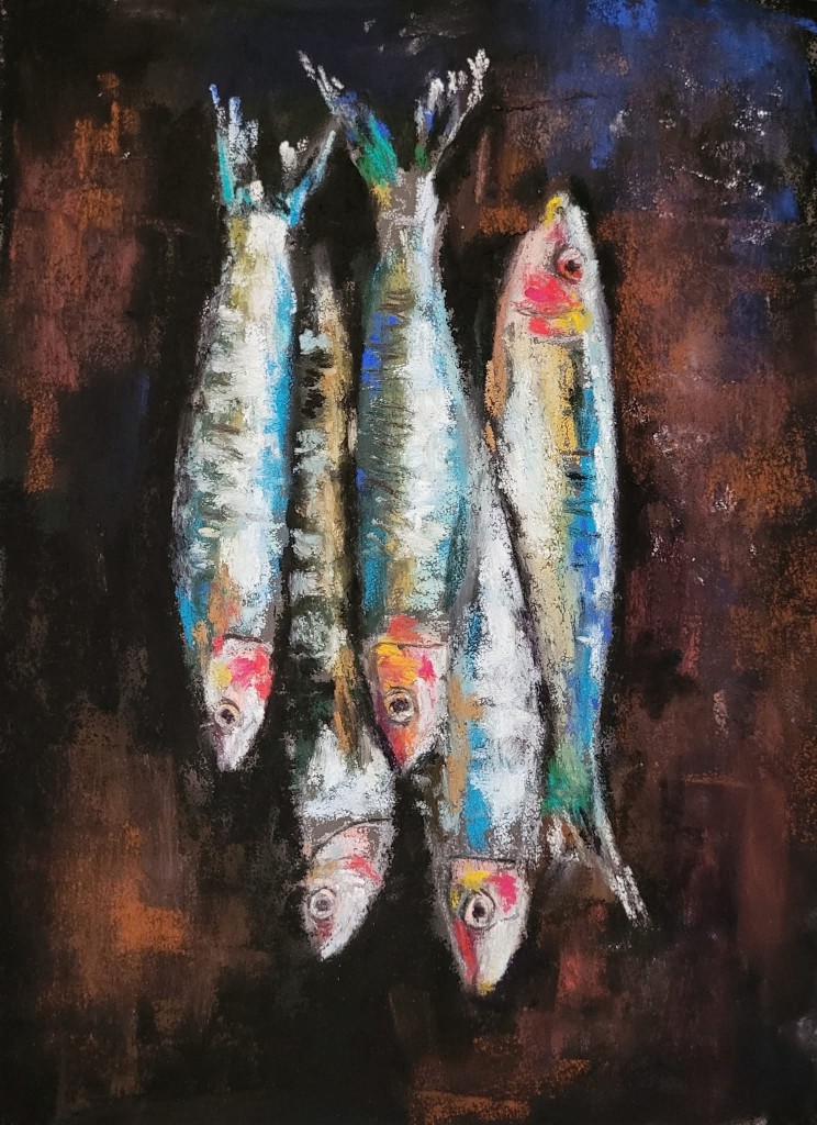
‘Dines’ by Jocelyn Pryor
There’s something about the ability of the artist to turn a simple object into art that attracts my attention straightaway. I like the ping pong of colours : reds, blues, ochres, greens – that suggest the colourful shimmer of the fish skin. Placing the fish on the dark, rich backdrop makes them really pop. There’s also something touching about the fish eyes – the way they look at me – which adds some ambivalence to this nature morte.
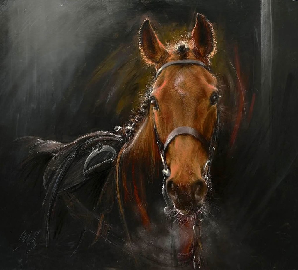
‘The Winner’ by Rebecca De Mendonça
Although this portrait of a horse is titled “The Winner”, I sense a little bit of melancholy in here. I like the thoughtfulness and alertness in the horse’s eyes – they hold my attention. The horse is depicted still but I get an impression that it has just stopped and will move away any moment. The rounded, energetic pastel marks around the horse and the clouds of its breath contribute to the feeling.
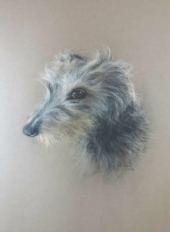
Peter Hogarth’s portrait of a Lurcher
Look at this eye! What a canny looking dog and a true character who seems to be slightly wary of the viewer. I like the minimalism with which the artist manages to create the multi-layered personality of a dog.