The Digital Dust: Navigating Art & AI in a Handmade World
As pastel artists, we are deeply connected to the “physical.” There is a unique joy in the resistance of the paper, the dusty residue on our fingertips, and that unmistakable buttery glide of a Unison Colour soft pastel. Our medium is ancient, tactile, and grounded.
So, when we talk about Artificial Intelligence (AI), it can feel a bit like an ill wind blowing in a studio full of loose pigment – disruptive, perhaps even a little alarming. But as the dust settles, many artists are finding that AI doesn’t have to be a replacement for the hand. Instead, it can be a surprisingly helpful assistant in the “pre-work” that leads to a masterpiece.
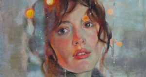
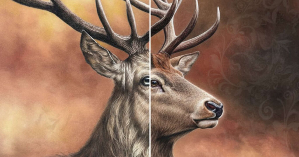
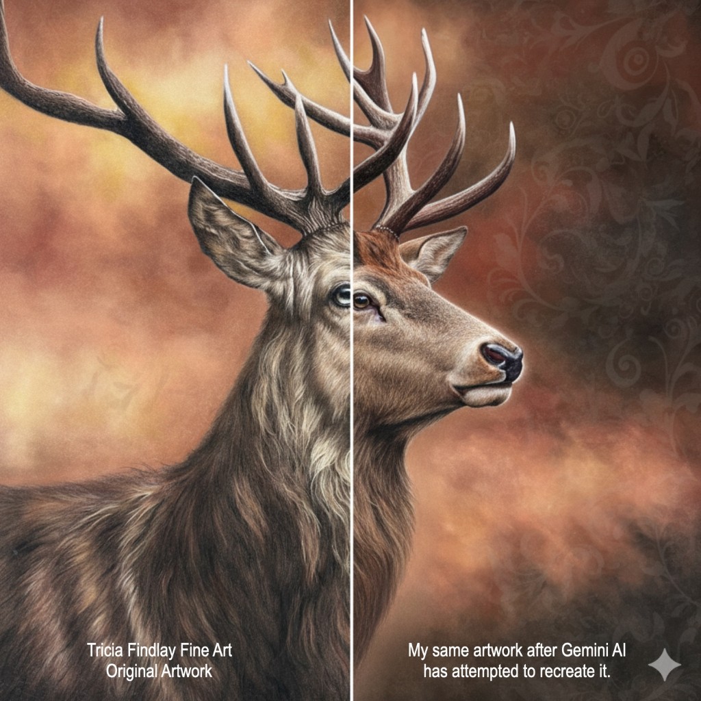
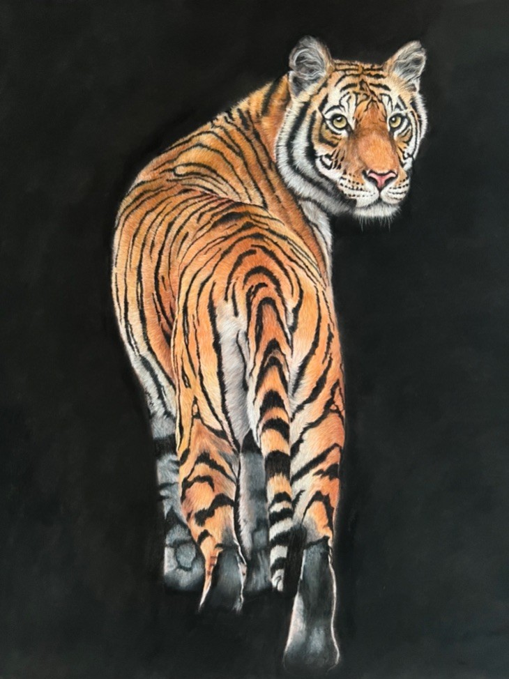
The image below shows what happens when you reverse engineer an artwork. I put my Stag artwork into Gemini AI and asked it to recreate just the right-hand side of the image. You can obviously see the difference – which just looks too smooth for my liking and lacks any emotion.
The “Good”: AI as Your Studio Assistant
AI isn’t just about generating images from thin air; it can be a powerful utility tool for the logistical side of being an artist.
Rescuing Low-Res Commissions
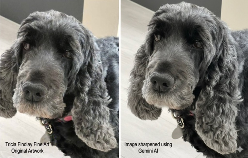
We’ve all been there, a client sends a cherished, but blurry 10-year-old photo of a pet or a loved one for a commission. Traditionally, squinting at the image and trying to make out the details often gave you a headache. Now AI upscalers, like Gemini, Topaz Photo AI etc can sharpen those edges and “guess’ the missing details, providing you with a much clearer reference to work from.
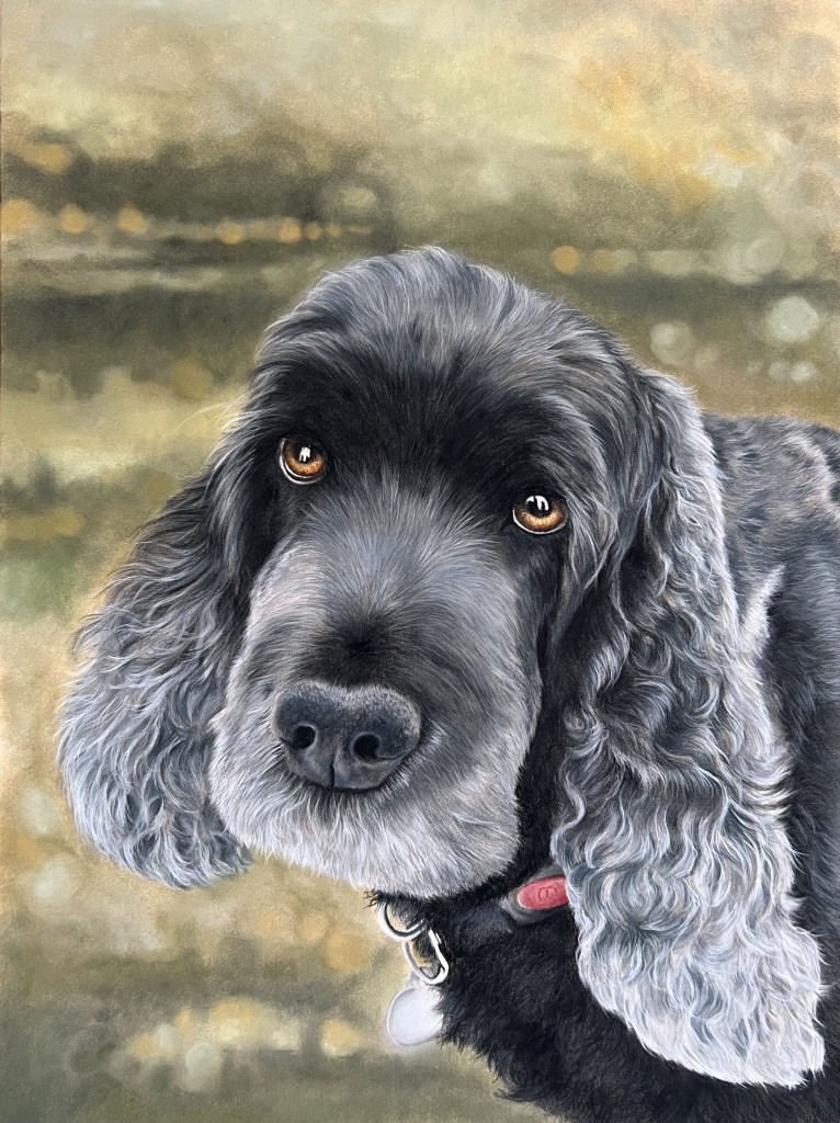
I recently received a memorial commission for a pet portrait of the lovely Olly. Sadly, the source image wasn’t great, so I used Gemini to sharpen it and add in the missing part of his ear. Here’s a ‘before’ and ‘after’ and my final portrait of Olly. Of course, it’s not always perfect and you need to always be aware of some oddities which can creep into the AI render.
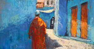
The “What If’ Stage
Choosing a background can be the most paralyzing part of a new artwork. Should that portrait have a moody indigo backdrop or a soft, sun-drenched ochre? Using AI tools to swap backgrounds on your reference photo allows you to try out different colour harmonies before you even pick up your soft pastel. It saves time, paper and lets you experiment with bold choices risk-free. Of course, this approach won’t be for everyone, if you love this part of the journey when you’re creating something new, then ignore AI and go for it.
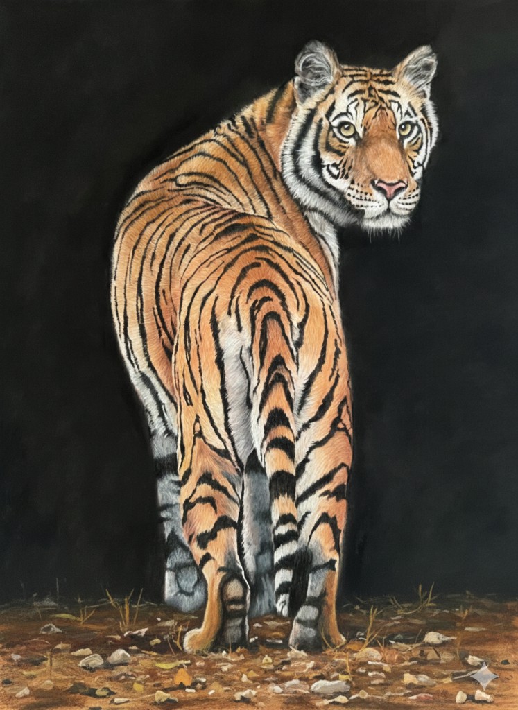
Here’s an example of one of my latest wildlife pieces I’ve created. The original photo had a detailed background, but I knew I wanted the tiger to be the star of the show so chose to just use a plain black background. Of course, once it was almost finished (I’ve still got to add the whiskers) I started to doubt myself. I used AI to try adding in some foreground but ultimately have decided to keep it as it is.
Compositional Brainstorming
If you have a subject but aren’t sure about the layout, AI can help generate dozens of compositional thumbnails in seconds. It’s like having a digital sketchbook that never runs out of pages.
The “Bad”: Where We Must Draw the Line
While the utility is clear, the “Art” in AI Art remains very contentious and not without good reason.
The loss of the “search”
There is something vital in the struggle of creating. When an AI generates a perfect colour palette for you, you miss the discovery of finding that perfect Grey 27 that makes your highlights pop. The “soul’ of a Unison Colour soft pastel painting comes from the artist’s intent. The specific pressure of your stroke and the way you layer your pigments. AI lacks our “artistic signature”.
Copyright and Ethics
We can’t ignore that many AI models are trained on the hard work of living artists without consent. As a community that prides itself on the craftsmanship of handmade materials, maintaining the integrity of human-made art is paramount.
Finding the Middle Ground
Perhaps we can view AI as one more tool in the box, sitting alongside our soft pastels, blending stumps and paper: not as a substitute for the artist.
You can use AI to clear the technical hurdles—upscale that photo, test that background, or organize your reference library. But when it comes time to creating, leave the screen behind. There is no algorithm in the world that can replicate the feeling of a hand-rolled pastel crumbling perfectly against a textured paper.