My reason for creating this large seascape was born out of sudden grief and despair related to a loved one. The dramatic shift in my circumstances led me to be cast out to sea in a whirlwind of turbulent emotion. To be lifted from the life I was living, into a world of uncertainty and fear.
Before I discuss how I created this piece, it is worth looking at what inspires us as artists to create an emotional piece of work. If one looks back at well-known artists and their journeys, it is interesting to note that the human spirit can rise above all forms of adversity.
One might ask if suffering and pain are necessary to create your most emotional work.
For me I have found that I am motivated to tackle something challenging when I feel the urge to do so. Some artists cannot bring themselves to create anything when their spirits are low but when happy and well-adjusted, their creativity knows no bounds.
Jean Balchin in her article in the Otago times believes that art produced from great emotion, whether it is suffering or joy, is likely to be more profound than that produced from a lack of emotion. She further states, “Fundamentally, the brilliance of the artistic process lies in its ability to transform the complexities of human emotion into works of great imagination and epic beauty.”
Marie Forgeard, a well-known researcher in the field of Art creativity states, “The more distressing the experience in their lives, the more post-traumatic growth they experienced, and the more changes in creativity are reported.”
And despite what the myth of the “tortured artist” would have us believe, pain is not a requirement for producing great art. Beauty, joy, hope, and love also inspire great art. As Francis Bacon once said, “An artist must be nourished by his passions and by his despairs.”
Isabella Meyer, a writer for the “Art in context” website writes “Of the broad spectrum of human emotions, sadness is the one emotion that has been a common underlying element of many famous artists artworks to date.”
Many of you are probably aware of Edvard Munch, the artist who created the well-known painting the Scream. He channeled strong emotions such as anger, grief, sorrow, and anxiety into the painting. Coupled with his signature wavy brushstroke style, and application of color, Munch knew exactly how to represent such a complex emotion through space, body language, and color. His painting “Melancholy” serves as the manifestation of the title itself, illustrated by the depiction of a woman who appears struck with depression.
Other well-known examples come from Vincent Van Gogh in his painting “At eternity’s gate”. The painting portrays an old man seated in a chair with his hands on his head, weeping at the thought of his life coming to an end. Picasso went through what was called his blue period. The famous painting titled “Wounded Deer” by Frida Kahlo was inspired by the hurt and sadness of the infidelity in her relationships with her husband Rivera, as well as the physical suffering that she had to live with due to her early involvement in an accident, leaving her in chronic pain.
What we know from history and psychology is that creativity and innovation arise in times of crisis. When our lives and our world undergo drastic changes, our minds change, too—often opening-up to a new level of our own creative potential. This is what happened with me in challenging myself to create this painting.
In his book Wired to Create: Unravelling the Mysteries of the Creative Mind, Scott Barry Kaufman investigated this phenomenon of art born of adversity—and what he found was an extremely high correlation of creative achievement and personal growth with experiences of loss and hardship.
Spend enough time reading biographies of great artists and creative luminaries, and you will notice a theme: They are disproportionately littered with stories of physical and mental illness, early-life parental loss, abuse and abandonment, heartbreak, and tragedy. A near-universal pattern emerges: An artist’s best work follows their periods of deepest suffering.
In the past, Expressionism drove the rise of sad art because it prioritized the integration of human emotion on behalf of the artist over the representation of objects and subjects rendered with technical excellence. Artists were moved to create paintings that expressed the true feeling behind a subject, as opposed to a mere representation of a perfect image.
Vulnerability, courage, empathy and one’s cultural background, among other factors, all inform art.
So, let’s get started with the process I used to create this painting.

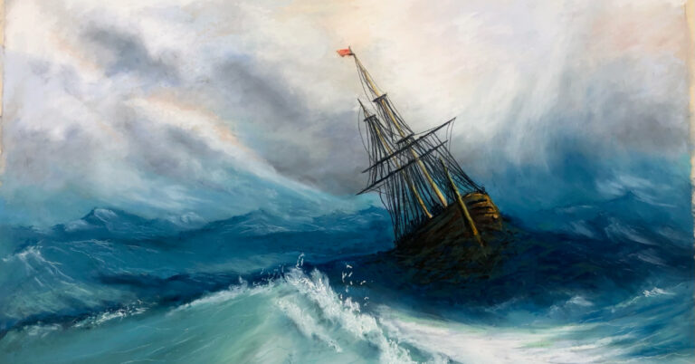
Here I was concerned with capturing the basic colors and how they would relate to each other in the painting. Since I used no references for this painting other than my imagination, I took the image I had in my head and translated it onto the paper. I used Uart 400 for this painting. The list of pastel colors I used to block in my initial layers were Additional 51, Ocean Blue 5, Blue Green Earth 6, Blue Green Earth 5, Ocean Blue 1, Ocean Blue 2, Ocean Blue 6 & 7. Blue Green Earth 10. Notice that at this stage, I only roughly sketched in the position of the Galleon. I was more concerned about its correct size on the canvas as opposed to any details at this point.

Here I started to roughly whisper in varying greys and beiges into my sky. I was experimenting with various color combinations that would work with my choppy sea colours below. I liked the idea of rising waves that looked like they were going up into the sky itself. The joining of sea and sky was fun to explore as well as creating distance with varying degrees of receding blues that leads the eye into the background. You might also notice I did a nine square grid over the entire piece so I could focus the viewer on the key interjoining places for my focal points. The lower right sections being key with an important light source. I also darkened the values of the blues around the Galleon to increase the drama surrounding it.

Here I started to gently blend my key light sources from the top right. Mixing various colors to see how they would translate into the rest of the sky. I used Blue Violet 8, Brown Earth 13, Grey 10, Additional 1, Grey 9, Grey 12, and Red 6. A few soft yellows also made an appearance in the sky with Light 12, Grey 24 and Grey 27.


Here my sky was starting to become more organized, but I wanted to add a richness to my greys, so I used various combinations to achieve this. The Sky mix picture shows how I overlapped my colors to create strong and varying grey mixes as well as soft pinks. I also used Blue Green 9, Ocean Blue 2 and Red 5 combined to create soft greys. The lower clouds in the distance were gently worked with soft blending with my fingers and some intentional mark makings where waves crests were needed.

Here is I was focused purely on the floundering Galleon, by first creating a translucent look to the hull beneath the waves. Various combinations of dark blues, green and browns were used in this process. For the hull, I used Dark 5, Brown Earth 6 and Brown Earth 36. The sunlit areas of the hull and masts were created using Yellow 13 and Yellow 14. The dark waters were created using Dark 17, Additional 51, Ocean Blue 12, Additional 50 and Additional 30, Ocean Blue 12. Notice the clean sharp lines drawn in for the masts and rigging which had to be drawn in without making marks on the painting. So, I used my custom suspended bridge to go across the painting.


My lightweight Perspex bridge was carefully placed onto the painting to render straight lines and detail without needing to rest my hand anywhere. Notice how the bridge only touches the paper in two places on its ends. Its foamcore surface area allows me to rest my hand gently on it and put in details without touching the paper. I found this to be a great way not to smudge the work I had already carefully created. I have three different length bridges, that I place over my paintings depending on their size, to create more details.

The finished painting attempts to harmonize my color choices in one nautical scene. In total, I used 33 different color pastels to create this painting. Notice I used Grey 28 to create a white light splash in the lower right corner. This focuses the eye on the prospect of where the ship is headed. Is someone from above showing it the way, or is it just coincidence that the clouds part to pave the way forward? I will leave you, the viewer, to take away your own feelings about the piece. I intentionally rendered the big wave in the foreground to be very imposing, very transparent, with dramatic foam splashes along its leading edge. I have intentionally used varied shades of blue and cool toned colors to evoke the feelings of sadness and a sense of turbulence. The greyscale pallet for the sky, coupled with some light beige also adds to the effect. Notice how the clouds swirl in the light source above the Galleon.
I felt that the old Galleon (Me) was searching for its home or port. There is a reason why I depicted masts without sails. The boat has no power to drive it forward. In my case I lost my drive and felt hopeless in the situation I found myself in. By creating this painting, it has helped me come to terms with something I can’t control and can’t really explain.
There is no rudder guiding me forward. Despite my floundering circumstances, I have intentionally placed a ray of light coming down from the sky and falling in the path of the boat. It serves as a ray of hope illuminating the way forward for me. All is not lost it seems as if there is light ahead. As Churchill famously once said, “Never, never ever give up.” I have found meaning in my suffering and the desire to heal and overcome. In fact, Meaning making has been called the sixth stage of grief, coming after the stage of acceptance. Apparently as soon as we find meaning, our experience is transformed into something valuable and affirming.
Perhaps the highest and lowest moments of our lives act as creative fertilizer. Any experience that shakes our world and challenges our assumptions can lead to heightened creativity and more authentic self-expression. Positive or negative, any experience that leads us into the unknown is also guiding us into the birthplace of creation.
The most important key to embracing the process of post-traumatic growth is to not rush to get things done or figure out everything. Real creative growth happens at its own natural pace, which can’t be forced or rushed. Creativity thrives with mental breathing room, wide-open inner spaces to roam, and unstructured time to dream and reflect.
So, I encourage all those who read this to take some real time and space for yourself, I hope you give yourself permission to dream, reflect, feel, and just be—and to allow your creativity to naturally arise from the deeper aspects of your being.


2 Responses
An absolutely stunning painting. I am in awe of how you rendered yourself into the canvas.
Thank you so much Sonya. It came from my heart and alot of pain that pushed me into creating this “Turmoil”