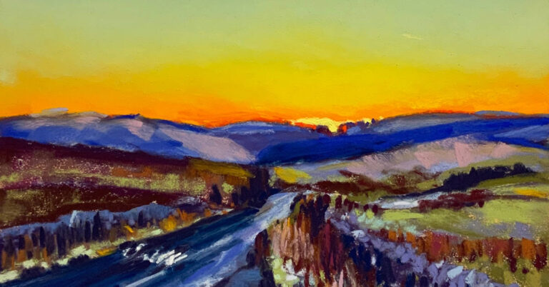
I am really excited to be sharing this blog with you. The view is looking over the western side of the North Tyne Valley, towards Dallycastle in Northumberland. The original photo reference, which some of you may have seen on Unison Colour’s Instagram and Facebook story back in January, was taken by Nessie Wise on her way home from work, and of course, most of you know that Nessie is one of the makers of the Unison Colour pastels which we all love using so much.
As soon as I saw Nessie‘s photograph, I got in touch to ask if I could use it as a reference to paint from and if she agreed for me to share my painting on social media and use it for the subject of a blog, in exchange I was more than happy to send it to her as a thank you and totally by coincidence, it arrived on her birthday!
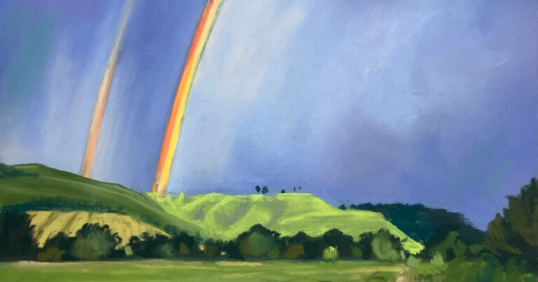
When I saw the photograph, I was instantly mesmerised by the incredible colours. It’s very difficult to paint from life, observing a sunset or sunrise, as they are so momentary with the colours moving and changing constantly.
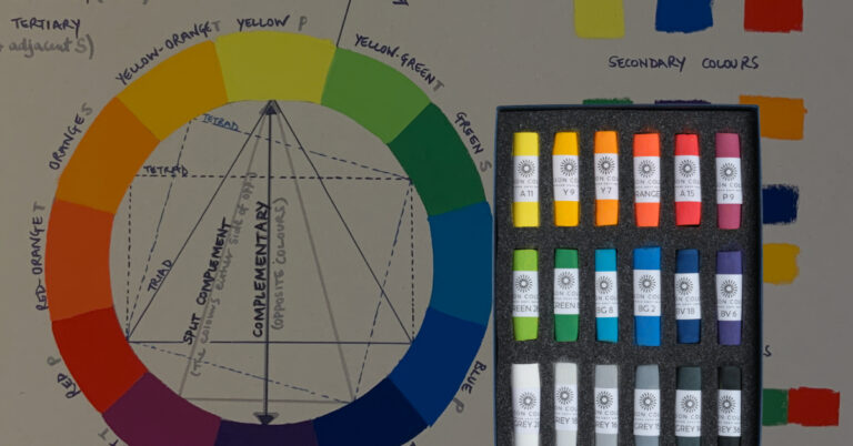
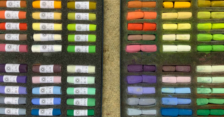
I started by gathering the colours and making a colour chart on the actual paper I planned to use so that I could see what the result would be. The overall feeling of the composition is one of drama, as looking at the colours more closely they are largely tetradic, which means two complementary pairs and such pairs of colours, always give dynamic results.
So included are many combinations of blues, oranges and purples, yellows.


You will notice in the photos, there are a couple of large sizes too which have a colour code of SC or ‘Special Collection’. These are no longer made, but I have a little collection of them which I found at Cornelissen & Sons, an amazing art shop in London not far from the British museum.
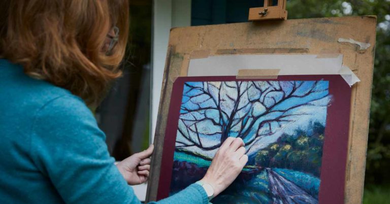
After choosing the colours, I made a quick colour sketch to give me an idea of how these particular colours would work together, again, using a little sample swatch of the actual paper. I used one of my favourites, which is Clairefontaine Pastelmat in maize colour. I decided that portrait format would give the most impact for this set of gorgeous colours.
In painting this view, I would have to say that blending the colours for the sky was probably the most enjoyable process as my fingers were really feeling those colours, pushing their dust into the paper, in an attempt to achieve a perfectly seamless texture. Blending done, I moved down the piece to work on the hills, gradually coming down to the road and the foreground. When you use a blending technique, it gives a soft focus effect, which works beautifully for a sky. As I started working on the land and the foreground, I resisted the temptation for any more blending, and here I wanted pure, confident pastel marks to be visible to describe the various elements of detail.


There are two elements in landscape painting that I always try to avoid and they are number one; never create a painting, which is half sky and half land because this divides your painting into two separate ones and number two; avoid using a strong horizontal line from one side straight across to the other side as this takes the eye out of the composition and it often doesn’t return! I am very happy to say that I have just, narrowly managed to avoid both!
As always when I am using a photograph as my reference to paint from, my intended result is never a direct copy or facsimile of the image, but a version, which I hope has the integrity, passion and emotion of my initial response to the subject alongside a freedom to use colour playfully.