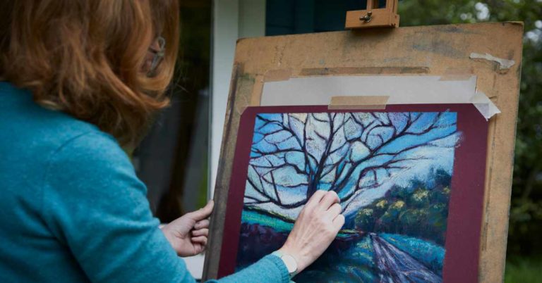
In my last blog “The Pastel is Mightier than the Sword” I admitted that I was no pastellist but an artist who used pastels to accompany a mixed bag of media and techniques working across a broad range of disciplines.
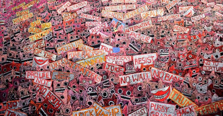
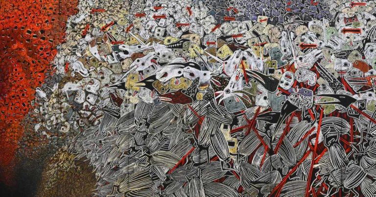
In the past much of my work was provocative, unsettling, edgy as subjects related to human rights and confrontational issues. In fact I had avoided pastels with the erroneous belief that pastels were a gentle medium for artists (with a few exceptions) who produced exquisite drawing or painting portraying all that is beautiful in the world – avoiding dark subjects of human depravity, trauma and pain.

All that changed on discovering Unison Colour pastels. With the speed and immediacy that meant I could apply ferociously hot “shouty” colours, the colours that colourists will no doubt tell you will be the least used, served my purpose as an artist/activist. I was hooked.
However when I became an Associate Artist, although feeling privileged to be inside this exclusive club, I came to the sobering realisation of just how limited my use of pastels had been. I realised by observing virtuoso pastellists, their finely honed skills are only achieved by having a profound understanding of the medium.
I decided it was time to behave, to cool down a little and quieten my palette perhaps, at least to take stock of where I might be heading with my pastels other than walls or the black gessoed panels of plywood I used for a temporary mural installation at Summerhall in Edinburgh.

It was all most confusing at first. I can really empathise with those artists who have worked in other media, but have come to pastels relatively late in their practise.
For a start I had been using pastels primarily as a drawing tool, so painting in pastels was quite unlike any other material I was used to. As for deciding what other colours to invest in I didn’t have a clue.
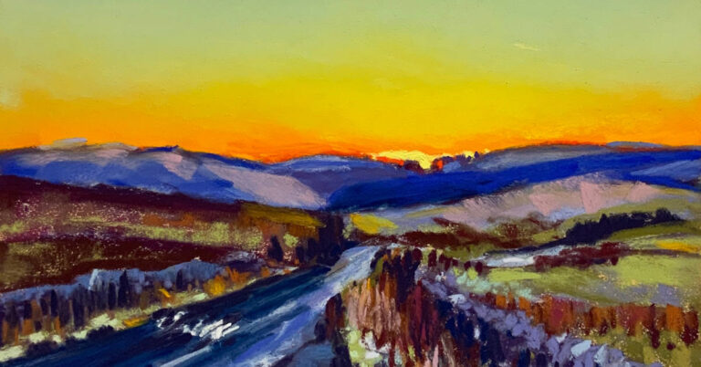
I found the suggested box sets limiting for my purposes. After all I have never “specialised” in any particular subject or methodology. I am neither a portraitist, nor a landscape or seascape artist – neither do I focus with particular intent on flowers, animals and birds. I am certainly no photo realist rarely using photographs at all. When I do use photographic source material I try to avoid copying in detail instead loosely extract the elements and form as a means of research only.
There was only one answer – buy the lot!
In the past I taught colour theory to costume design undergraduate students at the Arts University in Bournemouth. I felt what better way than to discover the capacity and range of 380 colours by revisiting the principles of colour application via colour theory using this purest, unadulterated form of all pigments?
I received a Creative Scotland/High Life Highland VACMA award and turned my studio into a colour laboratory.

First things first, as I opened each box and pored over the extraordinary array of organised colour, I began to chart methodically each of the 380 colours against my black wall alongside chalked notes relating to colour terminology.

If the greatest invention for humans is the wheel, for artists it must be the colour wheel. Normally when painting a twelve part colour wheel using water based media, usually gouache or water colours, I would mix my secondary and tertiary colours from hot and cool co-primaries.
However to really put my pastels and my colour perception to the test, I decided to use the ready made colour sticks without mixing or blending. I found that it took real concentration discerning saturation levels while differentiating between tone, value and tints across the full spectrum.

I have documented the pastels used between the two primaries red and yellow. Note the subtle colour range is difficult to discern with the digital compression of the photograph.
Prismatic Red = Additional15 with its cool co-primary Red 8. Orange Additional14 and for its contrasting co-secondary I wavered between using Additional13 or Orange1 (at this point I wished that I could have been a fly on the wall in the Unison Colour lab. I needed a second opinion!) I merged Yellow7, Yellow8, Yellow9, Yellow10 until reaching Additional12 which like the red is the most prismatic of yellows. Additional11 was the cooler co-primary leaning towards yellow/green.
It was amazingly difficult to do and I am sure if I do another colour wheel I will have quite a different result.
Taking this approach of slow yet vigorous enquiry is not for everyone, but it has helped me to understand the subtle characteristics behind each colour; equally by really looking at colour, I feel it helped me – perhaps for the first time – to really “see” colour with an enhanced awareness.
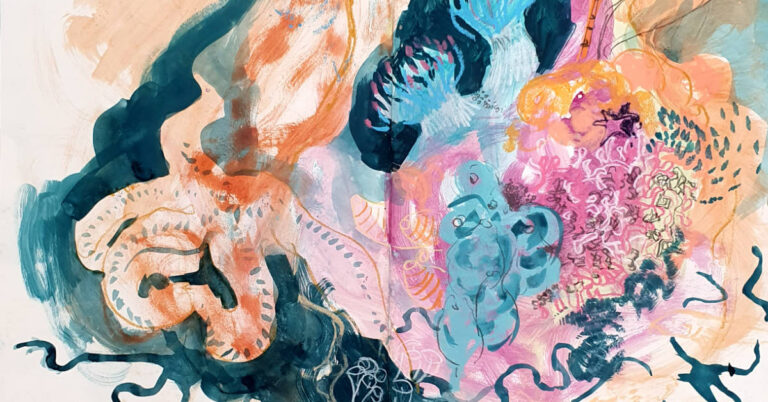
I undertook a series of abstract studies in the same way trying to use ready made colour with little mixing or blending. The studies are too numerous to illustrate in this blog, but I have included up to five exercises


Although the purpose of these studies below were to establish the illusion of space by using contrasts in colour temperature and saturation, I also wanted to focus on the mark making and texture. I kept the pastel pressure fairly light and painterly making use of transparency allowing optical mixing of colour in parts.


In contrast to the flat work on a two dimensional plane, I also wanted to explore units of pastel colour components in a 3D space.
A legacy from my theatre design days. I have built a customised black box with mirrors and lighting. I often use it to look at subjects via photography or through video as a means to test experimental ideas and concepts using objects and sometimes willing visitors.
I coloured small wood pieces which I suspended in the box. This gave me flexibility to move and reorder the colours within a physical space observing colour relationships and perspective.


Compared to all the other media I use, from oil based printing inks to gouache and water colour, I have always been amazed by the luminosity of pastels, which made with a medium that has the highest pigment concentration of all using limited binder, reflects light without darkening refraction allowing for saturated colours to literally glow.
Conversely I find this to be one of most challenging characteristics. I have always used a lot of colour in my work, but even by consciously limiting my palette I find the result often to be too brash, garish almost. It remains something I have not fully resolved.
However in one of my first “well behaved” paintings – “CAT” – my aim was to maximise its luminosity and exploit the inherent light. I used Dark21, Dark16 and Grey12 creating a deep velvety chromatic dark background to enhance the sensation of light emanating from the gradated Blue Greens and Ocean Blue. The decorative floating shapes and motifs gave me an opportunity to work with muted warm and cool hues, punctuated every now and again by an occasional prismatic BlueViolet12 or Yellow10.

It has been magnificently framed by its new owner but the success on how it glows depends entirely on how it is lit.
Recently I was commissioned to illustrate a children’s book as well as other illustrative works. Slightly nervous at first I took the risk by working with my Unison pastels and Caran d’Ache pastel pencils for greater detail


Even now I sometimes feel a little overwhelmed by my pastels and slightly uncomfortable with my “better behaviour”, in case it permanently alters my preferred style and results in tight, illustrative painting. Nonetheless I am looking forward to returning to my more spontaneous methods – only this time, having undertaken a lengthy and rigorous study, I can return with a far greater knowledge and understanding of the medium.


8 Responses
I don’t think you need to worry too much about “tight, illustrative work” – even the ‘better behaved’ works are gloriously exuberant and overflowing with life!
Well you should know Jennie, you’ve witnessed some bad behaviour alright in the studio going back to Orange the Orange 7 days ,!!!
What marvellous work and such wonderful use of colour. I will look forward to seeing your bad behaviour work in pastel.
Thanks Jennifer, Iv been quite restrained of late but I dare say that won’t last !!!
Another highly enjoyable read. Jane is a passionate person who paints the world as she sees it, from all is glorious light to the depths of its darkness! Brilliant.
Thank you Rebecca, pastels remain a challenge no matter what I do. There’s flexibility up to a point but the powerful pigmentation like no other medium, takes some getting used to. Anyway as always with art endless trial and error and an occasional rewarding result on the way!!
Oh how I wish I had your talent, imagination, in depth knowledge, persistence, passion and
dedication. I do however have the joy and appreciation of looking at your work.
How lucky I am.
That’s so kind of you,. I wish I had the same faith in my work, I end up destroying so much, on a perpetual exploration trying to find satisfaction. I must say going methodically through colour theory without being concerned too much by composition or subject does help. Just thinking, seeing pure colour.