I ordered Unison Colour’s Natural Earth Pastel set, not just because they are beautiful earthy colours, but also because I found myself using too many colours in my paintings and I wanted to use a monochromatic palette and get back to basics for a bit. I had tried two Natural Earth colours (16 and 18) a few months ago, and really loved the effect of these neutrals and was compelled to try the complete set. Also, I liked the idea of the natural earth pigments because they are made of earth. I imagine that humans have been using these same colours for thousands of years.

To get a real feel of the potential of these pastels I drew a portrait, a still life and an urban landscape. I found that sticking to these earth tones gave the pictures a cohesive quality. It was an excellent exercise to work on seeing tones and hues.
My approach was to use the colour and tone closest to what I saw in the subject. This took even more interpretation than usual. The coolest colours had to substitute for blues and greens, for the lightest tones I used the lightest earth tone in the set which was like a cool grey. For black I used the darkest pigment which tended towards red. Some of the colours were perfect for the subject, such as a red clay pot, earth, trees in winter, bricks, and certain hair colours. Using toned paper added another colour dimension.

For the portraits, the natural earth pigments gave a warmth to the shadow side of the face, and the cooler tones worked for the grey hair, and blue eyes. There wasn’t enough variation in the cool lights to give the effect of the white lab coat, but the limited palette helped to harmonize the coat into the rest of the picture. I used a black charcoal pencil for the pupils. I drew this self-portrait on toned Colorfix paper.

For the still life, in addition to the Natural Earth pigments, I also used a terracotta pastel pencil. This is drawn on 800 grit sandpaper.
It was very satisfying to draw the clay pot using the Natural Earth pigments. It really felt that the pigment was the same substance as the pot. The green leaves were tricky. I used the coolest pigments for the leaves, and for the one leaf that the light was shining through, I just left the light yellow colour of the paper. I was surprised at how well the greyish earth pigments read as green.

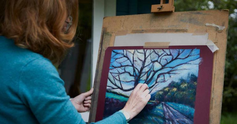
I drew the view from my porch on light grey Pastelmat paper. In addition to the Natural Earth pigments, I used a black charcoal pencil, which you can see in the thin branches and twigs. I left the paper colour for the sky and the snow. Sticking to the Natural Earth pigments helped to create the feeling of a dull winter day.
When I received my pastels, I made two charts, the first showing the Natural Earth Pigments in numerical sequence.

To help me figure out how to use this limited palette, I made a chart to break down the colours into reds, yellows and neutrals. This helped me quite a bit.

I would recommend the Natural Earth as a starter set. It could certainly help the artist to be restrained in their use of colour, and with some pastel or charcoal pencils you can do an expressive drawing with a range of tone and detail. Working with this set would give a chance to really understand the medium and enhance drawing skills. In fact, it reminds me of when I was in art school decades ago. We were only allowed to use four colours of conte for our drawings: black, white, and two shades of brown.
For established pastel artists, I suggest trying a couple of compositions using just this set. And of course, these Natural Earth pigments will round out your collection, adding beautiful neutrals, and warm earth tones that will balance out all your brilliant colours.

Natural Earth 1-18


7 Responses
Rhonda Abrams,
Thank you so much for this very interesting blog post. I love Unison Colour’s warm BE and RE range too I have a small hand full of RE, BE and NE and although I need to add bright colours to my pallette I am drawn to those beautiful tones, if I had the budget for it I would buy a tray of each along with so many of their colours.
I enjoyed the discipline of your approach in simplifying and studying tone. Your paintings are beautiful.
(Translated)Wow! I liked it a lot, I hope to be able to get this set soon.
Thank you very much.
(Original)Wow ! J’ai beaucoup aimé ,j’espère pouvoir me procurer cet ensemble bientôt.
Merci beaucoup.
Interesting and well done. Now I want the set!
Thanks Neva!
Hi Melanie
I’m happy you enjoyed my blog post. I quite enjoyed this self imposed challenge. You are making me think that I try the Blue Earth set next. Thank you for your positive words!
I love the way you specifically chose your scenes for the set, and especially making a color chart! Well done and nice work!
This is a beautiful set of colors. I have some of them, but I didn’t get the set. I will look to see what I am missing. Thank you!