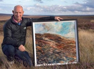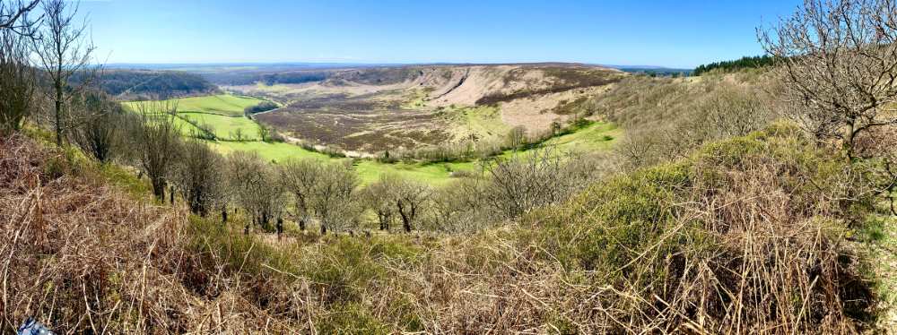
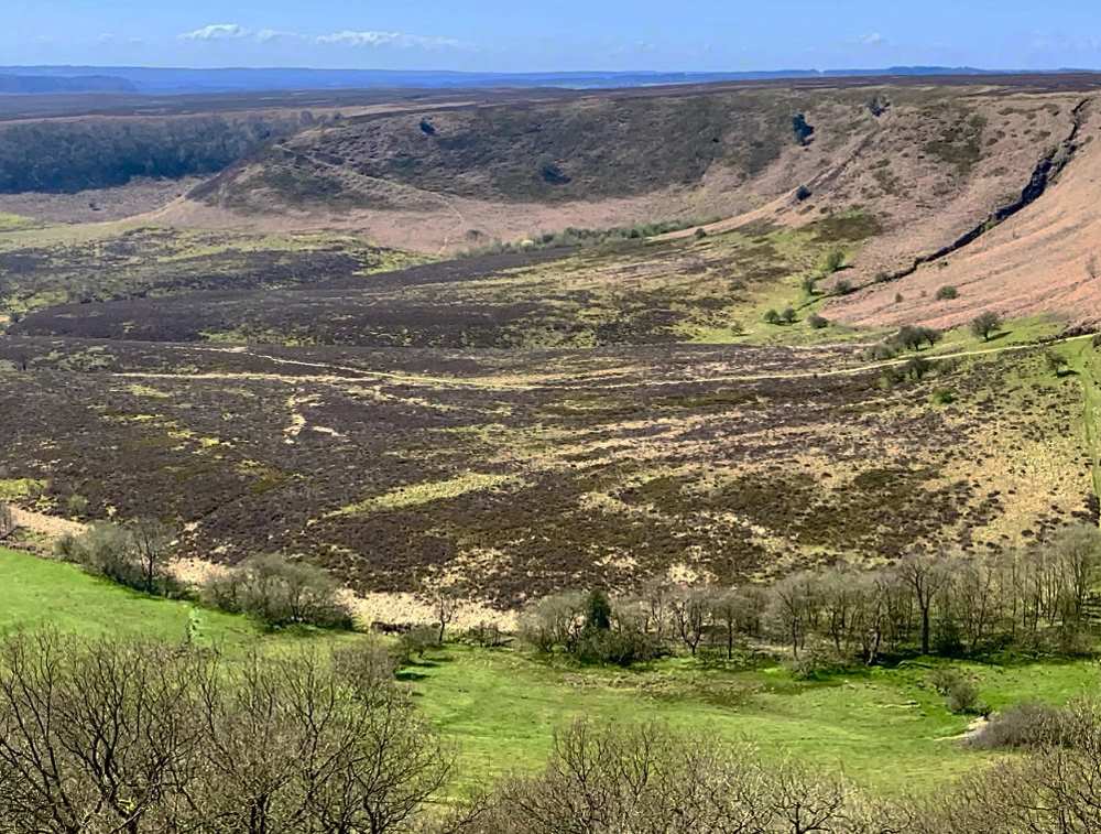
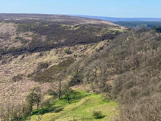
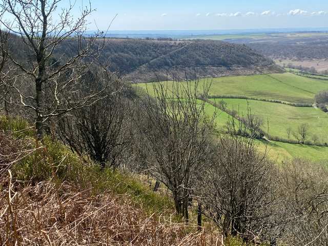
In April last year we ventured into the North York Moors to the famous view known in these parts as ‘The Hole of Horcum’. It’s a phenomenal viewpoint with a huge valley that looks like it was scooped out of the earth by a giant’s hand.
There are a lot of myths and legends around how the big deep valley was created (to include the mark left by a meteor hitting the earth) but truth is that this iconic view, in an otherwise rolling moorland, was created by a process called ‘spring-sapping’. This is where water, welling up from the hillside, has gradually undermined the slopes above, eroding the rocks and earth away bit by bit over time. Over thousands of years, a once narrow valley has widened and deepened into an enormous amphitheatre or ‘cauldron’. This water erosion still continues today so ‘the Hole’ is getting bigger all the time!
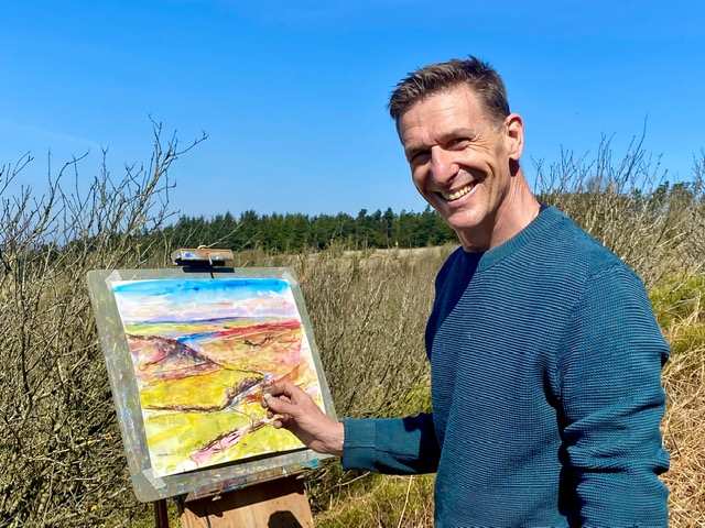
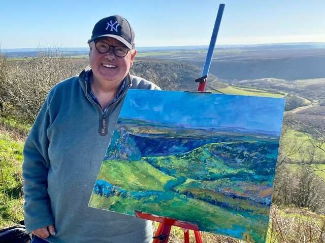
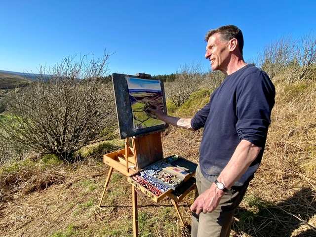
They say two heads are better than one but when Andy and I put our Unison Colour pastels into action again, painting on location at the Hole of Horcum, we made it ‘three heads’ as we invited fellow artist Ian Irvine from Teesdale to join us as well.
Ian is one of my students and a very keen artist. Choosing to spend more time with his family soon after lockdown, Ian made the monumental decision to surrender a number of his directorships with companies he’d helped develop as part of a successful business career. Ian now finds more time to develop his creative art skills with a real enthusiasm and passion for art.
It was great to have Ian on board. Ian is a real Unison Colour pastel fan and has a large and growing collection. Like many other artists, Ian loves the immediacy of soft pastel as well as its versatility. The forgiving nature, ease of working, range, quality and consistency of Unison Colour pastels keeps him coming back for more.
On this field trip though, Ian put into action a strength of colour and confidence developed with pastel, with acrylic paints this time when painting ‘the big view’. Having attended on a number of my workshops in North Yorkshire and residential art holidays in the Lake District, creative skills taught to students enable them to cross pollinate what they learn from one media into another.
Meanwhile Andy and I combined our Unison Colour pastels together with different media to create our own personal creative language of expression.
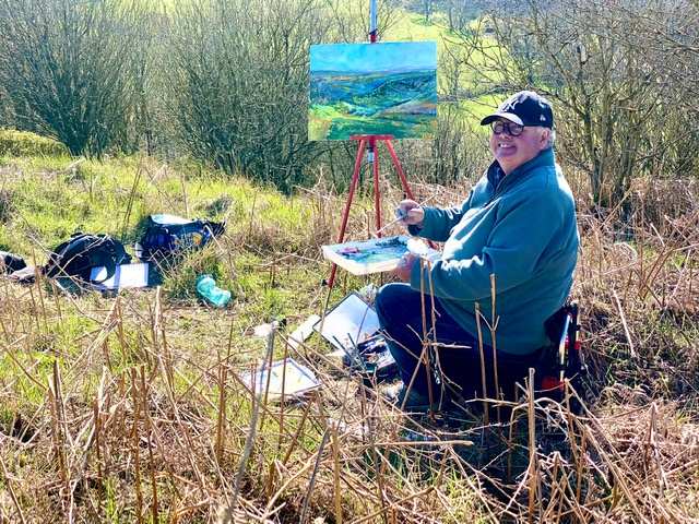
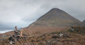
On arrival on our remarkably sunny morning, after meet and greet with the stunning view in front of us, we soon set up to paint in close proximity to one another.
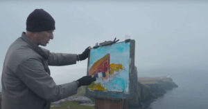
My first painting spot, a little down the slope between the trees that covered the steep hillside, provided the perfect opportunity to do some painting and drawing with my Unison Colour pastels.
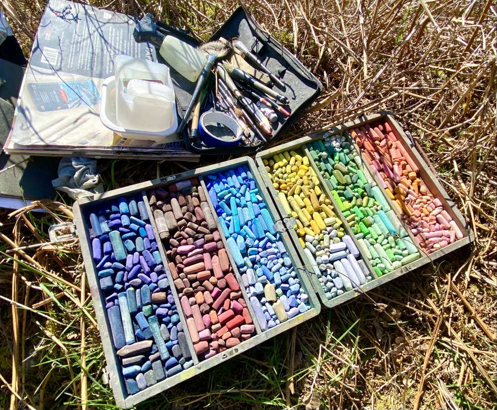
Fans of the Unison Colour Pastel Academy will recall some of my latest articles explaining how to both paint and draw with Unison Colour pastels with the use of solvents. Worth a read if you don’t know about this technique already making pastels like ‘paint’. Pushing boundaries of any media is what I’m compelled to do for maximum creative expression.
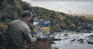
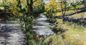
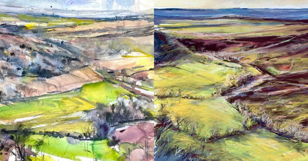
A change of position. Moving into colour – Second study of the day (first marks) using watercolour, water soluble graphite and Unison Colour pastels in combination. Even in this early stage you can identify how great Unison Colour soft pastels are to use on textured watercolour paper to add depth and surface layering. The skill is not to overwork the pastel over the watercolour and instead to ‘combine’ the pastel WITH watercolour rather than create a watercolour underpainting with a pastel painting on top. the flat bright transparency of watercolour gives a great contrast to opaque pastel marks with planning even in ‘study’ paintings.
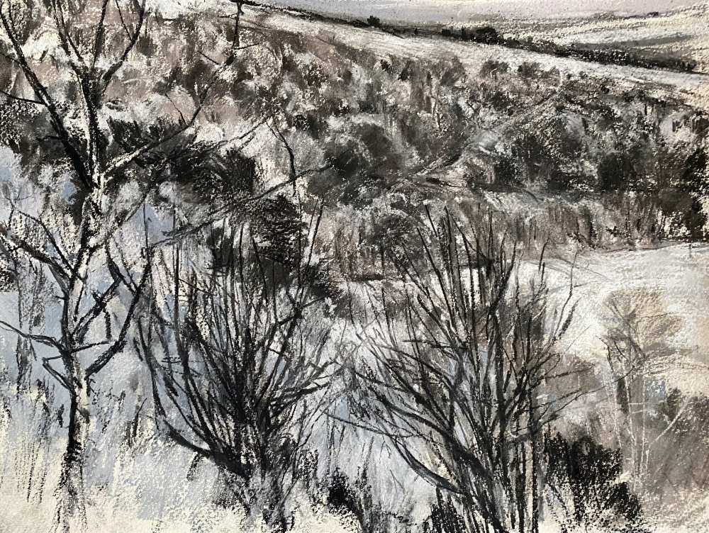
Combining several cool Unison Colour Greys (to include Grey 28) and Carbon Black CB1 and CB2, with charcoal and Quink Ink, this small black and white painting got things moving.
I always ‘draw’ first – studio or on location, it’s the same principle. Explore the subject with tone, I begin to loosen up and get a feel for the place as I explore through line and gestural strokes. I start small and gradually work bigger as a rule, but on this occasion I pretty much worked to a consistent smaller scale.
Working around the proportion of 16 x 20”, the smaller sizes helped ‘finish’ (or rather gain in visual reference) each chosen viewpoint I chose to paint during the easy going but focussed day amongst friends.
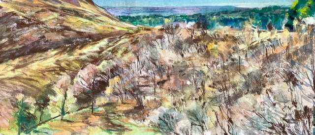
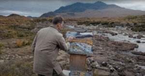
Change of position for the final time facing in a more northerly direction with the late afternoon sunlight casting long shadows from the West. It was the colour in the trees that was the main inspiration combined with the rich warm tones in the moorland and saturated colourist the pine forest in the distance. Don’t let anyone ever tell you that pastels don’t work on smooth paper – this painting proves otherwise.
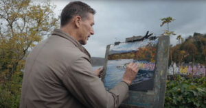
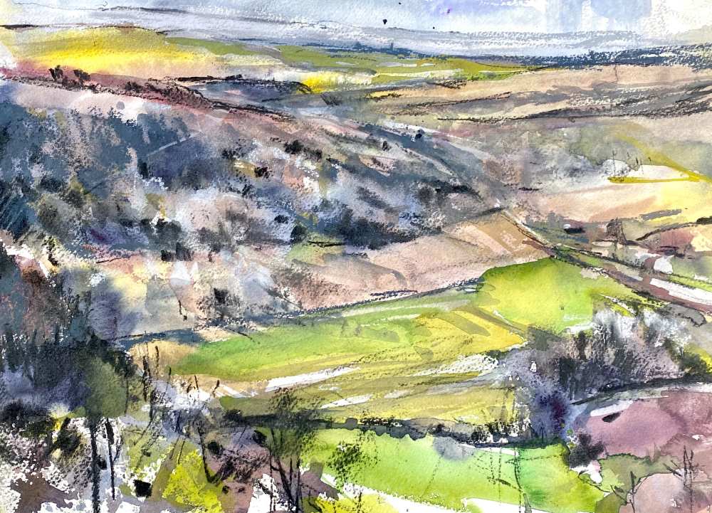
In the afternoon I switched to watercolour and Unison Colours in combination. The light direction had changed and colours became brighter. The intensity of the sun in the afternoon warmed up the palette and the cooler light fuzzy atmospheric mist had completely disappeared.
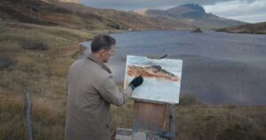
Trees, moorland heather clumps, paths, tracks and geographic forms maintained sharp shapes and profiles. To give a feeling of the vastness of the space, I chose a panoramic composition for the afternoon using a pre-cut sheet of hot pressed 640gsm (300lb) Canson Heritage watercolour paper. I often work to this format for outdoor painting.
The compact linear shape allows a lot to be packed into ‘a small size’ and I’ve learned over time that this bespoke and personal format creates the feeling of the vastness of our North Yorkshire landscapes very quickly as I work, regardless of media.
A conventional full imperial watercolour sheet can be cut and transformed into any size you want – such is the flexibility of paper compared to board or canvas for example. Imperial sizes such as full, half, quarter and so on can be completely ignored. You don’t have to conform and stick to the rules. Being different is all part of the creativity!
Using the rule of ‘less is more,’ choosing small sections of the landscape as small studies stated a lot each time rather than me trying to cram it all in within the one painting and as a consequence make everything within the landscape look small.
Painting is about sharing. I was more than happy to point Ian in a stronger painting direction with a nudge here and there between my painting sessions throughout the day. It was great to see how his painting was developing each time I saw it to also gain a true character of the place.
Taking a break helps your own work too. You come back with fresh eyes. As artists we forget to eat and drink when we’re in the ‘creative zone’ painting away. Stopping now and then means a refocus and it’s important to do and keeps your energy levels back on form.
Andy was sailing away creating his usual 3 an hour painting output! Slight exaggeration but my goodness, he is quick and on top form each time. Great to see his energetic marks in each painting producing real gems.
Conclusion
Everything I paint creatively usually has a use in other forms. The joy of painting for art itself as a professional does run true but for me, everything created has its purpose often two or three fold.
Take this blog for example, I’m sharing with you how great and flexible Unison Colour pastels are to use on different surfaces with these featured paintings.
Secondly these studies will lead to future framed paintings for a forthcoming major joint exhibition called ‘A Yorkshire Year’ that Andy and I are having together at National Trust Nunnington Hall, North Yorkshire in the Autumn of 2024.
There is no doubt we will both be keeping you up to date with progress on that forthcoming prestigious exhibition at this historic Hall in the heart of Ryedale (very close to where I live now).
We are both proud to announce that within the exhibition we will be featuring many different types of landscape paintings that utilise the beautiful and versatile Unison Colour pastels.
I did say that exciting things happen when Andy and I get together didn’t I!
Exhibition details
‘A Yorkshire Year’
Date: 14 September – 15 December 2024
Robert Dutton (SGFA)
Andrew Moodie
NT Nunnington Hall
Nunnington,
North Yorkshire
YO62 5UY
Read Part II of this blog by Andrew Moodie