I have attended a variety of life drawing classes over the years and have come to realise just how helpful they are to my progression as a pastel artist of landscapes. Of course, unless we think of complete (rather than semi) abstractness, the basis of all successful art is the ability to draw well, and that is exactly what life drawing both demands and teaches.
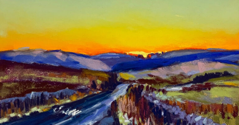
Pastel is perfect for the life drawing class. It is an immediate medium that requires no preparation and, combined with the ability to create both linear and broad blocks of colour, that means it lends itself to speed and expressiveness. Both are hugely valuable for capturing the essence of a quick life pose as well as, for example, the fleeting passing of a cloud or shaft of light on the landscape below.
Here’s some of the ways that life drawing has benefited me and how I think it could also help you. I’ve listed these in order of importance for me:
1. Measuring and perspective. We all know that we need to get the length of limbs correct for a life drawing to ‘work’ but that whether a tree branch looks short or long is of little importance. Yes, but the curve of a river or road needs to be correct, particularly in relation to features around it, and the size of a building and its perspective (the slope of the roof, the recession of windows) in relation to other buildings and features has to be right.
The practice of measuring in the life class serves just as well in the open landscape. I use the tried and tested method of a measuring stick. I use a dowel but a pencil or brush or really anything straight will work. Ensure whatever you use is long enough to measure against your chosen unit of measurement, be it a head or the width of a hill etc. and remember to keep your arm locked straight when measuring your subject. I like to draw intuitively in the first instance and then use measurement to confirm those initial marks, looking at respective sizes and also relationships between features e.g. the position of a shadow under a chin to the edge of a shoulder or the distance from a rock to the bank of the river. The more I have done this the nearer my initial marks have come to being correct, except perhaps in cases of extreme perspective where measuring is still essential.
2. Controlled speed. My preferred way of working is to make quick and expressive marks, developing a rhythm as I proceed. But I have learned from the life class to take time both to check measurements and also to frequently step back and assess. So often I would stay at the easel for the full time of the pose, only discovering when I stood back the various mistakes that were not evident up close. The same has applied (and sadly still does sometimes) to the landscape when my eagerness and excitement to capture a scene keeps me from stepping back.
3. Tonal planes. Tone, or value, determines how light or dark we see something. This can be particularly useful in a suitably lit (avoid flat light) life pose where the extent and depth of shadow can effectively describe the shape of the body. Similarly, one of the things I am most interested in when painting the landscape is the relationship between light and dark (I look for the lightest lights and the darkest darks) and the tonal range between the two. This is one of the things that turns a mediocre painting into a vibrant one.
4. Mark making. Pastel is all about the making of marks and the life class is a great place to experiment with using blocked in colour or linear marks or a combination of both. There is even a place for blending, although personally I try to avoid blending with my fingers in favour of blending by using different colours of pastel over one another. Be free with your marks and avoid too much detail – I never spend time trying to capture facial features. I keep that for portrait painting, which will need to be another blog!
5.Composition. A good composition is essential to the success of a painting but this is lower on my list as I am always aware, even if it’s subconsciously, of good composition and we artists, like photographers, tend to develop an intuition for good composition. Nevertheless, it often pays to think objectively about what will and won’t work. So often I see artists trying to fit a pose onto their chosen surface, squashing heads and shortening limbs to do so. Take a leaf out of Degas’ practice and let the body ‘exit’ the surface where appropriate. The practice of consciously thinking of composition will help avoid a dry stone wall forming a barrier across a landscape or the focal point ending up slap bang in the middle of your surface (unless of course that’s the desired result)!
6. Colour. Many life drawing artists don’t go beyond a stick of charcoal and that’s perfectly justified, particularly in finding those tonal planes. However, pastel gives us the opportunity to use colour and the life class is a good place to experiment with the effects of using complimentary and / or analogous colours or perhaps a limited palette (I like to use just red and blue with black and white) and to try blocked colour or linear strokes or a combination of these, all of which can be translated to landscape work.
And finally, here’s a few tips for getting the most out of your life drawing experience:
1. Give it a go! When I went to my first life class, I was dismayed to discover I was the only non-professional artist attending! But that was a long time ago! Life drawing’s popularity has grown hugely in recent years, and artists of all abilities now attend, so don’t be put off! You may find a social group in your area that meet in a pub for life drawing in a social setting. Great, but try not to get stuck in a class that requires sitting with a small pad and pencil.
2. If you have not done life drawing before, a tutored class can be a good way to start. A good tutor will take you through all of the above points and help you find your own style. However, I have attended an untutored class for many years and love the ability this gives me to experiment and develop my own practice. And by a process of osmosis I continue to learn by seeing what other artists are doing and picking up some of their processes.
3. DO measure. I very often see both experienced and inexperienced life drawers crack on without any checking of measurements, with inevitable eventual disappointment. Indeed, this is still something I need to remind myself of. A quick check of measurements will create confidence both in the life class and outside in the landscape.
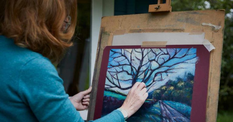
4. Give yourself freedom to move. Please, please, please avoid if you possible can, sitting at a table in the life drawing (or indeed any), class. This will distort perspective and encourage you to work tight and small. If you are able to do so, at least stand at your table or, best of all, stand at an easel. This will give you the ability to move your shoulders and upper torso, enabling freedom of expression. It is also much easier then to stand back from your work to assess
5. Experiment. While the freedom of an untutored class is great, there can be a tendency to do the same thing in every class. Instead, use the opportunity to try different media, including combinations. Remember that pastel works wonderfully well in combination with watercolour, acrylic, graphite and more, and combinations of all of these.
6. Challenge yourself. Following on from experimentation, remember also to challenge yourself if you have the opportunity. I will always try to position myself so that I have an angle of foreshortening or some other unusual composition. This will help you with those tricky scenes where perspective is all important.
7. Fill the page. Do not try to squeeze a figure on to your surface or have an elongated figure occupying the centre with lots of space either side, like a Giacometti. Focus on a part of the body that will fill the page and let the rest go off the paper as appropriate, This is all about finding an interesting composition which will help your other work.
8. Avoid unnecessary expense. We know the benefits of using a good quality pastel paper. I use a variety, including Sennelier La Carte, Pastelmat, Fisher, SAIT etc. But it would be expensive to use these papers for each 15 minute pose! So I will often use non sanded drawing papers such as Canson, Strathmore or Fabriano; it’s fun to try different colours. These will not take many layers of pastel but then you will usually only be looking to create a quick description of the pose. I particularly enjoy using ArtGraf, which is a water soluble graphite, or acrylic inks (and sometimes both) as a base with pastel on top, and I find that a reasonable quality cartridge paper is perfectly sufficient for that. It is also possible to prepare your own form of pastel paper as a cheaper alternative to using expensive sanded ones; I use Art Spectrum Colourfix pastel primer on cartridge paper.
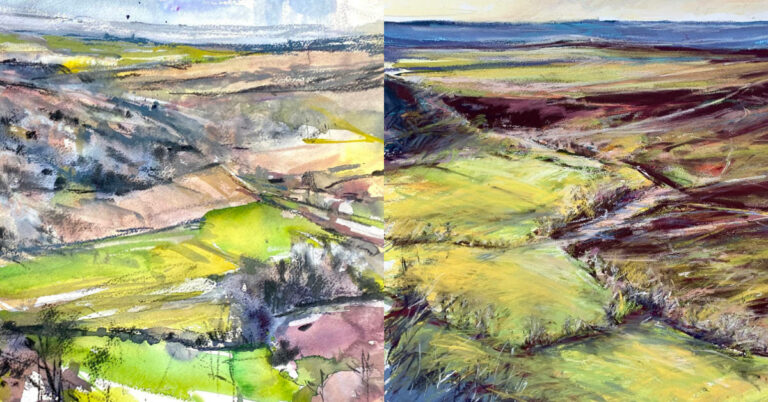
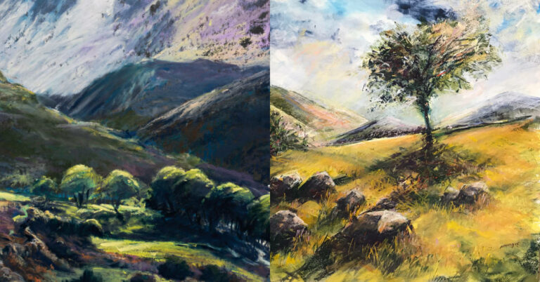
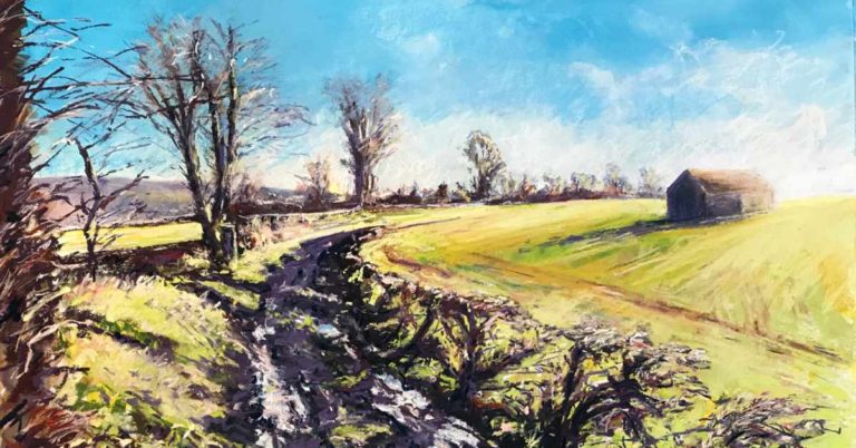
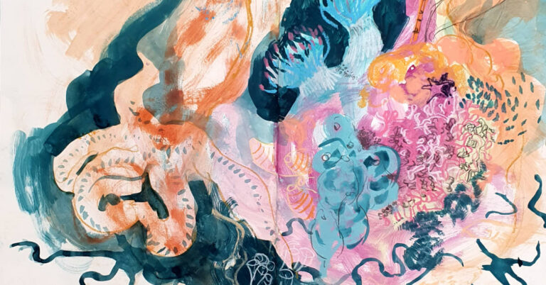
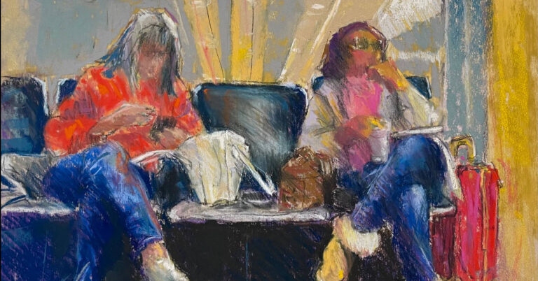
I have included example work (all drawn from life, between 5 and 30 mins poses) to help illustrate some of what I have said but the best thing to do is to give it a go yourself and discover how the experience aids your other work. Happy pastelling!