
I have a bit of a theory; it is my opinion that every piece of art is a self-portrait of the artist and a mirror to the viewer.
Whether an artist is doing a landscape, portrait, still life or abstract they will be interpreting the subject matter based on their own lens and life view. This lens has been crafted since birth and contains the full spectrum of their life experience; all the joy, pain, love and every unique emotion that they have ever felt. Any piece of art they make, therefore, has to be considered in the context of this lens and will, to a degree, be an echo of who the artist is and has to be something of a self-portrait. Conversely, a viewer approaches a piece of art with their own life view and will interpret the piece based on their unique personal lens. If the art resonates in some way with the viewer it will be because they have found something they recognize. This recognition will be an echo of who they are and as such the art has become a mirror to the viewer. The more of themselves they can find, the stronger the mirror and the more they are likely relate to the piece.
I have lots of art on my studio walls and, luckily, being in a busy place on the coast, lots of people come in to see my work. It is my experience that the pieces that viewers often relate to most strongly are the ones where I’ve left the most room for the “mirror” to work. If the viewer is able to find a sense of “oneness” with a piece and can lose themselves, even briefly, in an emotion they recognize then a zen like moment of self awareness has been reached – Pastel Zen.
Achieving Pastel Zen and making room for the viewer
There are a number of techniques an artist can employ to leave space in a piece for a viewer to find themselves, lets explore some.
Abbreviating the subject matter:
The first and most obvious technique is to remove everything from a piece that is not needed. I will often include the minimum number of entities to set up the stage and anything extra is considered superfluous and a distraction. Similarly, the only other way to get into such a piece is to be an essential contributor to any narrative.
I’ve used this technique in the piece “Beach”. Here in Cornwall we have the huge Atlantic Ocean facing swathes of sand, which, in the winter, might be nearly deserted. For me the only things really needed to describe a beach are the sand and the sea. In this piece I’ve mostly lost the horizon in the mist and not even really differentiated between the sea and sky. The only other player is the single wave, which if anything adds to the feeling of emptiness and isolation. This piece is so pared back that it is well on the way to abstraction and there is plenty of space for someone to find themselves and their own interpretation.

Colours used:
Sand – Unison Colur Yellow16, Yellow17 and Yellow18
Ocean / Sky – Unison Colour BlueGreen 13, BlueGreen14 and BlueGreen 18
Wave – Unison Colour Light 1
Use of colour:
As well as abbreviating the subject matter, colours can be pared back to the bare minimum. In seeking a less is more approach to colour, like subject matter, a colour will have to earn a place if I’m seeking to generate room for the viewer.
In seeking this abbreviation of colour, a colour wheel becomes invaluable. For my more zen like pieces I will normally choose a very limited range of colours from one of two colour scheme options. Firstly, an analogous colour scheme, where colours adjacent to each other on the colour wheel are used. An analogous colour scheme will often promote a feeling of serenity and calm. Secondly, I will use two key colours, opposite or nearly opposite each other on the colour wheel to create a complementary colour scheme. A complementary colour scheme can often add a sense of dynamism and energy to a piece.
Now for a bit of science – why should analogous and complementary colour schemes affect our mental states in this way?
We most often see an analogous colour scheme for real when the sun is just rising or setting. At this time the atmosphere is attenuating most colours and just leaving a narrow range of frequencies – normally in the red / red orange area (more about this in a future blog) and as humans, we will be safe in our “cave” with those we socially value. If it is the end of the day, our hormones will be preparing us for sleep and calm is the overriding feeling.
Conversely, nature most often uses a complementary colour scheme to draw attention to something. Red holly berries against green leaves to highlight a ripe food source is one example – calling birds to action. These naturally occurring complementary colour combinations are most visible to us humans during full daylight, when we are also at our most active.
In “Sirens call”, as well as paring the subject matter back, I’ve used a red / orange complementary colour scheme to try and invoke the sense of calm of a lone surfer crossing a beach, near to sunset – called by the ocean. The other name for this piece was “Only a surfer knows the feeling…”, which pretty much sums it up.

Colours used:
Beach / Sky – Unison Colour Red 13-16, Sennelier No 309, No 310, Unison Colour Red 1-6,
Light Source / Wave – Unison Colour Orange 5, Unison Colour Light5
Figure – Charcoal pencil
In “A yellow sail kind of day” I’ve again used the minimum number of elements and also put the yellow sail against the blue/violet sea and sky in a complementary colour scheme. I was hoping to give a sense of joyous, uplifiting experience, sailing a yacht on a perfect day.

Colours used:
Sky / Sea – Unison Colour BlueViolet 7-12
Sail / Reflection / wake – Unison Colour Additional12, Yellow11
Yacht detail – Charcoal pencil
Tone as king:
Tone (the use of light and dark) is pretty much king in most pastel paintings. In a pared back, zen inspired pastel it is even more important. Tone is a valuable tool that can be used in a several ways.
1. Use only tone
It is entirely feasible to use only one colour for a piece, thus removing the risk of colour distraction from any zen like quality and space that you are trying to achieve. Pastels are great for this type of approach as the tones are already provided in each colour. Unison Colour pastels are particularly helpful because you have 6 tones to play with in most colours. Of course as you are working in one colour you can easily blend between tones to achieve any number of intermediate values without generating mud. The choice of the single colour used is also key in establishing mood – perhaps the moody purples of twilight or fresh pinks of dawn.
I’ve used this approach in “From St Agnes to Godrevy”. It is purely a tonal piece with only Unison Colour Additional 43-48 used. I’ve also chosen this particular green/grey as I was seeking the feel of an old photograph (silver halide based) and to prompt something of a nostalgic longing for those empty coastal views and possibly the clear horizons of youth.

Colours used:
Whole piece – Unison Colour Additional 43-48
2. Introducing subtlety via tone.
Whilst you may have stripped a piece back in a number of ways, tone is a great tool to introduce some subtlety in a piece. Working with values that are very close, you can hint at shapes or movement. These subtle nuances can establish leading lines towards a narrative focal point or slightly augment a Spartan cast of subject matter elements.
You can see this approach in “Low tide”, which is a piece relying almost exclusively on tone. There are subtle shapes and tonal variations to be found throughout the work, which hopefully don’t distract from the sense of space in the piece.

Colours Used:
Sky / Beach – Unison Colour Red 8-12
Light Source – Unison Colour Yellow10
Waves – Unison Colour Light 3
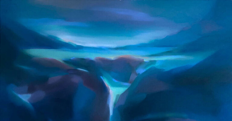
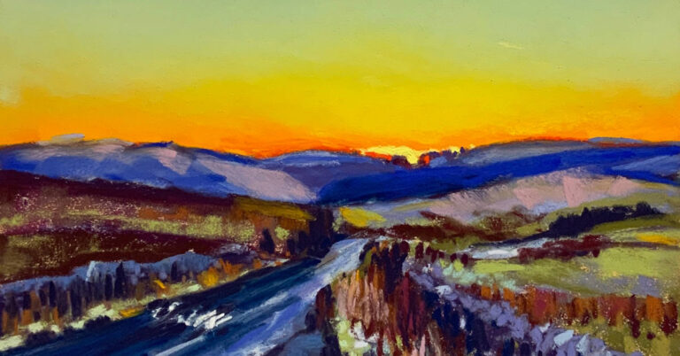
Similarly in “Journey”s End” shown at the start of the blog the 2 elements of subject matter (wave and light source) become so much more because of the more subtle tonal approach used in the sky and in the spray and other elements of the wave.
Colours Used:
Sky / Ocean – Additional 49-54, Dark 22, Dark 21
Light Source / Wave- Additional 49-54, Dark22, Dark21, Light14, Light1, Charcoal pencil.
A narrative nudge, symbology and metaphors.
As humans we all experience those emotional highs and lows that imprint on us from events throughout our life. As we discussed at the start, this forms our unique lens with which we process art. However, whilst our lens might be unique, at some time or other we all actually will experience the same emotions driven by similar life experiences; we will all have loved and lost, felt joy, hurt and jealousy. This kindrid exposure to emotion is part of what makes us human and is a powerful tool to build some sort of narrative into our work. A strong emotional narrative built on simple zen like elements in a picture can allow a piece to become much greater than the sum of its parts. There are two parts to a narrative in a pastel painting – the subject matter itself and the title. Of these I think the title is the much more powerful of the two. It is important to make it a nudge rather than a scalpel cut as you are still hoping for the viewer to find a personal connection rather than forcing the artist’s emotional link to the piece on them. Some ambiguity in the visual narrative or the title used will help with this subtlety.
A narrative nudge is the key tool that I’ve used in “All we Ever Needed”. The piece couldn’t be more simple, an analogous colour scheme (pink / purple), an empty space, a hint of the sea and two figures. However, the title carries you to one of those special moments, when love was simple, before life got in the way.

Colours used:
Sky / Beach – Unison Colour BlueViolet15, Red 17 and 18, Additional 7 and 8
Ocean – Unison Colour BlueGreenEarth10
Waves – Unison Colour Light 1
Figures – Charcoal pencil
Now let’s use the magic of photoshop to explore the power of the narrative nudge. I’ve basically kept the picture the same but varied the positions of the figures slightly and changed the titles.

It is clear to see how different narrative nudges really alter how the pictures manipulate your emotion and how it can convincingly help the viewer connect with a piece.
Coupled with a suitable title, symbols can be used effectively within the subject matter to help nudge a viewer’s emotion. All cultures have symbols that mean more than just the object. Balloons and kites may symbolize freedom; birds freedom or a journey, rivers a journey and so on. As an artist you are entirely at liberty to come up with your own symbols – these are then probably best described as methaphors. Considering the piece previously described and shown at the start “Journey’s End” I’ve used the wave as a metaphor for life and the breaking wave / title as a nudge towards the end of the journey we will all face at some time.
In the piece “Gentle hearts tied with easy threads” I’ve used balloons to symbolize, in this case, the freedom of a couple to choose to be together on life’s mutual journey. The title, which is a quote from the poet George Herbert, also alludes to the warmth and friendship of something done together. A viewer has the space to choose to interpret this as life partners, parent and child, siblings or maybe a friendship.

Colours used:
Sky – Unison Colour BlueViolet 7-12
Mountain Ridge – Unison Colour Dark18, Dark22
Balloons – Unison Colour Additional9, Additional7, Red8, Light7
Balloon Strings – Charcoal pencil
Paint from the heart
The final piece of advice I can offer in generating work that stimulates emotional connection is to paint from the heart. Paint honestly and about things that stimulate your own emotion. We have all heard of the phrase “suffering for your art” and this is really a nod to the deep well of human emotion (particularly pathos) that has acted as a muse for artists throughout the centuries. If a piece of work doesn’t make you feel something, is it fair to expect your viewer to feel anything? Indeed, if you don’t feel anything, is it art at all?
Summary
To summarize, some tools to help on the quest for Pastel Zen:
- Abbreviation of the subject matter.
- Use of colour scheme to augment the message.
- Use of tone to introduce subtlety / remove colour distraction.
- Narrative nudge.
- Use of symbology and metaphor.
- Paint from the heart.
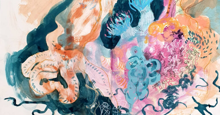
Before I offer a few exercises, a final word. In helping a piece connect with a viewer there is no need to always generate a completely austere work. All the tools above can be used in moderation in order to subtly increase the space for the viewer’s own life view in more complex pieces. In this final piece, “The things we let go”, I’ve painted one zen like painting inside another and used many of the techniques discussed above to try and allow a viewer to connect with the piece – I will let you see if you can spot them. Good luck if you decide on your own quest for Pastel Zen.

Colours used:
Internal Balloon scene
Sand / sky – Unison Colour Red 2-5, Orange5, Orange6
Clouds – Unison Colour RedEarth11, RedEarth12
Ocean / Waves – BlueGreenEarth8, BlueGreenEarth11, Light1
Figures – charcoal pencil
External Balloon scene
Tonal effects generating balloon shape – Unison Colour Orange6, Charcoal pencil,
Balloon thread – Charcoal pencil, Conte pastel pencil number 37.
Sky – Unison Colour BlueGreen 2-6, OceanBlue11, OceanBlue12, Dark24, Orange6.
Exercises in the quest for Pastel Zen.
1. Choose your favourite picture – repaint it after removing some things (objects, colours etc.). Look at your new picture and repeat the exercise. Do this a number of times until you really feel that nothing else can be removed – then do it again and remove one more thing.
2. Paint without photographs – you know what makes a beach / forest/ sky – don’t paint from the camera’s lens, paint from your own.
3. Paint just using one colour (multiple tones), now repeat the piece using only three tones and blend any extra that you need.
4. Paint really small (6 inches x 4 inches suggested) – you wont have room for superfluous items.
5. Think of a location and list the fewest number of things that would distill the essence of the place – are they all really needed?
6. Choose an emotion and represent it in the simplest way you can.
7. Paint a picture where you use the title and a symbol / metaphor to generate a narrative nudge for the viewer.


28 Responses
Wow Stephen – I love these. Who would have thought so little could mean so much. I must try them.
Thank you so much Barbara – I hope you enjoy trying them out 🙂
I found this blog really interesting, and the suggested exercises at the end are inspiring!
Thank you Gilly – I hope the exercises work for you.
Just love reading your blog . I really didn’t give much thought of emotion in a painting. Until I read this . I always work from a photo . However I am going to have a go at my own minds interpretation. Thankyou for the inspiration. And your beautiful paintings.
Thank you Jackie – good luck with it 🙂
What a brilliant read, Stephen! You have brought me back home. I’ve had a break from pastel painting for quite a few months due to “life getting in the way”, but you’ve really inspired me – giving inspiration to ease myself back, without the complications of thinking about what I “should” be doing. Thank you!
Thats very kind Fiona – good luck with your journey back to pastels. 🙂
Well written, informative article. Several ideas that I have not tried before and will be trying soon.
Thanks Susan – I hope the ideas work for you 🙂
Thank you for sharing Stephen. I love the feel of this work ❤️. I must try it!
Thank you Constance – l would love to see it if you do 🙂
Thank you for your beautiful way of expressing yourself both in prose and pastel. Such wonderful food for thought and exercises for both mind and canvas.
Thank you so much for your kind words Susan – I’m pleased you enjoyed it 🙂
Y vaya qué razón tiene usted! Menos es más! Maravilloso!
En verdad me emocionó su trabajo!
Bello bello!
Un gran saludo desde Santiago de Chile.
Gracias – 🙂
I am moved by your paintings and by the reasoning behind them, it’s pure poetry and I loved reading your blog.
Thank you so much for opening my eyes!
Thats very kind Maggie – thank you.
Your blog inspires me to look for more simplicity when painting. And, the reminder to remove objects – I follow the concept of “less is more” in other areas of life, and need to consider it when painting. Thanks!!
Lori O. – I hope some of the techniques work for you – thank you 🙂
Really awesome article!! Appreciate the suggested exercises. Thank you for sharing!
Thank you Tami – I hope the exercises are useful when you try them.
A heartfelt thank you!
Thank you for reading it Denise 🙂
Thanks for this, Stephen! I have admired your art for a long time on FaceBook. (Sure wish I could pop in to see it for real!).
I enjoyed reading all the thought and process that goes into your “simple” painting. And I love the exercises! Many thanks for this interesting and enlightening post.
Thank you Wendy – I’m glad you enjoyed it.
Hi Steve,
Your Zen invited me to return to my old friend Zen. It feels like I need to breath again. Thank you for sharing.
Thank you Carmel- internal peace is hard to find and easily lost 🙂