Colour is the element of my work which is remarked upon most of all. In fact I have many followers who tell me that they look out for my new posts as they find my joyful use of colour so up-lifting. Indeed my social media accounts are called Colour Shed by Cathy Pearce for the very reason that Colour is everything to me not just in my paintings but also in my life generally. I am always happy to share my colour secrets and in this blog I shall answer the question, “How do you choose your colours?”


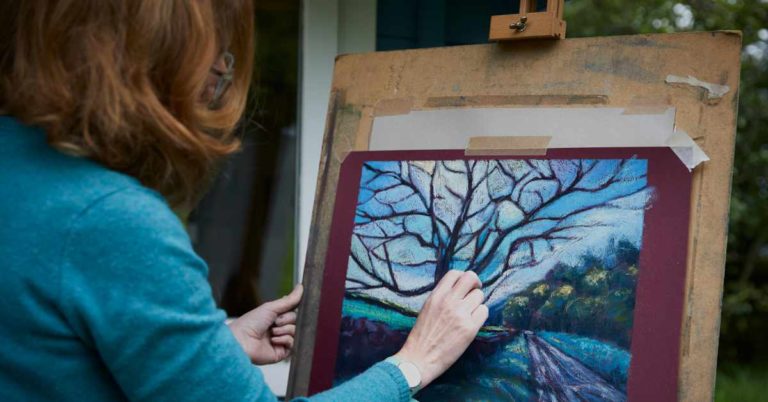
First of all, welcome to my studio, my ‘Colour Shed’ log cabin in my garden here in Wiltshire and, for those of you who have been following Unison Colour on Facebook for a few years then yes, I am the egg box lady! The first 2 drawers of my plan chest are filled with egg boxes of pastels, warm colours in the top drawer and cool colours in the drawer below. Egg boxes are useful storage containers because they have soft sides and won’t scuff my pastels and also I can write the Unison Colour codes easily on each section which is vital for when I am replenishing my stock and writing workshops, tutorials and blogs.


So already my first secret is having all my colours easily viewable and reachable ie; not stashed away in closed boxes and they are separated into warm and cool colours. When I am working in the studio and choosing my colours for a particular painting or series of works then I always make a quick little colour sketch which might only take me about 10-15 mins. My final painting will take up to 10 hours depending on size and process. Working at speed for the initial sketch allows me to make intuitive decisions about colour rather than laboured ones. Channelling the child within me I always select the brightest, pure colours first and then the shadow tones, light tones and then a few extra mid tones. I then separate these colours from the rest to avoid colour distraction! I use my colour theory knowledge constantly. If you don’t have one already then you really must get yourself a colour wheel. But very briefly, an analogous palette will be very easy on the eye and pleasing but personally I prefer a little drama so I usually use plenty of both complements and split complements. Another exciting combination can be achieved using a triadic palette.


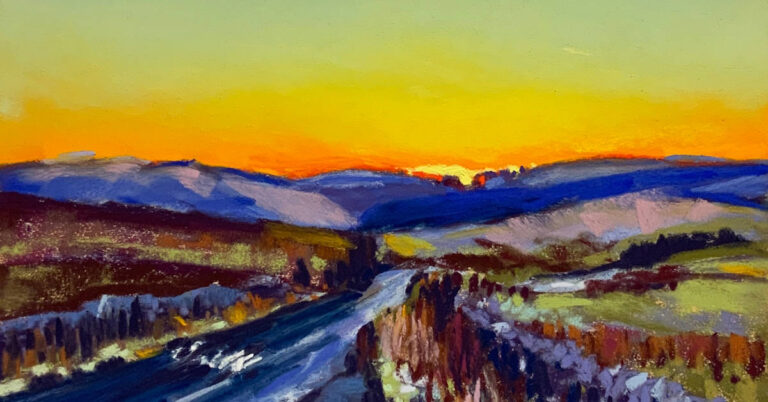
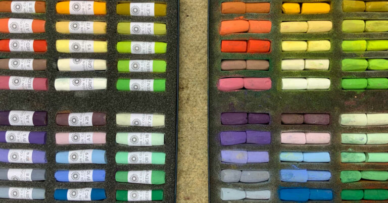
The boxed pastels show my workshop set of 36 landscape colours. I arrange them in order of colour temperature and colour groups. On the left are warm greens, then yellows and natural colours in the middle and hottest, warmest reds, pinks, orange on the bottom. Right top I have cool greens, blues, blue grey and white in the middle and finally purples and dark blues on the bottom. Having cool on one side and warm on the other is an excellent reminder for students that colour temperature is vitally important for depth, distance and form.
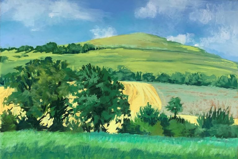
I have included one of my Wiltshire views painted totally with my workshop set to illustrate some of the points I make in my colour notes which follow…


It might be useful to explain my personal view about the use of black and white…
I do include a white as there are times when the tiniest touch of it makes a huge difference to a painting but generally speaking white is usually too cold and lifeless to use in large areas in a landscape. I prefer to use the lightest blue like BV7 for clouds as you will see from my notes… this leaves the opportunity to add an extra light touch but if you fill your clouds with white in the beginning you have no where to go to lighten them! As you train your eye to be more professional with your artwork then you will realise the obvious is rarely the best solution. This is exactly the same situation for black. I see many students initially wanting black for shadows! This will give a very amateur result as again, black is lifeless particularly in a landscape. Dark blues will give good shadows although if you really want to create a sense of depth in your work then choose purples and dark reds. This will all become more familiar to you as you spend more time working from life and less time working from photos.

To increase the potential of the box of 36 colours I designed my little set of 8 brights. These extra colours are super for spring bulbs; Tulips, Daffodils and Hyacinths and of course bluebell woods. Summer flowers like Nigella, Californian Poppies, marigolds and many others. Citrus fruits in a still life and Autumn foliage. Sunsets and summer skies, holiday seas, rivers and lakes. The list is endless all with just 44 colours. My advice to you is have a think about the specific subjects you wish to focus on with your pastels and see if you can pick out 36 colours which would be most useful and versatile for you, making sure you include some lights, some darks, warm and cool colours, plenty of mid tones and a few complementary pairs to add excitement to your compositions. Check out the amazing colour chart in the pastels section of the Unison Colour website.


4 Responses
Hi Cathy, well I now have studio envy. I’m like you have all my pastels easily visible but I can only dream of being so organised !! Great blog, really enjoyed it.
What a great exploration of colour. Enjoyed your view through the colour prism. I particularly liked the guidance for clouds + use of white
Thanks
Carolann Aa
Such valuable information so succinct too. Thanks so much
I would say the 36 color set looks so harmonious and cheerful. Unison should make it available as a set